Waterfall Charts
Waterfall charts are common in business to show how a value changes from one state to another through a series of intermediate changes. Bars for the beginning and ending values are connected by floating bars that show the rise and fall if the intermediate values. Peltier Tech Charts for Excel creates waterfall charts based on, but much more elaborate than, those in the Peltier Tech tutorial, Excel Waterfall Charts (Bridge Charts).
Waterfall Chart in the Peltier Tech Ribbon
The Waterfall Chart button is the first in the Custom Charts section of the Peltier Tech ribbon, right after the Peltier Tech button. You can create a waterfall chart by clicking on the Waterfall button…
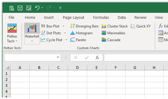
…or by clicking on the Waterfall dropdown arrow, and clicking the first item in the Waterfall dropdown menu.
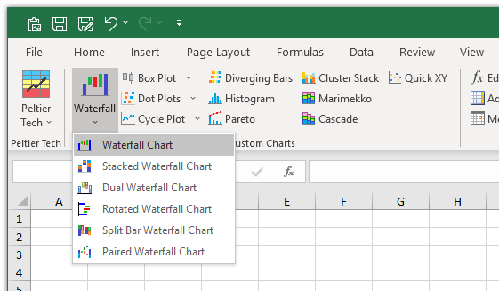
Waterfall and Stacked Waterfall charts are available in Standard and Advanced Editions of Peltier Tech Charts for Excel. Dual, Rotated, Split Bar, and Paired Waterfall charts are available in the Advanced Edition.
Waterfall Chart Dialog
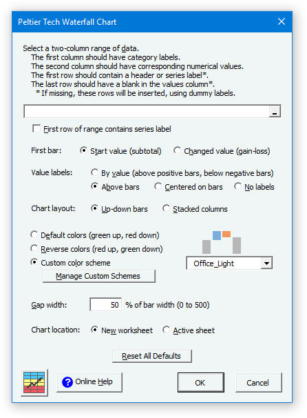
The Waterfall Chart dialog is rich with options. Many of the options are saved for the next time you open the dialog.
Data
If a range has been preselected or if the active cell lies within a valid range, the program inserts the range’s address into the range selection box. The program checks the ‘First row of range contains series label’ box if it detects labels in the first row of this range.
First Bar
You can decide whether the first bar is a starting total, and colored like the ending total bar, or whether it is treated as if it were a changed value, and formatted like any floating up or down bar. You can change this setting after the chart has been created, as shown later in these instructions.
Label Position
You can decide where to place your labels: above the bars, above positive bars and below negative bars, or centered in the bars, or you can decide not to show labels. You can change this setting after the chart has been created, as shown later in these instructions.
Chart Layout
You can choose whether the chart is constructed using Up-Down Bars or Stacked Columns. At first glance these options produce identical charts. Up-Down Bars makes the calculations and the chart somewhat simpler, but if you want to individually format the floating bars with unique colors or patterns, you should use Stacked Columns.
Colors
You can choose between built-in default (green up, red down) and reverse (red up, green down) color schemes, and you can create and save custom schemes.
Gap Width
This is the width of the gap between columns as a percentage of the width of the columns. It works just like in Excel’s regular column charts. You can only set this while creating your waterfall chart. The default value of 50 looks good in most cases.
Chart Location
You can choose whether the calculations and chart are created on the active sheet or on a new sheet. To use the active sheet, the range that will contain the calculations must be blank. When the chart is inserted on a new worksheet, the data and calculations link to the original data. In addition, the calculations are placed in an Excel Table, which makes it easier if you decide to insert or delete rows later.
Valid Waterfall Data
Click here to download a workbook with Peltier Tech Charts for Excel Sample Data for waterfall charts and other charts in the program.
Essentially you need two columns of data to create a waterfall chart. The first column consists of labels, and the second of values.
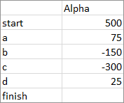
The first row should contain labels. If it does not (i.e., the ‘First row of range contains series label’ box in the dialog is unchecked when the program runs), the program inserts a row with dummy labels. The top left cell need not be empty, it just happens to be in this screen shot.
The last row should contain a label in the first column and a blank cell in the second. The blank cell tells the program to modify that row’s formulas to show a total bar, not a floating up or down bar, for the last row. If you don’t have a final row with a label and no value, the program will insert such a row for you.
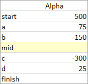
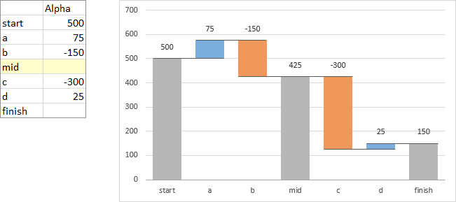
When the program encounters a row with a label and no value, it calculates the total from the data above it. With this in mind, it is easy to create a waterfall chart with a subtotal anywhere you want. Simply insert a row (shaded yellow below), put a label in the first column and leave the second column blank. The program will produce a subtotal bar, not a floating up or down bar for that row.
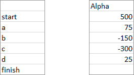
If your data has one or more columns between the labels and values, you can still use it to create a waterfall chart, if you use the option to create the chart on a new worksheet. The data might look like this, either with blanks in the intervening column or will cells filled with unrelated values. Select one area with the mouse, then hold the Ctrl key while selecting the other area. The two columns must start and end on the same rows, and if there are blank cells, you must include them in your selections.
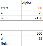
In the same way, you can skip unwanted rows in the middle of your data. For example, the rows between the top and bottom block below may be blank or may contain unrelated data. Select one area, then hold Ctrl while selecting the second, and the program will construct the waterfall chart with the selected cells, if you have selected to create the chart on a new worksheet.
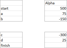
In fact, even a range like the following is permissible.
Output
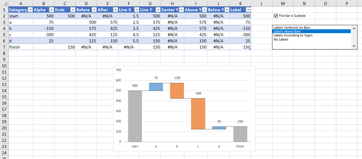
In all cases, the program constructs an output range to perform calculations needed to produce the desired waterfall appearance. In addition, a checkbox for the first bar and a list box for the label position are placed by these calculations. Note that wherever the chart is created, active sheet or new sheet, you can copy the chart and paste it anywhere else, because it is just a regular Excel chart, with some customized data and fancy formatting.
Here is the waterfall output created on a new sheet when the Up-Down Bars option is selected. The data is in an Excel table, and the first two columns are linked to the data selected in the dialog.
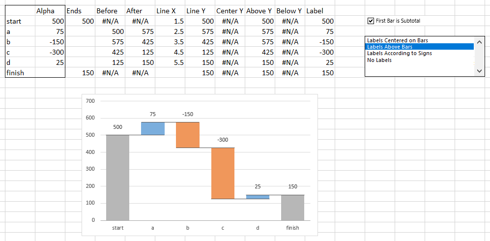
Here is the output in the active sheet. The data is not in a Table, just in a regular range.
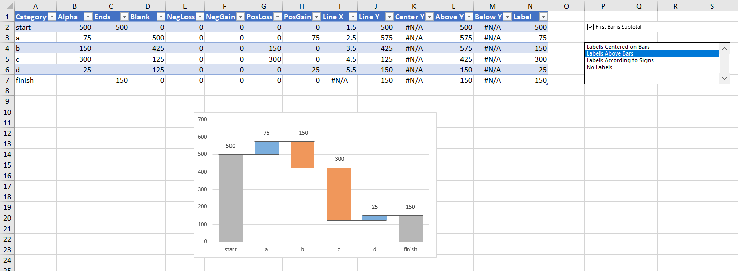
Here is the output created on a new sheet when the Stacked Columns option is selected. Note that three extra columns are needed for the calculations.
My preference is to use a new sheet, then place a copy of the chart where I want it.
Intermediate Subtotals
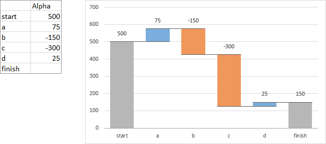
Below is our simple data set without an intermediate subtotal row, and the resulting chart.
Here is the simple data with an intermediate subtotal row inserted (yellow shading), with a label and no value. The chart has a subtotal in the corresponding category along the X axis.
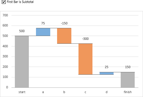
First Bar Subtotal
If you select ‘First Bar Is Subtotal’ in the dialog, or if you check the ‘First Bar Is Subtotal’ checkbox in the output range, the first bar is formatted like any other subtotal or total in the chart.
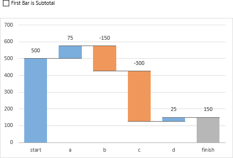
If you unselect ‘First Bar Is Subtotal’ in the dialog, or if you uncheck the ‘First Bar Is Subtotal’ checkbox in the output range, the first bar is formatted like any floating up or down bar in the chart, depending on the sign of its value.
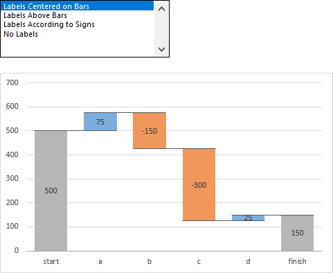
Label Position
You can select your label position in the dialog or in the Label Position listbox in the output range. You can center the labels on the bars.
You can place the labels above the bars.
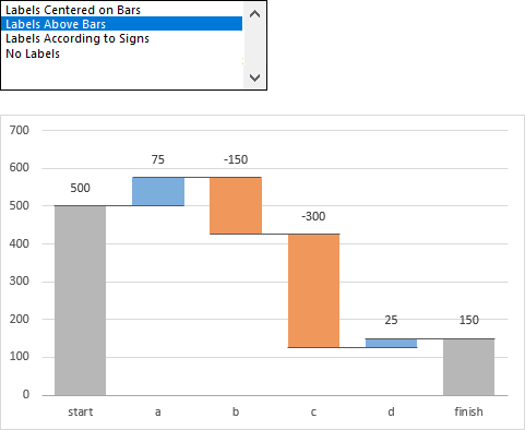
You can place the labels above positive bars and below negative bars, which seems to be a favorite among users.
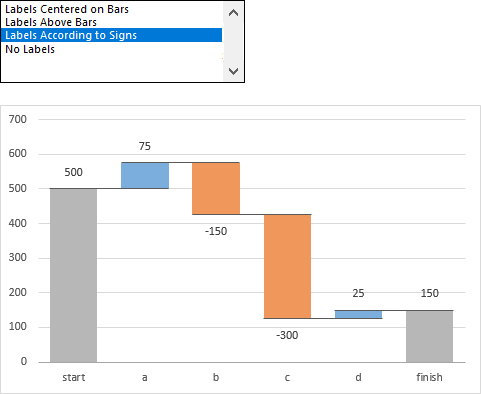
You can even choose to show no labels at all.
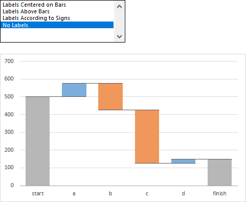
Insert or Delete Data
What if you have created a waterfall chart, and now you want to insert or delete data? If you created the chart on a new worksheet, it’s pretty easy. Here is our output range, with calculations and the chart. We want to insert data between the “b” and “c” labels of the chart.
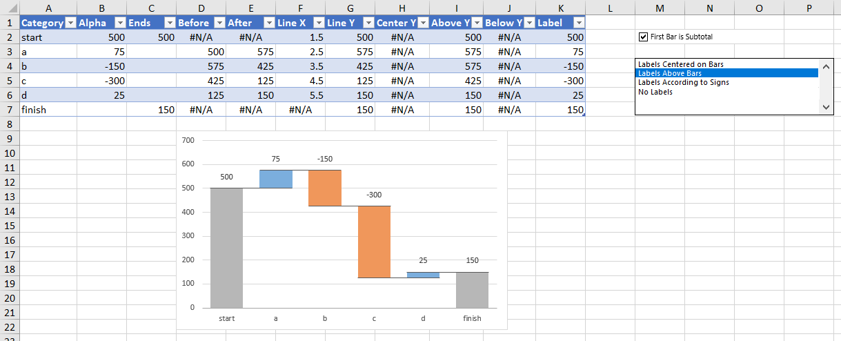
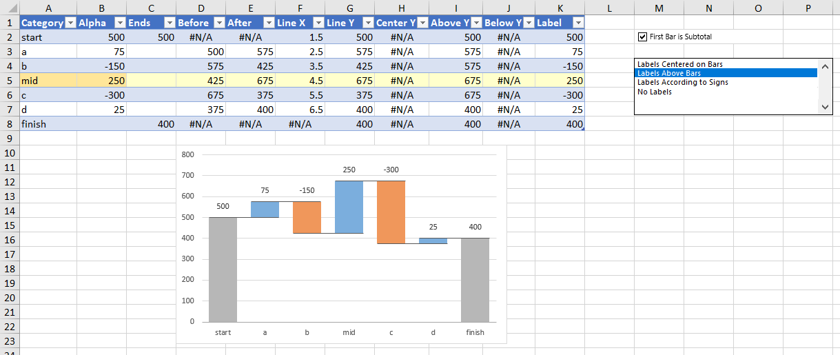
Right click in the table row below the desired insertion (with the label “c”), and choose Insert > Table Rows Above (yes, you can insert more than one row at a time). The inserted row is shown below with yellow shading. Enter a label in the first column of each inserted row (the horizontal lines in the chart are misaligned until a label is inserted).
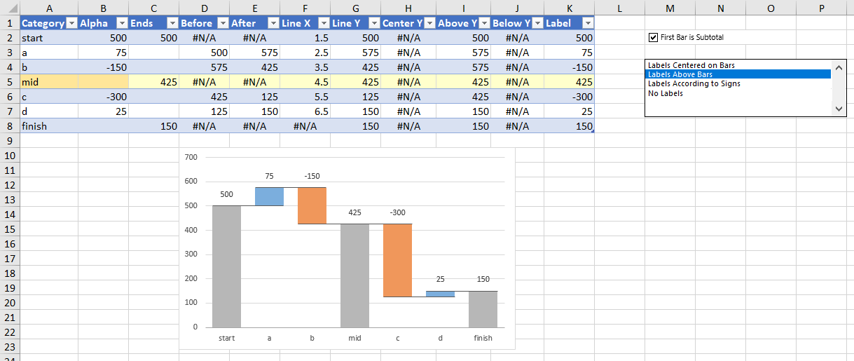
You can see a subtotal bar in the chart corresponding to the inserted row. If it’s not a subtotal row, enter a value in the second cell of the inserted row. A new floating bar appears.
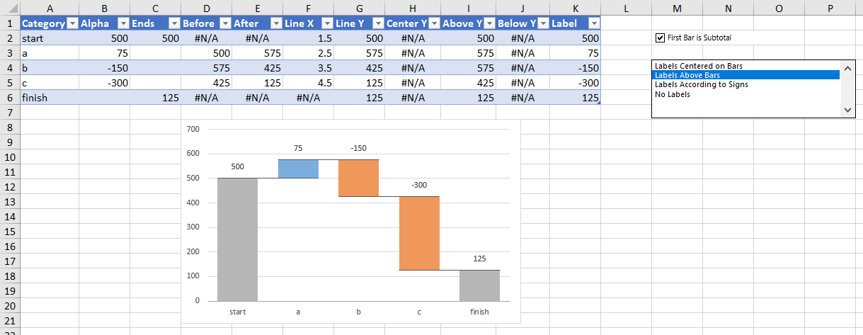
If you need to delete a row, right click on the row, choose Delete > Table Rows. Below I’ve deleted item “d” from the original output range, and it’s also gone from the chart.
Color Schemes
You can modify the color scheme used in your waterfall chart, save a scheme, and manage your schemes. You can access the color schemes through some controls in the middle of the dialog. Here the default color scheme is selected (blue total bars, green up bars, and red down bars). These colors are shown in the small graphic.

Here the reversed color scheme is selected (blue total bars, green down bars, and red up bars).

Select ‘Custom Color Scheme’, and a ‘Manage Custom Schemes’ button appears. The colors from the selected scheme are shown in the small graphic.

A dropdown showing all custom schemes you’ve created also appears. ‘Office’ is a custom scheme I made which uses the Office 2016 blue and orange accent colors for up and down bars and the Office 2016 gray accent color for total bars. This is the same as Microsoft’s own waterfall chart uses. ‘Office_Light’ uses these colors, but with 20% brightness applied.

Click the ‘Manage Color Schemes’ button to pop up the Waterfall Chart Color Scheme Manager. It lists the schemes, and shows the colors of the selected scheme in the graphic. There are buttons for managing the list.
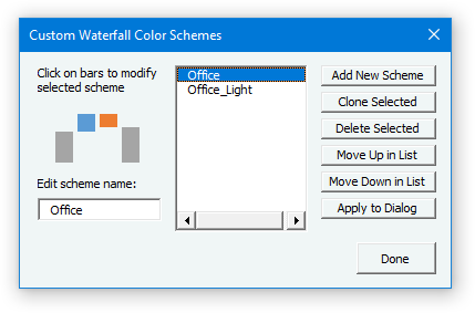
Click ‘Add New Scheme’ to create a new color scheme. Change the name by editing the scheme name in the box below the graphic.
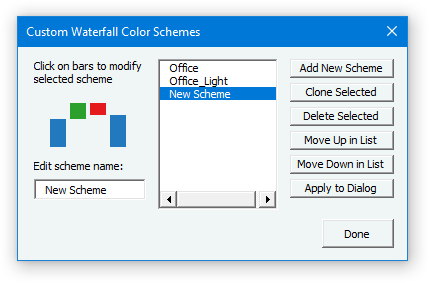
Click on one of the bars in the graphic to modify the corresponding color in the scheme. You can browse through a large number of possible colors to get the ones you like.
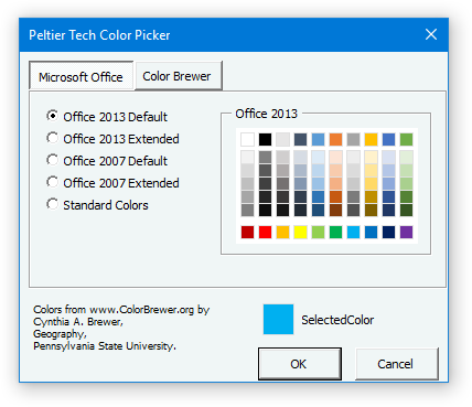
Click okay to apply the color to the scheme.
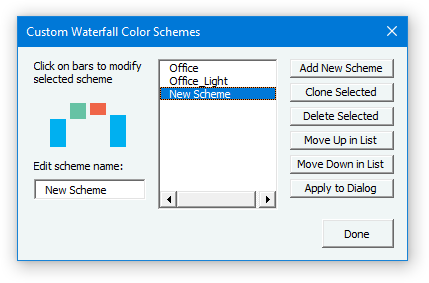
Click Done, and the new scheme is added to the list in the main dialog’s dropdown.

You can also apply your own colors to an existing waterfall chart using the usual Excel tools, but be careful not to break the chart.
Using VBA to Create Waterfall Charts
You can access the waterfall chart feature from your own VBA code, bypassing the dialog. Use the following function, which returns a chart as the value of the function.
    Public Function PeltierTech_WaterfallChart(ChartData As Range, LabelsInFirstRow As Boolean, _
        DataLabelPosition As DataLabelPosition, GapWidth As Long, Optional NewSheet As Boolean = True, _
        Optional WaterfallChartLayout As WaterfallLayout = WaterfallLayoutUpDownBars, _
        Optional CategoryLabels As Boolean = False, Optional ColorOption As WaterfallColorOption = _
        WaterfallDefaultColor, Optional CustomColors As Variant) _
        As Chart
The parameters correspond to options in the dialog. You should familiarize yourself with the dialog, so you understand how the parameters work. The variable types are Excel’s customary variable types, except for the following enumerated types. You can use the name of the enumerated element (DataLabelPositionCenter) or the value of the element (1).
    Public Enum DataLabelPosition
        DataLabelPositionNone = 0
        DataLabelPositionCenter = 1
        DataLabelPositionAbove = 2
        DataLabelPositionByValue = 3
    End Enum
Public Enum WaterfallLayout
WaterfallLayoutUpDownBars = 0
WaterfallLayoutStackedColumn = 1
End Enum Public Enum WaterfallColorOption
WaterfallDefaultColor = 0
WaterfallReverseColor = 1
WaterfallCustomColor = 2
End EnumFor some general hints on using VBA to operate the utility, refer to Using VBA with the Peltier Tech Chart Utility.


