Stacked Waterfall Charts
Waterfall charts are common in business to show how a value changes from one state to another through a series of intermediate changes. Bars for the beginning and ending values are connected by floating bars that show the rise and fall if the intermediate values. Stacked waterfall charts show the contributions of multiple values at each category by stacking these values within the waterfall’s floating bars.
Stacked Waterfall Chart in the Peltier Tech Ribbon
You can create a stacked waterfall chart by clicking on the Waterfall dropdown arrow, and clicking the Stacked Waterfall item in the dropdown menu.

Waterfall and Stacked Waterfall charts are available in Standard and Advanced Editions of Peltier Tech Charts for Excel. Dual, Rotated, Split Bar, and Paired Waterfall charts are available in the Advanced Edition.
Stacked Waterfall Chart Dialog
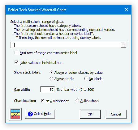
The Stacked Waterfall Chart dialog is rich with options. Many of the options are saved for the next time you open the dialog.
Data
If a range has been preselected or if the active cell lies within a valid range, the program inserts the range’s address into the range selection box. The program checks the ‘First row of range contains series label’ box if it detects labels in the first row of this range.
Labels
You can choose whether to display individual values centered in the bars.
You can decide where to place your labels: above the bars, above positive bars and below negative bars, or you can decide not to show labels.
You can change these settings after the chart has been created, as shown later in these instructions.
Gap Width
This is the width of the gap between columns as a percentage of the width of the columns. It works just like in Excel’s regular column charts. You can only set this while creating your waterfall chart. The default value of 50 looks good in most cases.
Chart Location
You can choose whether the calculations and chart are created on the active sheet or on a new sheet. To use the active sheet, the range that will contain the calculations must be blank. When the chart is inserted on a new worksheet, the data and calculations link to the original data.
Valid Stacked Waterfall Chart Data
Click here to download a workbook with Peltier Tech Charts for Excel Sample Data for stacked waterfall charts and other charts in the program.
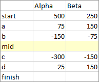
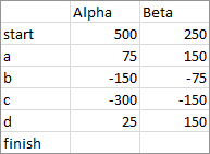
Typical valid data ranges for a stacked waterfall chart are shown below. The first column has categories (X axis labels) and subsequent columns have values to be plotted, the first row has names for the series to be stacked, and the last row has a category label but no values. The program will compute the sums, so no values are necessary. Here is data for two stacked series:
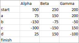
Here is data for three stacked series:
And here is data for four stacked series:
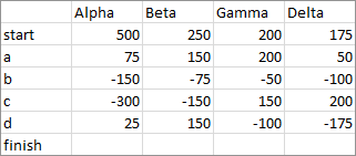
Here is data with an inserted row (shaded yellow) that will produce an intermediate subtotal:
If you don’t want a final total, simply omit the final totals row with label but no values:
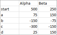
If you opt to draw the chart on a new worksheet, the program will accept discontiguous ranges. Select one range, then hold the Ctrl key while selecting more ranges. As long as the selected ranges would form a solid rectangular range if the unselected rows and columns were to be deleted, the program can use the selection. For example, the categories might be separated from the values:
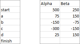
Or the second series might be separated from the first:
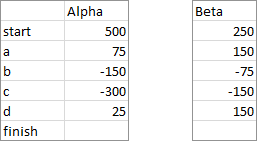
Or all the columns may be separated:
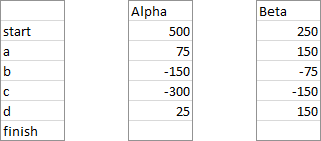
Or perhaps you want to omit one or more rows:
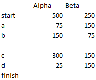
You can even split by rows and columns:
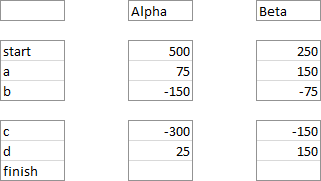
Waterfall Chart vs. Stacked Waterfall Chart
A typical waterfall chart shows how a value changes from a beginning value to a final value.
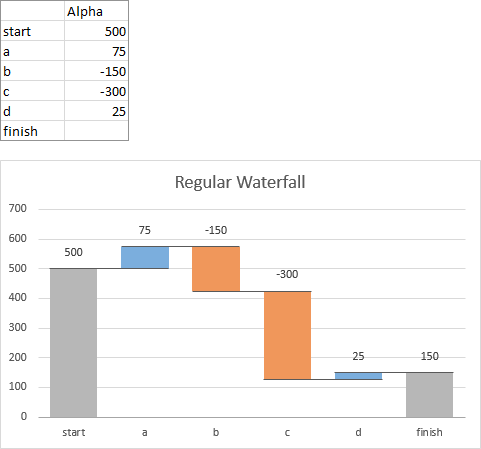
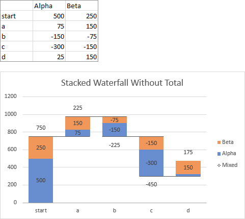
A stacked waterfall chart shows how different entities, for example, divisions of a company or sales people in an office, contribute to each value. Here is a stacked waterfall with two sets of values. I’ll explain the “Mixed” entry in the legend shortly.

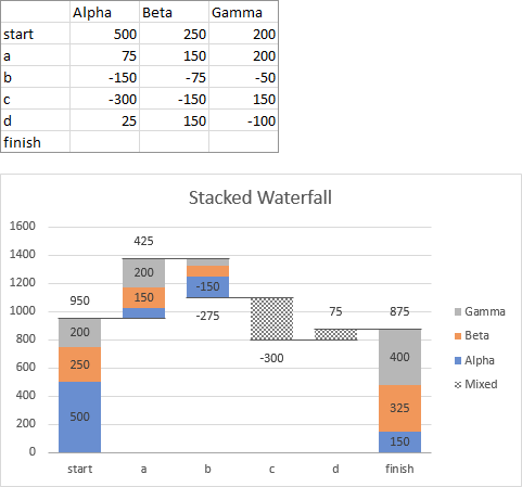
Here is a stacked waterfall chart with three sets of values. Note that categories “c” and “d” have no colored stacked bars, but only a patterned bar, corresponding to “Mixed” in the legend. This is because categories “c” and “d” have some positive and some negative values: their signs are Mixed. It is not possible to stack positive and negative bars on each other, so the combined values are plotted in a single Mixed bar.
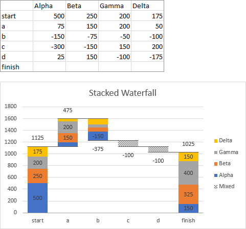
Finally, here is a stacked waterfall chart with four series.
Output
The program constructs an output range containing calculations needed to produce the desired stacked waterfall appearance. In addition, a checkbox for bar labels and a list box for the totals label position are placed by these calculations. Wherever the chart is created, active sheet or new sheet, you can copy the chart and paste it anywhere else, because it is just a regular Excel chart, albeit with customized data and fancy formatting.
Here is a stacked waterfall output range and chart which have been created on the active sheet. Note that the program will not allow the chart to be output on the active sheet if the range that will be filled with calculations is not empty.
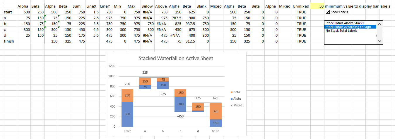
Here is a stacked waterfall output range and chart created on a new sheet. The calculations and the values are identical; the first few columns of the output range are linked to the originally selected data, so changes in the original data are reflected in the chart.

My preference is to use a new sheet, then place a copy of the chart where I want it.
Intermediate Subtotals, Final Totals
The standard layout has full bars (totals) at the beginning and end, connected by floating bars representing changes.

If you want to display an intermediate subtotal, simply insert a row (shaded yellow below) in your data with a label in the first column but no values in the other columns, then create your chart. The program interprets the blank values as a signal to generate subtotals.
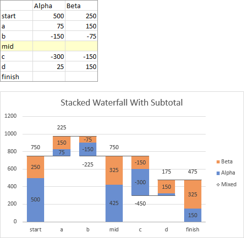
If you want to omit the final totals, simply omit the last row with label and blank values. The program will not generate totals for this row, and the chart will have no final total.
Data Labels
When you create the stacked waterfall chart, it displays labels showing the individual bar values and the stacked totals, based on your selections in the dialog. There are three places you can adjust the values: a shaded yellow cell with the minimum value to display, a checkbox where you choose whether to show individual bar values at all, and a listbox where you select how to display the stacked totals.
Here is the default chart with its labels.
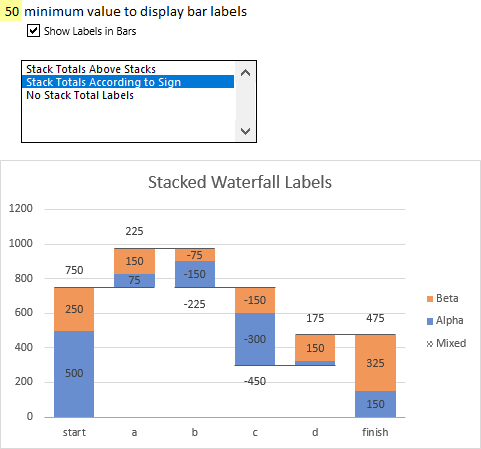
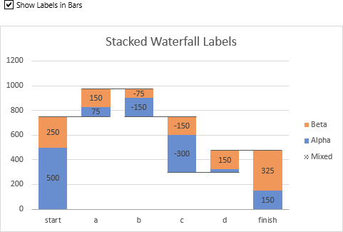
Here is the chart with Show Labels in Bars checked.
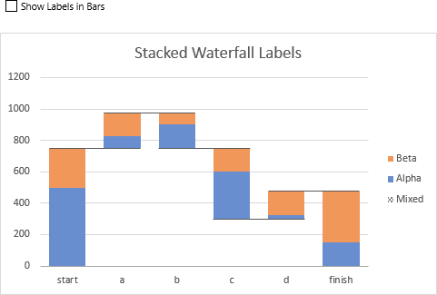
Here is the chart with Show Labels in Bars unchecked.
If labels are displayed in bars, you can adjust the value in the yellow highlighted cell to change which values are displayed, to remove clutter in your chart. Here, the value of 50 means that the “Alpha” bar above category “c” will not show its smaller value of 25.

Change the yellow cell to 100, and a couple of values of 75 are no longer displayed.

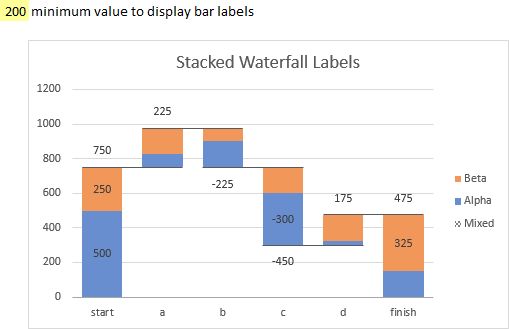
Change the cell to 200, and more values disappear.
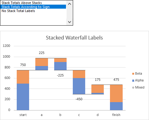
The stacked total data labels have three settings. Here are the stacked totals displayed according to sign, above positive totals and below negative totals.
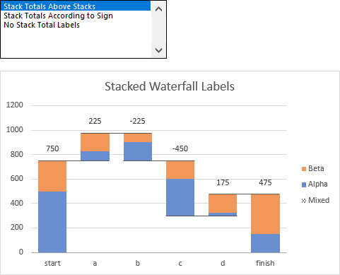
Here are stacked totals displayed above all bars, regardless of sign.
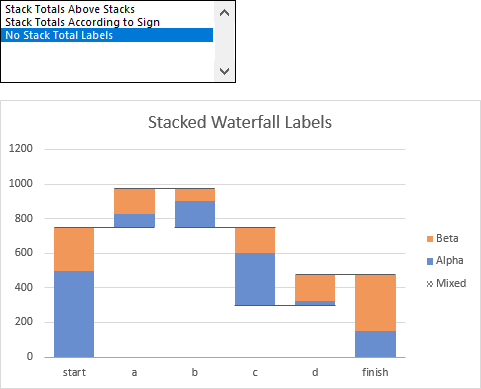
Here is the stacked waterfall chart without displaying stacked totals at all.
Colors
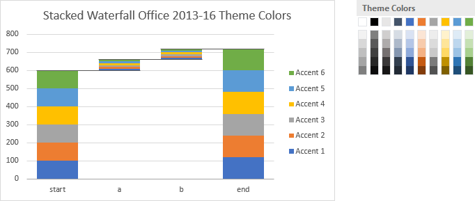
In the same way that a regular Excel chart use the workbook’s theme accent colors in order to format its data series, a stacked waterfall uses these accent colors for its stacked bars. Using the default Office 2013 (and 2016) colors, the stacked waterfall starts with blue (Accent 1), then orange, gray, etc.
If you create a stacked waterfall in a workbook that uses the Office 2007-2010 colors, or if you change the workbook’s colors to this theme, you start with dark blue, then red, green, etc.
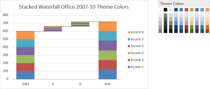
Any of the other themes, including your own custom theme, is used in the same way for the chart’s colors.
