Rotated Waterfall Charts
Waterfall charts are common in business to show how a value changes from one state to another through a series of intermediate changes. Bars for the beginning and ending values are connected by floating bars that show the increase and decrease of the intermediate values. Rotated waterfall charts change the orientation of the chart to use horizontal bars to represent values.
Rotated Waterfall Chart in the Peltier Tech Ribbon
You can create a rotated waterfall chart by clicking on the Waterfall dropdown arrow, and clicking the Rotated Waterfall item in the dropdown menu.

Waterfall and Stacked Waterfall charts are available in Standard and Advanced Editions of Peltier Tech Charts for Excel. Dual, Rotated, Split Bar, and Paired Waterfall charts are available in the Advanced Edition.
Rotated Waterfall Chart Dialog
The Rotated Waterfall Chart dialog contains several options. Many of the options are saved for the next time you open the dialog.
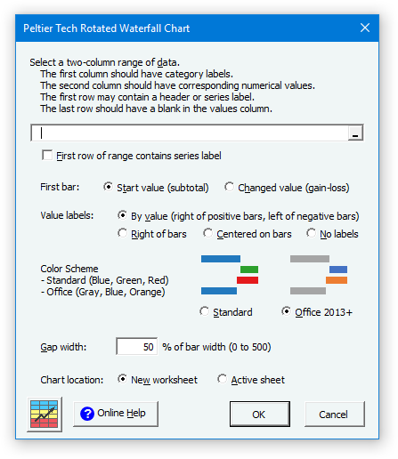
Data
If a range has been preselected or if the active cell lies within a valid range, the program inserts the range’s address into the range selection box. The program checks the ‘First row of range contains series label’ box if it detects labels in the first row of this range.
First Bar
You can decide whether the first bar is a starting total, and colored like the ending total bar, or whether it is treated as if it were a changed value, and formatted like any floating up or down bar. You can change this setting after the chart has been created, as shown later in these instructions.
Label Position
You can decide where to place your labels: above the bars, above positive bars and below negative bars, or centered in the bars, or you can decide not to show labels. You can change this setting after the chart has been created, as shown later in these instructions.
Gap Width
This is the width of the gap between columns as a percentage of the width of the columns. It works just like in Excel’s regular column charts. You can only set this while creating your waterfall chart. The default value of 50 looks good in most cases.
Chart Location
You can choose whether the calculations and chart are created on the active sheet or on a new sheet. To use the active sheet, the range that will contain the calculations must be blank. When the chart is inserted on a new worksheet, the data and calculations link to the original data.
Color Scheme
You can choose between a standard color scheme for the bars (which uses blue, green, and red) or a color scheme modeled on the Office 2013 and 2016 colors (which uses gray, blue, and orange).
Valid Rotated Waterfall Data
Click here to download a workbook with Peltier Tech Charts for Excel Sample Data for rotated waterfall charts and other charts in the program.
Essentially you need two columns of data to create a rotated waterfall chart. The first column consists of labels, and the second of values.
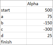
The first row should contain labels. If it does not (i.e., the ‘First row of range contains series label’ box in the dialog is unchecked when the program runs), the program inserts a row with dummy labels. The top left cell need not be empty, it just happens to be in this screen shot.
The last row should contain a label in the first column and a blank cell in the second. The blank cell tells the program to modify that row’s formulas to show a total bar, not a floating up or down bar, for the last row. If you don’t have a final row with a label and no value, the program will insert such a row for you.
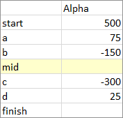
When the program encounters a row with a label and no value, it calculates the total from the data above it. With this in mind, it is easy to create a waterfall chart with a subtotal anywhere you want. Simply insert a row (shaded yellow below), put a label in the first column and leave the second column blank. The program will produce a subtotal bar, not a floating up or down bar for that row.
If your data has one or more columns between the labels and values, you can still use it to create a waterfall chart, if you use the option to create the chart on a new worksheet. The data might look like this, either with blanks in the intervening column or will cells filled with unrelated values. Select one area with the mouse, then hold the Ctrl key while selecting the other area. The two columns must start and end on the same rows, and if there are blank cells, you must include them in your selections.
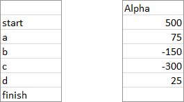
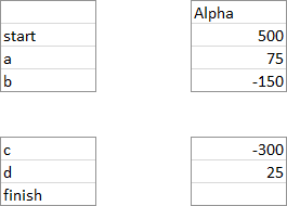
In the same way, you can skip unwanted rows in the middle of your data. For example, the rows between the top and bottom block below may be blank or may contain unrelated data. Select one area, then hold Ctrl while selecting the second, and the program will construct the waterfall chart with the selected cells, if you have selected to create the chart on a new worksheet.
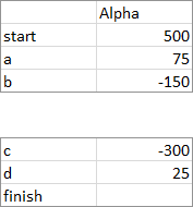
In fact, even a range like the following is permissible.
Waterfall Chart vs. Rotated Waterfall Chart
A typical waterfall chart shows how a value changes from a beginning value to a final value.

A rotated waterfall chart shows the same data, with horizontal bars rather than vertical bars representing the values, and categories along the vertical rather than the horizontal axis.

Output
The program constructs an output range containing calculations needed to produce the desired rotated waterfall appearance. Wherever the chart is created, active sheet or new sheet, you can copy the chart and paste it anywhere else, because it is just a regular Excel chart, albeit with customized data and fancy formatting.
Here is a rotated waterfall output range and chart which have been created on the active sheet. Note that the program will not allow the chart to be output on the active sheet if the range that will be filled with calculations is not empty.
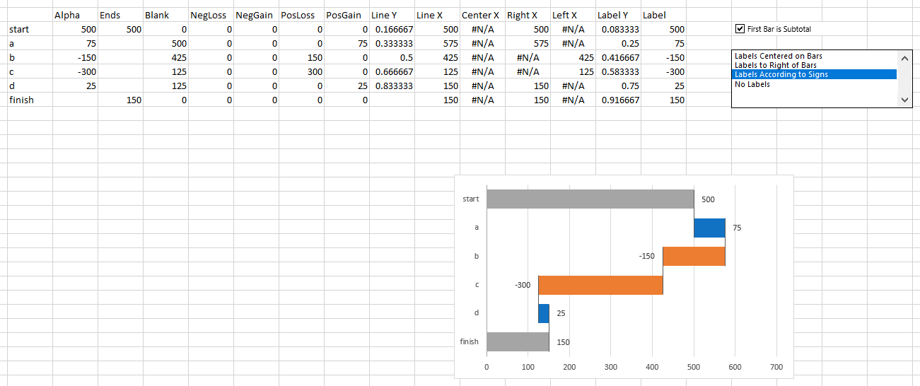
Here is a rotated waterfall output range and chart created on a new sheet. The calculations and the values are identical; the first few columns of the output range are linked to the originally selected data, so changes in the original data are reflected in the chart.
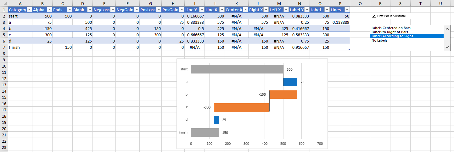
My preference is to use a new sheet, then place a copy of the chart where I want it.
Intermediate Subtotals
Below is our simple data set without an intermediate subtotal row, and the resulting chart.

Here is the simple data with an intermediate subtotal row inserted (yellow shading), with a label and no value. The chart has a subtotal in the corresponding category along the X axis (yes, the vertical category axis of a bar chart is the X axis).

First Bar Subtotal
If you select ‘First Bar Is Subtotal’ in the dialog, or if you check the ‘First Bar Is Subtotal’ checkbox in the output range, the first bar is formatted like any other subtotal or total in the chart.
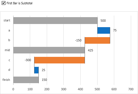
If you unselect ‘First Bar Is Subtotal’ in the dialog, or if you uncheck the ‘First Bar Is Subtotal’ checkbox in the output range, the first bar is formatted like any floating up or down bar in the chart, depending on the sign of its value.
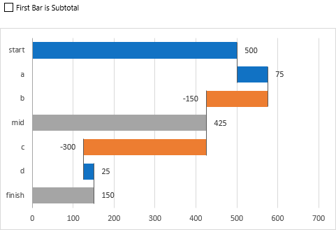
Label Position
You can select your label position in the dialog or in the Label Position listbox in the output range. You can center the labels on the bars.
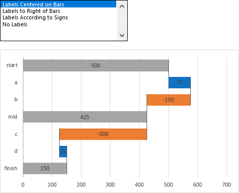
You can place the labels to the right of the bars.
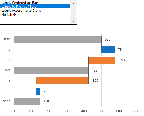
You can place the labels to the right of positive bars and to the left of negative bars, which seems to be a favorite among users.
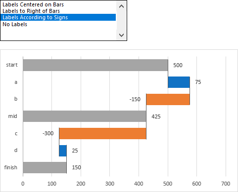
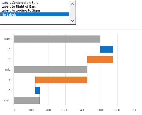
And you can leave off the data labels altogether.
Colors
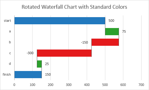
You can choose the “Standard” color scheme, with blue totals, green up-bars, and red down-bars.
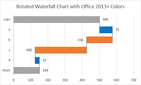
Or you can choose the “Office 2013+” color scheme, with gray totals, blue up-bars, and orange down-bars.
You can also apply your own colors using the usual Excel tools, but be careful not to break the chart.

