Dual Waterfall Charts
Waterfall charts are common in business to show how a value changes from one state to another through a series of intermediate changes. Bars for the beginning and ending values are connected by floating bars that show the rise and fall if the intermediate values. Dual waterfall charts allow you to compare two similar sets of data on the same scale.
Dual Waterfall Chart in the Peltier Tech Ribbon
You can create a dual waterfall chart by clicking on the Waterfall dropdown arrow, and clicking the Dual Waterfall item in the dropdown menu.
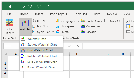
Waterfall and Stacked Waterfall charts are available in Standard and Advanced Editions of Peltier Tech Charts for Excel. Dual, Rotated, Split Bar, and Paired Waterfall charts are available in the Advanced Edition.
Dual Waterfall Chart Dialog
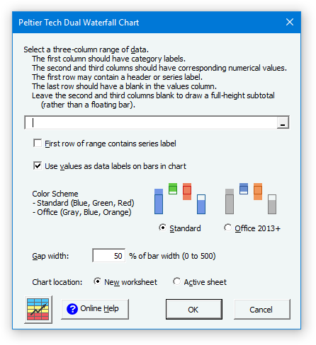
The Dual Waterfall Chart dialog contains several options. Many of these options are saved for the next time you open the dialog.
Data
If a range has been preselected or if the active cell lies within a valid range, the program inserts the range’s address into the range selection box. The program checks the ‘First row of range contains series label’ box if it detects labels in the first row of this range.
Labels
You can choose whether to display individual values centered in the bars. If you choose not to show labels, the program does not even include those options in the output calculations, so you cannot toggle them on and off later. Labels are positioned arbitrarily, based on algorithms that attempt to prevent overlapping. If you display labels, you can adjust the label number format after the chart is created.
Gap Width
This is the width of the gap between columns as a percentage of the width of the columns. It works just like in Excel’s regular column charts. You can only set this while creating your waterfall chart. The default value of 50 looks good in most cases.
Chart Location
You can choose whether the calculations and chart are created on the active sheet or on a new sheet. To use the active sheet, the range that will contain the calculations must be blank. When the chart is inserted on a new worksheet, the data and calculations link to the original data.
Color Scheme
You can choose between a standard color scheme for the bars (which uses blue, green, and red) or a color scheme modeled on the Office 2013 and 2016 colors (which uses gray, blue, and orange).
Valid Dual Waterfall Chart Data
Click here to download a workbook with Peltier Tech Charts for Excel Sample Data for dual waterfall charts and other charts in the program.
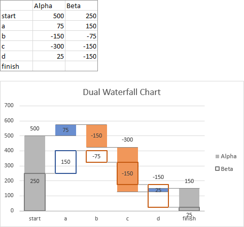
Typical valid data ranges for a dual waterfall chart are shown below. The first column has categories (X axis labels) and subsequent columns have values to be plotted, the first row has names for the series to be stacked, and the last row has a category label but no values. The program will compute the sums, so no values are necessary. If you omit the first label row or last total row, the program will insert it for you. Here is a typical data set:
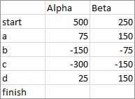
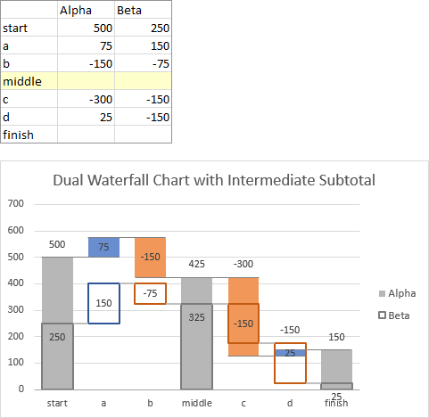
Here is data with an inserted row (shaded yellow) that will produce an intermediate subtotal:
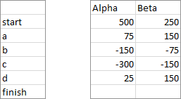
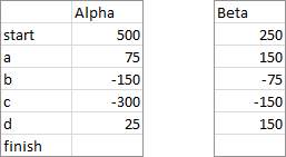
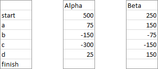
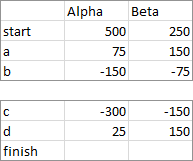
If you opt to draw the chart on a new worksheet, the program will accept discontiguous ranges. Select one range, then hold the Ctrl key while selecting more ranges. As long as the selected ranges would form a solid rectangular range if the unselected rows and columns were to be deleted, the program can use the selection. For example, the categories might be separated from the values:
Or the second series might be separated from the first:
Or all the columns may be separated:
Or perhaps you want to omit one or more rows:
You can even split by rows and columns:
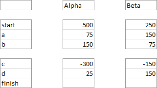
Waterfall Chart vs. Dual Waterfall Chart
A typical waterfall chart shows how a value changes from a beginning value to a final value.
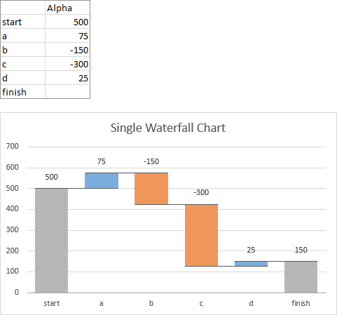
The dual waterfall chart lets you overlay two data sets on the same scale.
Output
The program constructs an output range containing calculations needed to produce the desired dual waterfall appearance. Wherever the chart is created, active sheet or new sheet, you can copy the chart and paste it anywhere else, because it is just a regular Excel chart, albeit with customized data and fancy formatting.
Here is a dual waterfall output range and chart which have been created on the active sheet. Note that the program will not allow the chart to be output on the active sheet if the range that will be filled with calculations is not empty.
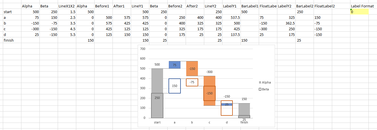
Here is a dual waterfall output range and chart created on a new sheet. The calculations and the values are identical; the first few columns of the output range are linked to the originally selected data, so changes in the original data are reflected in the chart.
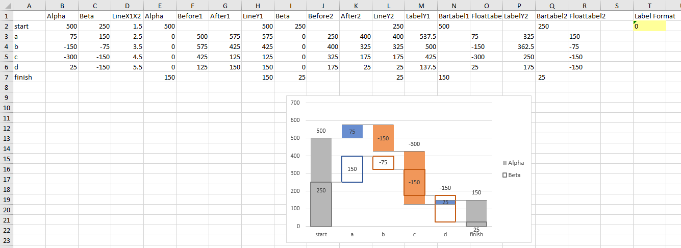
My preference is to use a new sheet, then place a copy of the chart where I want it.
Intermediate Subtotals
The standard layout has full bars (totals) at the beginning and end, connected by floating bars representing changes.

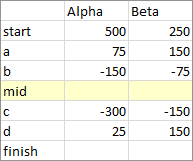
If you want to display an intermediate subtotal, simply insert a row (shaded yellow below) in your data with a label in the first column but no values in the other columns, then create your chart. The program interprets the blank values as a signal to generate subtotals.
Data Label Number Format
If you display data labels, they initially use the number without decimals format, and you cannot change the display by changing the number format of the data labels. This is because of the tricks used to prevent overlapping labels.
However, you can change the apparent number formats of the labels by entering the desired format into the yellow “Label Format’ cell adjacent to the output data. Here is the default “0” number format:
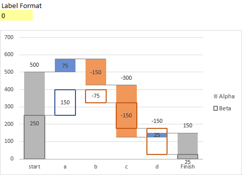
Here the number format has been modified to include two decimal digits, using “0.00”:

Here the format is “$0”, with a dollar sign and no decimal digits:

Colors
You can choose the “Standard” color scheme, with blue totals, green up-bars, and red down-bars.
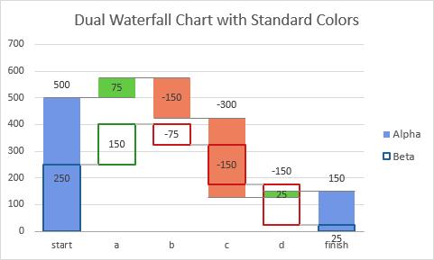
Or you can choose the “Office 2013+” color scheme, with gray totals, blue up-bars, and orange down-bars.
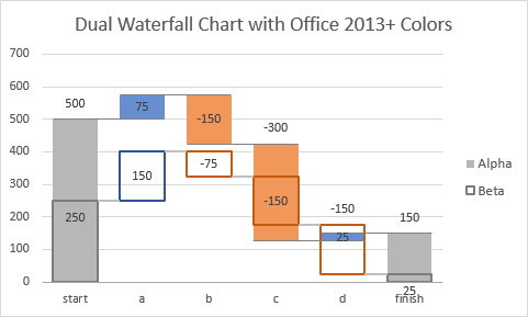
You can also apply your own colors using the usual Excel tools, but be careful not to break the chart.
