Cycle Plots
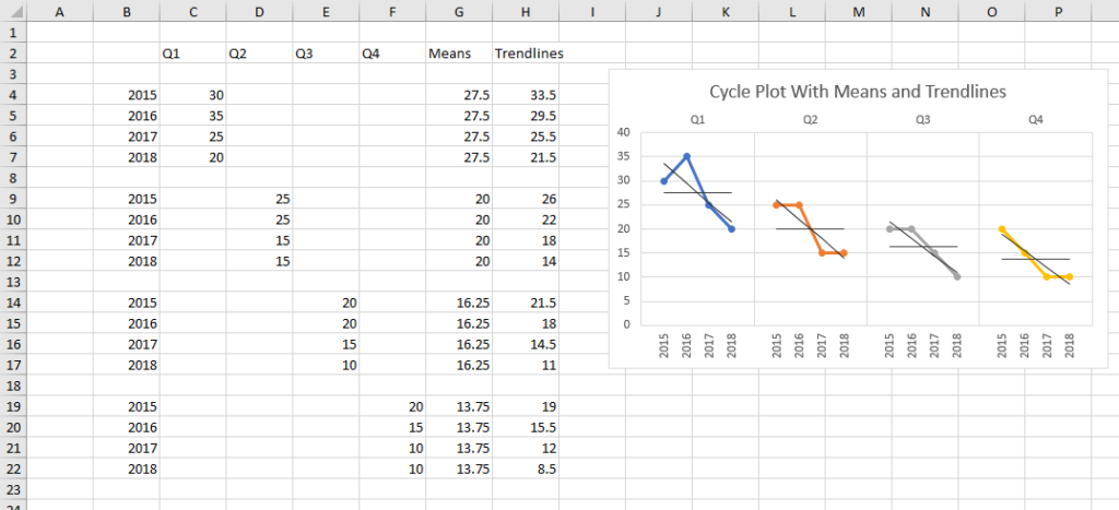
Cycle Plots can help to show patterns and trends in your seasonal or cyclical data which are not evident in timelines or in standard charts.
Peltier Tech Charts for Excel creates cycle plots based on the protocol in Cycle Plots in Excel, a tutorial on the Peltier Tech Blog.
Cycle Plots in the Peltier Tech Ribbon
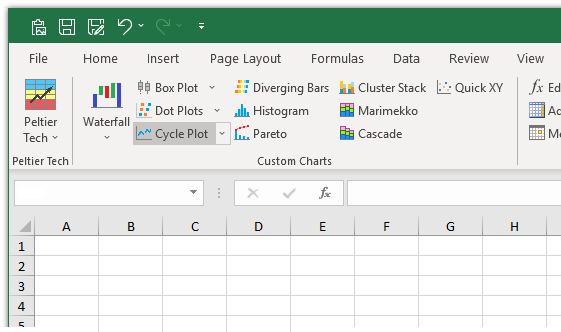
You can create a cycle plot by clicking on the Cycle Plot button in the Custom Charts section of the Peltier Tech ribbon…
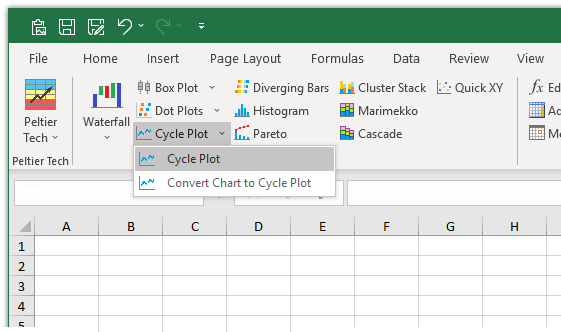
…or by clicking on the Cycle Plot dropdown arrow, and clicking the first item in the Cycle Plot dropdown menu.
Cycle plots are available in the Advanced Edition of Peltier Tech Charts for Excel.
Cycle Plot Dialog
The cycle plot dialog contains several options. Many of the options are saved for the next time you open the dialog.
When the line chart type is selected, the subsequent options are illustrated with line charts.
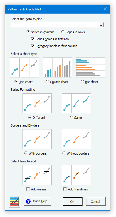
When the column chart type is selected, the subsequent options are illustrated with column charts.
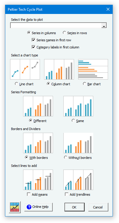
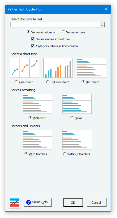
When the bar chart type is selected, the subsequent options are illustrated with bar charts, and the options to add means and trendlines are hidden, because those are not available for a bar chart cycle plot.
Data
Click here to download a workbook with Peltier Tech Charts for Excel Sample Data for waterfall charts and other charts in the program.
If a range has been preselected or if the active cell lies within a valid range, the program inserts the range’s address into the range selection box.
The program determines by the number of rows and columns in the data range whether the data is to be plotted by column (same rows and columns, or more rows) or by row (more columns), but you can override this setting.
The program checks the ‘Series Names’ and ‘Category Labels’ boxes if it detects labels in the first row or column of the data range.
Chart Type
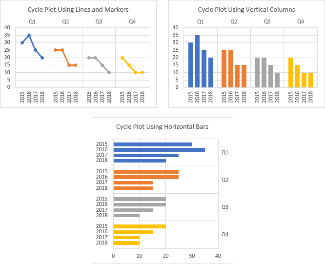
Your cycle plot can be a line chart, a column chart, or a bar chart.
Series Formatting
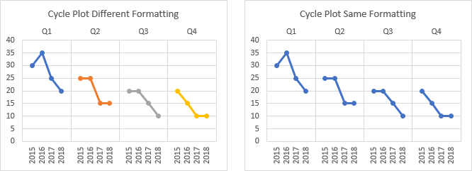
You can choose to have the series in your cycle plot formatted differently or the same.
Borders and Dividers
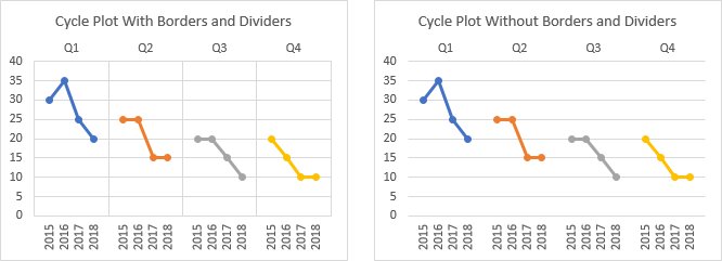
You can create a cycle plot with borders around the plot area and dividers between series, or you can omit the borders and dividers.
Add Means and Trendlines
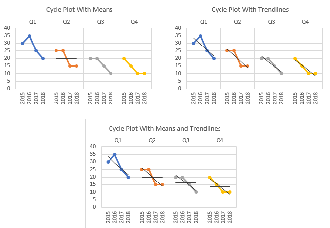
You can create a cycle plot with means, trendlines, or both, calculated for each series.
Cycle Plot Data
The cycle plot data range should be rectangular. It is good practice to have labels in the first row and column of this range, which the program will use for series names and category axis labels.

The data range need not be contiguous. Separate areas can be selected by holding Ctrl while dragging with the mouse. As long as the selected range is arranged as a rectangle that is divided with unselected rows or columns, the program can make a cycle plot with that range.
There can be columns that separate selected columns…

… or rows separating selected rows…
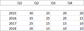
… or a more complicated arrangement.

Cycle Plots vs. Regular Charts
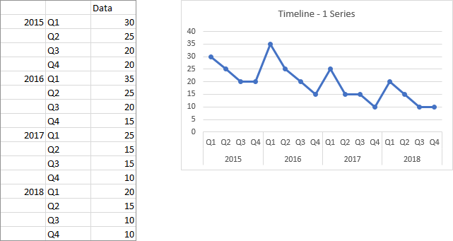
Here is some simple data plotted in a line chart. The data are plotted with series in rows. Each series in the chart represents the quarterly data for one year. The data is overlapping, and it is tedious to sort out which series is which.
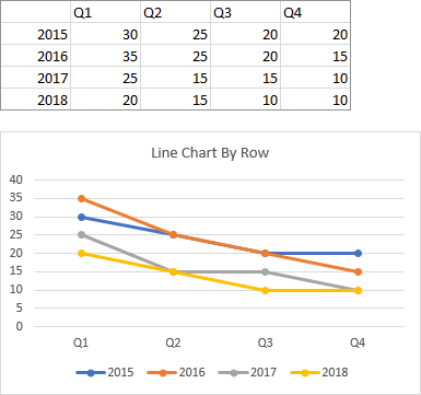
Here is the same data plotted by row in a cycle plot. The data for each series is separated out into its own panel or cycle of the chart. It is easy to see at a glance which series is which, and it is easy to compare the behavior of one series to that of the others.
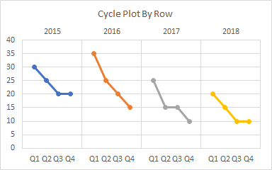
The above cycle plot is rather unremarkable, since the data is arranged in the same order as a simple timeline. The cycle plot may be marginally easier to read, as there are gaps between years, and the years are shown in different colors.
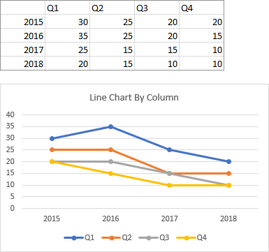
Here is a line chart of the same data, plotted by column. Now each series consists of a given quarter’s data for all years.
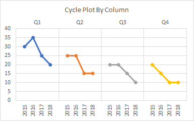
When the data is extracted by series into separate panels, we can see the behavior for each quarter across the years. This is a strength of cycle plots, showing each time of year separately from the underlying seasonal variations.
Cycle Plot Output
The program inserts a new worksheet, and constructs an output range containing an arrangement of linked data needed to produce the desired cyclic appearance. This data is then plotted in a regular Excel chart, with default formatting for the chart type selected, in Excel’s default chart size. You can format this chart, or copy and paste the chart anywhere else.
Here is the output for a simple cycle plot.
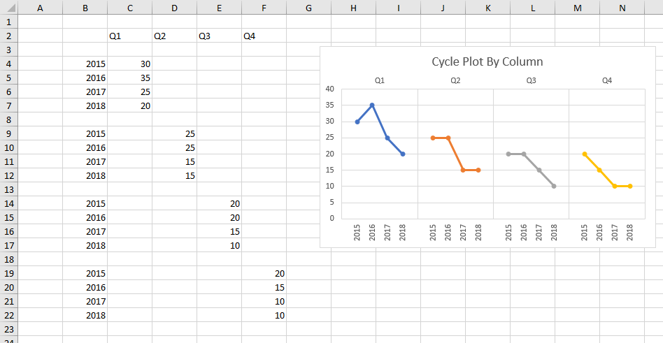
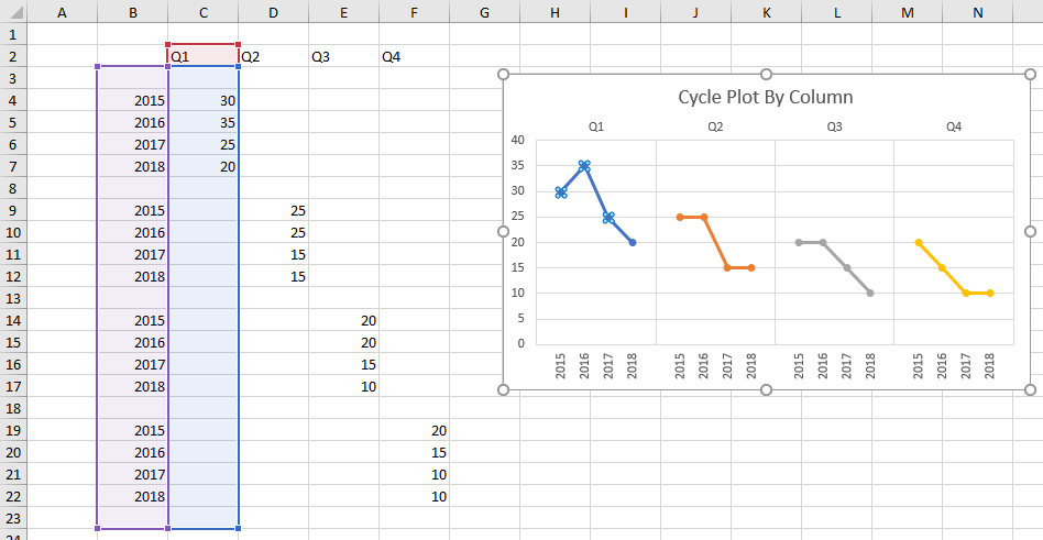
The highlighted range shows the data for the first series in the chart. Note that the X and Y values include a blank row at the beginning and end of the range, and between blocks of data.
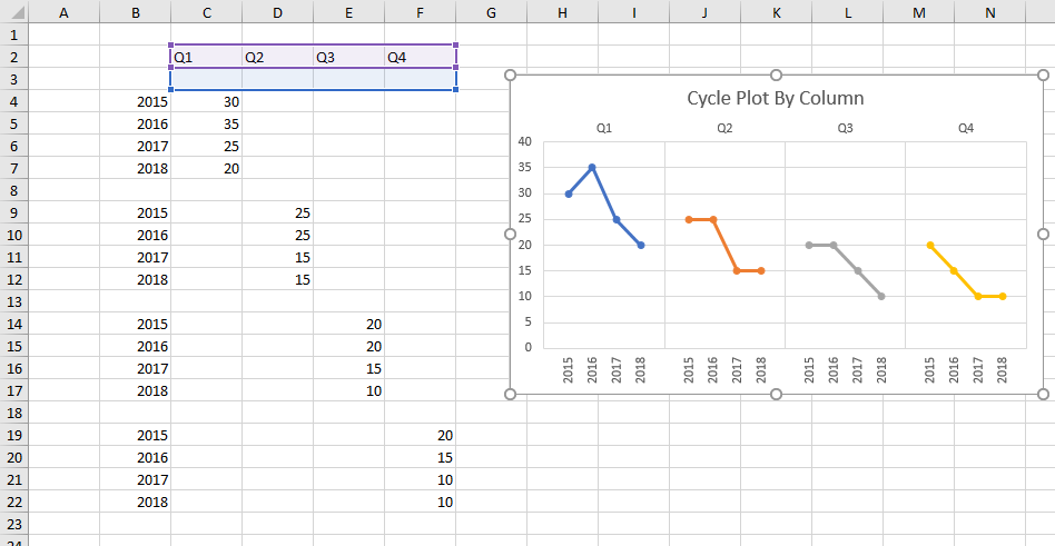
There is a hidden series plotted on the secondary axis, which provides category labels along the top of the chart. These labels serve as titles for each cycle.
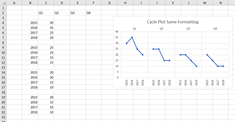
If you choose to format all series the same, the data is placed in only one column, so there is only one visible series in the cycle plot.
If you add means or trendlines to the cycle plot, the program adds extra columns to the output range, and these columns are plotted as the means or trendlines.
