Box Plots
Box and Whisker Charts (Box Plots) are commonly used in the display of statistical analyses, to illustrate the underlying distribution of data in a data set, by showing medians, quartiles, and outlying data points.
Peltier Tech Charts for Excel creates box plots based on the protocol in Excel Box and Whisker Diagrams (Box Plots), a tutorial on the Peltier Tech Blog. Excel 2016 introduced Microsoft’s own box and whisker plots, but they are not as flexible as those created by Peltier Tech Charts for Excel.
Box Plots in the Peltier Tech Ribbon
You can create a box plot by clicking on the Box Plot button in the Custom Charts section of the Peltier Tech ribbon…

…or by clicking on the Box Plot dropdown arrow, and clicking the first item in the Box Plot dropdown menu.
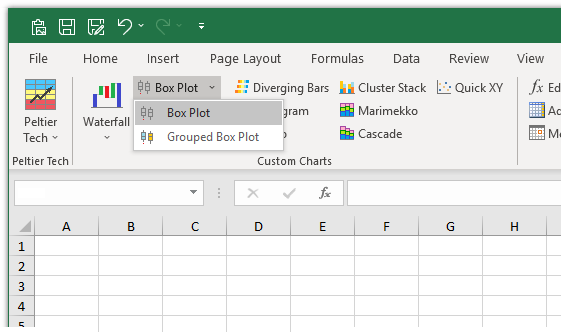
Box plots are available in both Standard and Advanced Editions of Peltier Tech Charts for Excel. Note that the Standard Edition does not have the Box Plot dropdown, as the Grouped Box Plot option is only available in the Advanced Edition.
Box Plot Dialog
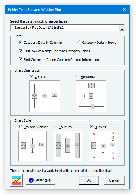
The box plot dialog contains several options. Many of the options are saved for the next time you open the dialog.
Box Plot Data
Click here to download a workbook with Peltier Tech Charts for Excel Sample Data for waterfall charts and other charts in the program.
Data Orientation
Box plot data can be arranged in columns…
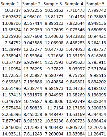
… or in rows.

Category Labels
The program checks for labels in the first row (if data is aligned in columns) or in the first column (if it is aligned in rows). You can override this setting, for example, if the years in the first row should be treated as labels rather than data. If there are no category labels in the data, the program will use “Series 1”, “Series 2”, etc., as labels in the chart.
Record Information
The program checks for non-numeric data in the first column (if data is aligned in columns) or in the first row (if it is aligned in rows). This data has record information in the first column.

Discontiguous Data
Box Plot data need not be contiguous. You can select multiple-area ranges by holding Ctrl while selecting additional ranges. The data can be split vertically…
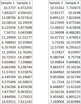
… or horizontally…
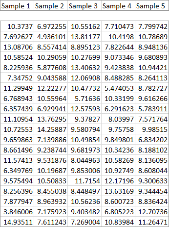
… or both.
The program will accept multiple area ranges as long as the total range is nicely divided into separate areas by complete rows or columns.
Box Plot Orientation
You can select vertical…

… or horizontal orientation for your box plot.

Box Plot Style
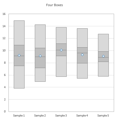
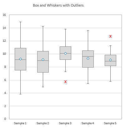
Peltier Tech Charts for Excel produces three styles of Box Plots.
There are simple box and whisker plots, where the boxes indicate the inner quartiles of the data distribution, and the whiskers indicate the outer quartiles.

There are four box plots, where all quartiles are represented with boxes.
And there are box and whisker plots with outliers, where boxes indicate the inner quartiles, whiskers represent the outer quartiles out to the furthest non-outlier points, and outliers are represented by markers.
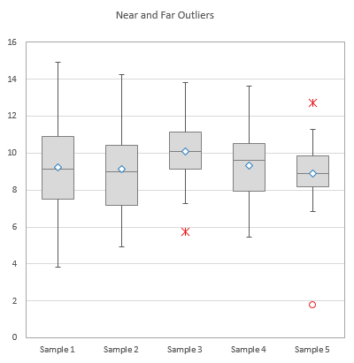
Note that there may be two classes of outliers. Near outliers, represented by star markers, fall between 1.5 and 3.0 interquartile ranges outside the inner quartiles. Far outliers, represented by circles, fall more than 3.0 interquartile ranges outside the inner quartiles. The interquartile range is the distance from the first and third quartiles, or the combined height of the inner quartile boxes.
Box Plot Output
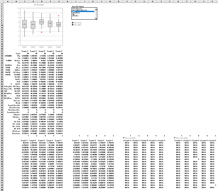
The program inserts a new worksheet, makes a linked copy of the data on this new sheet, inserts rows of calculations needed for the box plot, and finally inserts the chart itself. Here is how the inserted worksheet looks when we zoom out to 40%. The chart (box plot) and some worksheet controls are at the top of the sheet. The linked data is in the bottom left corner of the sheet. The statistical calculations lie between the linked data and the box plot. Finally, for box plots with outliers, there are three blocks of data to the right of the linked data which are used for plotting the outliers. You don’t need to worry about any of these details; the program manages it for you.
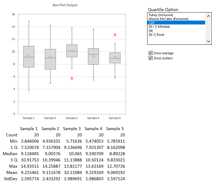
Here is the important part of the program’s output. The box plot is at the top. The top of the calculation range is a summary of the data, and the columns of calculations are aligned with the boxes in the chart (only for vertical box plots, of course). There are controls beside the chart that allow you to select an option for calculation of quartiles, as well as to show or hide averages and outliers (for outlier-containing charts).
Show Average and Outliers
The standard box plot with outliers shows outliers as well as averages for each category.

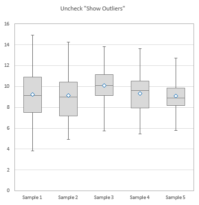
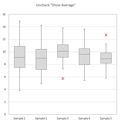
You can check and uncheck the boxes beside the chart to toggle display of outliers..
… and of averages.
Quartile Options
You can select from six different methods to compute Quartiles (and Outliers).

These have been explained in an extended tutorial, Quartiles for Box Plots, on the Peltier Tech Blog.


