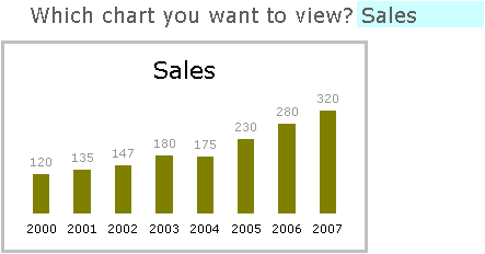
Once again, I rely on Chandoo for inspiration for a charting tutorial. In Select and Show One Chart from Many he shows how to let a user choose which of several charts to show, in an interactive display. He uses data validation to enable the user to select from a finite list of charts, and uses a little-known image linking trick in Excel to show the selected chart. Basically, selecting an item changes a dynamic range so it refers to the range beneath the selected chart, and the picture is linked to this dynamic range.

This linked-picture trick is related to Excel’s Camera tool, which means two things. First, it’s pretty cool. Second, using it more than a few times will consume resources and slow down the workbook’s response. If you are linking to one picture of many, this is the way to do it, but if you merely want to show different set of data in your chart, it’s more than you need. In this post I will show you an easy and resource-friendly way to achieve the same effects in your dynamic report.
The Report Layout
I’ve set up my report as shown below. Cell F2 contains the selected quantity to be plotted, and I’ve named the cell “WhichChart”. The original data is in B17:E25, and a second data range linked to the first is in B28:E36. The borders around parts of the range B28:E36 show the chart source data range of the working chart, which I will discuss shortly.

One or both of the data ranges can be moved to a different place on this sheet, or onto another sheet, so that the focus is on the chart itself.
Data Selection
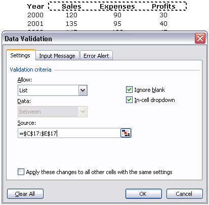
To make the selection of a chart more flexible, I changed the data validation list source of cell F2 (“WhichChart”) so it refers to the range C17:E17 rather than a hard-coded list (see the dialog below). This way, if I change one of the headers, I don’t need to update the data validation list.

I generally prefer using a dropdown control or a listbox. A dropdown always shows the drop down arrow icon, so the user knows he can choose something even when the cell is not selected. A listbox shows all options without having to go to all the trouble of dropping down a list. But data validation is pretty easy to use, so it’s really a matter of choice.
The Dynamic Chart
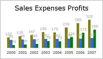
I then constructed a chart that contained all of Chandoo’s data and the formatting from Chandoo’s three charts. I used B18:B25 for the category (X-axis) labels, C17:E17 for the series names, and C18:E25 for the series Y data. To make the chart title dynamic, I selected the title, typed = in the formula bar, then selected the range C17:E17, and pressed Enter. The chart title then displayed the formula =Report!$C$17:$E$17. When multiple cells are selected like this, Excel concatenates the cell values, inserting a space between non-blank items.

The Dynamic Data
The second data range is linked to the original data, with a twist. It compares the column header to the selection in F2 and shows or hides the column as appropriate. I selected the range C28:E36 with C28 the active cell, entered this formula, then pressed Ctrl+Enter to enter the formula into the entire selected range:
=IF(C$17=WhichChart,C17,"")
This hides the headers and Y data for the non-selected column of data. I changed the source data of the chart so that B29:B36 (purple outline) is used for the category (X axis) labels, C28:E28 (green outine) for the series names, and C29:E36 (blue outline) for the series Y data. I also changed the title link formula to =Report!$C$28:$E$28. The outline colors correspond to the colors that Excel highlights these ranges when the chart’s plot area or chart area is selected. When Sales is selected, the data range looks like this (with only the Sales column displayed):

and the chart looks like this:

Final Touches
This isn’t quite perfect yet, but it’s easy to finish. First, apply a custom number format of 0;;; to the data labels in the chart, so the zero values (corresponding to the blank cells) are not shown. Second, format any one of the series in the chart so that it has an overlap of 100, so that all columns overlap, and there is no horizontal space wasted for columns with no data. Here is the finished chart:

Download this dynamic chart (in a zipped workbook).


Robert says
Jon,
very nice trick. Thanks for sharing.
I found an Excel 2007 oddity though. The technique itself is working fine with Excel 2007 as well. But referring to line 28 in the chart title has a strange effect: It works fine for the first item, but shows ‘320 Expenses 208’ for the second and ‘320 112 Profit’ for the third, i.e. the title of the columns accompanied by the values in the last(!) row of the other two data sets.
If you are using a textbox instead of the chart title, Excel 2007’s behavior is different but odd again: ‘Sales’ is displayed correctly, for the other 2 columns the text box seems to be empty.
You can easily resolve this by linking the chart title to input cell F2.
What do you think? Another bug in Excel 2007?
Jon Peltier says
Hi Robert –
So Excel 2007 is making things interesting again. I’ll have to take a look. you’ve applied SP1, haven’t you? That service pack fixed a lot of little annoyances with charts.
Robert says
Jon,
yes, I have Microsoft Office Professional 2007 and 2007 Microsoft Office Suite Service Pack 1 (SP1).
I guess this is an ‘unfixed little annoyance’…
Jon Peltier says
Robert –
In the spring, we’ll see another service pack, so the annoyance factor might go down. of course, SPs only reduce total annoyance incrementally, and you have to wait for a whole new version for large changes in annoyance. (Note that I didn’t say “large reductions”: the change from 2003 to 2007 was a “large increase”.)
Andrew says
I also tried the Chandoo version and I wasn’t able to link a picture to a cell in 2007.
I have SP1 and I tried to do it in 2003 and it worked just fine. Is there a special trick for linking a picture to a cell on 2007?
Jon Peltier says
Andrew –
I just tried, using the tried and true technique that has worked since Excel was invented in the late 1800s, and I could not link a newly inserted picture to a range of cells.
Here’s the two versions of the trick:
1. Use the camera tool to copy the range beneath a chart and then paste it.
2. Select and copy the range beneath a chart, then use Paste Special > As Picture > Paste Picture Link.
Both of these result in a picture which has a link to a range. By the way, it’s not necessary to use a single cell for this. You can use any contiguous rectangular range.
Simon Wilson says
I have a similar but different requirment in that I’m trying to build an auto exceptions report based on RAG status of KPIs.
So if the RAG status is R or A, I want it to appear in the report, if it’s G, I don’t want it to appear.
The graphs are already built in a separate worksheet named “graphs”, and I want them to appear in another called “Exceptions Report”
Any ideas?
Jon Peltier says
Do you mean you have separate charts with only one series, or do you want to be able to control which two of three series appear in a single chart?
The first of these requires a different approach altogether, while the second is covered on my web site in Chart by Combo Box or Checkbox.
Clay says
Love the post – been looking for a solution like this. I found I don’t even need to NAME a range. Just use “{=sum(if(}” array formulas in the dynamic chart areas. Catch the column and the year to select the appropriate value. Easy peasy.
Jon Peltier says
Clay – Thanks for your alternative. Excel offers many ways to skin a cat. Some people will shy away from using array formulas because “they’re so slow”, but if you have only a small range, there’s no worry about performance issues.
Brian says
How would you use this in relation to a stacked bar 100% chart?
Jon Peltier says
Presumably you know which data you want to show in the chart based on the selected item in F2. There would be more than three columns of data in rows 17:25, and the range to populate the chart (rows 29:36) would show more than one set of data. I’d stack all of the data, use a formula that placed either zero or the data value into the display cells
derek says
It occurs to me that Simon’s problem could be addressed by the trick Chandoo described, of using Autofilter to display charts. Instead of the chart name being the trigger for display of the right rows, the RAG status can serve that purpose.
Jon Peltier says
Derek – That’s a good idea.
Alan says
Hi.
I’m just new to this method for displaying data and experimenting a tad, – and learning a lot!
My question is, if I’m placing my own data in the appropriate ranges, how do I display 2 decimal places in the data labels?
I’m imagining it’s particularly easy, but I just can’t seem to do it…
Cheers,
Alain
Alan says
No wait. It was as easy as I thought. For some reason it only worked on my third or fourth attempt though…
My question now is, does the custom format on the data restrict the possible formatting on the labels?
Jon Peltier says
Alan –
When you add the labels, they pick up the formatting of the cells containing the values, and the Linked To Source option is selected (checked). You can format the labels independently, though. When you change the label formats, the Linked To Source option is unselected (unchecked). With this setting unchecked, you can change either format without affecting the other. Check the Linked To Source option and the labels will again assume the formats of the cells.
Krinsom says
Hi Jon, very good post.
But what happen if I have negative values on my table?
If I apply the 0;;; cell formatting it simply isn’t shown.
Any tip?
Cheers
Krinsom
Chandoo says
@Krinsom… try the formatting code 0;-0;;
christian says
how do i create a dynamic chart from just one cell
this cell is updating every .5 sec so i want to plot its values dynaically in excel on a chart
would anyone know how to do this…
thanks
christian
Jon Peltier says
If you are just displaying the one value, make a chart from that cell. The bar will get longer and shorter as the data changes. Enter reasonable values for the axis scale min and max, so the bar is all that changes.
If you want to display the history of that value, you need a mechanism to save the values the cell has had. This usually means an On Time procedure that runs regularly, checks the value, and if its different, save the new value in a list. The chart updates to show the new value plus all the old ones, or the new one and the N last old ones.
Mira says
Is there any way to make the data validation arrow appear all the time, without having to click on the cell first (Cell F2 in the example)? I know if you use the combo box then the arrow appears permanently, but can you also do it for data validation?
Mira says
Sorry, instead of “data validation arrow” I should have said the “list arrow”
Jon Peltier says
Mira –
As far as I know, and as far as I can tell, you can’t affect the appearance/visibility of the dropdown arrow used in data validation.
Nate says
Hi Jon,
Thanks for this article, it’s very helpful. I ran into one little issue though, hopefully you can give me some advice to resolve it.
When I switch between graphs, sometimes I have data for 14 bar graphs in the same chart, sometimes I only have the data for 4 bar graphs. Since I’ve selected a range of cells, there are 10 empty spots on the x-axis of the chart.
Do you have any tips to get rid of these empty spots on the chart, so that the 4 bar graphs can be distributely evenly?
Jon Peltier says
You need to combine this technique with the dynamic charting approach such as those in Dynamic Charts and in Dynamic Chart Review.
Bijal says
Hi Chandoo,
Thanks so much for this really helpful technique. I want to display my charts using this technique. However i have one complexity, instead of selecting form just one drop down list, i want to use 2 drop down lists. E.g. In the first one i want to select the region, e.g. Sri Lanka and the inthe 2nd drop down i want to select what to show E.g. Sales, Volume, EBIT etc.
I tried If AND formula with indirect, but doesnt seem to work.
Any thoughts on how i can do this.
Thanks Again.
Bijal
Jon Peltier says
Bijal –
In your data (B17:E25 in my example), add another row for the region. The existing data validation dropdown can be used to indicate Sales, Volume, EBIT, etc. Add a new data validation dropdown for region and insert a row in the data range with these regions. Each column of data then has two headers: Variable and Region.
Adjust the formulas in the lower table from this:
=IF(C$17=WhichChart,C17,””)
to this, which tests for two variables:
=IF(AND(C$17=WhichChart,C$18=WhichRegion),C17,””)
The rest of the protocol is the same.
Veena says
Ques: i have 17 charts already made in one sheet. But i want to view only one chart at a time. I want a drop down box so that i can select which chart is to be displayed. please help me.
Jon Peltier says
Veena –
If you use my approach, you replace many charts with one chart that has many series. The dropdown lets the reader select which series to display, and it seems like a different chart.
Veena says
Thank you Jon. But do you have any other alternative.
Jon Peltier says
Veena –
I guess there’s Chandoo’s approach, in his post that I wrote about, that I offered this alternative for.
Veena says
Thanks Jon, It worked..
But the problem m facing after using your approach is than
Suppose I plot 5 series. After using this approach i should be able to see 1 series at a time. I am able to do that but the graph is also showing 1 more series with all values as zero. I dont want t graph to show blank series as zero.
please help!! :(
Jon Peltier says
Veena –
Select your main series (the one you want to show) and look in the formula bar. It looks like this, with four arguments I’ve replaced by A, B, C, and D:
=SERIES(A,B,C,D)
A stands for series name, B for X values, C for Y values, and D for plot order). A and B are allowed to be empty. I suspect you’ll find that B is empty, and C is the Y values you need to plot. Then select the other series. I’ll bet it has an empty B parameter, and its Y values (C) are really the X values you wanted to use in the other series.
Delete the unwanted series, then select the wanted one. Put your cursor in the series formula where B should go, and select the range with X values. Press Enter and you’re good to go.
Jeffrey Nickerson says
Great Post! I like the way this works. Thanks for taking the time to explain and putting this together.
Brian says
Jon –
Creating dynamic chart titles (via formula) is extremely useful, but I’ve encountered an interesting situation.
I have a pivot chart with a report filter. I base my dynamic title on the value in the report filter. But if I select multiple items my title now includes “(Multiple Items)”.
Is there any way to build a dynamic title that includes the actual items selected instead of “(Multiple Items)”? In other words, I’d like to have the title be ‘=”static text ” & item1, item2, itemx…’.
Thanks in advance for any suggestions!
Jon Peltier says
Brian –
I think if there is a variable number of items, then you will need a programmatic solution.
Brian says
time to start coding then…
thanks!
Jane says
Just came upon this article, it has worked fantastic thusfar. I have a few issues.
1. I am graphing 4 different factors, each with a mean and a mean bar. So there are two series per factor. I can get them to show up on the graph together, but they avoid being titled properly.
2. My title reads out some values, then the factor i want, then more values, instead of JUST the factor I would like. Not sure how to bipass this.
3. All other non-selected graphs show up on the bottom at zero. i read the other comment pertaining to this, but there are no empty slots, like you said there might be.
4. Finally, How can I go about hiding the original chunk of data and just show the selected range in the second chunk of data?
Thanks, its alright if you can’t answer all my questions.
Jane says
I finagled with my worksheet a bit and figured out 1 and 2, still looking at 3 and 4.
Renato Lyke says
Hi,
I am trying the same chart however i have a Dept and sub depts.
When i used the get chart with indirect option it allows me only 4 indirect functions that could we written, I am an unable to use the above method, because when i select my Dept, i need to get the various sub depts graphs as well in seperate graphs, Any idea who could i do that
Regards,
Renato,
Jon Peltier says
Renato –
This is much more complicated, but if you’re clever with formulas you could probably make it work.
You might check out Debra Dalgleish’s dependent lists approach for data validation (http://www.contextures.com/xldataval02.html) in order to get the subdepartments after a department has been selected.
Geoff says
Hi Peter,
Thank you for being a tech guru in Excel and sharing your knowledge with the world. More people like this I say!
I have a problem with Excel at work which I am struggling to solve.
I need to create a dynamic chart (using drop down menus on a dashboard) but with 20 to 50 projects to feed into the dynamic chart. In addition the chart I am using is one of Chandoo’s milestone charts which has a dummy line graph always on zero value, and then column graphs (formatted to look like error bars ‘i.e. narrow’). I have thought abouyt some of the methods you have put up but the problem is ther is only one static x axis, i.e. the month. The other x-axis is not static it is the category name of the milestone for (whcih I display at the end of the column graph). Of course the y-axis is the height of the column graph. So if I had multiple proejcts I am not sure how to combine these two types of graphs into a dynamic drop down grph on a dashboard.
Would this be possible?
Thanks kind regards
Geoff Lang
Canberra, Australia
Steve says
When I use the camera tool to insert its viewer object on a chart, I am now unable to group that object with the chart itseff. WIthout having them grouped, the cameral tool viewer object does not move if the user selects and moves the chart. It seems like I’m overlooking something obvious – and I swear I’ve done this before – but I can’t get Excel to let me simultaneously select both the chart and the camera viewer object so they can then be grouped. Can anyone tell me how to group a camera viewer object to the chart on which it resides?
ashl says
Hi John,
This is great and easy to follow. I’ve used it for one of my graphs, just have a quick question – I’ve modified the =IF(C$17=WhichChart,C17,””) formula so that I get a value based on whether one of my checkbox is ticked. It works great, the only problem I have is that because my graph is a line graph but with stack colums for the check boxes, that when I select the other series say expenses, the line from the last series is on the graph still and the new series turns all the values to stacked. How can I modify this so that when i change series a) the format stay and b) the line from the last series disappears?
it so that I show a stacked graph and a line graph.
ashl says
Hi John,
This is great! I have a question in regards to the chart – I have modified it so that it is stacked and a line chart, with the stacks controlled by check boxes. It works great until I change the series and it only give me stacked and I have a line at the zero values from the previous series. Is there a way to hide this line and keep the formatting?
Jon Peltier says
To avoid the line across the bottom, you need to change
=IF(C$17=WhichChart,C17,””)
to
=IF(C$17=WhichChart,C17,NA())
This puts #N/A into the cell, which isn’t very pretty and you can hide it with conditional formatting. But #N/A isn’t plotted in a line or XY chart.
However, if a whole line disappears, the formatting of the line may go away. You’ll have to test it.
ashl says
Thanks Jon perfect :)
PaulM says
Hi Jon,
My only question is what to put in the custom number format for the data labels. If my labels are currency, I would need to show the currency value (e.g. $) next to the number but still follow the behavior you made that if it is not selected then the values shouldn’t show.
Thanks a lot!
Jon Peltier says
Paul –
Start with the number format is for your data range (select a cell, press Ctrl+1 to format it, click on the Number tab of the dialog, then click Custom in the list, and it will be displayed to the right):
$#,##0.00_);[Red]($#,##0.00)
_($* #,##0_);_($* (#,##0);_($* “-“_);_(@_)
_($* #,##0.00_);_($* (#,##0.00);_($* “-“??_);_(@_)
Keep everything to the left of the first semicolon, then add two more semicolons:
$#,##0.00_);;;
_($* #,##0_);;;
_($* #,##0.00_);;;
You can simplify any like these by removing the _( and _) as well.
PaulM says
Hi Jon,
I get an error msg ” Microsoft excel cannot use the number format you typed” try using one of the built in formats. Tried to use the same format in the data labels as well setting it to custom and adding the format, but it wouldn’t let me add as well :-(
PaulM says
Hi Jon,
I am using Excel 2013 by the way, just in case it might help clear out things. Sorry for double posting couldn;t edit the previous one.
Rama says
Hi Jon ,
In My case Data labels appearing is like 0.00 but i am not able to remove it kindly help on this i tried by 0;;; format to data labels . also suggest the format needs to be applied to 0.00 which occurs or standard labels appearing on Bar