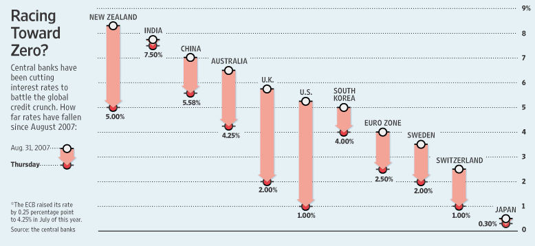
David Boyle of InfoClarity shows us a chart of declining interest rates in Interest rates racing down. He got the chart from Paul Kedrosky‘s The Interest Rate Race, and Paul apparently got the chart from the Wall Street Journal‘s Fed Weighs Its Options as Europe Cuts Rates (don’t bother following this link unless you have a subscription).

Click on the chart to see it at full size
Of this chart, Paul said, “Good graphic in the WSJ today showing the race to zero by central banks in major countries worldwide.” David added, “There was a nice little chart in the Wall Street Journal yesterday showing clearly how central banks are racing interest rates towards zero.”
My first impression upon seeing tha chart was, “Wow, the rates sure are declining fast!” But I was misled by the effective advance PR and the poor chart design.
Let me explain this deception by first recreating this chart.

The titles of the two posts (“The Interest Rate Race” and “Interest rates racing down”) combined with the decreasing top series of points instantly caused me to mentally connect these points, like this:

Wow, look at that decline. It was pretty steady for a while, but lately it has accelerated. See it? Here, let me help.

What could be more clear? I’m sure many people stopped here, thinking that the chart had made its point clearly.
But that’s a false conclusion to draw from this data. When you step back and let (un)common sense guide your reasoning, you will realize that the chart above does not plot a decline in interest rates over time as it may seem. It plots a decline from one country to another at one point in time in October 2007.
The data could just as easily be sorted by interest rate not at the beginning of the period, but at the end, that is, last Thursday. This is arguably more relevant, since it’s more recent. You still see a steady decline in rates, but not as steep just because of the scaling of the chart.

It’s still going down, but not as sharply.

One could plot in order of increasing change in interest rate, which implies no false trend. It does not really make a point or show anything particularly clearly.

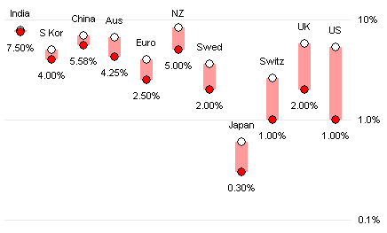
Or in order of increasing proportional change in rate, on a logarithmic Y axis to scale the proportional change more clearly. Again, no implied pseudo-trend, but also no clear point.

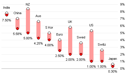
If we want to observe the decline in rates more clearly, we should use a “Bumps Chart”. You can read about bumps charts at Process Trends, at Junk Charts, or at XL Cubed. Essentially bumps charts show changes in a number of related values from one time point to another (or sometimes over a series of time periods). The chart below shows the changes in interest rates from a year ago October to last week. This bumps charts shows the decline in rates clearly, for each country, without resorting to displays of exaggerated pseudo-slopes to magnify the effect.


Mike Woodhouse says
A Bump Chart was my first thought. Well, apart from not remembering the name (was in it one of the Tufte books?).
You’d have a hell of a job getting it into print though – editors don’t like “complicated” charts, even if the “simple” ones are misleading. I’ve even given up my long-standing series of arguments over misleading charts in the business pages of The Independent, even though I thought they, of all UK papers, might have got the point. Actually, they conceded several points that I made, but didn’t start producing better graphics. Anyway, after the price went up 25% I decided there were better ways to spend my commute time.
Jon Peltier says
Tufte showed several types of chart similar to the bumps chart. I don’t recall exactly where i learned that name for it, maybe Process Trends or Junk Charts (links in the post above). I did learn from Wikipedia that they were named after “bumps” races on the Thames, where boats started close together but in a certain order, and raced to see if any boats could pass the one in front. Apparently there’s a lot of bumping in these races, hence the name. I can’t imagine this kind of race nowadays, where the fiber reinforced hulls crack easily, yet cost $30k apiece (which would buy a decent new automobile).
If the publishers don’t like the “complicated” bumps chart (and what makes it more complicated than the misleading floating bar chart they used?), then could splash around some color. Each line could be color coded, and you could put miniature flags beside each series, and what? some kind of banking-related background image. Something like failing bank managers jumping from ledges comes to mind.
I think I’d spend the commute with headphones on, pretending to be asleep.
Tony Rose says
I would vote for the bump chart even though I think it gets a little jumbled as you add more data points.
I thought the same thing and mentally drew a line, which is completely wrong for the original chart. Nice find!
derek says
True bumps charts are introduced on page 111 if Tufte’s Envisioning Information, and they’re based on the Cambridge boat races called “bumps races”, which are run in such narrow waterways that the only practical way to overtake is to “bump” the boat ahead by touching it from behind, which means by the rules that they have to pull aside and let you pass.
The beauty of the true bumps chart is that it is a chart of *rank* against stage. Every rise in rank must be accompanied by one or more falls, that have been “bumped” down. And the levels are strongly quantised, so if you label the lines, the labels appear neatly spaced.
It was Kaiser who popularised the practice of calling any line chart a bumps chart, and I strongly disapprove of it. By his definition, there is no such thing as a line chart: all line charts fit the definition of the bumps chart. It also leaves no distinction for a graph of changing ranks, unless you recursively called them a “rank bumps chart”,
Jon Peltier says
Derek –
You’re right, of course, the bumps chart is all about showing how ranks change from race to race. The chart I used here is a line chart. Consider me appropriately chastised.
Maybe I should call my chart something like a “fixed time interval line chart”.
derek says
Oxford, not Cambridge, sorry. Showing my lack of Oxbridge nous :-)
Alistair says
I’m not so sure this is necessarily misleading as a result of the visualisation. There are two observations made in the text to the left of the graphic: a) whether interest rates are tending toward zero, and b) the distance they have fallen since August 2007. If you regard the graphic with a) in mind, the slope merely shows the distance that each rate has to go before it hits zero. If you regard the graphic with b) in mind, the length of the bars clearly illustrates the absolute change. The graphic does achieve both aims; perhaps ordering by a neutral dimension such as country name would be more objective, but to me the graphic actually has a useful third characteristic, which is to clearly show the wide spread of interest rates from country to country, which goes some way to show that interest rates by themselves are hardly a reliable indicator of financial stability. This is clear in the original but less visible in the re-ordered charts.
One could argue it is the relative change that is a better indicator of “panic”, so New Zealand’s 39% drop is nothing compared to Switzerland’s 60% drop, which is more in line with the UK’s.
In fact, the issue may not be in the visualisation but in the data selection. The footnote points out that the ECB actually raised its rate in July this year, something which does not come out through any of the charts. Even more notable is the fact that the ECB’s rate has apparently (I’m just looking at their data, I have no idea about economics) fluctuated frequently between 2% and 4.75% several times since 1999 – from March 2003 all the way through to March 2006, their rate was the same or lower than the current rate of 2.5%.
The significant of August 2007, as the start point for the chart, appears to be that the UK’s interest rate was at its highest point for the past few years. That hardly seems an objective comparator, and in any case serves to lengthen the actual decline: by October 2008, UK rates were at 4.5%, the same as they were in October 2005 (i.e. Happy Days). It is only in the past 3 months that there has been a notably steep decline. A reasonably similar trend is seen when looking at the Australian interest rates over the same period.
There is clearly something significant to be found in the recent (past 3 months), sharp reductions in interest rates, but this is obfuscated by the very selective time period used to display the data, and the fact that only 2 data points are shown per series.
All of which is a roundabout way of saying that even if the bump/line chart is a better representation of the data, it is still a misleading use of the available data.
Jon Peltier says
Alistair –
The text at the left is not visually appealing enough to suppress our eyes’ natural attraction to the graph, so it must be a rare individual who views the graph with the fine print in mind. And the slope does not show how far each item has to go to reach zero, the slope is related to the difference between the starting points of consecutive country’s data. This is pretty arbitrary itself.
As you point out, the starting point is rather arbitrary, and the use of only the endpoints is itself misleading. I’d thought of this point, but did not expand upon it in my post. If we switch to a line chart as I’ve suggested, we should make the extra effort to get at least monthly data, to better show the nature of the decline in rates.
Alistair says
Fair point regarding the dominance of the graph over the text. I half wondered whether horizontal bar rather than column chart would help downplay the downward slope you observe; with a zero % marker on the right hand side it would give a different representation of “distance” travelled in the 20 months, but it’d still be open to interpretation and I guess the underlying question is whether this distance travelled/distance to zero is something worth commenting on in the first place.
I’ve quickly put together a scatter chart showing 3 of the central banks’ interest rates since 2004 to illustrate the difference that an earlier startpoint makes. It’d be better with all the banks listed (and probably as a line chart showing more clearly where there were periods without any change) but I’m pushed for time at the moment and for some of the banks it is pretty difficult to figure out where they store the rate information on their websites!
Anyway, thanks for this excellent resource.
Jon Peltier says
Alistair –
To address the distance traveled/distance to zero issue, you could plot the rates on a log scale, which produces a slope proportional to change in value/initial value. I initially made this chart, but excluded it to keep the post reasonably short. This isn’t too bad a chart other than the congenstion in the top left.
Regarding your second point, to keep my investment of time down, I rejected the thought of trying to locate all of the individual interest rate histories. I’m a programmer, not an economist. Your post helps to bridge the gap, and shows what the two-point line chart leaves out.
derek says
Argh, user interface fail. I composed a message, then missed the light “Submit” button and clicked on the gray “Subscribe” button instead, which wiped my message and rejected the subscribe request due to no email given. If I was using Opera I would not have lost my message, but old versions of Internet Explorer are less forgiving.
Jon Peltier says
I find that FireFox is pretty good about remembering what was in a form on a page you navigated away from.
derek says
(re-typed) I agree with you and Kaiser that the two-category line chart is so sweet it deserves its own name. One of its nice properties is that because there are only two categories, each one has a plot edge to itself, allowing the series label and one value to be plotted next to the line on either side, provided you’re reasonably lucky and it’s not too crowded. But what name?
Robert Kosara at EagerEyes.org has a post up now on a similar subject, pointing out how many charts have the names of food, and wondering why. I though you might call this a “dry spaghetti chart” for the straight lines, but that feels a bit too forced. Straw chart? Yarrow stalk chart? :-)
Jon Peltier says
I saw Robert’s post, and I wanted to comment. But I couldn’t think of anything smart to add.
Ben says
Hi Jon,
As an Australian there is one glaring fault with the chart presented by the Wall Street Journal. The start date given for the rates data is 31st August 2007. On that date the Cash Target Rate, as set by the RBA (Reserve Bank of Australia), was 6.5%. On the following dates, the RBA increased interest rates 7 Nov 2007, 6 Feb 2008 & 5 Mar 2008. Each rate increase was 0.25% leading to a Cash Target rate of 7.25%. Since 5 Mar 2008, there have been four interest rate cuts, totalling 3%, leaving the current cash rate at 4.25%.
If the start date of the chart was 31st March 2008, then the Australian interest rate would show a bigger decline.
The chart as presented by the WSJ doesn’t accurately reflect what has happened to interest rates in Australia since 13 Aug 2007.
I know that having the inital interest rate values on the left hand side might be messy on the bump charts, but IMHO it would allow the reader to mentally calculate the value decrease i.e having 6.25% as the intial Australian value and 4.25% would allow the reader to recognise that the total decrease is 2%.
Cheers,
Ben