Kaiser of JunkCharts has posted twice in a couple days about some charts that compare the effectiveness of different profile photo topics, in terms of attracting a potential date. The article that led to the controversy is The 4 Big Myths of Profile Pictures on a site called OK Cupid. Kaiser posted first in Light entertainment, where his attitude was “who cares, really?”, but after receiving serious feedback, he revisited the charts in From light to heavy. I should note that Kaiser himself is quite a good Chart Buster.
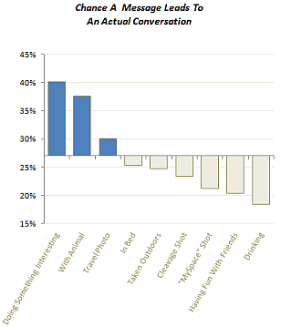
There are a number of strange and wonderful charts on the dating site, but the one that led to this specific discussion is shown here.

The major controversy it that the horizontal X axis is not located at zero on the Y axis, but at the average effectiveness of 27%. A second issue is that vertical bars pretty much force category labels with hard-to-read orientations. If these are really a problem, then a horizontal bar chart with the bars starting at zero solves it, as Kaiser demonstrates.
If you are interested in relative effectiveness of each photo category, then the zero axis origin may not be so important. Also, the resolution of this chart is better than if the bars had to start at zero.

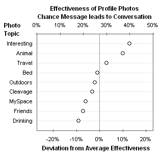
This is an improvement in terms of legibility of labels and judging the absolute values of the bars. Perhaps a dot plot is equally effective?

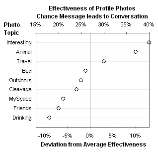
Unlike a bar chart, starting the value axis at a value greater than zero poses no cognitive issues. We can then expand the scale, to gain back the resolution of the original chart.

What do you think of these alternatives?


ikkeman says
I do think the dot plot runs the risk of loosing the relation between the data label and it’s data point.
It’s already in play in the chart above, but as the list of data labels expands, it becomes harder to determine which point correlates to which label.
The Gridlines help, but I think the barchart offers better readability.
Maybe a thin-bar chart with big dots at the end of each bar?
derek says
If you need the labels to be associated with the dots, you can label the dots directly, although I prefer then lined up on the left.
Stružák says
If there is one thing I really admire on the dot plot charts, it must be the fact, that it can be easilly made and read using just one or two colours. Well done!
Thom Mitchell says
You may be a victim of your own effectiveness or powers of persuasion: you have made me a believer in bar charts with a zero base. I prefer the ability to identify small *relative* differences, rather than spreading out the data points of a dot plot to fit a horizontal scale of smallest [numerical] width, i.e., the range of the values. Color me a bar chart fan!
Gary says
Actually the original (maybe turned 90 degrees) works great if you just relabel the axis to “Deviation from Average…” That way the zero-based bars are irrelevant. I like this more than the dot plot, actually, since there’s only one series. Maybe use data labels to indicate the actual effectiveness percentage values. I don’t like double-axis-ing it so much.
Jon Peltier says
Ikkeman –
The gridlines in the dot plot can be made more pronounced to help with identification, or the labels can be placed next to the points per Derek’s suggestion.
If you decide to use bars, just use bars, but don’t clutter them with markers as well.
If clearly marked, bars showing Deviation from Average also work. There are many ways to skin this cat, and there are multiple ways to do so effectively.
Gary –
I don’t like Secondary Axes in Charts much myself, but this is one example of Secondary Axes that Work.
Jeff Weir says
Jon…you’re going really dotty on us. Do a Google image search on Yayoi Kusama…she’s got an exibition here in Wellington New Zealand that I’m sure you would approve of
Jon Peltier says
Here is what Jeff is talking about.
Jeff Weir says
I love the categories in these graphs. They really beg the question as to how effective a photo would be of you doing something interesting with a friendly animal in bed while on holiday.