In The Increasing Patriotism of Iraqis (actually just a comment on the labeling of years on x-axes of graphs), Andrew Gelman showed the following chart from The Increasing Patriotism of Iraqis. The chart came from a paper by the author of The Monkey Cage blog.
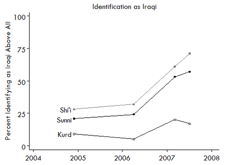
Andrew commented that the X axis should have years centered between the tickmarks, since a year is a span of time, not an event.
I decided to demonstrate how to produce a date scale axis with centered year labels in Excel. Using the following simplified data, I reconstructed the chart of Elkins and Sides as an Excel line chart.

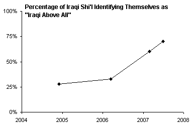
The year labels have a number format of “YYYY” so only the four-digit year is shown. If the months and days are also shown, we see that the year labels actually appear at the start of each year (which is evident if we examine the data).
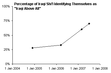
To “fix” the labels, I will add a second line chart series, move the original series to the secondary axis, and only display the primary axis year labels. Below is the data used for this second series, as well as the chart with this series added. Although the X values (category labels) are different for this second series, in a line chart, all series in each axis group use the same labels as the first series in the axis group.

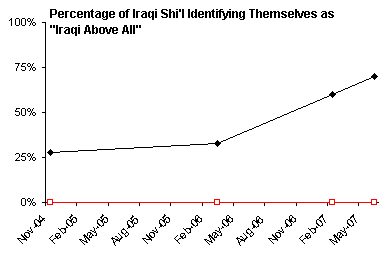
Move the original series to the secondary axis (secondary axis group) by choosing Secondary in the Format Series dialog. Note that both series now use the X labels of the second series.
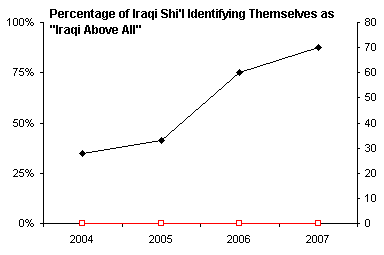
When you move a series to the secondary axis group, Excel usually provides a secondary value (Y) axis but not a secondary category (X) axis. Delete the secondary Y axis and add a secondary X axis. This axis appears at the top of the chart, overlapping with the title.

Adjust the scale of the secondary date axis, so it starts at the beginning of 2004 (i.e., January 1) and ends at the start of 2008.
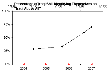
Finally, hide the secondary category axis by changing all of its formatting properties to None. Also hide the second series by chaning its line and marker properties to None.

Without too much muss and fuss, we’ve created a nicer date scale axis, with the year labels centered within the corresponding years, rather than at the start of each year.


Andy Pope says
Hi Jon,
How about this alternative which uses a xy-scatter chart with a series for data, fake tick marks and fake axis labels.
Assumes original dates and data is in A2:B5
in A6:A10 enter date for 1st of each year 2004 to 2008. In C7:C9 enter zero.
in A11 enter the formula =A6+((A7-A6)/2) . and copy down to A14.
in D11:D14 enter zero.
Now create a xy-scatter, markers only, on the range A2:D14. Format 1st series to have a Line.
Format 2nd series to have small cross as marker
Format 3rd series to have X value data label but no marker. Align data labels below and set number format to YYYY.
Final format X axis to start 1/JAN/2004 and end 31/DEC/2007. No tick marks or labels required.
Jon Peltier says
Andy –
I use both ways in my own work. In Excel 2003 the XY series option is a nice one, because the XY series can coexist on the line chart’s date axis, and there’s no need to use the secondary axis. But sometimes it’s easier to let an axis provide its own labels, as above.
In Excel 2007, an XY series ignores the line chart date axis even when both are plotted on the primary axis and there should be no confusion. This has broken a good number (a bad number?!) of client solutions for no good reason. You can still plot the XY series on the secondary axis, but now the axes must manually be synchronized, and you lose the ability to use the secondary axis for another purpose.
derek says
Andy, I tried a pure line chart version of your idea earlier today, using the “all in one column” method of faking multiple x ranges. and adding a third series to define the ends of the scale to avoid manually changing the scale. My write-up was interrupted by the need to get some work done, after which you posted. Darn that paying job :-)
My intuition, that it would be no more fuss than Jon’s method, was very wrong; for instance, I had to go into Tools.. Options to make the line interpolate between points, and so on. The only advantage left was that in the end I had something reasonably robust if frequently-changing data was to be applied to the chart: it had one axis left on auto instead of two axes that needed manual aligning.
Jon, would a line chart version also break in Excel 2007?
Jon Peltier says
Derek –
If I understand your approach, it should work fine in 2007. Since it entails multiple series of the same type using the same axis, the problem I’ve butted against is not a problem.
Bob says
We just downgraded to Office 2007 at work.
A very complex chart / project timeline tool was rendered obsolete by the Excel 2007.
Joy and bliss here.
At least everyone is in the same boat…
Bob
Jon Peltier says
Bob –
You have my condolences. I have had a few projects obsoleted by 2007. I also have been able to salvage some complex charts, often by resorting to the “hard” way of achieving an effect or by sacrificing something else.
Andy Pope says
Derek,
I wrote xy-scatter rather than Line chart because as you point out the actual data line becomes broken otherwise.
Jon Peltier says
Andy –
Except as Derek pointed out, you can change how blanks are treated and avoid the gaps. I am thinking that Derek’s technique is probably the best discussed here. I think I’ll have to rewrite the post, put all of the techniques here, and put his first.
Andy Pope says
The line chart is easier.
If you fill column B’s empty values with =NA() you do not need to go via Tools > options…
Jon Peltier says
Andy –
I think a single trip to Tools > Options (or wherever it’s been moved to in Excel 2007) is easier and cleaner than filling blank cells with formulas.
derek says
My data layout was like this. Apologies for the eccentric method of presenting the info, as I’m between ISPs at the moment. Does anyone know of a file hosting service that’s as convenient for spreadsheets as flickr, photobucket et al. are for pictures?
Michael Cassidy says
Can anyone comment on the formats used for the dates in the two series above. I can’t seem to get this to work correctly in Excel 2007. Specifically, are the dates associated with the Label category formatted as Date (YYYY) or is it general text? When I do attempt this, by placing the Shi’l values into A1:B5, and the Legend values in D1:E5 into a Line chart, then moving the Shi’l values to the second Y-axis, I get nothing close to what’s resembled above. Can anyone help? I’d be happy to email a spreadsheet of what I do get, if anyone’s willing to look.
Thanks,
Michael
Jon Peltier says
The “years” are simply text labels (whole numbers, but treated as text in the chart labels), in the block of cells corresponding to “Labels” and all zero Y values.