Cycle Plots
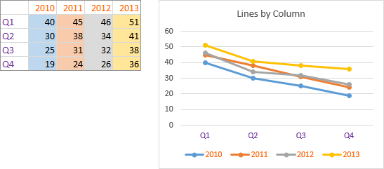
When you make a line chart in Excel, the series overlap, and sometimes it may be tricky to resolve the individual data. Here is a line chart created with series in columns. The data is color coded, with Y values in filled cells by series color, with series names in orange text in the legend and in the cells, and with categories in purple text along the category axis and in the cells.
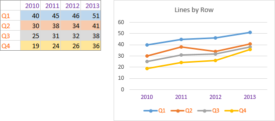
Here’s the same data plotted with series in rows, using the same color coding.
It would be nice to have the option to arrange the separate series data end-to-end, with a space between them, as is done in Excel’s bar and column charts.

In principle you could simply keep using bar or column charts, but in practice they become crowded and hard to read. Suppose for instance we were plotting a ten year period by months.
These column charts are examples of cycle plots, and they can be done using Excel line charts without too much pain.

First let’s determine how to arrange our data.
Cycle Plot Data
We can arrange the data so it is lined up end-to-end in a single column, and make our line chart.

Or we can arrange the data end-to-end in a single row.
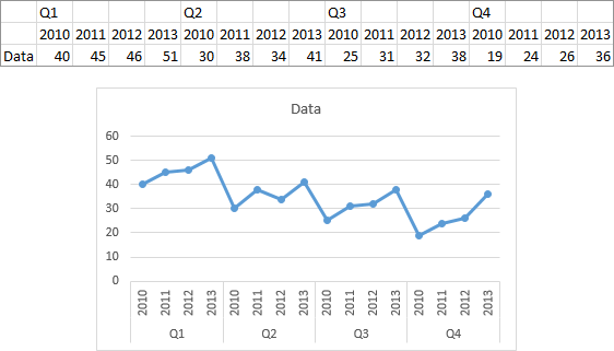
To get gaps in the line, you could manually format individual segments between points to use no line, but what tedium.
By default, Excel skips over blank cells in the data, leaving a gap in the connecting lines. This is how we will separate our plotted data into cycles.

We can fiddle with more blank rows and so forth to tweak the alignment. Below the labels are all nicely aligned, at the expense of excess space between cycles and crowding of the labels within each cycle.
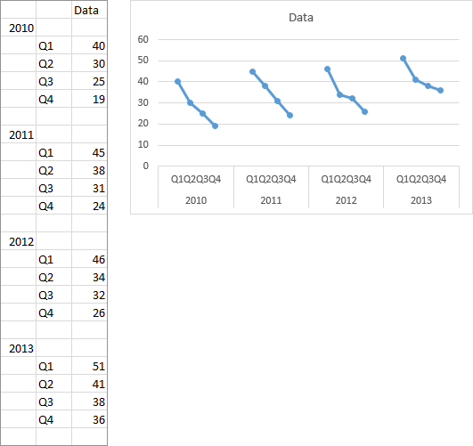
The short exercise provides a means to get separate cycles in our line chart. But we can do it with much less rearrangement of our data.
Plotting a Series Using Discontiguous Ranges
One useful but not well-known feature of an Excel chart series is that it can use data from discontiguous ranges. To demonstrate, select the first two columns of the data (the category labels and the first column of values; don’t bother with the header row), and create a line chart.
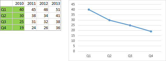
The series formula is simple: no series name, category labels in B3:B6, Y values in C3:C6, and it’s the first series in the chart.
=SERIES(,Sheet1!$B$3:$B$6,Sheet1!$C$3:$C$6,1)Copy the first column (the category labels), then hold Ctrl while selecting the third column (the second column of values) and copy, again omitting the header row. Select the chart, use Paste Special, and select the New Points option.

Excel has added the new range to the existing series, so the two columns of data are plotted end-to-end. Has the lightbulb gone on yet?

The series formula shows this more complicated data range: still no series name, a multiple range of category labels B3:B6 and B3:B6 in parentheses (Excel doesn’t care if you use the same range twice), a multiple range of Y values C3:C6 and D3:D6 in parentheses, and again plot order 1.
=SERIES(,(Sheet1!$B$3:$B$6,Sheet1!$B$3:$B$6),
         (Sheet1!$C$3:$C$6,Sheet1!$D$3:$D$6),1)
You don’t need to use Paste Special to add the additional ranges. You can directly edit the series formula in Excel’s formula bar, or you can use the Select Data dialog to select multiple ranges for category labels and Y values. But for now we’ll continue with Paste Special.
Repeat the Paste Special as New Points protocol with the next two columns. This looks a lot like the chart above, made with a single column of data, before we added gaps.
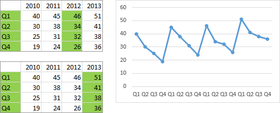
The series formula shows this more complicated data range: still no series name, a multiple range of category labels B3:B6 four times in parentheses, a multiple range of Y values C3:C6, D3:D6, E3:E6, and F3:F6 in parentheses, and again plot order 1.
=SERIES(,(Sheet1!$B$3:$B$6,Sheet1!$B$3:$B$6,
              Sheet1!$B$3:$B$6,Sheet1!$B$3:$B$6),
         (Sheet1!$C$3:$C$6,Sheet1!$D$3:$D$6,
              Sheet1!$E$3:$E$6,Sheet1!$F$3:$F$6),1)
We’ll use an embellished version of this technique to build our cycle plot.
Cycle Plots Using Data in Columns
The only modification our data range requires is to insert a blank row above and below the Y data range. The top left cell of this range is Sheet1!$B$2.
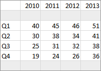
To simulate the columnar category range below left (yellow), we’ll use the category labels below right four times, the first three times we’ll use only the first blank row, and the fourth time we’ll use both blank rows. To simulate the columnar Y value range below left (blue), we’ll use the first three columns of Y values below right with only the first blank row plus the fourth column of Y values including both blank rows.

To start, we’ll select a simple data range…

… and insert a simple line chart.
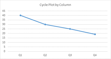
For reference, here is the series formula:
=SERIES(,Sheet1!$B$4:$B$7,Sheet1!$C$4:$C$7,1)Change the chart’s data to include the composite range described above. I did this by editing the series formula.

Here is the new series formula:
=SERIES(,(Sheet1!$B$3:$B$7,Sheet1!$B$3:$B$7,
             Sheet1!$B$3:$B$7,Sheet1!$B$3:$B$8),
         (Sheet1!$C$3:$C$7,Sheet1!$D$3:$D$7,
             Sheet1!$E$3:$E$7,Sheet1!$F$3:$F$8),1)
Now let’s add the year labels. Select the top two rows of the data, including the year labels and the blank row, and copy.
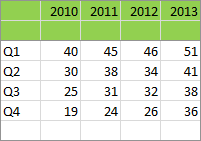
Use Paste Special, and this time use the New Series option, with Series in Rows, Series Names in First Column, and Categories (X Labels) in First Row.

Since the Y values of this added series included blank cells, it doesn’t appear on the chart. However, we can still select it by selecting the visible series and pressing the up arrow key. With the new series selected, press Ctrl+1 (numeral one) to open the Format Series dialog or task pane, and choose the Plot on Secondary Axis option.

This adds a secondary vertical axis. Using the plus icon in Excel 2013 or the Chart Tools > Layout tab > Axes dropdown, add the secondary horizontal axis.

Select and delete the secondary vertical axis, and format the secondary horizontal axis so it uses no line.

There is a slight misalignment between labels on the primary and secondary horizontal axes. This is shown more clearly in the following charts, in which I’ve displayed the secondary axis series (orange series), added tickmarks on the primary horizontal axis, and moved the secondary labels to the bottom of the chart (I’ll explain how later).
The top chart below shows the misalignment: the 2010 label and orange marker are aligned with the Q2 label, while the 2013 label and orange marker are aligned with the Q3 label.
The bottom shows the corrected alignment: all year labels and orange markers are lined up between the corresponding Q2 and Q3 labels.
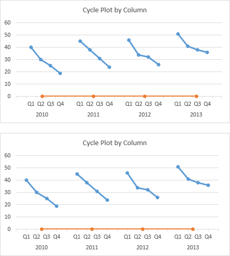
To correct the alignment, format the primary horizontal axis so the (vertical) axis position is On Tick Marks.

This completes the construction of our cycle plot, although we can embellish it further.
To place the year labels below the quarter labels, select and format the year labels (actually you’re selecting the secondary horizontal axis), and for Label Position, choose Low. I also changed Distance From Axis from 100 to zero.

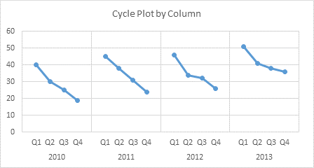
You can turn the cycle plot into a panel chart by adding secondary major vertical gridlines.

Or you can move the labels and add the gridlines.
Cycle Plots Using Data in Rows
The only modification our data range requires is to insert a blank row above and below the Y data range. The top left cell of this range is Sheet1!$B$2.
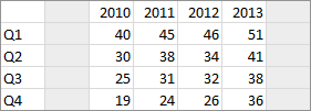
To simulate the row of category labels in the top range below (yellow), we’ll use the category labels in the bottom range four times, the first three times we’ll use only the first blank column, and the fourth time we’ll use both blank columns. To simulate the row of Y values in the top range below (blue), we’ll use the first three rows of Y values in the bottom range with only the first blank column plus the fourth row of Y values including both blank columns.

To start, we’ll select a simple data range…
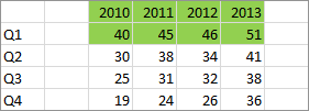
… and insert a simple line chart.
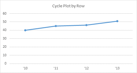
For reference, here is the series formula:
=SERIES(,Sheet1!$D$2:$G$2,Sheet1!$D$3:$G$3,1)Change the chart’s data to include the composite range described above. I did this by editing the series formula.
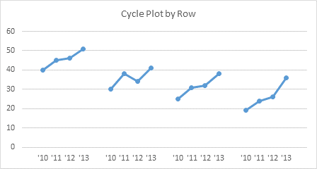
Here is the new series formula:
=SERIES(,(Sheet1!$C$2:$G$2,Sheet1!$C$2:$G$2,
             Sheet1!$C$2:$G$2,Sheet1!$C$2:$H$2),
         (Sheet1!$C$3:$G$3,Sheet1!$C$4:$G$4,
             Sheet1!$C$5:$G$5,Sheet1!$C$6:$H$6),1)
Now let’s add the quarter labels. Select the top two rows of the data, including the quarter labels and the blank row, and copy.

Use Paste Special, and this time use the New Series option, with Series in Columns, Series Names in First Row, and Categories (X Labels) in First Column.
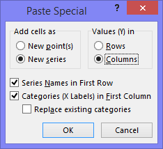
Since the Y values of this added series included blank cells, it doesn’t appear on the chart. However, we can still select it by selecting the visible series and pressing the up arrow key. With the new series selected, press Ctrl+1 (numeral one) to open the Format Series dialog or task pane, and choose the Plot on Secondary Axis option.
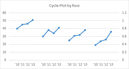
This adds a secondary vertical axis. Using the plus icon in Excel 2013 or the Chart Tools > Layout tab > Axes dropdown, add the secondary horizontal axis.

Select and delete the secondary vertical axis, and format the secondary horizontal axis so it uses no line.
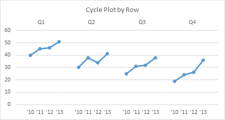
There is a slight misalignment between labels on the primary and secondary horizontal axes. This is shown more clearly in the following charts, in which I’ve displayed the secondary axis series (orange series), added tickmarks on the primary horizontal axis, and moved the secondary labels to the bottom of the chart (I’ll explain how later).
The top chart below shows the misalignment: the Q1 label and orange marker are aligned with the ’11 label, while the Q4 label and orange marker are aligned with the ’12 label.
The bottom shows the corrected alignment: all quarter labels and orange markers are lined up between the corresponding ’11 and ’12 labels.
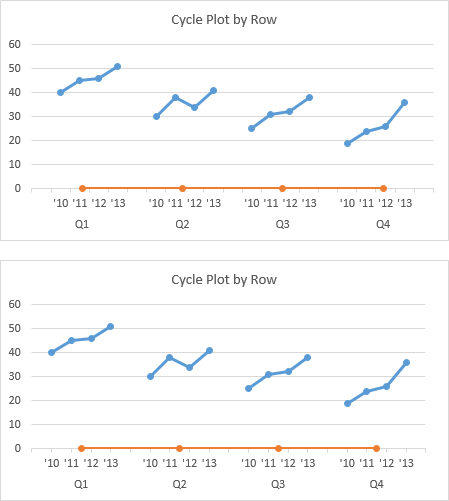
To correct the alignment, format the primary horizontal axis so the (vertical) axis position is On Tick Marks.
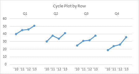
This completes the construction of our cycle plot, although we can embellish it further.
To place the quarter labels below the year labels, select and format the quarter labels (actually you’re selecting the secondary horizontal axis), and for Label Position, choose Low. I also changed Distance From Axis from 100 to zero.

You can turn the cycle plot into a panel chart by adding secondary major vertical gridlines.
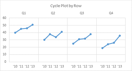
Or you can move the labels and add the gridlines.

Going Both Ways
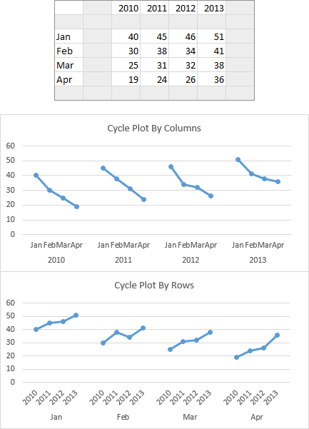
You can insert blank rows and columns into your data, and generate charts both by columns and by rows.
Summary
In this tutorial we’ve learned (or been reminded) how to
- Add blanks to a chart series data range to produce gaps in a line chart,
- Use discontiguous ranges to plot a single chart series,
- Use a hidden (dummy) series on the secondary axis to add a set of category labels to a chart.
These are all useful techniques that are powerful additions to your Excel charting arsenal.
Cycle Plots in Peltier Tech Charts for Excel
This tutorial shows how to create Cycle Plots, including the specialized data layout needed, and the detailed combination of chart series and chart types required. This manual process takes time, is prone to error, and becomes tedious.
I have created Peltier Tech Charts for Excel to create Cycle Plots (and many other custom charts) automatically from raw data. This utility, a standard Excel add-in, lays out data in the required layout, then constructs a chart with the right combination of chart types.
You can plot a block of data by column or by row.

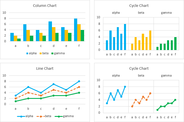
You can format each series separately (above) or all series the same (below). You can add averages or trendlines (or both) to each series.

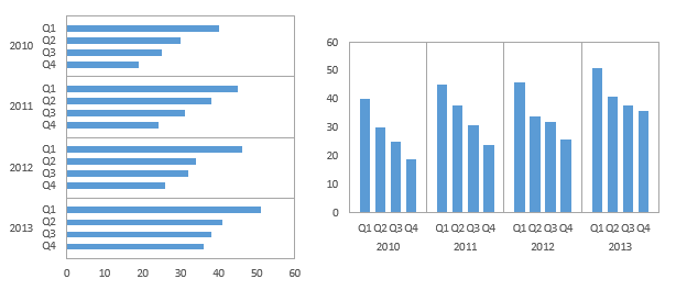
You can plot lines, columns, or bars.
You can also select an existing chart and Peltier Tech Charts for Excel will convert it to a Cycle Plot. The program inserts a new worksheet, finds the data for the chart and lays it out on this new sheet, and makes a copy of your chart on the new sheet, which it points at this new data. Since it starts with a copy of your chart, all formatting stays the same.
This is a commercial product, tested on thousands of machines in a wide variety of configurations, Windows and Mac, which saves time and aggravation.
Please visit the Peltier Tech Charts for Excel page for more information.


Naomi B. Robbins says
Nice work! Bill Cleveland and Irma Terpenning introduced cycle plots for seasonal adjustment of time series in a 1982 paper. They include the mean of each subseries in the plots. That would be a nice addition.
Jason G says
Once again you put out incredibly helpful stuff.
I actually did something similar in a much less refined way, with some added complexity. I needed to do a panel of panels plots. How would you do that.
I don’t see a way to submit a file to show you what I am talking about so I will email that to you seperatly if you are interested.
Thanks,
Jason
David Hager says
This is a very interesting and useful post, as well as a very long one.
Matth F says
Indeed, very interesting.
Experimenting I encountered a problem : once finished my cycle plot chart I wanted to add a new serie. Doing so screwed my primary horizontal axes : only Q4 caption was displayed.
I did succeed in making it alright again by removing secondary axes, removing the caption dummy serie charted on it and adding it back afterward. Is it the only way ?
Jon Peltier says
Matth –
Since the most recently added series was moved to the secondary axis, Excel moves any subsequent series to the secondary axis. As soon as you add your new series, you need to move it to the primary series. This should be enough to preserve the structure of the chart.
Matth F says
Thanks Jon for your answer but the series are already on primary axes. (I checked , trying to set it on secondary axis and back to primary but It’s only make things worse)
To illustrate the problem I did a simple scenario case screenshot before / after : http://imageshack.us/photo/my-images/854/dpnm.jpg/
As you can see I lost caption Q1 / Q2 / Q3 on each series and instead I got Q3 / Q3 / Q3 only once ? I don’t understand what is wrong.
Jon Peltier says
I see what you’re doing. I thought you were adding a whole new series of data. You’re simply extending the existing set of data.
I just ran a quick test, and the same thing happened to my chart. The series formula pointed to the correct range, but it was incorrectly displayed in the chart.
As is my habit, I made a copy of this chart to play around with, so if I broke it, I’d still have the original. Lo & behold, the copied chart’s labels were correct.
When I saved, closed, and reopened the workbook, the original chart’s labels also were correct.
So it seems Excel is having a mental lapse, from which it later recovers.
Matth F says
Indeed saving, closing and reopening solve the issue. Didn’t think to try that. Thanks ! :-)
Sally Martinson says
In my job I create a few charts. Column charts and line charts are usually all I need. I’ve learned some wonderful charting methods from your site, but until now I haven’t been able to use any of them on the job. I am delighted that I can use cycle plots to create charts that show the data in a different way. Cycle plots “tell a story” clearly. Thank you for your excellent tutorial.