Cycle Plots
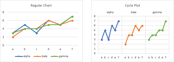
When you make a chart in Excel, sometimes plotting all of the series in the same space make it hard to see the behavior of an individual series (below left). A cycle plot separates each series into its own section of the main chart, so it is not obscured by other series (below right).
I first read about cycle plots in Naomi Robbins’ article Introduction to Cycle Plots on the Perceptual Edge web site.
Cycle plots aren’t standard Excel charts, but they’re not too hard to create. Soon after Naomi’s article was published, my colleague and former Excel MVP Charley Kyd wrote How to Create Cycle Plots in Excel to Chart Seasonal Sales Data.
A few years ago I wrote a tutorial, How To Make Cycle Plots Using Excel Charts, which showed a convoluted way of creating these charts, loosely based on Charley’s approach..
The tutorial below describes a technique which I hope is easier to follow and reproduce than the old technique. In addition, following the tutorial you’ll find information about Peltier Tech Charts for Excel, which has its own Cycle Plot features (in the Advanced Edition only).
Creating Cycle Plots in Excel
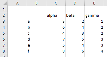
We’ll start with this simple compact data range for our cycle plot. The categories (X axis labels) are in the first column, highlighted in purple, series names in the first row, highlighted in red, and Y values are in the grid, highlighted blue.

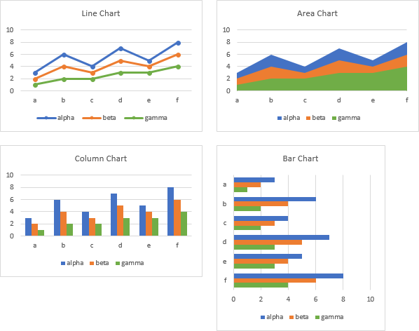
We can make line, area, column, or bar charts from this data, and in fact, all of these types are suitable for cycle plots.
Cycle Plot Data
To make the cycle plot work, we need to divide the chart into sections, or cycles, or panels. Each series in the chart will be plotted in its own cycle, with its own category labels. We leave the series names in place (again highlighted in red below), and duplicate the category labels (purple) in the first column so they appear once per series. Then we stagger the Y values (blue) for each series so each aligns with its own set of category labels.

We then expand the data by inserting blank rows before, between, and after each cycle’s data, shown by the yellow shaded rows below. This provides a bit more horizontal separation between the data. It is helpful to put space characters into the first cells of the inserted rows (the darker highlights). When you make a chart from this data, Excel will see the space characters and make them part of the category labels for the chart.

Below is the data and chart, with the series names, category (X axis) labels, and Y values highlighted in red, purple, and blue as before. Note that each series is plotted in its own region of the chart, with its own duplicate set of X axis labels.

Secondary Axis for Labeling
Let’s add some secondary data, which will provide gridlines to separate the cycles (panels). The secondary range is shown below the chart, with the series names from the main chart to be used as secondary axis labels (highlighted in purple), a new series name “secondary” (red), and zero values (blue).

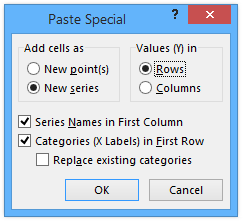
Copy this new range of data, select the chart, and use Paste Special from the Paste dropdown button on the Home tab of the ribbon. Choose the options shown in the Paste Special dialog below.
We see a new series, which at first is present just in the bottom left corner of the chart. We’ll have to hide this series (format it with no markers and no lines) and move it to the secondary axis.

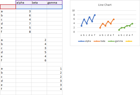
We didn’t really have to add a new range of data for this secondary series. We could have used the top of the existing data range, as highlighted below. The series has no name in the legend, because it uses a blank cell (highlighted red) as its name, and it doesn’t appear in the chart even though the legend shows a yellow marker and line, because its Y values consist of blank cells (highlighted blue).
Right click on the new series if you can see it, or right click on any series in the chart, and select Change Series Chart Type. The dialog lists the series in the chart, along with their chart types (which we do not need to change), and whether the series is plotted on the secondary axes. Check the Secondary box next to the new series, and click OK.

The chart doesn’t really change much. The data is plotted where it was, but now there is a new vertical axis. Click the little plus “skittle” (that’s Microsoft’s term, and I wish more people knew it), and click on the right-pointing arrow next to Axes. The checked axes are the default ones when you’ve just moved a series to the secondary axis.
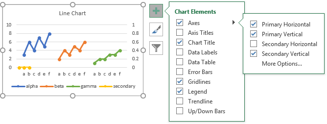
For our chart, we need to uncheck Secondary Vertical and check Secondary Horizontal. The secondary horizontal axis labels are the original series names, and they are neatly positioned above the plotted data for each series.
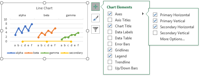
Formatting
Now a little formatting. If the secondary axis series is visible in the chart (below left), format the series so it has no markers and no line, to hide it (below right).

Using the plus skittle, click the arrow next to Gridlines and check the Secondary Vertical box. This gives us lines that separate the data for each series, effectively forming panels (below left).
Note that the white spaces to the left of series alpha and to the right of series gamma are wider than the spaces between series and the interior gridlines. We can fix that by formatting the primary horizontal axis (along the bottom of the chart). Select the axis and press Ctrl+1, Under Axis Options, choose On Tick Marks for Axis Position (below right). The spaces are now uniform.

Finally, remove the legend, which was made redundant by the secondary axis labels at the top of the chart.
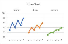
Cycle Chart Types
I showed this technique using a line chart, but you can also use a column chart instead.

You can also use a bar chart.

You can use an area chart as well. Note that the default area chart plots blank cells as zeros, so the edges of each series are not vertical (below left). To correct this, right click the chart and choose Select Data, click the Hidden and Empty Cells at the bottom left of the dialog, and choose Show Empty Cells As Gaps and click OK twice. The area series now don’t encroach upon each other (below right).

You can even mix up the series in a combination cycle plot, but make sure this won’t complicate the visual or confuse your readers.

Peltier Tech Charts for Excel
Creating Cycle Plots with Peltier Tech Charts for Excel
While this technique isn’t too difficult, it takes some time, and after your fourth chart in a row, it becomes tedious. But never fear, because Peltier Tech Charts for Excel, my Excel charting add-in, handles this task with ease.
Select a suitable data range, such as B2:E8 below. If you select a single cell inside such a range, the program will expand the selection outwards until it hits empty rows and columns, and use that as the source data.
You can even use a discontiguous range, as shown below. You have to select all of the individual ranges.

The ranges you select also have to result in a “nice” range. A “nice” range is shown below in green; it includes the intersections of the entire row of the selection (yellow rows) with the entire column of the selection (blue columns).

The discontiguous range can be split up a number of different ways. The range below works fine, with eight separate areas.
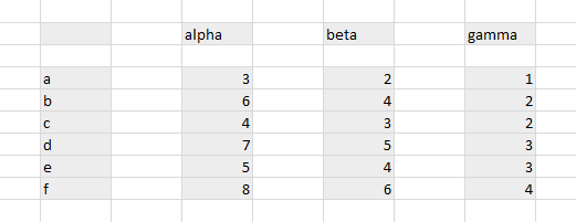
This range also works fine, with nine separate areas.

The following range is “too” discontiguous; the limit is somewhere between 9 and 12 areas before VBA chokes on a range. But that’s okay, because this is more complicated than you should be trying to plot.
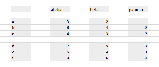
Once you select a range, click on the split button labeled “Cycle Plot”,

or on the Cycle Plot menu button which is also labeled “Cycle Plot”.

Up pops the Cycle Plot Dialog. Make sure the desired options are selected. (The program remembers the options you used last time.) Then click OK.

The program inserts a new worksheet with linked data that is appropriately arranged for the cycle plot, and creates a cycle plot using the selected options.
Among the options are Chart Type…
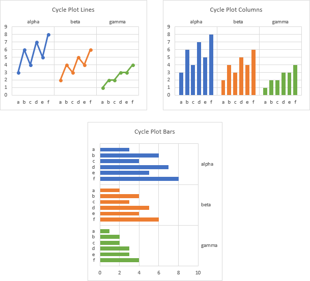
… whether to plot by row or by column…
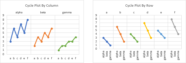
… whether to format each series differently or all series the same…

… whether to show dividers between series or not…
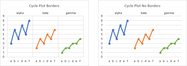
… and whether to add means, trendlines, or both to each series.
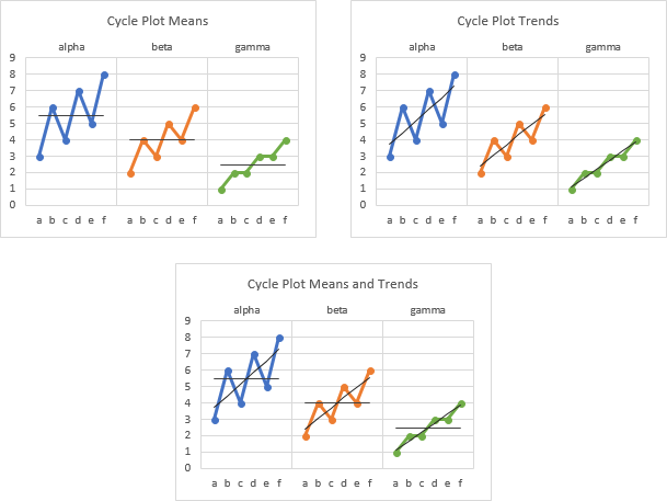
Converting Regular Charts to Cycle Plots with Peltier Tech Charts for Excel
Not only can Peltier Tech Charts for Excel build cycle plots from scratch, but if you have a regular chart that you’ve already formatted and you want a cycle plot of the same data with the same formats, Peltier Tech Charts can convert it for you.
Here is some data and a standard column chart, which is to be converted to a cycle plot.
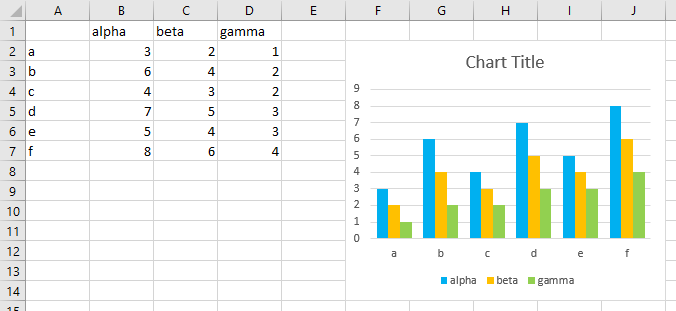
Select the chart (or select several charts: it will do them all), then click the Cycle Plot dropdown on the Peltier Tech ribbon, and click Convert Chart to Cycle Plot.

The program inserts a new worksheet, and builds the appropriate data range with links to the data in the original chart. It copies the chart and pastes a duplicate chart on the new workbook, and adjusts the data in this new chart so the same series (with the same formatting) now refer to the cycle plot data. Finally, the program adds the secondary series that provides the labels above the chart and the vertical gridlines. The original chart and data remain intact.
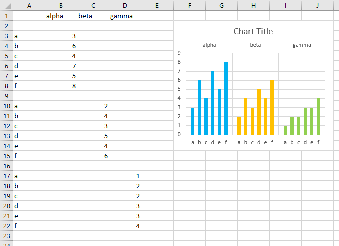
Here are a handful of original charts.

The program created the resulting cycle plots, each from its own worksheet (with its own data).

It took me longer to make these screenshots than it took my software to convert all of the charts.


derek says
Where the cycle plot shines is in inverting months and years to show all years in one month, all years in the next month, and so on.
For a quick and easy cycle plot pivot chart, add a second column of label data to your data table (it has to be in your data, I know no way to double up in the pivot table). Now you can get the diagonal effect by adding one column each to the Legend/Series field, and the Axis/Categories field.
Often, the different colours are unnecessary, so you can colour all the data series the same. In which case, you can make the second column just 1/2, or a/b, or odd/even, instead of a diagonal. All that’s needed to break the line from one cycle to the next is to stagger the series from one to the next. Really, it should be an option in Excel (and here is an example where fiddling with the data points might be worth it, until the day Excel installs a “break the line from one panel to the next” option)
GMF says
I use cycle plots quite a bit, mostly with the Charles Kyd format. But as you walked through your excellent tutorial I wondered if what we’ve been using and describing are more along the lines of what Tufte calls “multiples”? Is it a cycle plot until we have more than one row of multiples? Is there truly a distinction?
Jon Peltier says
Tufte has his “small multiples”. There is a family of chart types called “trellis” or “lattice” plots that contains a grid of small charts. A scatter plot matrix is a variation of these. Another name for a chart with separate panels of data is a “panel” chart. Semantics, I guess.
derek says
That’s why I think it’s really a cycle plot when it takes different time scales and inverts them. That’s what the “cycle” part means.
Milind says
Hi,
Sir, I have data of Interest Rate cycle since 1968-1969 til 2019.
How can I plot change in Interest rate cycle on chart?
The data shown that in 1968-1969 it was start.
In 1986 – 1989 was at peak.
And from on wards it is down side & in 2019 – 20120 the data is just at or near to 1980-1981.
So this is cycle.
I am not expert in Excel. How can I plot? Do you have any link?
Second, which Chart pattern shall I use to plot?
In Excel there is no chart to show cycle. The above data or chart if plotted, looks like reversible “U”.
That is bend is at top or peak.
Please guide me if you can.
And how can I learn Excell in simple way? Please send me the link.
Thank you.
Jon Peltier says
Milind –
A cycle plot as presented here is a way to view timeline data in a different way, to identify patterns in one time frame (e.g., annual) without distractions of another time frame (quarterly).
Your “Interest Rate Cycle” sounds like it is a description of how a factor (interest rate) changes from a low value over time to a high value and back to a low value. You don’t want my type of cycle plot to display this, you simply need a time line, or a simple line chart.
You need your dates in one column and your interest rates in the next column. Make sure the cell above the dates is blank, and the cell above the interest rates has a label, such as “Interest Rates”. Select this entire data range including the blank cell and cell with label (or a single cell within the data range, and Excel will figure out what to plot, if the data range is surrounded by blank rows and columns), and insert a line chart.
To learn Excel, you have to use it, and use it a lot. Use Google to find tutorials for each thing you need to do that you can’t figure out. After a period of months or more, you will become proficient.