Excel Charts
Excel is a great tool for crunching lots of data. The best way to share that data with others isn’t by showing rows and rows of calculations, but by presenting it graphically, that is, to create one or more charts.
Fortunately, Excel has a broad capability to create and format charts. Excel used to get a lot of criticism for its horrible defaults, but in Office 2007 Excel’s color system was updated and the defaults were improved somewhat, and Office 2013’s default colors and chart styles made it easier to create decent-looking charts with a minimum of post formatting. Office 2024 introduced a new, darker set of default colors, which I don’t like as much; this article uses Office 2013’s color scheme.
It’s easy to create Excel charts. You first select your data or select one cell in a block of data and let Excel determine the size of the data block. You can use the commands on the Insert tab of Excel’s ribbon, the Quick Analysis tool, or a keyboard shortcut; you can also create an Excel chart with VBA. These approaches are described below.
Chart Data
I’ll use this sample data range in this article. The first column contains X-axis categories (the letters a through f), the first row contains series names (Greek letter names), and the top left cell is blank to help Excel know that the first row and column are not Y values. There are more rows of Y values than columns, so Excel will plot series in columns.
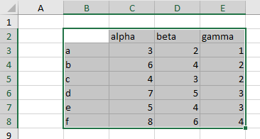
It’s easy to switch between rows and columns if Excel doesn’t do it the way you want. But it’s not so easy to fix series names and X-axis categories if Excel guesses wrong, so make sure these are in the first row and column, and use the blank row to make Excel’s task easier.
A more detailed description of well-formatted data for charts is found in Good Chart Data.
Using the Ribbon to Create an Excel Chart
You can choose whatever chart type you want by using the controls in the Charts group of Excel’s Insert ribbon tab. Select the data first, then navigate to the chart type you want to use.
The subset of Excel’s Insert ribbon tab deals with data visualization is shown below. There is a group of “Charts” controls, a “Tours” group that refers only to 3D Maps (this group has been moved elsewhere in the latest Beta releases of Excel), and a set of “Sparklines” controls. In this article, I am dealing only with the Charts group.

Recommended Charts
If you click on Recommended Charts or the tiny clickable icon in the bottom right corner of the Charts group, you get a dialog of Recommended Charts.

Excel uses its internal logic to suggest chart types that might suit your data. Any chart type displayed in this dialog will show a preview based on the selected data, with a short description of what the previewed chart type is used for.
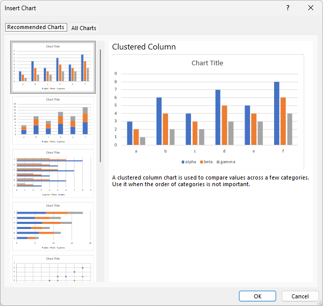
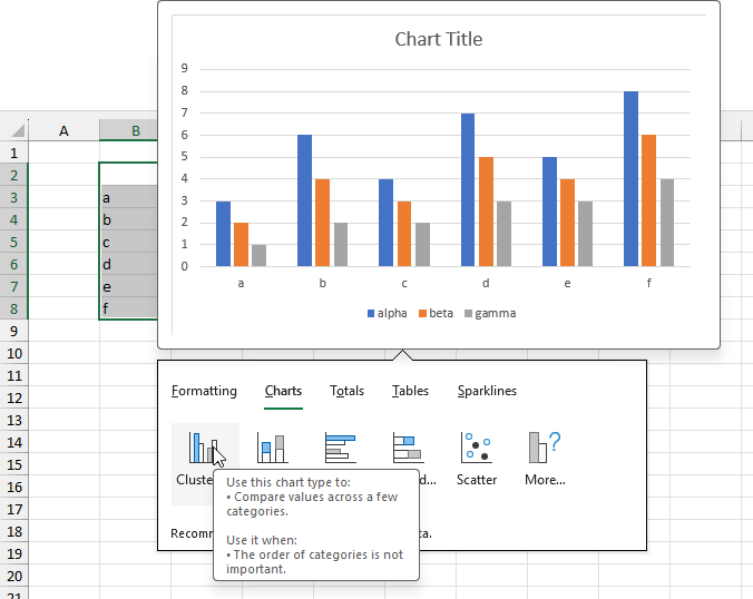
The first chart type recommended by Excel for my sample data is a clustered column chart, which is often the type I would use for such data. I generally have a chart type in mind, however, so I bypass the Recommended Charts option. You might try this setting to get out of a chart-type rut.
All Charts
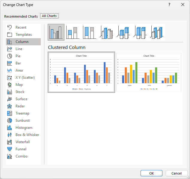
If you click the All Charts tab in the Insert Chart dialog, you can access any of Excel’s built-in charts as well as any custom chart types you may have saved as a template (more on this later). A list of chart types is shown along the left edge of the All Charts dialog, a set of chart subtypes is shown along the top, and previews of the selected chart subtype are displayed using the selected data.
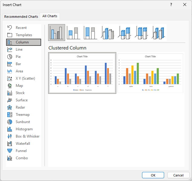
Click OK or double-click on the highlighted preview to insert this chart into your worksheet.
Galleries
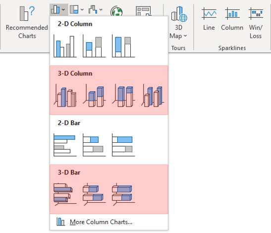
Excel has a lot of built-in chart types, grouped neatly into galleries in the ribbon and the Chart Type dialogs. You should be cautious using chart types that I’ve shaded yellow, and you should avoid ones I’ve shaded red.
Here is the column chart ribbon dropdown, which includes 2D and 3D column and bar charts. Column and bar charts are fine, just stick to 2D column and bar charts, and please avoid the red-shaded 3D variations.
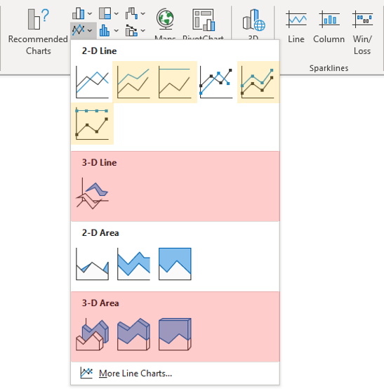
Here is the line chart dropdown. Use only the first type of each line chart group, that is, the Line or Line with Markers charts, not the yellow-shaded Stacked or 100% Stacked variations, which will lead to confusion. Any area chart variation (regular, stacked, or 100% stacked) is fine as long as it is clear to the viewer what is being shown. Don’t use the red-shaded 3D variations.
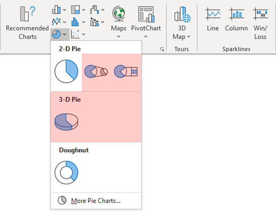
Here are the pie and donut charts. Stick to the regular pie and donut charts; avoid the red-shaded 3D pie and the horrendous pie-of-whatever types, which distort data and will confuse most readers.
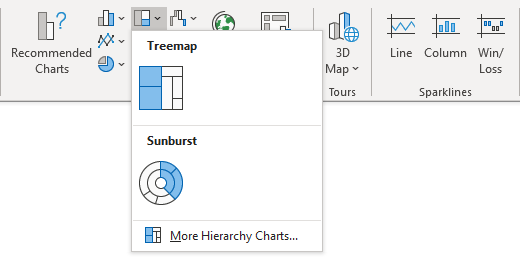
This dropdown shows Microsoft’s hierarchy charts: treemaps and sunburst charts. These are interesting and useful, but they are among the new Office 365 charts, so formatting and layout options are less extensive than Excel’s “regular” charts. They are unfamiliar to many viewers, making them hard to read.
Here are Excel’s statistics charts. Like the hierarchy charts above, they are new to Office 365 and lack the formatting and layout options of Excel’s “regular” charts.
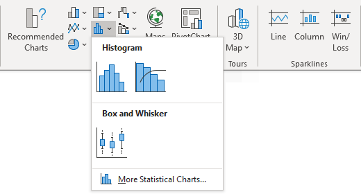
Peltier Tech Charts for Excel can create Histograms, Pareto Charts, and Box Plots without these limitations.
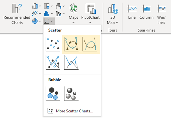
Here is the scatter chart dropdown, which includes bubble charts among the various XY scatter chart types. I’ve highlighted the smooth-line variations as a warning that they make it more difficult to see where the data points are located.
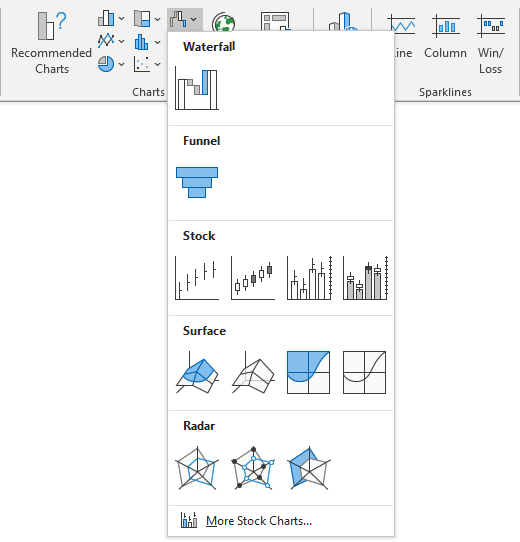
This dropdown contains Excel’s various business-type charts, such as waterfall and funnel charts (which like all new Office 365 charts are less flexible). It also includes stock charts, surface and contour charts, and radar charts, which have been around since at least Excel 97. I debated shading the radar charts in yellow because they don’t work as well as their many proponents believe.
Peltier Tech Charts for Excel includes several varieties of Waterfall charts that do not suffer from the Office 365 charting limitations.
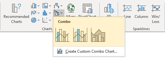
Here are Excel’s combo charts. I have found that it’s better to create a chart using one of the types in your combo, and one-by-one change the other chart types to create the combo. This protocol is described later in this article.
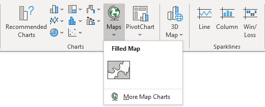
Here is Excel’s map chart. Office 365 has only one type of map, which fills regions (categories) in a map using a color scale based on the values in the data range. I’m waiting for a different variation that traces map coordinates of a path along a trail or other running route.
You can select a pivot chart (with limited types: for example, XY scatter types are not allowed) that uses a Table or an intermediate Pivot Table as its source. Unlike “regular” Excel charts, a pivot chart cannot use data that is not part of the parent Pivot Table.

Using Quick Analysis to Create an Excel Chart
When you select a range of data, a small icon floats at the bottom right corner of the selection.
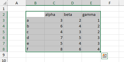
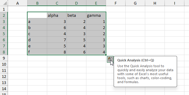
When you mouse over this icon, a small tooltip tells you it’s called Quick Analysis, and “Use the Quick Analysis tool to quickly and easily analyze your data” blah blah blah. If the Quick Analysis icon does not appear, you can invoke it with Ctrl+Q.
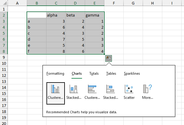
I used to get annoyed that this icon was cluttering up my nice neat worksheet. But one day I clicked on the icon, and saw this popup containing Formatting, Charts, Totals, and more. Maybe I was wrong and it’s really a good thing.
Let’s look at the Charts options (below). What you see are a handful of chart types and a ‘More…’ icon. These are actually the first five charts that appear in the Recommended Charts dialog discussed previously.
Mouse over one of the recommended chart icons, and Excel shows you a preview of that chart with the selected data. Clicking the icon inserts the previewed chart in your worksheet.
Clicking on the More… icon opens the Recommended Charts dialog described earlier.
Changing a Chart Type
It’s easy to change a chart’s type. On the Insert ribbon tab, select the icon for the chart type you want, the same as you did when you created the chart.
Or select the chart and click the Change Chart Type button on the Chart Design tab, which opens the Change Chart Type dialog below. Right-clicking on the chart and choosing Change Chart Type does the same thing. Navigate to and select the chart type you want.
Note that except for its title the Change Chart Type dialog is identical to the Insert Chart dialog.
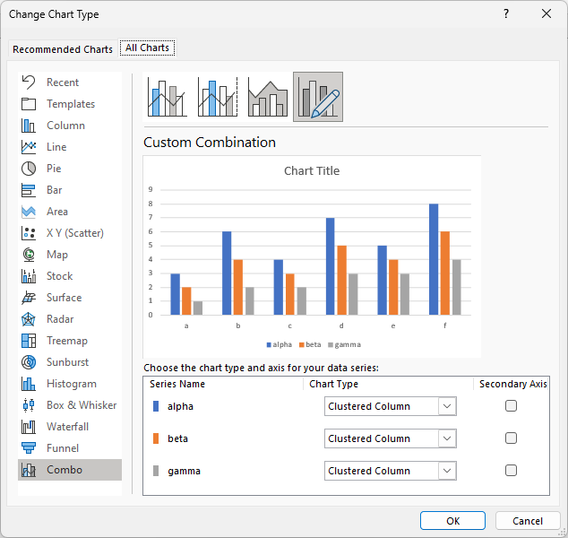
What if you want to change the chart type of one series in the chart? This is called a combination chart, or combo chart: a chart with multiple chart types. Select the series you want to change and navigate to the new chart type in the Insert ribbon tab.
Or select any series in the chart before you click the Change Chart Type button on the Chart Design tab. Alternatively, right-click on any series in the chart, and click on Change Series Chart Type in the popup menu. This opens the Change Chart Type dialog with a twist: The series in the chart are listed below the preview, and there is a dropdown to select a new chart type for each series and a checkbox to switch each series to the secondary axis.
The chart type popup for each series shows the available chart types for the selected series.
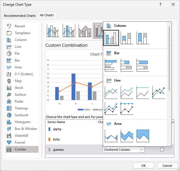
The preview shows what the chart will look like with the changed series.
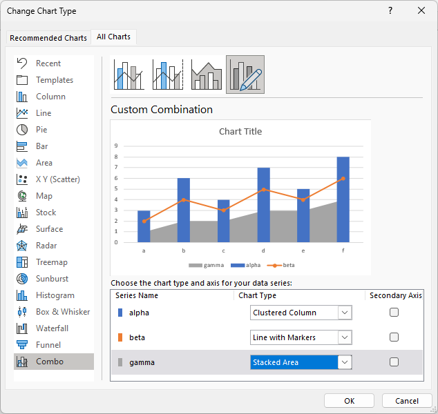
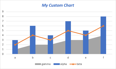
Here is the resulting combination chart.
Saving a Custom Chart Template
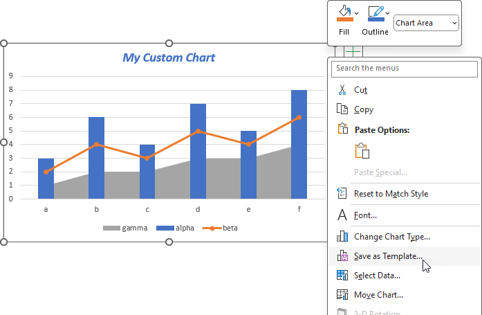
It is a lot of work to change multiple chart types, format each series, and customize other elements in a chart. It can be tedious to have to change a dozen charts, and you risk making errors. To streamline this process, you can save a customized chart as a template for future use. Right-click on the chart and choose Save As Template in the popup menu. Select a name for your template and click OK.
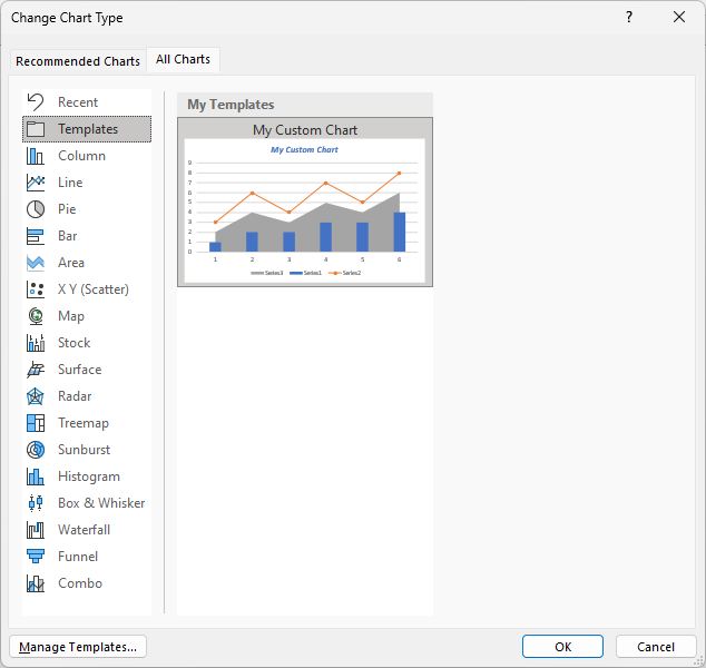
When you return to the Insert Chart or Change Chart Type dialog for another chart, click on Templates in the list of chart types, and you will see a gallery of the custom chart templates you’ve saved, previewed with the chart data. Click to apply the previewed template.
Using Shortcuts to Create an Excel Chart
Create an Embedded Chart
Select the data range you want to use, or select one cell in the range if it is a neat, contiguous data block surrounded by blank rows and columns.
Press Alt+F1 to insert a chart from the selected data.
The result is an embedded chart, that is, a shape embedded in the active worksheet, and the shape contains your chart. The default chart in the US is 3 inches high and 5 inches wide (elsewhere it is 76.2 mm high and 127 mm wide), and is centered within the Excel window. The chart (or its container shape) floats in a layer above the worksheet, but you can access the rows and columns behind the chart.
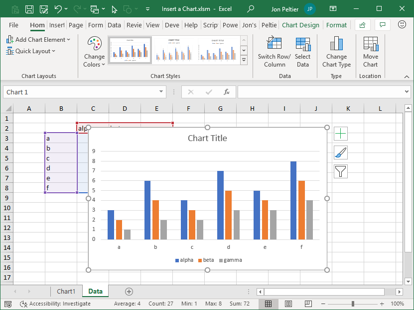
If a chart is embedded in the worksheet that contains its data, the chart data is highlighted in the worksheet. You can see these highlights, colored borders and pale fill colors, behind the chart above.
The chart created by a shortcut has the default chart type, which by default is a clustered column chart. You can easily change the default type, as described later.
I make many charts using a wide variety of types, so using a shortcut tied to a default chart type doesn’t make sense for me. I almost always use the ribbon controls to create a chart. But some people use this shortcut all the time.
Create a Chart Sheet
Select the data range you want to use, or select one cell in the range if it is a neat, contiguous data block surrounded by blank rows and columns.
Press the F11 shortcut key to create your chart.
The result is a chart sheet, that is, a chart on its own sheet (not a worksheet), which contains only the chart and no rows or columns of cells behind the chart. As with the Alt+F1 shortcut, Excel uses the default chart type for this chart.
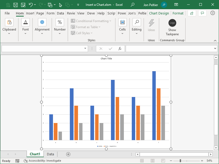
The Excel window is zoomed so that the chart fills the height or width of the window, keeping the chart’s aspect ratio fixed. In older versions of Excel (2003 and earlier), the chart would stretch to fit the height, width, and aspect ratio of the Excel window, but now there is usually unused space beside the chart.
Chart sheets are not as useful in an informative display, report, or dashboard as having several charts embedded in a worksheet, along with tables and other annotations in the underlying rows and columns. To change a chart sheet to an embedded chart (or vice versa) right-click the chart and choose Move Chart from the pop-up menu, or click Move Chart on the Chart Design tab of the ribbon.
The Default Chart Type
When you use a shortcut to create an Excel chart, Excel uses the default chart type to create this chart.
When Excel is first installed, the default chart type is a clustered column chart. You can see this if you right-click on the chart subtype icon in the Insert Chart or Change Chart Type dialog. A popup appears with a caption of Set as Default Type and a green checkbox.
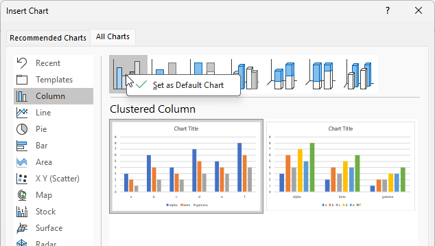
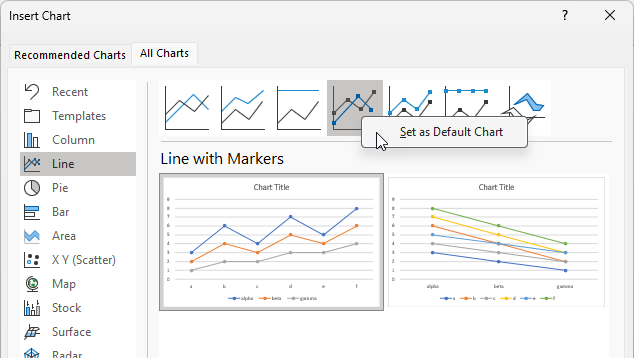
Other chart subtype icons will show the popup without the checkbox. To make a different chart type the default type, right-click on the chart subtype icon, then click on Set As Default Type. I make more line-with-markers charts than clustered column charts, so I usually set that as my default chart type.
Comparing Methods to Create Charts
Shortcuts
Shortcuts are obviously the fastest method to create Excel charts. They are limited by only creating the default chart type, and while it is easy to change the default, it is impractical to do so repeatedly.
Insert Ribbon Chart Galleries
The chart galleries are relatively quick and do not lock you into a default chart type. But if you decide halfway through that you’re in the wrong gallery, you have to escape the gallery you’re in and select the right one. You also get Excel’s choices for some of the chart’s features.
If there are more rows than columns, for example, Excel plots series by column, and if there are more columns than rows, Excel plots series by row. This is probably what you want. If there are equal numbers of rows and columns, Excel plots by row, which I think is the wrong default. This isn’t hard to correct, but it gets annoying.
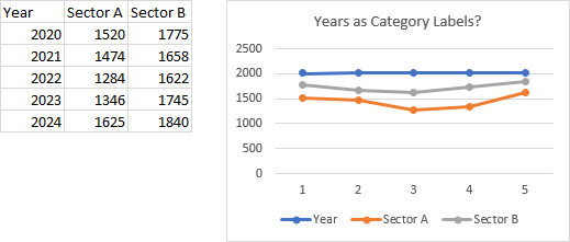
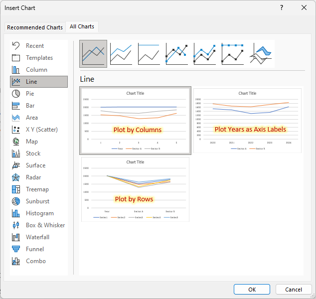
Also, if your first column has numerical values, for instance, years, the line chart Excel creates doesn’t distinguish the years from other numerical values, so years are plotted as another series in the chart. It’s annoying and tedious to correct this. Fortunately, Excel can distinguish dates in the first column from numbers in the others.
Recommended Charts/All Charts
This option is the slowest but is also the most flexible. I find that Recommended Charts rarely offers me the chart type I am looking for. But with one extra click, I can access All Charts. I can browse the various chart types and see previews with my data. I can select between previews that plot by column and by row. And in the case of my line chart above with a numerical first column of data, I also can choose a preview that uses these numbers as category axis labels.
Using VBA to Create an Excel Chart
There are VBA commands that mimic the shortcuts for creating Excel charts. These commands provide more control over the resulting chart, such as position and size, data used in the chart, and whether it is plotted by row or column. And you can add more VBA code to fine-tune the formatting of the new chart.
See Use VBA to Add a Chart for details about creating Excel charts with VBA.


Leave a Reply