The Advanced Edition of Peltier Tech Charts for Excel 3.0 includes a number of handy chart functions, available on the chart’s context menus (those menus that pop up when you click on a chart element).
Chart Title
When you right click on the chart title, you will see a new item, Chart Title Position, near the bottom of the menu.
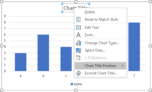
Click on Chart Title Position, and you will see a menu of items that help with positioning of the chart title.
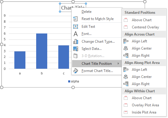
There are the standard positions: Centered Above Chart and Centered Overlay, where the title partially overlaps the plot area.
You can left-, center-, and right-align the chart title with respect to the whole chart or to the plot area.
Finally, without changing the horizontal position of the title, you can align it above the chart, you can overlay it so it partially overlaps the plot area, and you can position it so it is completely within the top edge of the plot area.
Plot Area
One item is added to the plot area context menu.

Reset Plot Area simply returns the plot area to its default size and position, undoing any manual adjustments you have made.
Legend
Peltier Tech Charts for Excel adds a number of items to the context menu of the legend.

The Legend Position context menu allows you to select one of the standard top, bottom, right, or left positions for the legend. It also allows you to position the legend just within any of the corners of the plot area.
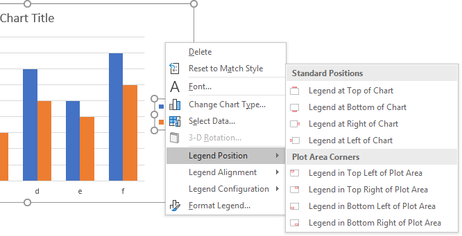
The Legend Alignment context menu allows you to align the legend vertically or horizontally at the center or edges of the entire chart or of the plot area. It also lets you choose whether or not to overlap the plot area and the legend.

Finally, the Legend Configuration context menu lets you arrange the legend as a vertical or horizontal list of entries, and if it’s a vertical list, it will condense the legend by about 20%.

Axis
There are two items added to the chart axis context menu. The Apply Nice Axis Scale function will calculate and apply a nice axis scale to a numeric or date axis, following an approach based on Calculate Nice Axis Scales in Excel VBA, a tutorial on the Peltier Tech Blog.
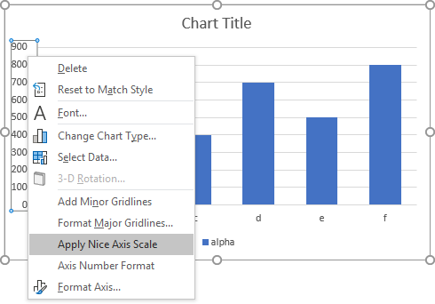
Axis Number Format lets you enter a custom number format in a small dialog that pops up.

This dialog shows the current format, and allows you to edit it or enter something new. In this case, the axis format was m/d/yyyy, and the axis labels show 1/1/2018, 2/1/2018, etc.

I can easily change the format to mmm-yy to show month abbreviations and two-digit years.

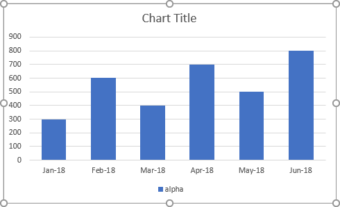
When I click OK, the axis labels appear as Jan-18, Feb-18, etc.
The nice thing is that the dialog lets me enter a format that contains a newline character, so the text will wrap in the middle of the formatted label exactly how I want. Here I have entered mmm<newline>yyyy because I want my labels to be a three-letter month abbreviation above a four-digit year.

When I click OK, that’s exactly the label appearance I get.


