A visitor to my web site asks, “How can I connect corresponding points of two different XY series in a chart?”
In other words, how can this chart
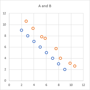
be converted into into this chart
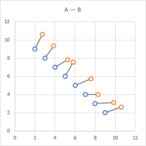
This is pretty easy by adding a third XY series that includes all of the data for the original two series, properly sequenced to connect the points.
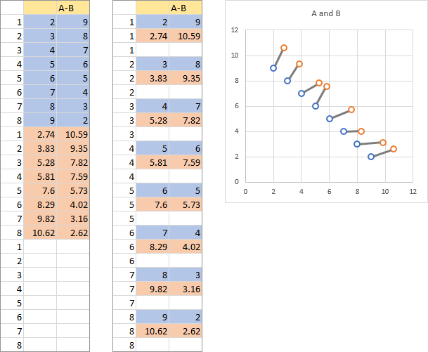
There are two blocks of data below. The block on the left has the data for A (shaded blue) stacked on the data for B (shaded orange). A column of numbers is inserted to the left, counting the points of each series from 1 to 8. The block on the right has been sorted by these inserted counting numbers, producing alternating data from series A and B. When plotted on the chart with A and B, the new series connects the points.
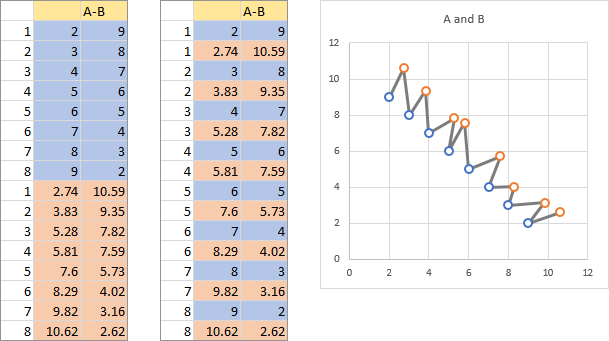
The problem is that not only are the corresponding points of series A and B connected (solid lines below), but also each point of series B is connected to the next point of series A (dashed lines below).
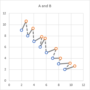
How can we eliminate those dashed lines? By default, an Excel chart draws a gap for a blank cell, so we need to insert blank rows in our data.
We adjust our methodology to include a region of blank cells below the data for series A and B, below left. When sorted, we now have our data sequenced as Series A – Series B – Blank. When this data is added to our chart of A and B, the lines connect our points perfectly. (In fact, the last row, the blanks next to the index 8, is not needed.)
While working on this data arrangement, I realized it was what I needed to enhance a step chart (Line Chart vs. Step Chart) to omit the “risers” and draw only the horizontal segments (Step Chart Without Risers). I guess there are more reused solutions than new solutions.
You can download a simple workbook that shows these charts from the link below:


Eyad Husseini says
Mr. Peltier,
I am one of your fans who has learned many and many from your great web site. I have read Excel 2007 Chart by John Walkenbach where i saw you name first time. Since that time, I have 3 meals daily in addition to my Excel Charting Meal in Jon Peltier Resturant. I implement your tricks and tips in my daily task as a Planning and PMCE – Project Monitoring and Contorlling Engineer. Thanks Thanks and Thanks a lot Mr. Peltier and I am waiting for an Excel Charting Book from you.
Regards,
Eyad Husseini
PMCE
Jay says
Jon
Thanks for this wonderful tips on connecting XY series.
While on this, I think it will be improved data visualization if I can show an arrow (from earlier to new levels) instead of simple connecting-lines.
Could you please advice us how this can be done?
Thanks
Jay
Jon Peltier says
Jay –
In versions of Excel up to 2003, this can be achieved only through the addition of autoshapes, that is, lines with arrowheads drawn on the chart. These are tricky to align with the points, and if any little thing happens in the chart, the lines will have to be realigned.
I’ve also seen techniques where several extra points are added to each section of the series that connects each pair of points, such that these extra points define the shape of an arrowhead. This is tricky to define the points, given unequal X and Y scales, such that the arrow heads are nicely proportions, and if anything in the chart changes, these extra points have to be redefined.
I’ve criticized the eye-candy formatting added to Excel 2007 charts to the detriment of chart functionality, but some of the added formatting is actually useful. You can format the lines in a chart series as if they are autoshapes, and by adding arrowheads to the lines, you can achieve the effect you have requested.
Jay says
Jon
Many thanks for this clarification. Yes, I agree that this arrow will be helpful. But, if it comes with the baggage of autoshapes, It may be difficult to maintain and therefore not advisable. I shall explore this in my charts and check. Thank you for your clarification. You are doing a great service to us excel community out there. May God bless you.
Jay
Jon Peltier says
Jay – I’ve written a bit of VBA that will draw and redraw the arrows:
Connect Two XY Series with Arrows (VBA)
Jiby says
Thank you Jon. Once again you are GREAT.
I have been looking for VERY long how to show movements in my bubble charts to indicate where a bubble was in PERIOD-1 and where it stands NOW.
When will Sweden/Norway create a Nobel prize for Excel Science ? You deserve it.
Greetings from Belgium
-Jiby-
Patrick says
Can I just say a BIG thank you for putting this up. You have saved me many frustrating hours of work.
Patrick
Ingrid Esser says
Great, thanks!
Ingrid Esser, Sweden
bynkook says
Hi I am using Excel 2016 and I am able to detect a small arrowhead at Left Bottom corner of ChartArea after played the script. How can I delete this? I can send you my workbook.
Jon Peltier says
I checked out BK’s file, and the problem is that his chart series use 200 rows of data, but many of the rows are blank. The code still draws the arrows, but they are not at a relevant place in the chart.
The solution is to insert a test within the loop that draws the arrows, and only draw an arrow if the X and Y values for both series are not blank. Here is the loop with the additional If statement: