Box and Whisker Charts in Microsoft Excel
A customer asked me to compare Excel Box Plots between Peltier Tech Charts for Excel, a commercial VBA add-in for Excel, and the new Microsoft box plots introduced in Excel 2016. My email reply has developed into this full article.
Box and Whisker Charts (or Box Plots) were introduced by John Tukey in 1969, as a quick and easy way to visualize the distribution of a set of data by hand. Computers were not yet widely available, and box plots make use of readily determined medians and quartiles, rather than computationally intensive means and standard deviations.
Over at Flowing Data, Nathan Yau has a short tutorial showing How to Read and Use a Box-and-Whisker Plot.
I’ve written a popular tutorial that shows how to construct Excel Box and Whisker Diagrams (Box Plots). I’ve also built Peltier Tech Charts for Excel, a commercial Excel software package (aka “add-in”) that includes Excel box plots among its many features.
Microsoft introduced several new chart types in Excel 2016, the first new charts since Excel 97. Among these are Box Plots, Waterfall Charts, and Histograms, which I guess makes Microsoft my biggest competitor in the Excel Charts space.
Peltier Tech Box Plots
History
I’ve been using box plots since grad school in the mid 1980s, and probably earlier. While working as a research scientist, I used Minitab for much of my analysis, but it was awkward to use and I hated the charts. It was easy enough to do what I needed in Excel, except for box plots. Box plots sucked in Minitab too, and eventually I worked out the basics of Excel box plots, in the mid 1990s. This required extensive tables of calculations as well as tricky combinations of chart types, but I guess that ‘s what I do.
In the early 2000s I started developing VBA procedures to build Excel box plots, to take away the tedium and pain of compiling the calculations and building the charts by hand. Key milestones after this include:
- September 9, 2006: I announced a demo of a New Charting Utility – Box And Whisker Charts. I hadn’t started my own blog yet, that didn’t happen until March 2008, so I posted this on Dick Kusleika‘s Daily Dose of Excel blog. I received a lot of feedback, and made many incremental improvements and fixed many annoying issues.
- October 30, 2007: I announced (again at Daily Dose) the Updated Box And Whisker Chart Utility. This Excel VBA add-in included new features and improved old features, and most of the bugs went away.
- September 1, 2008: I launched my first software product, the Peltier Tech Waterfall Chart Utility 1.0.
- December 3, 2008: I sold the first license of the new Peltier Tech Box and Whisker Utility 1.0.
- April 14, 2013: I released the Peltier Tech Chart Utility 2.0. This new utility bundled together my separate first-generation chart utilities, including the Waterfall and Box Plot Utilities mentioned above, and also included a lot of chart-related features, for modifying chart data, formatting charts, and exporting charts. Eventually there were Standard and Advanced editions of this utility, as well as Windows and Mac versions.
- September 18, 2015: I released Peltier Tech Charts for Excel 3.0. This included more charts, including a new Grouped Box Plot in the Advanced Edition, and new features. It serviced Windows and Mac with a single add-in, but maintained Standard and Advanced editions.
- November 30, 2020: I released Peltier Tech Charts for Excel 4.0. More charts, more features, and overall performance is improved.
Output
It’s easy to build Excel box plots using Peltier Tech Charts for Excel. I’ll use this sample data range: there are three subsets of data (“A”, “B”, and “C”) aligned in columns, with the data subsets labeled in the first column.

Select the data you want to use and click the Box Plot button on the Peltier Tech tab in Excel’s ribbon. If you only select one cell within the data range you want to use, the routine finds the entire block of data that contains the active cell. The routine guesses whether the data is in columns or rows, whether there are data labels in the first row or column, and whether there are record identifiers in the first column or row. The data range and various row and column settings are prepopulated in the dialog.

When the dialog opens, you can adjust the data, if necessary. You can also select various style components, such as whether the chart is vertically or horizontally oriented, whether you want the box and whisker style or a four-box style that replaces the whiskers with another set of boxes,
and whether you want to display outliers. These orientation and style settings are remembered for next time you run the program.
The program inserts a new worksheet. The chart appears at the top, with a block of formulas below that, where you can see calculated statistics (count, min, max, mean, standard deviation, median, and quartiles). There are intermediate calculations below this, and the bottom of the worksheet’s used range is populated with the input data (linked to the original data). Calculations that facilitate display of outliers also appear at the bottom of the used range.
The chart is sized according to the number of categories portrayed. Vertical charts are also aligned with the columns of data in the worksheet below, to make it easier to visually pick off statistics from the worksheet formulas.
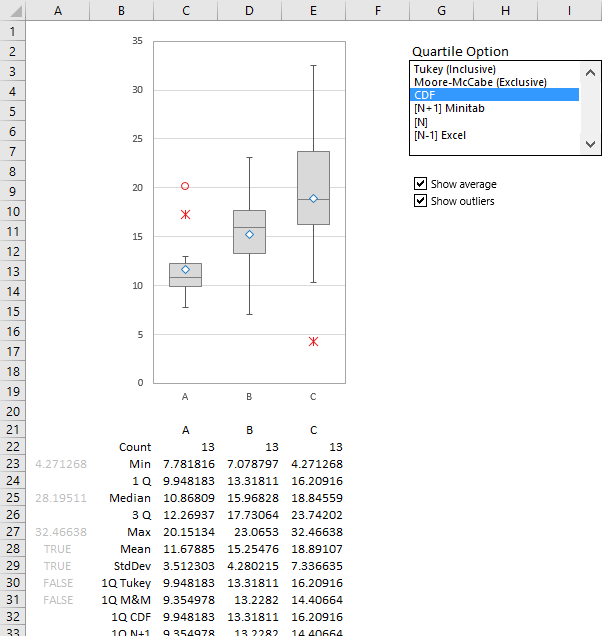
To the right of the chart are controls that let you adjust various settings. For example, you can choose to show or hide outliers and means, and you can select the method used to calculate quartiles.
The chart is a regular Excel chart, albeit with some customized formatting do get the appropriate box and whisker appearance. You can copy it and paste it anywhere, such as another worksheet or another application (a presentation in PowerPoint or a report in Word). You can also modify the size and formats of the chart, being careful not to mess up any of the custom formatting that make it work as a box plot.
Microsoft Box Plots
Making native Excel box plots in Excel 2016 is easy, and perhaps faster than using the Peltier Tech tool because there is no dialog and fewer options. Select the data, go to the Insert tab of Excel’s ribbon, find the Chart group in the middle of this tab, click on the Insert Statistic Chart dropdown button in the middle of this group . . .
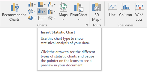
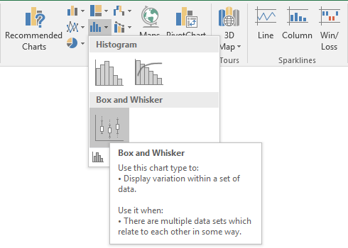
. . . and click the Box and Whisker button. It seems like I described a lot of steps, but it’s really quick once you know where the buttons are.
Excel inserts a box plot of the default chart size (in the US it’s 3 by 5 inches) in the default position (the middle of the active window). When the chart is selected (any chart element), the input data that went into the analysis is highlighted.
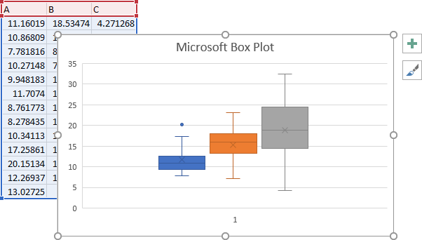
Here is an Excel box plot without the added distraction of data or selection highlights.
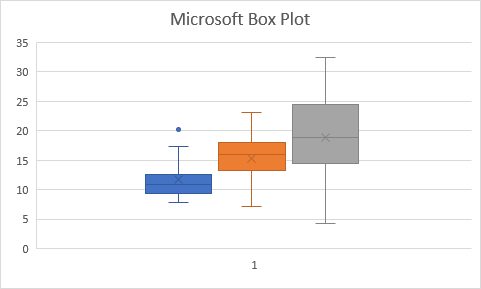
Not too hard, not too bad looking. But these charts have issues that I would like to address, and unfortunately I can’t address them all.
Comparisons between Microsoft’s and Peltier Tech’s box plots will be discussed in line.
Issues With Formatting
Like all new charts introduced in Excel 2016. Microsoft’s box plots are built using a new charting platform (or engine). This new platform will eventually make it easier for Microsoft to give us new chart types and new features, and eventually all the existing charts will move to this new charting platform. Unfortunately, for the time being, not all of the features we’ve had in the existing chart engine are present in the new one. This means that some things just aren’t available. Not yet, anyway, although Microsoft assures us that the new charts will be brought to parity with the old.
For example, in the new box plots, we can set our vertical axis minimum and maximum scale values, but we can’t change the spacing between tick marks and labels, nor can we set the position of the labels (i.e., low, high, next to axis, or none).
We also have little control over the position and size of many chart elements in the new charts. We cannot resize or reposition the plot area, the chart title, data labels, or the legend, other than choosing between some preset options for some elements (such as label position above or below points; or legend at top, bottom, left, or right).
There also is a disconnect between what you can do manually with a new chart, and what you can do with VBA. Recording a macro leaves out some actions (for example changing the fill color of the boxes), and when you type them in, you get run time errors.
Some of the formatting issues are related to the new chart platform, which is still being developed, some may be due to shortcomings in the way the box plot is implemented, and some are issues with all charts in Excel.
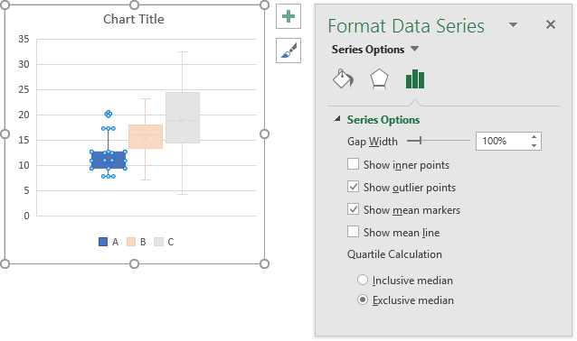
As with any Excel chart, you format an element by selecting it and pressing Ctrl+1, or right-clicking on it and selecting the Format item at the bottom of the pop-up menu. Here is a box plot with a series selected, showing the Format Series task pane.
Overlap and Gap Width
The first thing I noticed is that the default box plot has wide spaces on either side of cluster of stacks (below left). The data is only given the middle half of the plot area, and a quarter of the plot area on either side is blank; at the same time, the space between adjacent boxes is very small. That’s equivalent to a column chart with series overlap of -11% and gap width of 330% (below right). Inconsistently, the box plot has a stated gap width of 100%, and no reported series overlap.
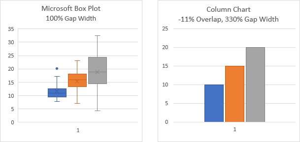
If I had a regular column chart that looked like the box plot, I’d reduce the gap width and increase the overlap. Here are two appropriate combinations:

I can decrease gap width in the box plot, but there is no way to access the series overlap, so can’t increase space between colored stacks of boxes. The best I can do is something like the box plot below left, equivalent to -10% overlap and 105% gap width in the column chart, below right. The bars are still not evenly distributed across the box plot.
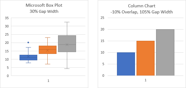
Microsoft treats each column of raw data as a series, which does make some kind of logical sense. The output related to that series has unique formatting, resulting in this example in data plotted with blue, orange, and gray pixels. The box plot has no gap width parameter, though, so the spacing between different colored elements is not adjustable.
Peltier Tech treats the charted data differently, so the upper boxes comprise one series and the lower boxes another. This means they are not by default formatted differently, and only gap width is needed to control this spacing. Below is the default Peltier Tech box plot, which is equivalent to a column chart with 100% gap width; the data is still evenly spaced across the chart.
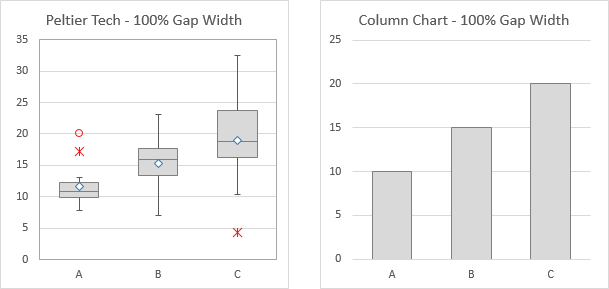
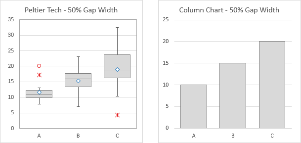
Changing gap width to 50% in either chart type results in data which is still evenly spaced across the chart (bottom row).
Category (Horizontal or X) Axis
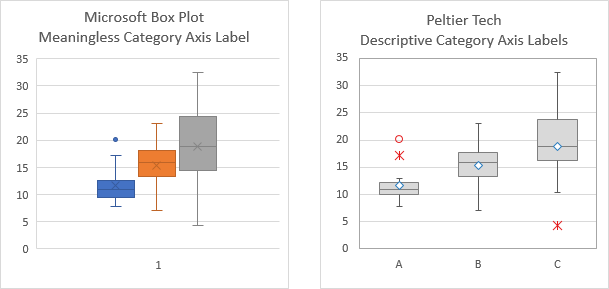
Another effect of Microsoft’s assigning a series to each column of input data is that there is only one category. This results in the “1” label below the plot area. This label is kind of useless: why not use the axis to label the data being plotted?
For example, look how the Peltier Tech chart has “A”, “B”, and “C” labels along the axis. And with the axis labeled clearly like this, there is no need to color-code the boxes.
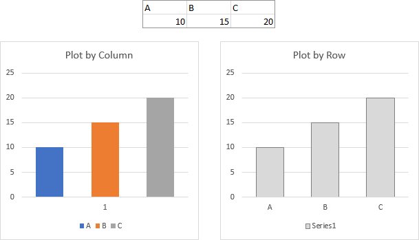
This is really just the difference in a regular column chart between plotting a simple data set by column or by row. In the chart below left, the labels “A”, “B”, and “C” are series names, and only appear in the legend. Conversely, in the chart below right, the labels are categories, and appear along the category axis (X axis).
The chart below left requires color coding and a legend to identify the different bars in the chart, while the chart below right has no need for potentially distracting colors, since the bars are clearly identified by the axis labels.
Okay, so Excel gives us an unhelpful axis label. Let’s just replace it with a legend (below left). Then let’s hide the axis label. Hmmm, there’s no Label Position option in the Format Axis pane. That’s inconvenient.
Let’s apply a custom number format of ” ” (double quote, space, double quote), which will force Excel to format the axis label as an unseen space character. Unfortunately, this leaves a large blank space between the axis and the legend.
Okay, then let’s stretch the plot area. Aaargh! (No, it’s not Talk Like a Pirate Day, it’s Using Excel Everyday.) The plot area cannot be resized or moved in a new platform chart.
So let’s try formatting the legend. What if I uncheck the “Show legend without overlapping chart” box? Finally! We have the chart on the right.
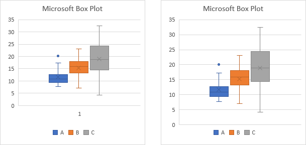
In an old school Excel chart I’d also stretch the legend widthwise, to roughly align the legend entries under the boxes, but the new chart platform doesn’t let me resize the legend, or even drag the legend to center it under all the data.
Box Fill Colors
When dataviz experts talk about using colors, they’ll tell you that you should use darker shades for lines and text, and lighter shades for fills. A problem with Excel charts in general is that they use the same medium shades for everything. The lines are okay, but sometimes text is too light, and usually fills are too dark.
It’s not usually a question of legibility, it’s just that large saturated fills overwhelm the reader. However, the box plot uses a slightly darker shade of the fill color for outlines, whiskers, and the “x” marker that indicates the mean. It’s not bad for most of the standard colors, but for the blue series in particular, I find it difficult to resolve the median and mean (below left).
You can easily enough format each series, and choose a lighter shade of each color for the fills, and everything shows up just fine (below right)
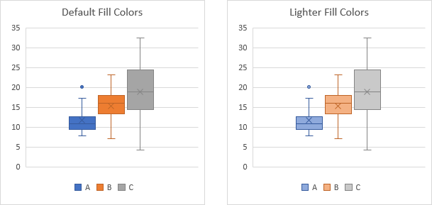
In an old school Excel chart, I’d replace the “x” marker with a more visible marker, like the diamond used in the Peltier Tech box plot. But the Microsoft box plot doesn’t have that flexibility.
Adding Features to the Chart
In addition to “How can I make Excel box plots?”, many of the articles on this blog answer questions like “How do I add a line to my bar chart?” or “How can I shade a target region in my chart?”. Most of the answers require you to add data to the chart, assign a particular chart type to the added data, and apply special formatting (including hiding) and labels to this new data. In a Peltier Tech box plot, for example, I can add lines to indicate high and low targets (below left) or add a shaded area to show a favored region (below right).
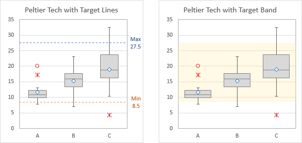
I’ve tried this with the Microsoft box plot, with no success. If I copy data, I cannot use Paste or Paste Special to get the copied data into the chart. If I add data using the Select Data button, I can add data, but Excel assumes it has to construct another box and whisker series. When I go to the Change Chart Type dialog, Combo Chart is disabled, so I can only change the type of the entire chart. Maybe Microsoft will enable combining other chart types with a box plot, but I suspect it will be like the bubble chart, which cannot have other chart types mixed in.
Concerns About Data or Statistics
Exclusive or Inclusive Calculations
Exclusive and Inclusive refer to how quartiles are calculated when the data set isn’t divisible by 4. If we have five values, the median is the third value, because it’s in the middle. The first quartile is the median of the bottom half and the third quartile is the median of the top half. Exclusive calculations of our quartiles exclude the third value, and compute the medians of the first and second values and of the fourth and fifth. Inclusive calculations of our quartiles include the third value, and compute the medians of the first through third values and of the third through fifth. Exclusive calculations result in a wider interquartile range and fewer outliers than inclusive calculations.
Tukey’s “hinge” method is an inclusive point-counting method to find quartiles, and Excel classically uses an inclusive N-1 interpolation method to compute quartiles. The Moore-McCabe hinge (point-counting) method is exclusive, as is Minitab’s N+1 interpolation method. Statistics packages impose a preferred method or allow the user to select one. Peltier Tech offers a selection of methods, and Microsoft offers two: exclusive and inclusive.
Despite Excel’s historical use of inclusive interpolation, Microsoft’s box plot uses exclusive calculation by default. Peltier Tech uses inclusive by default. Note the differences in the box heights, whisker lengths, and number of outliers in the two charts below:
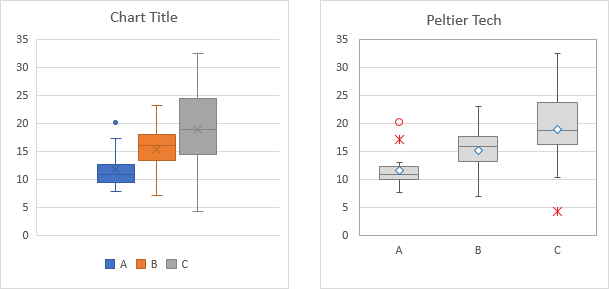
The plots are the same if both are using inclusive calculations. . .
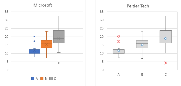
. . . or if both are using exclusive calculations.
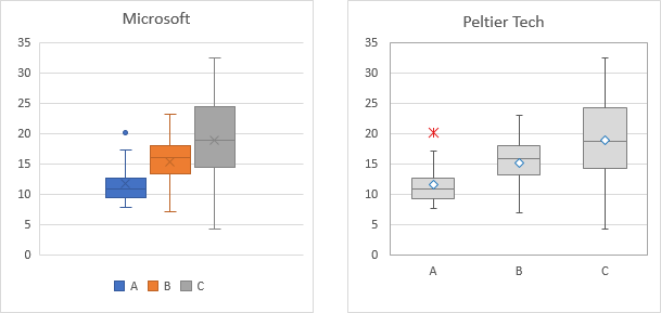
Because Microsoft applies exclusive or inclusive calculation on a per-series basis, it’s possible to have some data in the chart plotted on an exclusive basis and other data on an inclusive basis. Peltier Tech applies the calculation method for all data in the chart.
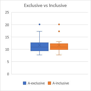
This is dangerously confusing, because it displays inconsistently computed data on the same chart. Except for the identical medians and means in the chart above, the two sets of data look quite different.
There is an exhaustive comparison of various quartile calculation methods in Quartiles for Box Plots on this blog.
Outliers or No Outliers
In a box plot, you have the choice between simple box and whiskers, where the boxes show the interior two quartiles, and the markers show the first quartile down to the data minimum and the fourth quartile up to the data maximum.
A point is an outlier if it is more than 1.5 times the interquartile range from the interior quartile boxes. (The interquartile range, or IQR, is the third quartile value minus the first quartile value.) When showing outliers, the whiskers don’t reach out to 1.5 IQR beyond the interior quartile boxes, they reach out to the fences, which are the furthest points which are not outliers.
In the top two charts below, we see that formatting the Microsoft box plot to hide outliers has no effect on the whiskers: they still show the distance to the upper and lower fences, not to the maximum and minimum values. This distorts the data by not including all of the data in the display.
The bottom two charts show that Peltier Tech box plots jump out to the extrema when the outliers are hidden.

Notice that the Peltier Tech outliers have two different styles. It is customary though not mandatory to use a star (asterix) to indicate an outlier that lies between 1.5 and 3.0 IQR from the interior quartile boxes, and to use an open circle to indicate an outlier that lies beyond 3.0 IQR from the boxes. Microsoft only shows one class of outliers.
Tabulated Statistics
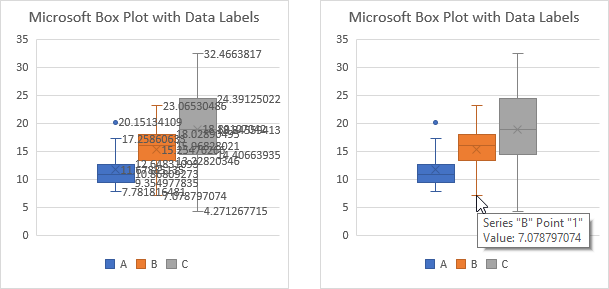
Peltier Tech inserts a new worksheet with its box plot and all of the related statistical calculations. Microsoft doesn’t provide this table, but if you add data labels to the box plot, the data label value option labels the values of everything: the mean and median, first and third quarter, whisker endpoints, and outlier values. It can be quite messy (below left). Even if you don’t have these labels, if you mouse over any of these values on the chart, it shows in the ChartTip (below right). If you need a table, you will have to write your own formulas, or do a lot of mousing over the chart and typing of values.
Summary
After two decades of the same chart type choices, Microsoft has started introducing new options. It has been possible to make these non-native charts in Excel, using special data layouts and custom combinations of chart type and creative formatting. The new built-in charts are easier and faster than existing manual techniques, but these are still not as capable as programmatic options, available as Excel add-ins powered by VBA.
The Peltier Tech box plot is more flexible than the Microsoft box plot, introduced in Excel 2016, especially in terms of user formatting of the produced chart. The Peltier Tech waterfall chart has also been shown to be superior to Microsoft ‘s waterfall, with more options for labeling and other formatting, and more options for the form of the output (stacked waterfalls, rotated waterfalls, etc.).
Peltier Tech Charts for Excel includes box plots, waterfall charts, and a variety of other charts and formatting tools developed to fill gaps in Microsoft’s charting options.


Colin Banfield says
Hi Jon,
Some of the new charts do not work like the legacy charts in the way that they create the chart from the data range. The Excel box plot does not work well with cross-tabulated data, like you’re shown in this post. It works best with tabular data. You must first unpivot the range so that the category names are in one column and the corresponding values are in another column (naturally, the category names will be repeated multiple times). When you create the plot from the tabular data, you will end up with a single series with category labels on the horizontal axis. As a single series, all categories have the same color. Also, the series are spread across the plot area, as you would expect. A second value column would plot as a new series and so on.
“Statistics packages impose a preferred method or allow the user to select one.”
I’ve noticed that in your excellent documents about quartile calculations, you don’t mention by far the most important stats package on the planet, which is R. R has about 9(!) methods for quartile calculations, but uses the inclusive method by default. I agree that Excel should probably follow suit. The one thing I don’t understand about box plots is that there is never any indication on the chart about what quartile calculation is used, so unless the chart creator takes the time to add the appropriate text to the chart, the end user remains clueless.
“A point is an outlier if it is more than 1.5 times the interquartile range from the interior quartile boxes. (The interquartile range, or IQR, is the third quartile value minus the first quartile value.) When showing outliers, the whiskers don’t reach out to 1.5 IQR beyond the interior quartile boxes, they reach out to the fences, which are the furthest points which are not outliers.”
Excel uses the same method of calculating outliers as R does by default, including where the whiskers end (for example, see this post: http://www.clayford.net/statistics/a-note-on-boxplots-in-r/).
“This is dangerously confusing, because it displays inconsistently computed data on the same chart. Except for the identical medians and means in the chart above, the two sets of data look quite different.”
This is a very good point. Some of this selections should be global, but where do you apply global selections to a particular chart type?
“Maybe Microsoft will enable combining other chart types with a box plot, but I suspect it will be like the bubble chart, which cannot have other chart types mixed in.”
This has been promised, but with the slow pace of new chart functionality in Excel, who knows when?
My biggest peeve with the Excel boxplot is that there is no horizontal option. Would anyone be happy if we had column charts but no bar charts?
Jon Peltier says
Hi Colin –
Good points. I’ll address a few.
I don’t use R, so I didn’t know how rich it was in quartile methods.
It never really occurred to me that box plots never state the method used to determine quartiles. They all ought to.
I have never seen whiskers not stretch to the min and max when outliers are not shown, until Microsoft’s implementation.
You could make changing the implicit/explicit setting global, even though you find it under “Format Series”. Same way Overlap and Gap Width are found under Format Series, even though they apply to more than one series.
I have always preferred vertical box plots, but if you shrink them, you can fit them into a tabular layout like bullet charts. It’s strange that there is only a vertical option. When I search Google for box plot images, more than 50% are vertical, but less than 80 or 90%.
Colin Banfield says
“It never really occurred to me that box plots never state the method used to determine quartiles. They all ought to.”
Hint! Hint!
“I have never seen whiskers not stretch to the min and max when outliers are not shown, until Microsoft’s implementation.”
I’ve always created mine stretching all the way from min to max. Wikipedia suggests that the Microsoft implementation is also valid (“Any data not included between the whiskers should be plotted as an outlier with a dot, small circle, or star, but occasionally this is not done”). However, from a practical standpoint, I’m wondering why you wouldn’t always show outliers if they exist, since doing so provides additional insight into the data. At any rate, I agree that there should be an option to show the entire data set, if you don’t want to distinguish outlier points.
“You could make changing the implicit/explicit setting global, even though you find it under “Format Series”. Same way Overlap and Gap Width are found under Format Series, even though they apply to more than one series.”
Agreed. If you make a Format Series change on one series, the change should apply to all the other series.
“It’s strange that there is only a vertical option. When I search Google for box plot images, more than 50% are vertical, but less than 80 or 90%.”
I like using horizontal box plots with there is a time axis, and, for example, you are comparing response time distribution across different services, or say, among telemarketing personnel.
Doug Glancy says
“since grad school in the mid 1980s” At first I read “grade school” and was impressed on two counts – age and brains. I’m still impressed with the latter, of course.
DaleW says
Hi Jon,
I see no reason to let Microsoft arrive at the party very late and redefine what Inclusive and Exclusive quartiles mean.
Microsoft’s inclusive quartile is their weird N-1 number line interpolative quartile; their exclusive quartile is the traditional (Minitab) N+1 number line interpolative quartile.
If you double-check, you’ll see that much of your discussion here about (historic) Inclusive and Exclusive quartiles simply doesn’t apply to Microsoft’s quartiles by those names. The only real similarity is that both historic and Microsoft exclusive interquartile ranges tend to be bigger than the inclusive ones.