In Stacked column chart in Excel with the label of x-axis between the bars, a SuperUser user posted this chart, asking how to get the labels between the columns, instead of under the columns, where Excel puts them. This is a great tutorial, so I’m repeating my answer here.
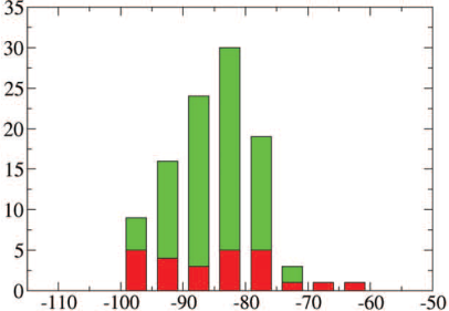
We’re going to use a dummy (hidden) XY series on the chart, whose data labels will become the labels we want our axis to display.
We’ll start with two sets of data. The first (below left) is the data for the stacked columns, using simple counting numbers for the categories. The second (below right) is XY data where X is the list of values where we want our labels, and Y is zero.

Select the first set of data and insert a stacked column chart.

Copy the second range, select the chart, and use Paste Special (Home tab of the ribbon > Paste button dropdown > Paste Special), and select the following options: Add data as series, series in columns, series names in first row, categories in first column.

The new series is added as a third set of stacked bars, which don’t show up because their height is zero.
Select the added series by selecting the green bars and clicking the up arrow key. Click the menu key (between the right Alt and Ctrl buttons on most Windows keyboards) or hold Shift and click the F10 function key to pop up the context menu. Click Change Series Chart Type, and choose XY Scatter. This adds a set of markers along the bottom of the chart (I used blue circles in the chart below) and it adds secondary X and Y axes.

Format the scale of the secondary horizontal axis (top of chart) so it fits the data: min = -115, max = -50. Note that the blue circles are now aligned between the bars, where the labels will go.

Hide the secondary X and Y axes by formatting their label position as No Label, and their line color as No Line. This hides the labels and reduces the margin around the chart that previously held the labels.
Hide the primary horizontal labels by using a custom number format of ” ” (that’s right, a space surrounded by double quotes). This hides the labels but keeps the margin in place for the other labels we’re going to add.

Right-click the series of blue dots, and choose Add Data Labels. Excel adds the default Y values (zeros) to the right of the markers.

Format the labels so they are in the Below position, and so they show the X values instead of the Y values.

Finally format the series of dots so they use no markers. And we’re done.
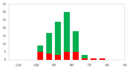
This technique can be used to customize axis labels and add many other labels to your charts.


Bob says
Hi Jon,
Sometimes, there is elegance in simple solutions to quirky problems. Bravo.
Bob
Explication Excel says
It’s clear, Thank you.
Dan White says
Hi Jon,
I hope you can help me please> I was looking for a very old article of yours that was linked from PC Review:
The reason I was after this is a little complicated but I’ll try to explain. This is for a data set that I have inherited, and due to the client’s requirements, I can’t change too much:
1) I have a column chart with two data series, “Incidence” and “Mortality”.
2) Using a related formula in the source data, some of the values in either the “Incidence” or “Mortality” series need to have a red or green border around them if they meet certain criteria. Each valie can either have a red border, a green border or none.
3) With only one data series value (e.g “Incidence”, I have been able to achieve this by adding a red and green data series in the source data, containing only the values that need to be highlighted. I then overlap the series and job is done.
4) The moment I add a second series, “mortality”, positioned adjacent to “Incidence”, I cannot get the overlaps to consistently sit in the right position. Mostly they work ok, but I will then get a red or green border overlapping the wrong data point.
Does this make sense? Your link and description in PC review sounded like it might be what I was after, but it seems to have been removed. I’d be grateful for any advice you could offer.
Dan
Jon Peltier says
Dan –
I don’t totally get your description, but I don’t really think it’s related to that old article. Could you upload the workbook to a file hosting service and post the link?
Dan White says
Hi Jon,
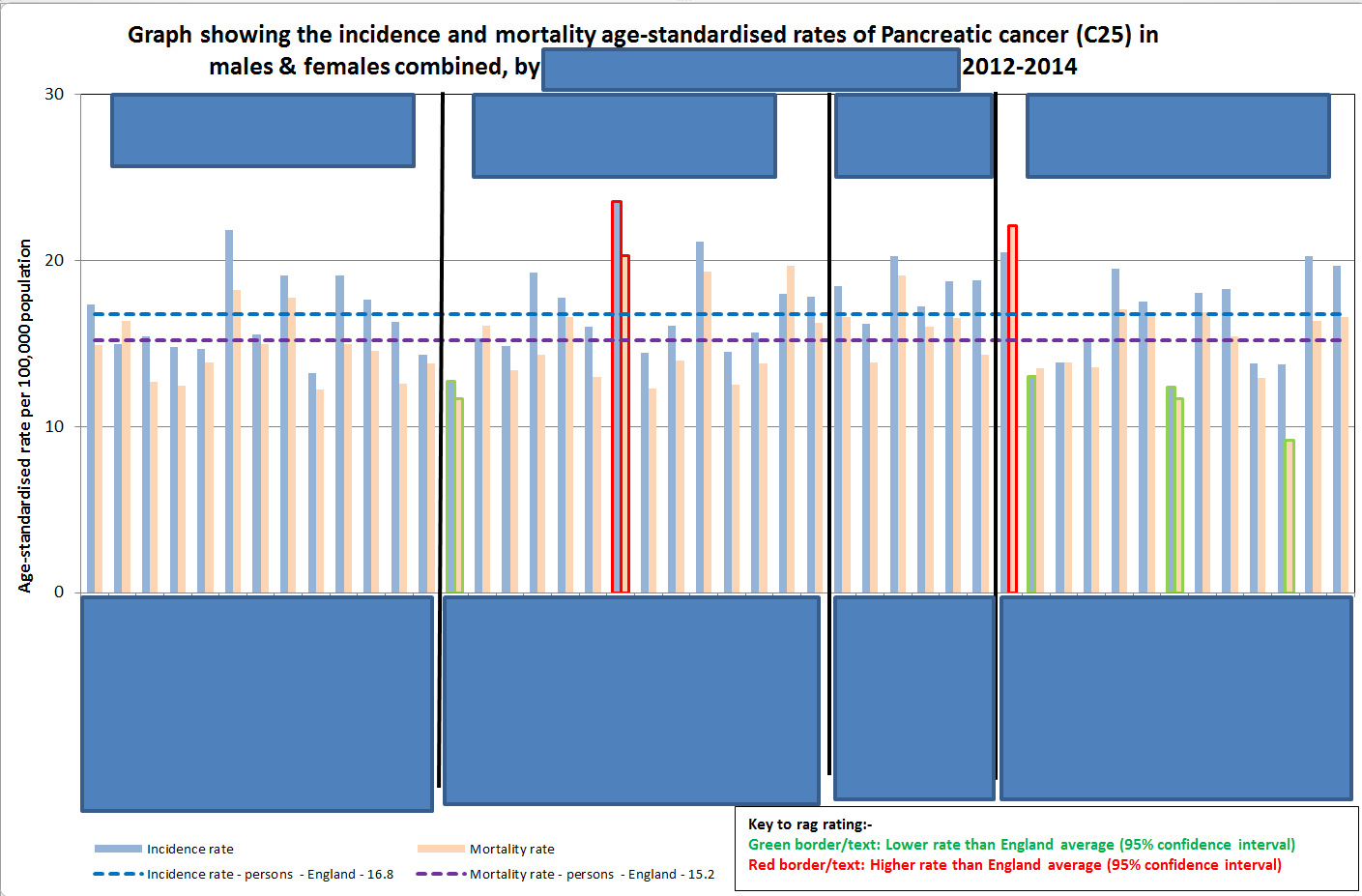
I’m not allowed to post the actual workbook, due to the nature of the content. I’ve posted a screenshot of the chart that I inherited here, so hopefully this will work. :
https://drive.google.com/file/d/0ByG9Bi5I3HONUnIybFE0QkZPYzA/view?usp=sharing
(Apologies for the redacted blue blocks, and the horrible choice of colours for the bars!)
There are two data series, “Incidence” and “Mortality” rates, as well as two lines to show the national rates for comparison to local areas.
For each area, some bars may need to have a coloured outline in Red or Green based on external data (not plotted but in the workbook). As things stood, this was being done manually by going into each chart and changing the outline colour by hand.This is not going to be sustainable in the future though as we produce more charts.
I attempted to automate this by adding two extra data series for incidence and mortality, where the new data series only contained values that met the “Red or Green outline” criteria, with the rest of the cells empty. I then formatted the series with no fill and red or green outline as applicable, and set the series to overlap.
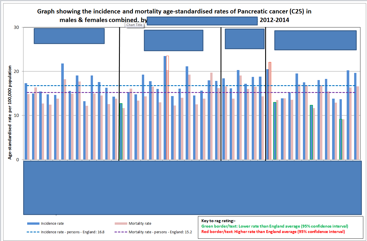
Unfortunately I seem to end up with the following problem:
https://drive.google.com/file/d/0ByG9Bi5I3HONU0hjS2M5Xzl0cnc/view?usp=sharing
Approximately halfway along the chart, there is an “Incidence” value that should have a red outline, but the outline has appeared adjacent to it over the “Mortality” series value. Conversely, the third value from the right should have a green outline on the “Mortality” series value, but it has appeared to the left over the incidence series value.
To recap and hopefully make more sense of it, what I think I need are two groups of three data series. Each of the three series in a group need to overlap, but the two groups must not overlap:
1. Incidence series, Incidence green outline, Incidence red outline.
2. Mortality series, Mortality green outline, mortality red outline.
However I try and arrange the data, I seem to have outlines appearing in the wrong place!
Any advice much appreciated.
Dan
Jon Peltier says
Dan –
This is solved using a variation of my Clustered and Stacked Column and Bar Charts, but instead of stacking the different bars, you need to overlap them.
Your data originally must look something like this.
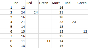
Unfortunately, if you overlap them so the red and green outlines overlap, the incidence and mortality bars will also be overlapped. You need to offset the three incidence and three mortaility values by one row, and then separate the pairs of incidence and mortality rows by another row. So the new data looks like this. I’ve shaded the incidence values light blue and the mortality values light orange, and the inserted rows are blank with “x” in the first column.
You start by inserting a clustered column chart (top chart below).
Format any of the columns, and set the gap width to zero and the overlap to 100 (middle chart).
Finally format the bars as desired (or I guess as mandated).
There are a few more steps to get the horizontal axis labels to look good. This is covered in the Clustered and Stacked Column and Bar Charts tutorial.
Dan White says
Thanks Jon, As ever your solution worked like a charm!
One VERY happy analyst here :-)