Someone asked in the Microsoft Excel Charting newsgroup, “How can I put four pie charts in a printed page, but only have one legend?” Well, the answer to that question has three parts.
- Use a single legend for multiple charts.
- Use data labels.
- Don’t use pie charts.
I’ll address these answers in the order stated above, even though the most important part is the last.
Use a single legend for multiple charts
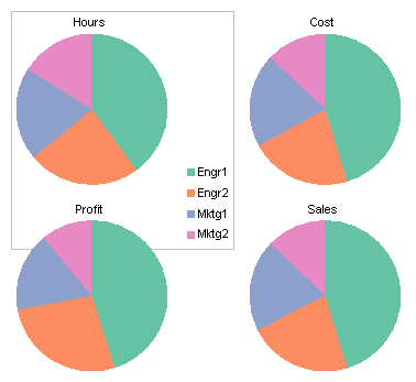
You can simply delete the legend from three of your charts, and arrange the charts so that the remaining chart’s legend is as symmetric as possible. The data shows how four classes of employee (Engineer 1 and 2 and Marketeer 1 and 2) compare in four measured quantities (hours, cost, profit, and sales).

To center the legend among all the charts, keep the legend in the top left chart and delete the legends in the other charts. Make the top left chart taller and wider than the others, and move the legend into the bottom corner. Arrange the other charts in front of the first with a transparent background. This is shown first with a border on the first chart to illustrate its size.
Here are the same charts without the border.
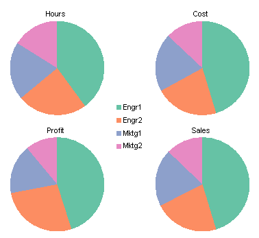
That’s not too terrible, considering it’s a set of pie charts. But it is often better to put the labels on the points themselves instead of sequestering them in a legend.
Use data labels
This option is easier than the first, because all charts can be the same size, and all have the same elements. This is one key to making charts line up nicely. There is no legend, and data labels have been applied using the Categories option.
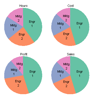
It’s a little cluttered, but your eye doesn’t have to move from the data points to the legend and back.
Don’t use pie charts
As Professor Tufte writes in The Visual Display of Quantitative Information, 2nd edition (p. 178), “The only worse design than a pie chart is several of them.” Fortunately there are several options at our disposal. To the credit of the person asking about pie charts, he said “No donut charts.” It’s a good thing too.
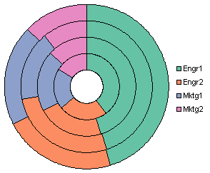
First of all, I don’t know where to put the series labels (Sales, Hours, etc.). Second, if it’s hard to compare the sizes of segments of a pie chart, it’s impossible to judge the sizes of the donut chart’s segments. For example, consider the blue sections. Three of the four have values between 19.7% and 20.0%. Can you tell which is different? Can you tell if the different one is larger or smaller? No way. I’m not telling, either, because first I’d have to look it up in the table*. The blue segment closest to the center looks smallest of all, and in fact it does have the smallest area, but it actually represents the largest value of the blue points. This chart type bears no further discussion.
*A frequently suggested alternative to a pie chart is a table. It contains the same data, arranged neatly in rows and columns, not arbitrarily distributed around a circle, like a pie chart’s data labels.
My favorite chart for this type of data is a simple clustered column chart.

You could make a stacked column chart. Each stack shows the sum of the percentages, the way a pie does. And while this is what pies and stacked charts are supposedly good at, they aren’t particularly good at it. At least the column chart has the percentage axis to help judge values, but it’s not easy to compare values of bars that don’t start at the same height. In the clustered chart above, in contrast, all bars start at the same baseline, so any pair of bars can be compared just by comparing the positions of the tops of the bars. Also for charts of the same height, the resolution of the value axis in the clustered chart is finer, so it is easier to see small differences between bars.

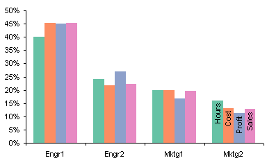
The clustered column chart above is still not ideal. We can replace the legend with data labels to make it easier to decode which bars go with which employees. We can use horizontal labels like this, which are easy to read, but may overlap for certain data configurations.

Or we can use vertical labels, which will not overlap, but are harder to read.
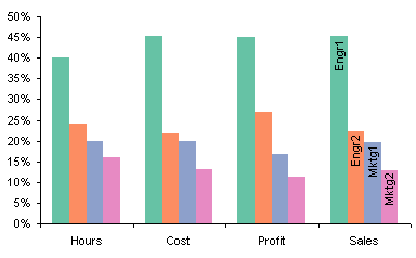
Another advantage of column charts over pie charts is that a single chart shows all the data. If you decide to group your data differently, it’s a simple matter in the chart source data dialog to switch rows and columns.
Edit 21 November 2008
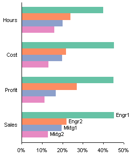
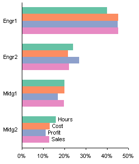
Using bar charts avoids the problems that these column charts have with labels.


Andrew says
I prefer a line chart to a clustered bar chart.
Jon Peltier says
Andrew –
A line chart works in this case.
The problem with a line chart is that the lines emphasize the trend between points rather than the actual values of the points. Since this data is categorical (the X values are not numerical and not continuous), there really isn’t any trend. Therefore, the recommendation is to use a chart type that accentuates the values and not the trends, such as a column chart.
Gary says
Doesn’t the answer depend on what the real-world meaning of the data is? The fake-data aspect of this makes it hard to figure out what that might be.
While the knowable equality (from the data) is for each variable (hours/sales/costs/profits):
mktg1 + mktg2 + engr1 + engr2 = 100%
– which motivates the pie chart/stacked bar approach, I suppose – it would be useful to know what we are trying to figure out or show. In the real world, for example, you might also know that:
sales – cost = profit
which would suggest that we should not use clustered bars, which doesn’t highlight the important point. Alternatively, we might derive additional measures beyond these four, say:
profitability = profit/hours
which would suggest an additional thing to display. Or perhaps there’s other relationships in the data. Hard to tell since they’re fake.
Form must follow function, I guess.
Jon Peltier says
Gary – Thanks for your comment.
Sure, the data’s fake, I made it up for the example. I ignored any possible relationship between the data classes, because for the person who asked the question, “profit” may not equal “sales” minus “cost”.
The point is, between the column chart I proposed and the line chart Andres suggested, there are better ways to present a group of numbers than in a group of pie charts. Naturally this makes sense when you are looking at similar types of data in similar contexts.
If the classes of data are different, it is better to put the charts into different charts, even in different sections of the report. It’s not just about the micro-optimization of information transfer produced by selection of chart type, it’s also about the macro-optimization of information transfer provided by the entire presentation or report.
Gary says
I wasn’t trying to pick so much on the fake data per se. The post looked at an issue- “how do you best present multiple part/whole relationships?” – and what occurred to me is – under what circumstances might you actually want to do that, and might there be a “third way” that conveyed the point and avoided the liabilities of each of the charts? But that third way is going to depend on what the data actually mean.
I ran into this issue with survey data – where the internal relationships of the “financial” labels you put on your data don’t hold – and it’s a thorny thing to cut up how 3 categories of people (plus the sample as a whole) responded to a 5-choice multiple-choice question. I used clustered bars – but a table is probably best in the end – maybe color-keyed to point out where a group responded significantly higher or lower than the total.
Jon Peltier says
Gary – I don’t feel picked on. It’s a tricky subject. While pies might be tough to justify, there may be a place for stacked charts. Often a survey offers five responses ranging from completely against to completely in favor, and I’ve seen charts like this:
As we both keep saying, it depends what you want to show.
Gary says
Beautiful – works awesome for likert scales. And pretty good for fruit preference (cherry/persimmon/lemon/lime/avocado?)… :)
My personal cross to bear is getting this stuff done for the web. Any thoughts about Google’s charting implementation? They are beautiful:
Tony says
-Jon
I am not a fan of the [horizontal] stacked bar chart mostly because it becomes extremely difficult to compare any of the series past the first one due to the baseline being different. In your example, can you tell if the Learning category is bigger or smaller between Question 1 and Question 4? I can’t.
I agree with your favorite, which is the simple clustered column chart.
Jon Peltier says
Gary – I said in the main post that stacked charts weren’t so great, but they do work for certain types of data.
Tony – If you need to know what the leaning percentages are, you’ll have to go back to the clustered style charts. What this style is good at is showing the strong feelings (No, Yes) and the general feelings (No + Leaning No, Yes + Leaning Yes). It’s not great, but it gives the impression.
I saw a version of this where the undecided was split across Y=0, with the negative responses added to the Y<0 side, and the positive responses to the Y>0 side.
The advantage of this style is that the more negative bars are pushed left and the more positive bars right, so you can judge relative approval by where each bar floats. The disadvantages are [1] the reduced resolution: the scale goes from -100 (full disapproval) to +100 (full approval); and [2] the same problem as with tornados: you’re trying to compare how far to the left one side goes with how far to the right the other side goes.
You can undo the tornado effect by plotting the positive and negative stacks side by side.
I wonder if it makes more sense to put the stronger feelings next to the axis.
Or change to a columnar orientation.
Jon Peltier says
Gary –
You asked about the Google charting API. It looks pretty simple to use, and offers some useful chart types (and like every other charting package, some junk). I’m planning to look at it when I get some free time, which at this rate will be a week from next summer.
Colin Banfield says
Jon, per the line chart – it’s meaninless in the context of the example, since there’s no relationship among the measures (Hours, Cost, Profit, Sales) or anything to suggest that the measures must be in a particular order. Shuffling the measures around simply gives you different lines, none of which has meaning.
Actually, my preferred method to represent the example data is using “small multiples”, where Hours, Cost, Profit and Sales are shown as separate bar charts. This approach addresses the following potential issues with the clustered column:
1) Eliminates the need for a legend as each chart has only one series (as a aside – when a legend is required on a column chart, it’s easier to decode the legend if it’s placed above the chart because the eyes don’t have to work as hard).
2) Since the measures are independent, they’re probably better off on separate charts anyway. When everything is on one chart, people have a tendency to compare things that they shouldn’t (the bar heights for Engr1 is an obvious example of this problem).
The clustered column alternative for the same data have similar issues, in addition to those that you mention.
It’s somewhat unfortunate that Excel only knows to plot everything on a single chart and provides no option to plot data on separate charts when you select a data range covering multiple series. However, one could adapt the VBA code in your excellent post “Creating Charts in a Grid” for thiis purpose. Hmmm…now that I think about it, that code could be generalized so that a dialog box is used to specify the grid parameters *and* the chart type.
By the way, this is a great blog with excellent discussion topics. Keep up the good work!
Colin
Jon Peltier says
Colin –
Nice response. I agree about the line chart. It shows the data, but it also shows nonexistent trends, which change drastically as the categories go from one arbitrary order to another.
If the data classes were related, like different categories of costs, the clustered columns would show if an employee group accounted for the same percentage of each type of cost. In this case, the relationships are false.
Re small multiples, I’ve been showing examples of panel charts for a few years now, since even before I heard Kelly O’Day call them “panel charts”. I think he originated the term, and I like it, so I’m sticking to it. Anyway, here’s a panel chart of this data, crafted in Excel:
I think my next big non-work project will be a utility that takes a data range, arranges it appropriately, and constructs a panel chart.
Thanks for the comment about the blog. I’m enjoying it a great deal. I’m afraid that posts like this use up more of my good material in the comments! Look at all these alternative charts I’ve put into the follow-ups.
Jon Peltier says
Tony –
Looking back at those one-sided half-tornado charts, I can see how they would be confusing. I find that as I work on different alternatives, I become so familiar that I know what the chart means without thinking about it. Someone looking at it cold has a lot of work to do to come up to speed.
The tornado-like chart that balances on zero does seem to be a good approach. I saw that on someone’s web site the other day, I don’t recall whose. I hope they see this and speak up, so I can say thanks.
Tony says
Great points Jon! After looking at the new tornado type chart where neutral is in the middle I can effectively see the Yes/No and undecided or neutral. The other three versions start to get confusing and may lose the audience.
Colin Banfield says
Jon, it wasn’t my intention to preempt your future discussions but the panel chart shown here based on the superb techniques you describe on your Web site is a great solution. My thinking only went as far as creating sparate small charts.
….Now feel free to continue where you left off on the SPC discussion…. :^)
Colin
derek says
I thought “panel charts” was William S. Cleveland’s term in the 1980s, before he decided to call them “trellis displays” in the 1990s. But I can’t now find any unambiguous reference to that, so I guess I was imagining it.
DaleW says
Jon, adding the tornado effect to the stacked bar chart for 5-point Likert scale survey data is nice, and something I hadn’t seen before.
The simple stacked % bar charts (with color coding) are scaled to cumulative %, which tends to be very useful if the categories are ordinal but worthless if the categories are nominal. You can’t read cumulative % directly from your favorite clustered column chart’s scale. Depends what you want to show.
Terry says
Hello Jon,
I’ve been looking everywhere how to make the first chart as you show in your post dated May 2, 2008 at 6:36 pm using Excel. I have a level of satisfaction scale that ranges from extremely satisfied, somewhat satisfied, somewhat dissatisfied, and extremely dissatisfied. I would like the Y=0 in between the two Somewhats, with the positive moving to the right and negative to the left. Is there a simple way to achieve this in Excel? Thanks
Jon Peltier says
Terry –
Arrange your data as shown below, with negative responses given as negative numbers, somewhat dissatisfied before satisfied (so the responses are out of order). Select the data and create a stacked bar chart. You’ll have to reverse the order of categories on the vertical axis.
Terry says
Ahh yes! Thanks so much. I didn’t even consider using negative numbers. Seems so obvious now. It works perfectly.
How would you deal with a neutral response that would be half positive and half negative? Thanks in advance.
Jon Peltier says
Terry –
Everything’s obvious when you know how it’s done.
For the neutral response, I use two columns, one with half the value, negative, placed before the moderate negative response, the other with half the value, positive, before the moderate positive response.
Terry says
Thanks Jon. I think I’ve got it figured out. I’m having some slight issues with the ordering and the legend, but I’m better off than I was previously.