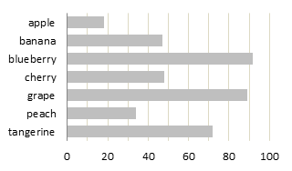
In The Right Colors Make Data Easier To Read (Harvard Business Review), Sharon Lin and Jeffrey Heer report that using “semantically resonant colors” make charts easier to read. They offer this before and after figure to support their claim, where default colors are shown at left, and semantically resonant colors shown at right.

See what they did there? Apples are green (except of course when they’re red), bananas are yellow (except for the green and brown ones in my kitchen), blueberries are blue, etc. Joking aside, this makes intuitive sense at first.
However, I didn’t think the changed colors made the second chart appreciably easier to read. Part of the problem is that the identification of the colored bars requires repeated eye jumps from the chart to the legend, and the seven colors in this chart use up the three to five to seven chunks of short term memory at my disposal.
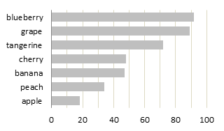
I usually advise people to replace the chart’s legend with labels closer to the data points. In this case, category labels right on the axis work well. I’ve also rotated the chart to make use of easy to read horizontal labels. The numerical scale also has a greater resolution, since it uses the width of the chart rather than the shorter height. This is another advantage of a rotated chart, given a wider than tall aspect ratio.

Note that no colors are required to give the chart meaning.
Unless you need to look up a particular value by name, it is usually beneficial to sort the data by a factor other than alphabetically by name. In this case, I’ve applied a sort by decreasing value. With only seven points, looking up a particular fruit isn’t much of a burden despite not being sorted alphabetically.

Colors or shades of color can be useful to highlight particular values. If I were writing a brochure about the growing tangerine market, I could use a darker shade of my fill color to easily show where tangerines fit among their peers.

I realize the authors were using the simple bar chart to illustrate their point about semantically resonant colors. However, more basic best practices for simple bar charts tell us to ignore these colors.
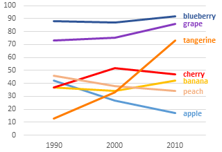
If I wanted to differentiate different data sets in a line chart, of course, this use of colors would be helpful.

Note the use of best practices here. There is no legend, instead, data labels have been applied directly to the data. The labels have also been colored to match the data.


Rick Wicklin says
Excellent advice, as usual. Sorting the categories by counts almost always helps to tell the story of the data. If you do use color for the bars, it might make sense to put the reference (or “control”) category first in the order.
Jon says
Great points Jon! I think that in today’s world we tend to over use colors for a few reasons… 1. It’s very easy to do and the software typically defaults to colorful charts. 2. As designers (chart engineers) we want our message to be read and assume that the more colorful it is, the more it will stand out on a page. I see this mistake made a lot, and I have to admit that I am guilty of it too.
Even on the page above, when I scan down it quickly, the two colorful charts at the top stand out the most. But just because they stand out, doesn’t mean that they tell a story or communicate an idea effectively. I think your sorted bar chart with the tangerine in a darker color does the best job of that. And it might stand out even more if you just colored the tangerine bar orange, leaving all other bars gray.
One of the biggest challenges I face is convincing readers that less color is better. Especially when readers are used to seeing the same colorful chart every week or month. It would be interesting to know what techniques others use to persuade their audience to accept less color.
Jon Peltier says
Jon –
Not only do people love colorful charts, they love 3D charts. That’s the first hard piece, convincing the customer to use simpler 2D charts. The higher the customer, the harder this is. Engineers and technicians like the idea of simpler charts, managers and directors need some convincing, and VPs insist on 3D.
I worked on a project building a reporting program for a big company, and it was 2D and simple colors all the way. My contacts at the client company were very happy. But when it was time for the VPs (yes, a committee of them) to sign off on the project, their consensus was that it was all great, but could I use the default 3D formats instead of the 2D styles I’d created. And this was the old ugly Excel 2003 3D formats, not the merely unattractive Excel 2007 3D formats. Because I’d used dummy series to place labels in appropriate places on the chart, I would have had to start from scratch (since 3D charts don’t allow most practical dummy series approaches). They said thanks anyway, paid me for my time, and stuck with their existing manual 3D system.
MrGeneralLedger says
Jon,
Being color blind, I try to avoid relying on color to tell a story in my graphs. This does not mean I only use black and white. I do use colors but I make sure they are quite contrasting, the data is well labeled, and sometimes fill with patterns. Doing this also aids other users of my graphs who may not be using color printers.
John
AlexJ says
The point is valid for the kind of data presented. Here’s the “however”: human factors engineering has developed a body of knowledge which demonstrates the ability of humans to recognize data based on multiple (and resonant) characteristics. The most common example would be a traffic light system, where color, shape, sequence, and behavior (flashing or not) re-inforce each other so that humans can quickly and consistently recognize the information encoded. This also helps the color blind, for example, understand the trafffic light information.
As a practice, I use color and shape to reinforce message, e.g. red = bad, green = good, orange = warning, everything else, not so important. I try not to use those themes when they are not present in the data.
To Jon’s point about grey-scale and highlighting, this is exactly the way that humans can be helped to find the important information in the data.
Dinesh K Takyar says
Loved the grey charts and the point about colors bought home nicely. The line color chart just deepened the understanding of using colors fruitfully. Thank you for sharing!
Mike Cowley says
Excellent article, and helped me change a couple of charts I regularly use for clarity.
Not sure I want to eat your blue apples though…
Dave Bruns says
Nice article, I agree with you that no colors are needed to give the chart meaning. In fact, I think the colors in the example just create extra noise that interferes with understanding the chart.
Way back, when I worked more in design, I read some advice about logos and layouts that’s always stuck with me: a good design works well without color. When you have a design that communicates well in B&W, you know it’s good, and you can always add color later if needed. For that reason, I’ll often try to avoid color initially because I find it’s just a distraction from the main goal.