This week in the Mr Excel forum, someone wanted to know how to set Graph Colors to match cell colors. A couple years back, my good buddy Mike Alexander presented code that Color Pie Chart Slices to Match their Source Cells. But I thought of a couple enhancements and I need to increase my posting frequency, so here goes.
Basic Data and Chart
Start with a simple data set:
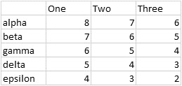
Create a stacked column chart:
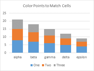
This will work with stacked or clustered column charts, stacked or clustered bar charts, and pie charts.
Formatted Data and Chart
Enhancement Number One: Work on all reasonable chart types that use fill colors for each point.
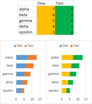
Apply the fill colors to the cells that you want applied to the plotted points. Just fill colors; the VBA code will ignore borders and skip any cells that don’t have a simple “Solid” fill pattern.
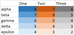
Select the chart and run the procedure. The points (bars) will be filled with the same colors as the corresponding cells.
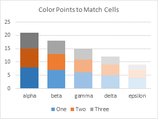
It works on bar charts too.
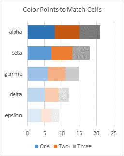
Note that the legend colors haven’t changed, because we’ve changed the points one-by-one, and haven’t changed the series. Even if you changed all points in a series to the same new color, the legend will still show the old color. See?
Partially Highlighted Data and Chart
Enhancement Number Two: Apply fill colors only to certain highlighted points.
That was pretty cool. What if I only want to change the colors of some of the points, indicated by the selective colors of the following data set?
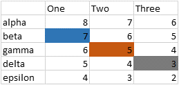
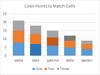
Look, it works! The program skips any cells with no fill color (in code, it skips cells with a fill pattern of “None”).
The VBA Procedures
The first procedure is a stub that is used to reformat the active chart.
Sub ColorActiveChartPointsToMatchCells()
  If Not ActiveChart Is Nothing Then
    ColorPointsToMatchCells ActiveChart
  End If
End Sub
You can call the main procedure inside of any other code to format a chart you’re working on, like this:
ColorPointsToMatchCells ChartIAmWorkingOnA variation allows you to format all selected charts at once (use Ctrl+Click to select multiple charts):
Sub ColorSelectedChartPointsToMatchCells()
  If Not ActiveChart Is Nothing Then
    ColorPointsToMatchCells ActiveChart
  ElseIf TypeName(Selection) = "DrawingObjects" Then
    Dim shp As Shape
    For Each shp In Selection.ShapeRange
      If shp.HasChart Then
        ColorPointsToMatchCells shp.Chart
      End If
    Next
  End If
End Sub
The second procedure accepts a chart as input. It cycles through all series in the chart. If the chart type of the series isn’t column, bar, or pie, it skips that series. Otherwise it parses the series formula to find the formatted range containing the series Y values. The code then loops through the points in the series (and the cells in the source data range), and if the cell has a simple “Solid” fill pattern, it uses the fill color of the cell as the fill color of the corresponding point.
Sub ColorPointsToMatchCells(cht As Chart)
  Dim srs As Series
  Dim sFmla As String
  Dim vFmla As Variant
  Dim sYvals As String
  Dim rYvals As Range
  Dim iPt As Long
  Dim nPts As Long

  If cht Is Nothing Then GoTo OuttaHere

  For Each srs In cht.SeriesCollection
    Select Case srs.ChartType
      ' only do pie, bar, column charts
      Case xlPie, xlBarClustered, xlBarStacked, xlBarStacked100, _
          xlColumnClustered, xlColumnStacked, xlColumnStacked100

        On Error GoTo SeriesError

        ' get series information
        sFmla = srs.Formula
        nPts = srs.Points.Count
        vFmla = Split(sFmla, ",")
        sYvals = vFmla(LBound(vFmla) + 2)
        Set rYvals = Range(sYvals)

        For iPt = 1 To nPts
          ' don't change point color if cell has no fill color
          If rYvals.Cells(iPt).Interior.Pattern = xlSolid Then
            srs.Points(iPt).Interior.Color = rYvals.Cells(iPt).Interior.Color
          End If
        Next
    End Select

SeriesError:
    On Error Resume Next
  Next

OuttaHere:

End Sub
Note that I used
srs.Points(iPt).Interior.Color = rYvals.Cells(iPt).Interior.Colorto format the points of the series. The Interior property of a chart series has been deprecated, and the official syntax has changed to the much simpler and easier to remember </snark>
srs.Points(iPt).Format.Fill.ForeColor.RGB = rYvals.Cells(iPt).Interior.ColorBut it seemed to make sense to use Interior for both cell and point, especially in this case deprecated doesn’t mean “no longer works”.


Bob says
Hi Jon
Will this work on xy or line charts?
I can see hooking this routine up to some controls on some dashboard reports to show progress or change since last report… That sort of thing.
Cool stuff.
Jon Peltier says
Bob –
I have only set it up to do charts that use fills. I suppose it would be easy enough to recolor the markers in a line or XY chart.
baud says
Hi,
for area Charts after declaration this is working:
Case xlAreaStacked
On Error GoTo SeriesError
‘ get series information
sFmla = srs.Formula
vFmla = Split(sFmla, “,”)
SeriesNames = Split(vFmla(0), “(“)
SeriesName = SeriesNames(1)
Set SeriesNameRange = Range(SeriesName)
srs.Format.Fill.ForeColor.RGB = SeriesNameRange.Interior.Color
baudl says
Hi,
did you find out how to take Advantage of “conditionally formatted” cells?
-baudl
Jon Peltier says
It is not easy to determine the color of a conditionally formatted cell. I mean, you can see what color it is, but it’s very roundabout to determine what color is being applied. Excel thinks the cell has the same color as before, because the conditional format works as a kind of overlay. You need to find any and all conditions that apply to the cell, then see which are true or false, and then determine what effect the true conditions have on the cell’s color. It was hard enough in Excel 2003, which had at most three conditions per cell and had only formulas to judge the conditions. In 2007 and later, there can be many conditions, and the judgement does not stop after on condition is true, and the conditions need not be phrased as a formula.
So, no, I have not even attempted to apply this technique to conditionally formatted cells.
baudl says
Hi,
I wondered about the conditional formatting. Since we don’t Need to catch the CF on the fly and we can Color the cells also while processing the Chart, I enhanced the function to put the CF right into the Cell. Next time the Chart is updated it will catch modified CF.
see here:
Jon Peltier says
Well, I learn something new every day.
I didn’t know about the .DisplayFormat property, which was introduced in Excel 2010, and which describes the format of the cell after any conditional formatting has been applied. That would be your answer.
Piotr says
Jon,
I have been using macro from this example a lot. I found it very useful and helped me a lot.
I thought I could modify your code to be able to plot column plot which plots matching color and pattern. Unfortunately my VBA skills are to basic to do it and after few attempts I have decided I need to ask you direct.
Is it possible to create a plot which will have color and pattern as source cell color and pattern?
regards
Piotr
Jon Peltier says
Piotr –
I rarely use anything besides a solid color, so I’m unfamiliar with the syntax of color patterns. Have you tried recording a macro while coloring both a cell and a bar using the desired color and pattern? To format a range:
To format a bar (column) in a chart:
So in the last section of the loop, where it applies the colors, you need to include both fore and back colors and pattern. In the simple case above, with just one color, I could use the same syntax for chart element and for cell; this is the older style syntax from Excel 2003 and earlier, which mostly still works on charts, even though there is a new syntax for that. As soon as the colors and patterns get more complicated, I had to use the newer syntax for the chart colors. I could use the same syntax for Pattern, even though the recorder produced a different syntax.
Ito says
Hi Guys,
first of all, thanks for your great work! I’m new to Excel Macros and am stuck with a seemingly simple task..none of the above Codes worked for me (except for baudl’s post, which did something to my diagram, but not what I expected or what I could comprehend…)
I have a data table (C3:O23) and want the values portrayed as a stacked column diagram. So far so good. But the cell values as well as the respective cell fill color (the numeric value represents minutes; the color the category of a task that has to be finished within the timespan-value). Both the numeric value as well as the color (category) will change frequently during project planning.
The bar length, which represents the timespan in minutes updates smoothly and just fine. But I can’t figure out how to get the graph’s data points to update their fill color accordingly to their respective cells.
I have stored the file here:
https://www.dropbox.com/s/k9exfp6n0mwca6q/Auto%20Update%20Diagram%2001.xlsm?dl=0
any help is much appreciated!!
Thanks in advance
Ito
Jon Peltier says
Ito –
I looked at your workbook. The first thing you should do is remove the blank rows between rows containing data. This is best practice and makes everything work better. It also means you should change the gap width in your chart from 0% to 100%. I also got rid of the shadows on the bars in the chart, because less clutter is better.
Then I see a bunch of code in the workbook, but nothing that matches what is in this tutorial, so I can’t tell what you tried. I added the code exactly as shown above and ran it, and the bars in the chart picked up the colors in the worksheet.
benedict Robbins says
I am very new to VBA and I’m trying to write a code that can produce an xy plot series the same colour as the series name (that has been conditionally formatted (CF)), so that when I update the graph it automatically updates the graph.
The series names are conditionally formatted so that when a lithology equals a name then it highlights a certain colour. i.e. Fine SAND = orange.
At the moment I only have an old code, which changes the colour of the xy plot to the colour of the cell in the y axis (which is typically blank). When the colour of the box is manually changed then the macro still changes the colour of the graph (but this is time intensive and makes the macro redundant). However, when I use conditional formatting to change the y column (using an If function such as (=IF(C2=”Fine SAND”, TRUE, FALSE)) it will be orange.
I have added the workbook and macro for adaptation. The top table is conditionally formatted b column using IF functions, where as, bottom table using manually formatted colours.
1. Can you help adapt the code so that the xy series colour displays the same colour of CF cells.
2. Can the code be adapted to the name of the series (column c) rather than y axis.
3. with I also want to modify the code to specifically make the plotted xy values have the line style width of 50 pt and Cap type is ‘Flat’.
Module 3 & 4 are pieces of code I found to help display on CF cells but I don’t know how to add them into my original code or whether they work.
code is below
####################
Other pieces of code for conditional formatting
David says
thanks for your work on this, is there any way to loop through all the charts in a workbook?
thanks
David
Jon Peltier says
David –
You can call the main routine from within another sub that does the looping.
This will do all charts on the active sheet:
This will do all charts (both chart sheets and embedded chart objects) in the active workbook:
esko1902 says
is it a way to update the color of the legend as well please?
Jon Peltier says
The legend shows the formatting for the entire series. The code here shows how to change formatting of individual points. Even if you reformat every point in the series, the underlying formatting of the series itself is not changed. So the legend will not show any change.
I have a modified routine below which checks each cell in the series data range, and if they all have the same color, then the whole series is changed. If all cells do not have the same color fill, then the series (and legend) is unchanged, but the individual points are changed, as before.
In the example below, all cells for each series have the same fill color, so each entire series is formatted, and the legend reflects this reformatting.
In this example, only series One has the same color for all points, while series Two has different colors. In the legend of the changed chart, only series One is changed, while series Two keeps its original color.
esko1902 says
thank you very much for the quick reply, it is AWESOME !!! :)
Carmelo says
Hi there, this is very useful! How can I change the code if I want to make it working for two or more charts at the same time? Thanks
Jon Peltier says
Hi Carmelo –
Great question. I would modify the ColorActiveChartPointsToMatchCells procedure to the following, which finds all charts that you have selected (use Ctrl+Click to select multiple charts).
Sub ColorActiveChartPointsToMatchCells()If Not ActiveChart Is Nothing Then
ColorPointsToMatchCells ActiveChart
ElseIf TypeName(Selection) = "DrawingObjects" Then
Dim shp As Shape
For Each shp In Selection.ShapeRange
If shp.HasChart Then
ColorPointsToMatchCells shp.Chart
End If
Next
End If
End Sub