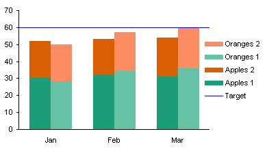
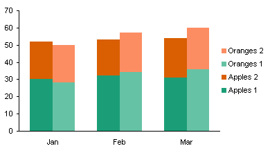
In Clustered-Stacked Column Charts I showed how to create a chart that combined clustered columns with stacked columns. It’s basically just a trick using staggered data to make a stacked column chart so that series display columns for only certain categories, and the gaps give the appearance of clusters of stacked columns. Smoke and mirrors, but it’s an effective use of smoke and mirrors.
That’s been my most popular blog post, and probably the most commented. Many of the comments ask about modifications to the technique to achieve different effects, and mostly these are achieved by carefully adjusting the arrangement of the data. One such request was, How do I add a target line that reaches to the edges of the chart?

The answer isn’t too complicated. Set up the data as shown below.

Using the technique in Clustered-Stacked Column Charts, create a chart using the first five rows of data.

Copy the last row of data (including the label in the first column), select the chart, and use Paste Special to add the data as a new series. A new column series will appear stacked on the rest.

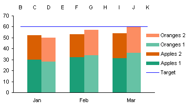
Right click the new series, choose Chart Type, and select the line without markers option. Excel helpfully adjusts the secondary category axis, making the labels visible and making the value axis cross between categories.

No matter, we fixed this once before during the protocol, we can fix it again. Format the secondary category axis so it again shows no category labels, and so the axis crosses at the categories, not between them.


M@rk says
Thanks Jon, excellent addition to clustered-charts and just what I needed ;-)… I wanted to mention (I’m on 2003), my drama was getting the lines to the edges. I had already removed the Pri & Secondary Category labels from the chart (they’re not required), so I found it difficult to get to the “Value (Y) axis crosses between categories” option in the Format Axis window. Also, with only the Secondary Categories (and not Primary) activated, the “…crosses between categories” option wasn’t available anyway. Maybe these items are accessible via other menus, but when ‘playing’ that was my experience, and added to some confusion in the last step. Sorted now. Cheers, will definitely be buying you a coffee!! :-)
Aaron Warnecke says
Jon – This method and adding a horizontal line to a column chart are GREAT methods, but I can’t get them to work for my purposes. I’m trying something similar, adding a VERTICAL line to a HORIZONTAL cluster-stacked chart (rows, not columns), and I can’t get it to work! You’d think it’d be similar, but for some reason it isn’t. I was successful in adding a horizontal line to a vertical cluster chart per your methods, but I don’t seem to be excel-handy enough to convert that to a horizontal bar-style cluster chart – the line simply remains horizontal with the rest of the bars! Can you help me out?
C@th says
Thanks for all the advice and help – however I have exactly the same problem as Aaron Warnecke – I’ve tried every which way I know how to follow the method you outline, but cannot seem to get it to work for a horizontal stacked chart at all. Is there an answer to this please?
Jon Peltier says
Cath –
What version of Excel are you using?
Where do you get stuck?
C@th says
Hi Jon,
It’s excel 2010, and I can create an additional data series and change the chart type to line, but it appears as a horizontal line among the other bars, not a vertical line – exactly as described in the earlier post.
thanks
C@th
Jon Peltier says
Oh, got it. A line chart always has a horizontally oriented series, on a horizontal category axis, and so does a column chart, so a line and column are compatible for this.
A bar chart uses a vertical category axis, which is incompatible with a line chart’s horizontal categories. If it’s a simple bar chart, you can use the approach in Build a Bar-Line Combination Chart.
Unfortunately the cluster-stack bar chart approach I describe uses primary and secondary axes for two sets of bar chart series, so there is no axis left for the XY series. But there’s another way.
Start with data like this. The cluster-stack bar data is in A1:K5 (orange tint), the axis label data is in M1:O4 (labels in column M, XY series data tinted purple), the target data is in Q1:R3 (tinted blue).
Make the stacked bar chart from the orange tinted range (top left chart below).
Change series gap width to zero, reverse order of vertical axis categories, change axis crossing position to maximum category (top right).
Copy the purple tinted range, select the chart, and paste special as a new series, series in columns, categories in first column, series names in first row (bottom left).
Right click on the new series, choose Change Series Chart Type, and select the XY style to produce the purple circles (bottom right).
Select the added series, and add data labels to the left of the markers. This produces labels with the default Y values (top left).
Use one of the approaches in Apply Custom Data Labels to Charted Points to apply the values in column M to these data points (top right).
Format this series to use no markers, then click on the legend, then on the legend entry for “Axis”, and press Delete (bottom left).
Copy the Blue tinted range, select the chart, and paste special as a new series, series in columns, categories in first column, series names in first row (top left).
Format the secondary vertical axis (right edge of chart) so it runs from 0 to 6 (top right).
Format the secondary vertical axis (right edge of chart) so it uses no labels and no line color; format the primary vertical axis (left edge of chart, may be hard to click on) so the axis crosses on tick marks to line up the month labels with the groups of bars.
C@th says
Hi Jon,
that is so helpful, and I can’t thank you enough for your time and trouble in posting this info. I’ve learned more about creating charts in the last two days than in the last 10 years!
I tried your suggestion on my trial version stacked bar chart – first time it worked perfectly, the line appeared exactly as predicted, where I wanted it. When I tried to do the same thing again on the real version (the same just more data) it produced a line, but not where I expected, and at an angle! Now I can’t replicate the first success on any of my spreadsheets. I can’t seem to paste a picture to illustrate it on here, sorry. Thanks again for your help though, its much appreciated. I’ll just keep fiddling with it to see where I’ve gone wrong. cheers
Rahul says
Thanks Jon, your post is still helping people in 2024! Helped me push out a great visual without having to manually superimpose two lines on top of the chart to show the lower and upper bounds.