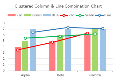
Combination charts in Excel are pretty easy, once you figure them out. But sometimes they present challenges. If you make a combination clustered column chart and line chart, it takes special treatment to align the markers over the columns.
I will warn you that adding several series of lines to a chart with several series of columns might make your chart cluttered and difficult to read, especially if the lines and columns need different axes to show different types of data (for example, dollar sales vs. percentages of target). If that’s the case, you should break down the data into more easily digestible pieces, and use multiple charts for improved clarity.
I often use this technique when I need some kind of special highlighting or labeling, and my added data is partly or totally hidden (by formatting with no markers and no lines).
Setup and First Attempt
We’ll start with data for three categories (Alpha, Beta, and Gamma) and three series (Red, Green, and Blue). These might correspond to three companies over three years, or any other grouping you have in mind.
In addition, we want to display columns and lines for each series, showing perhaps target sales values as columns and actual sales as markers on the lines. Here is our data and the separate column and line charts.

Making a combination chart is pretty easy. Start by plotting all of the data using one of the chart types in the finished chart. I started with a column chart, but it would work the same if you start with a line chart.

Right-click on any series in the chart, and choose Change Series Chart Type from the pop-up menu to open the Change Chart Type dialog
If you right-click just anywhere on the chart, the menu option is Change Chart Type, and when you select Combo, Excel will use its own favorite combination, and you will have to override Excel’s choices. In this case it would have been okay, but generally Excel chooses something other than what you want.

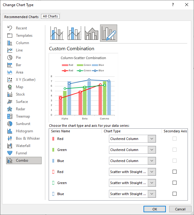
Combo is selected in the list along the left of the dialog, there is a preview of the chart, and a list of all series in the chart, with a dropdown to select the chart type and a checkbox to select the axis of each series.
Change the chart type of each of the last three series to Line with Markers, and leave the Secondary Axis checkboxes unchecked.
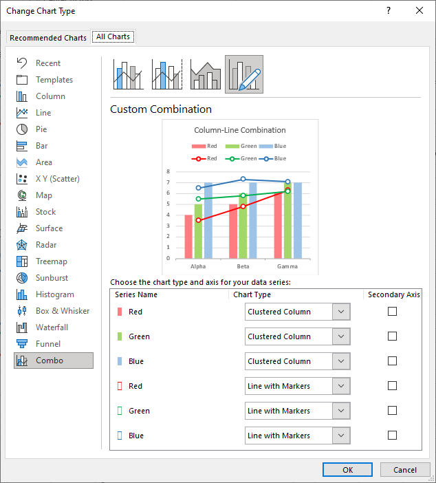
The resulting combination chart looks just like the preview (well, perhaps I’ve formatted it a bit).

That was pretty easy, and it looks pretty good, except for one thing. The markers are all centered in each category and are not aligned over their respective columns. The red, green, and blue markers are all centered on the green column.
This is a consequence of how Excel draws line charts. Each data point fits into a category, and it is centered on a category. Unlike clustered column charts, where the points (the columns) are distributed within a category according to properties Gap Width and Overlap.
So we can’t use line chart series to align markers over columns, but all is not lost. We can instead use XY scatter series, because Excel will plot them along the category axis as if the category axis has a numerical scale.
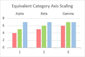
Equivalent Category Axis Scaling
Let’s examine our simple column chart, with three text labels (categories) along its category axis.

Numerical Category Axis Scaling?
If we plot XY scatter data on the chart, Excel treats the categories as if the first category is at X=1, the second at X=2, and so on.
For the XY scatter data, we can consider the axis as a continuous numerical scale starting at the first category number minus 0.5 and ending at the last category number plus 0.5, or in our example, from 0.5 to 3.5. Each category takes up the space from the category number minus 0.5 to plus 0.5.
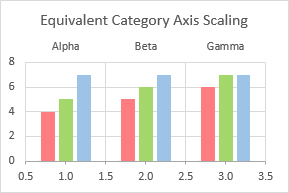
We can calculate X values for our XY data to position the markers wherever we want them. If we had used X values of 1, 2, and 3, our XY series would line up on the green columns just like our line chart series. But we can see that our Red X values need to be a little less and the Blue X values a little more than the category number.
How do we know the precise X values? We can guess and adjust them by trial and error, but we can also calculate them easily enough (you’re not afraid of a few formulas, are you??).
Gap Width and Overlap
Excel’s column and bar charts use two parameters, Gap Width and Overlap, to control how columns and bars are distributed within their categories.
Gap Width is the space between bars in adjacent categories, given as a percentage of the width of a column in the chart. The default is 219%, which means the gap is 2.19 times the width of a column.
Overlap is the amount that columns in one series overlap columns in the next series within a category. The default is -27% (below left), meaning that there is a space 0.27 times the width of a column between adjacent series. A positive overlap of 27% (below right) means that the columns actually overlap by 0.27 times the width of a column.

I don’t know where Microsoft came up with these default values, but they are easy to adjust. Select any series and press Ctrl+1 (the universal shortcut to open the formatting user interface for the selected object in Excel). In the task pane, move the sliders or type in the desired values. I usually choose a gap width of 0.5 to 1.5 (and most frequently 0.75 to 1.0), and an overlap of zero (so adjacent series of columns are touching).

Calculating X Values
So let’s set up the calculations. Here are some variables:
BW: width of a bar (or column) = 100
GW: gap width as percentage of BW
OL: overlap  as percentage of BW
iSrs: the number of the series
nSrs: the number of series
iCat: the number of the category
The X value of a point is the X value of the left edge of a category plus the distance the point is from that edge of the category divided by the width of a category.
The left edge of a category is the category number minus 0.5:
Category Edge = iCat - 0.5
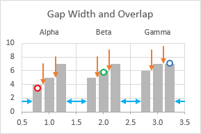
The red marker is half a gap width plus half a bar width from the edge of the category.
The green marker is half a gap width plus one and a half bar widths plus one overlap from the edge of the category.
The blue marker is half a gap width plus two and a half bar widths plus two overlaps from the edge of the category.
The general expression is:
Marker Distance = 0.5 * GW + (iSrs - 0.5) * BW - (iSrs - 1) * OL
The width of a category is the gap width (half on each side) plus the bar width times the number of series plus the overlap times the number of series minus one. Actually minus the overlap, because a negative overlap adds to the total width:
Category Width = GW + nSrs * BW - (nSrs - 1) * OL
The complete expression for the X value of a marker is:
X = iCat - 0.5 + [0.5 * GW + (iSrs - 0.5) * BW - (iSrs - 1) * OL] / [GW + nSrs * BW - (nSrs - 1) * OL]
We can simplify this formula since all red markers are offset within a category by the same amount, as are all blue markers, and all red markers. We can then calculate each offset only once and use a lookup formula for each point.
X = iCat + Xoffset
Xoffset =  - 0.5 + [ 0.5 * GW + (iSrs - 0.5) * BW
Here is the data range I have set up:
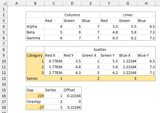
B2:H6 contains my original column and line chart data. B15:D18 is where I calculate the Xoffset values based on values of Gap and Overlap entered in the appropriate cells. The formula in D16 (filled down to D18) is:
=($B$16/2+($C16-0.5)*100-($C16-1)*$B$18)/($B$16+MAX($C$16:$C$18)*100-(MAX($C$16:$C$18)-1)*$B$18)-0.5
B8:H13 contains the helper row of category numbers in column B and the helper row of series numbers in row 13. There are X and Y values for the three XY series. The Y values come from F4:H6 in the table above. The X values in cell C10 (and copied into C10:C12, E10:E12, and G10:G12) are calculated by this formula:
=$B10+XLOOKUP(C$13,$C$16:$C$18,$D$16:$D$18)
Clustered Column and XY Scatter Combination Chart
There are several ways to generate the combination chart. You can start with a column chart with three series then add the XY data. To add the Red XY data, copy the range C9:D12, select the chart, and choose Paste Special from the Paste dropdown on the Home tab of the ribbon. Select the appropriate options in the dialog: New Series, Values in Columns, Series Names in First Row, Categories in First Column, and DO NOT CHECK Replace Existing Categories.

The data is added as another column series; we’ll fix that shortly. Repeat with the Green data in E9:F12 and the Blue data in G9:H12. Here is the column chart:
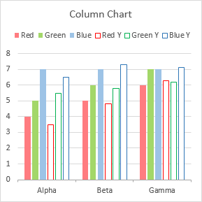
Convert to a combination chart as we did above for the column-line chart. Right-click on any series, and select Change Series Chart Type from the pop-up menu. Change the chart type of the last three series to Scatter with Straight Lines and Markers, and UNCHECK the Secondary Axis checkbox for all XY series.
Another way to generate the combination chart is to build a column chart using the block of data in C3:H6, changing the last three series to XY Scatter, then changing the data for these three series. Change the chart type before changing the data.
Changing the data is easy. You could right=click on the chart and choose Select Data from the pop-up menu and wrangle with that uncomfortable dialog, but my favorite way is to edit the SERIES formula directly. For example, the formula for the red scatter series starts out as:
=SERIES(Sheet1!$G$3,Sheet1!$C$4:$C$6,Sheet1!$G$4:$G$6,4)
but I edit it to:
=SERIES(Sheet1!$D$9,Sheet1!$C$10:$C$12,Sheet1!$D$10:$D$12,4)
You can type the new row and column addresses, or you can select a reference in the formula (select both the sheet name and the cell address), then drag to select the new data range in the worksheet with the mouse.
The Finished Clustered Column and XY Scatter Combination Chart
Here is the complete data range plus the chart.
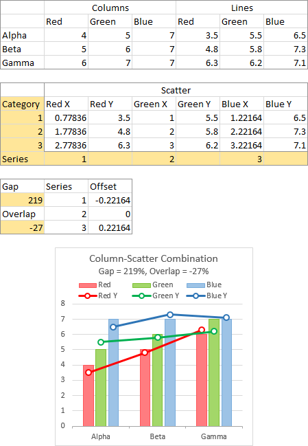
Looks good. Let’s check with the same gap width but a positive overlap.

Also looks good. How about a smaller gap and zero overlap?

Still looks good. What if we add a series and a category?

Looks good, except that all those lines make the chart a bit cluttered. What if we plot markers without lines?
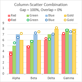
The calculations work and the cleaned-up chart looks pretty good.
More Combination Chart Articles on the Peltier Tech Blog
I wrote a similar post a couple years ago about Precision Positioning of XY Data Points. If the explanation above isn’t clear, you might try this other article.
In addition, I have written several more articles about combination charts:
- Pareto Charts in Excel
- Precision Positioning of XY Data Points
- Add a Horizontal Line to an Excel Chart
- Horizontal Line Behind Columns in an Excel Chart
- Bar-Line (XY) Combination Chart in Excel
- Salary Chart: Plot Markers on Floating Bars
- Fill Under or Between Series in an Excel XY Chart
- Fill Under a Plotted Line: The Standard Normal Curve
- Excel Chart With Colored Quadrant Background


Bob says
Hi Jon,
Great post as always. Now, if I only had a situation to use this cool technique.
Cheers
Bob
Bob says
Not related to this post, will a recording of your webinar about building the spiral Covid chart be available on your blog?
I had a work meeting at that time and could not attend.
I am curious how you scaled the axis.
Marvi says
I have tried the above method but i am not getting the above graph even using your data.
Jon Peltier says
Could you upload a screenshot or your workbook so I could help debug it?
Carin says
Once complete – is there a way to enable secondary axis on a pair from the column and the scatter datasets? The option is available on the scatter but not on the clustered columns. Wondering how to do that.
Nice how to by the way!
Jon Peltier says
When there are only column type series in the chart, you can assign any of them to the secondary axis.
When you change some of the column series to XY scatter type, Excel automatically assigns them to the secondary axis, and does not allow you to assign any remaining columns to the secondary axis. Even though you can assign all XY series to the primary axis, freeing up the secondary axis, you still cannot assign a column series to the secondary axis.
This kind of chart is already pretty complicated, though, and moving some column series to the secondary axis throws the columns into disarray, because the secondary axis series will overlap the primary series. Fixing this overlapping is complicated and requires adding a bunch of hidden (“dummy”) series. And of course, the chart becomes very difficult for people to keep track of which series are on which axis and to interpret accurately.
For this reason, I don’t use secondary axes for plotting different ranges of data, but only to get special visual effects in the chart.