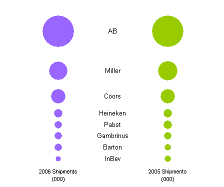
Last fall, Many Eyes posted a bubble chart to show US Beer Shipments by Supplier. They made the chart using a visualization technique they call the matrix chart, which essentially supplies a matrix of rows representing one parameter, columns representing another, and a graphic at each grid location representing some value. In this case, the columns represented year, the rows represented beer distributor, and the graphic was a circle with an area proportional to the sales volume for that distributor during that year. Presumably sales volume was in dollars, but given that Anheiser Busch was the leader, it may well have been in gallons.
Many Eyes uses a Flash utility to plot their data, which has the benefit of being interactive. I made my own version of their chart using Microsoft Excel, which isn’t as interactive, but everyone seems to have it on their desktop, and I could easily write a short program to replicate the chart type for any data set. Here’s my version of the chart:

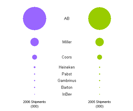
It’s not too bad, and I think the centered labels may be a slight improvement, but in general I don’t care for the chart style. Excel has an option which makes the chart even less likable, which is to make the width of the bubbles, not the area, proportional to the plotted value. Here’s the width version:

Based on bubble area, a bubble with 1% of the value of a large bubble will have 1% of the area or 10% of the width, so small values are still readily visible. Based on bubble width, the 1% bubble is 1% of the width of the large bubble, and as you can see (or can’t see), the smaller bubbles risk disappearing altogether.
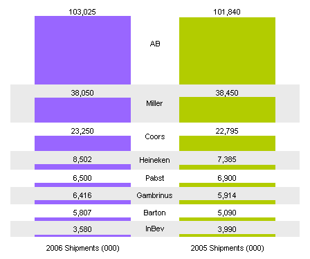
Nathan of FlowingData also didn’t care for the bubble chart approach has proposed an alternative. He instead made what’s called a stacked floating bar chart, also using Many Eyes’ matrix chart Flash utility. In the Flash utility this was a pretty simple matter of clicking a button to change the chart type, which is a huge advantage. I used Excel, which in this case meant I had to highly configure a custom chart range, involving large arrays of worksheet formulas, and plot as many hidden series as visible series, but I got a decent looking version of this chart:

I think my version’s distributor labels are well placed between the columns of data, though I could easily enough have located them off to one side. The advantage of this chart type is that the values are based on the thickness of the bars, and cognitive scientists have demonstrated that human perception of one dimensional variables (i.e., length) is much more accurate than that of two dimensional variables (i.e., area). This is the rationale for not using pie charts, because humans are not very good at comparing the areas. The angular misalignment of wedges in the pie makes this comparison even worse. But I digress….
The problems with this chart involve the configuration of the bars. For even the largest values, the bar width is much wider then the thickness, so the thickness is not readily perceived. Bars for different years from the same distributor are difficult to compare because of the small heights of the bars and because of the distance between the bars (so perhaps the labels should be moved to the side and the bars moved together). Bars from different suppliers are even harder to compare because they do not share the same baseline, but are offset vertically. To make the values easier to compare, labels have been added showing the values themselves. The result is that the chart has been converted into a table with excess chart junk. All in all, I found this chart style lacking, no better than the bubble version.
I made a quick attempt at a third chart type. It has several benefit over the other chart types:
- it has the simplest data layout,
- it has the simplest chart layout: no extra series are needed to help position labels or offset colored bars,
- it has a common baseline for all bars, facilitating comparisons across all factors,
- it is a common chart type, familiar to most if not all viewers,
- it is a standard chart style, built into most if not all plotting packages, even Excel.
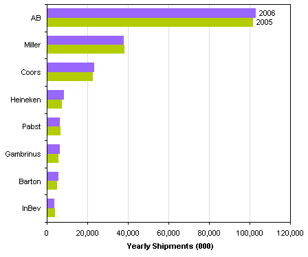
The chart type that shows this data best is a simple clustered bar chart.

It is very easy to see small variations among the smaller distributors, and you can easily see which distributors saw increased vs. decreased sales in 2006. This simple chart is a good example of the KISS principle: Keep It Simple Stupid. (I once worked with a Total Quality instructor who was always coming up with more politically correct words for that second “S”, but none of them stuck.) Note that the chart is relatively simple: there are no 3D effects, no shadows or glowing shapes reminiscent of ET (The Extraterrestrial, not Professor Tufte!), no color gradients or bevels or any of that chart junk. The text is simple, the colors are simple, and there are few extraneous lines.


derek says
For a second there, I thought you said your TQ instructor used to come up with *less* PC words for the second S, which would have amusement value :-)
Keep It Simple, Slimeball!
Jon Peltier says
Keep It Simple Sucker, Keep It Simple S-head, yeah, that would have been a good story. It was more like Keep It Simple Statistically. And Have Fun!! I guess it shows how the TQ attitude of being positive and upbeat permeated the staff. Except me. I was an instructor for a couple of years, and never lost that little edge of cynicism. It made people in my classes relate to me better.
Nathan says
your version is definitely easier to see the small differences.
just for the record, i actually do like bubble charts. I would never put them in a technical report, but if I wanted to get some eyes looking, I might consider the “fun” bubbles.
i always though KISS was something they made up for The Office. i can’t believe people actually used that acronym…
Jon Peltier says
Nathan – You did say that bubbles were so much more fun. Maybe I’ll rephrase my misstatement of your opinion.
And yes, KISS has been around for decades. Wikipedia says it’s been around since at least the US Space Program, but it feels like it should be much older.
Tony says
Depending on the goal of the chart, another option may be to simply plot the 2005 vs. 2006 variance in shipments in the bar chart. If the total sales are still important, a label could show % of market.