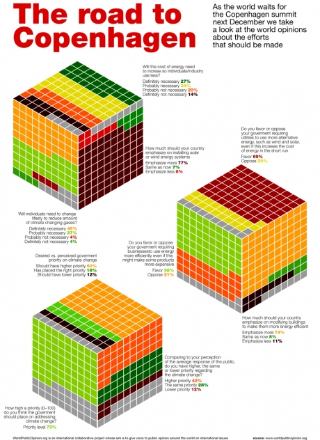
Dustin Smith’s World Opinions on Climate Change article in Chart Porn blog pointed me to an attractive but ultimately ineffective graphic. The road to Copenhagen Summit on Whatype blog presents results of a 2007 World Public Opinion survey of worldwide public sentiment over global warming-related issues. The graphic is reproduced in small size below; click on the image for a full size view.
It’s eye-catching. It also is difficult to read, because of the use of irregularly-shaped polygonal areas to encode values. In fact, the graphic sticks several square pie charts together to make cubical square pies. I addressed square pie charts in Ineffective Chart – Partition Chart Revisited (Defragged), where I noted:
The defragged partition chart reminds me of the “square pie” we first read about in Eager Eyes (Women in IT – Squaring the Pie?), and which was taken up by Juice Analytics (Squaring the Pie), Dashboards by Example (The Square Pie Chart), Anil Dash (Pixels Are The New Pies), Info Clarity (A square pie), Bella Consults (Square pies taste bad), and others.
The square pie chart was all the rage for a while. Consensus seemed to be split between “they’re wicked cool” and they’re even less effective than round pie charts. My own opinion is that they are ineffective: the awkward shapes imposed by rows and columns of filled squares make comparison of areas even more difficult than comparing areas of rectangles with unequal lengths and widths or comparing areas of rotationally misaligned wedges in a pie chart.
As with so many ill-advised charts, a more effective replacement is a bar chart. Here is the Chart Busters version:

I suppose if you felt you had to, you could apply similar colors to those of the cubical square pie chart.

The colors may add to the chart’s ability to get attention, but they may actually detract from its ability to convey information.


Mathias says
Amazing how people get out of their way to create ever-more fancy looking and unreadable charts, where the good old bar chart tells the truth, all the truth and nothing but the truth so effectively… As a member of the color-blind tribe, I can tell you that there is no way I can get the story behind the cube without effort – but spotting the peaks and valleys (if this is an adequate way to describe it, given the horizontal layout!) in a bar chart is a breeze.
Chandoo says
Cubicle square pie chart.. .gosh, I cant imagine the reason why some one would even think of making this. If only people are made to buy carbon credits to make chart pollution…
Thanks for the wonderful advice Jon.
jeff weir says
C’mon guys…EVERYTHING is going 3D these days. Hell, down here in New Zealand we even have a 3D newspaper – check out http://www.3news.co.nz/3D-newspaper-pops-up-in-Taranaki-/tabid/421/articleID/126158/cat/52/Default.aspx
And as with newspapers, if I print these charts out they are perfect for wrapping my 3D fish and chips up with.
gerdami says
Dear Jon,
I am currently visiting your blog with a laptop and screen width of 1024px, which is certainly not unusual amongst your subscribers. Your blog then displays a non-user friendly horizontal scrollbar.
Thanks to FireFox’s firebug plugin, I noticed within the associated CSS file that the width of your “div” named “wrap” was set to 1060px.
#wrap {
background-color:#FFFFFF;
color:#333333;
margin:0 auto;
width:1060px;
}
Please lower width to 1010px and it will fit perfectly on laptops like mine.
DaleW says
At the risk of being considered contrarian, I feel that this, well — Rubik’s cube tribute chart — is a perfect chart for this data.
It would be a tragedy if good and meaningful data were lost in a chart like this.
However, it’s more of a comedy when such soft, feel-good data from a self-serving opinion survey is presented in such pretty but puzzling form. This chart format really is inherently more interesting than the results being presented here.
Consider: by a 7:2 margin, these nonrandom respondents for the world admit to placing a higher rather than lower priority on climate change than the general public. What next? A survey of largely Microsoft employees to see if they believe Vista users should switch to Windows 7 instead of Snow Leopard?
No tough questions were presented in that chart. No “will you support Greenhouse gas regulations even if they triple your electricity and petrol expenses and send more jobs overseas?” No mention of nuclear power, just currently much less large scale cost effective wind and solar power . [Disclaimer — I considered Penn & Teller’s show on nuclear power as a green alternative both entertaining and informative, while I found this chart mostly just entertaining. Informative only in the sense of learning about worst practices in charting, as I believe Jon intended.]
Jon Peltier says
Dale –
A fluff display for a fluff survey? Perhaps you’re right. What I did get out of it, was I used the original large graphic as an opportunity to learn how the OCR piece of MODI (Microsoft Office Document something) worked. And I noticed I had to correct a bunch of misspellings in the text of the graphic. “Goverment” is the one that came up again and again.
Rachele says
Hi Jon,
I am interested in using this chart format but can’t seem to figure out how to assemble it. Do you have instructions or is it a purchasable item?
Jon Peltier says
Rachele –
There’s no magic. It’s just a bar chart. The X values (category labels) are the response options, and the Y values are the percentages. There are spaces between questions (blank rows in the data), and a textbox is places over the gaps in the chart for each question.