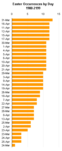
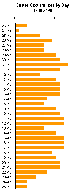
In the Calculating Easter post on John Walkenbach‘s new Spreadsheet Page blog, John presented a bar chart showing the occurrences of the dates of Easter between 1900 and 2199. He sorted his dates in decreasing order of occurrence (below left). In Gradients, Fills, and Shadows, Oh My I proposed sorting in date order (below right).


There are advantages to both sorting techniques. The sorting by occurrence (left), as in a Pareto chart, makes it easy to see which item has the largest or smallest incidence, and if you need to take a particular action, you can simply start at one end of the list and work your way to the other.
Often when people have plot this kind of data, instead of sorting by incidence, they will sort in alphabetical order. This is generally not so useful, because alphabetical sorting is rather arbitrary: only the incidence has a quantitative meaning.
Dates, however, have a quantitative meaning, an order all their own. You can use a Pareto sort, as John has, or a date-order sort, as I have. If you are concerned only with the absolute incidences, then the Pareto sort makes sense. If you are interested in the distribution of incidences over your range of dates, then the date-order sort is more useful. It might help you see that certain days of the week or months of the year tend to have higher incidences.
Another advantage of the date-order sorting (or another numerical sorting in a histogram) is that, if you are pressed for space and compress the chart, you can leave out category labels without deleting information from the chart. In the chart below right, I know that 17-Apr fits right between 16-Apr and 18-Apr. In the incidence sorting below left, I can only guess where 17-Apr fits (between 15-Apr and 30-Mar), and if the incidences changed, I would have to guess again where to find 17-Apr.


I couldn’t think of a good way to plot the way that dates move around as the sampling size of Easter dates changes. I made this table showing the incidences of the date of Easter sorted by occurrence, for 100, 200, 300, 400, and 500 years. I highlighted some arbitrary dates, showing how they move around. Some dates stay relatively close to the same position, but some move up and down many rankings. This rearrangement of the scale makes any comparisons meaningless.

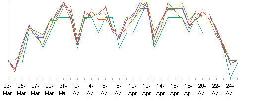
In contrast, the dates in the date-order stay in the same order. By definition. I can plot the curves for 100 through 500 sample points together, and see that they follow roughly the same distribution, and I can plot the curves separately and see the same thing. Even though there may be some movement from one curve to the other, it is easier to understand the charted behavior.


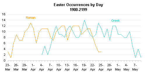
Another reason why I was interested in the distribution by date was for a comparison of the dates of Easter calculated by Western Christians (i.e., the Roman dates) and those calculated by Orthodox Christians (i,.e., the Greek dates). This is part of a topic for an upcoming post, but I’ll illustrate the utility of the date-order scale here.
I can plot the two Easter date distributions either together (first chart below) or in separate panels (second chart below. I can see that the distributions are similar in shape, but offset by about two weeks (the Greeks place Easter about two weeks later on average than do the Romans). I’ve displayed only every third date, but I don’t need the missing ones to understand the distributions. A comparison of two Pareto charts would yield no meaningful observations.


ckz says
I am creating a chart. I have list of items. Within the list there is one row that I do not want included. At the same time, there are rows that are inserted or deleted above the row I do not want included. Is there a way to use ranges to address this?
Example:
Vegetables:
Brocoli 5
Carrots 6
Squash 4
Total Other Items 8
Apples 3
Oranges 3
Tomatoes 2
I want to graph Brocoli through Tomtatoes minus “Total Other items”. At times, the program will insert a row between “Squash” and “total Other items”
Brocoli 5
Carrots 6
Squash 4
Pumpkin 3
Potatoes 10
Total Other Items 8
Apples 3
Oranges 3
Tomatoes 2
How do I make the chart series see the changes between “Squash” and “Total Other Items” and still not include “Total Other Items”.
I really appreciate it if you can help me with this VBA code for excel to create a dynamic chart.
ckz
Jon Peltier says
Is there a method to your madness? You aren’t plotting by order of highest to lowest, nor by alphabetical order.
The easiest thing to do, also the most sensible for anyone interpreting your chart, is to put “Total Other items” at the bottom of the list, because it isn’t a stand-alone item. This way, you only need to know how many rows there are in the range, and plot that number minus 1.
Then you could use a dynamic charting approach like I described in Dynamic Charts.
Jon Peltier says
ckz replied by email:
No plotting by order of highest to lowest, just a pretty pie chart
making a picture of a summary table. I can’t move the the “Total
Other Items” to the bottom because it totalizes everything below it.
I just read through the dynamic chart, can I include two name ranges
with an offset of -1 for one of the ranges to not include the “Total
Other Items”?
Here is my reply:
Hmm, a pie chart. Well, I’ll answer anyway.
Do you want to plot all of the data in your list except for “Total Other Items”? If so, then you should have two ranges, one for display with this item inserted where needed, and the other for the chart without this item.
ckz says
I was a afraid to mention it was a pie chart.
Only one chart minus the row that includes the “Total Other Items”. The problem is that rows will be added or deleted in between the “Total Other Items” and whatever is above it. How do I tell the Offset range to find the word “other” and stop or not include it in the range?
ckz says
Thank you for your help and your web articles. I figured it out.
Naming values above the row with name of “Other” (Other would total anything below it – thereby being redundant in the chart, but a good summary in the table)
VertValues = =OFFSET(Sheet1!$B$1,1,0,COUNT(Values)-1,1)
(Note – the Values range includes the value of the “Other” row)
VertCats = =OFFSET(VertValues,0,-1)
Naming values below the row with the name “Other”
VertCats2 = =Sheet1!$B$13:$B$14
Values = =OFFSET(Values2,0,-1)
Graphing both named ranges.
=SERIES(,(Book2!VertCats,Book2!VertCats2),(Book2!VertValues,Book2!Values2),1)
The answer came from the basic info from the dynamic chart article you referred me to.
Thanks,
ckz
Jon Peltier says
Very nice. I was writing up a VBA approach for tomorrow, and I’ll still use it (thanks for the topic). But I always like to see someone take a few hints and figure out how to make it all work.