Jan Schultink shows that effective charting practices work in PowerPoint as well, in his Chart make-over example on Slides that Stick. He gives an example taken from some financial data from Skype.
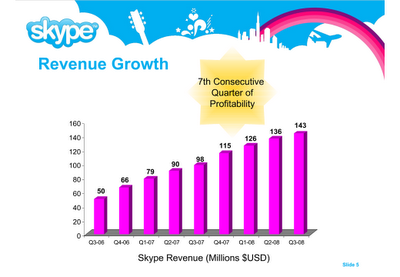
Here is the original slide:

Here is all that Jan had to do, in his own words:
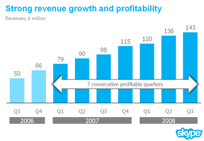
- I reduced the template to a logo at the bottom right of the page, eliminating all other distracting elements. I really like white space.
- I rigorously applied the Skype corporate colors and fonts.
- I changed to a simple column chart without 3D.
- I replaced the vertical axis with data labels.
- I re-wrote the headline.
- I replaced the yellow star to give the text more connection to the numbers (still it would have been better to show the actual profit numbers).
Where have we heard these steps before? I guess charting best practices are platform independent. They work as well in PowerPoint as in Excel.
As proof, check out the “after” slide:

The subtitle of Jan’s blog is Better PowerPoint Presentations. If you follow advice like his, it can only improve your own presentations.


Naomi B. Robbins says
“I replaced the vertical axis with data labels.”
I’d agree with this step if all graphs and graph designers were honest. However, often when I see a graph without an axis, especially in corporate annual reports, I take out my ruler and measure. I’m shocked by how often they are not drawn to scale. In the before figure, I can easily see that the tick marks are evenly spaced and that 50 is halfway between 40 and 60. I’d need a ruler to check the after figure.
A minor point is that although I like the arrow saying “7 consecutive profitable quarters”, I don’t like it cutting the bars. I’d rather see it moved above the bars or below the years labels.
Jon Peltier says
Naomi –
Good points.
I’m sometimes a bit skeptical about the labels too. My favorite trick is to remove the axis line, keep the axis labels, and add light gray gridlines behind the data. You can check for zero, and you really don’t need the exact numbers if you’re looking for comparisons or trends.
I would have located the arrow so it didn’t obscure part of the data, or I would have colored these bars differently, or shaded the background differently. As Jan points out, plotting the actual profit numbers on the same chart would have been best of all.
For some venues, Jan’s approaches are just fine. His intention here isn’t to populate a business dashboard, but to make presentations probably to a rather general audience. And there is still room for stylistic variations.
Michael Pierce says
Normally I would agree with the comments about being able to make sure the numbers are to scale, etc. If this is a presentation, however, I don’t think you’d be able to get your ruler out and walk up to the screen to measure! :)
Because the slide is out of context it’s difficult to discern the actual story the presenter was trying to tell. Based on the bright yellow star used in the original, I’m guessing that it’s the 7 quarters of profits more so than 7+ quarters of revenue growth. As such, maybe the scale isn’t as important.
I actually prefer the arrow on top of the chart instead of floating anywhere else. As Jan said, it connects the message to the data (which strangely doesn’t show profits). One thing to keep in mind, this is PowerPoint, so you could use a build/animation to first show the chart without the arrow to discuss the general revenue trend and then layer in the arrow as you’re making the point about profits. Generally, I hate animations as they are often overused, but a simple one in this instance might be effective.
[Jon – thanks for raising this discussion; looks like Jan’s site is a great resource.]
Tony says
I do like the after slide much better. You did point this out, but I’m not a big fan of the text box (arrow) to denote 7 quarters of profitability. The reason i don’t like this is that could mean $1 of profit or $1 bizallion dollars on the bottom line each quarter.
I’m okay with removing the y-axis labels. You could go that route or remove the data values and keep the axis. Also, the different colors of blue doesn’t really do it for me. I know what it’s trying to do, but think the text callout accomplishes that.
I really like the changes in x-axis labels and the title. Also, moving the logo to a less valuable location and removing the background pics are a nice change.
Naomi B. Robbins says
I vote for Jon’s idea of dropping the axis but keeping the labels and using light grid lines.
To Michael: I can always measure the handouts. :)
Conrad says
When I looked at the first slide, what jumped out at me was a pattern of dramatic revenue growth that the slide implied would continue to climb into the clouds, that Skype soars above competition like a plane, that like a rainbow, positive, hopeful feeling should be associated with Skype. The 3D shadows in the original slide all point toward the clouds.
While from a stylistic point of view, the above critiques are accurate, I wonder whether the original slide might nonetheless be more effective on a psychological level for conveying optimism about the company.
Ryan says
What strikes me most about the original slide is the rainbow — it follows the upward trend of the bar until exactly the last column (and is the only other thing in a purply color), then drops, as if implying that revenues are currently peaking and will soon start plummeting!
Conrad says
After further posts at Jan’s site, I finally realized the familiar phrase suggested by the first slide. “The sky is the limit.” This is a powerful message that fits with the graph and tells a compelling story about Skype’s future. This is totally missed by the second slide.
Jan wins on style.
Skype wins on communicating their narrative.
Which matters more?
Jon Peltier says
Good point, Conrad. The thing is, if they just want to say The Sky’s the Limit, they don’t need the chart, just happy graphics. If they want to show the actual financial results, they have to try harder not to obscure them with happy graphics. It’s a trade-off.