Plotting Part of a Data Range
Excel is pretty handy for collecting, analyzing, and charting lots of data. If you want to plot a subset of your data, you can manually adjust the data range used by the chart. But there are easier ways to select partial data ranges, and to make this selection less tedious than manually adjusting the chart’s data.
Plotting the Entire Range
In the workbook named “MSFT Price.xlsx” (click to download) and its worksheet named “MSFT 5-week” I have a range and chart showing five weeks of Microsoft adjusted closing price data.
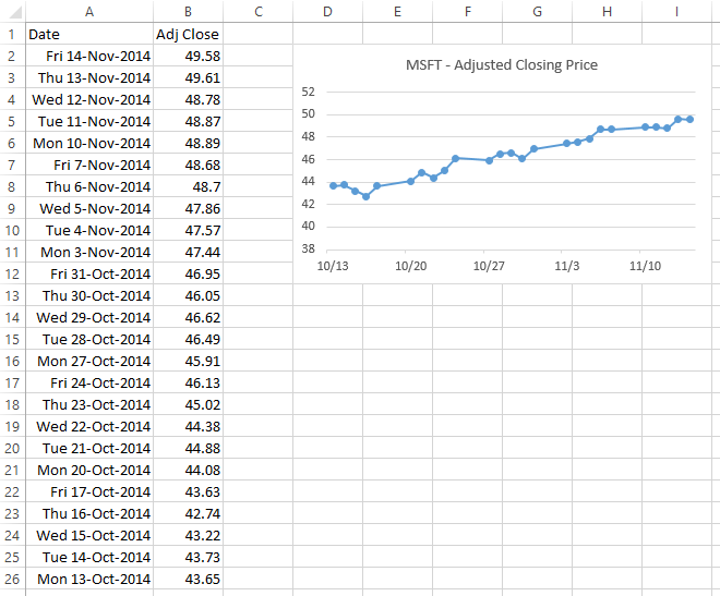
The series formula of the chart is:
=SERIES('MSFT 5-week'!$B$1,'MSFT 5-week'!$A$2:$A$26,'MSFT 5-week'!$B$2:$B$26,1)Recall that the series formula includes the chart data as follows:
=SERIES(Series Name, X Values, Y Values, Plot Order)and that the series can be edited right in the Formula Bar, just like any other Excel formula.
A commonly asked question is, How can we plot part of this data, based on some kind of lookup? We’ll use a technique known variously as “Names” (the official moniker), “Defined Names”, “Defined Ranges”, and “Named Ranges”. I’ll show three approaches, which increase in complexity but also in ease of use.
Defined Names – By Index
This exercise is in a worksheet named “MSFT By Index”. The data is the same and the chart is nominally the same as above. We’ll use cells E2:E3 to contain the index of the first and last rows of the data range we want to plot. We will count rows in the data range and enter values into these cells.
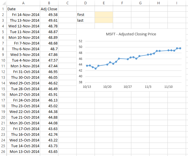
To define names, go to the Formulas tab of the ribbon, click on the Define Name button, and select Define Name… from the dropdown menu.

The New Name dialog appears. You can name the name, define its scope to the entire workbook or to one of its worksheets, add a comment, and write a formula which the name refers to.

For the dates in our chart, we will define the following name:
Name: MSFT_Date_Index
Refers To:
=OFFSET('MSFT By Index'!$A$1,'MSFT By Index'!$E$2,0):
     OFFSET('MSFT By Index'!$A$1,'MSFT By Index'!$E$3,0)
OFFSET takes three arguments: a reference range, the number of rows down from this reference (up for a negative number of rows), and the number of columns to the right of the reference (to the left for a negative number of columns). OFFSET may take two more arguments: the number of rows high and the number of columns wide the resulting range is; if height and width are not entered, the resulting range is the same size as the reference range.
This OFFSET:
=OFFSET('MSFT By Index'!$A$1,'MSFT By Index'!$E$2,0)indicates the cell $E$2 rows down and zero columns right from $A$1, while this OFFSET:
=OFFSET('MSFT By Index'!$A$1,'MSFT By Index'!$E$3,0)indicates the cell $E$2 rows down and zero columns right from $A$1. Combining the two OFFSETs, separated by a colon, indicates the range bracketed by the two cells.
For the values, we will use this simple OFFSET that returns the prices in the column immediately to the right of the dates defined by MSFT_Date_Index:
Name: MSFT_Close_Index
Refers To:
=OFFSET(MSFT_Date_Index,0,1)
To make the chart dynamic, replace the cell addresses of the X and Y values in the original series formula:
=SERIES('MSFT By Index'!$B$1,'MSFT By Index'!$A$2:$A$26,'MSFT By Index'!$B$2:$B$26,1)with the names we’ve defined. Here is the series formula as edited in the formula bar:
=SERIES('MSFT By Index'!$B$1,'MSFT By Index'!MSFT_Date_Index,
            'MSFT By Index'!MSFT_Close_Index,1)
Since the names were scoped to the workbook, the worksheet name in the series formula is replaced by the workbook name:
=SERIES('MSFT By Index'!$B$1,'MSFT Price.xlsx'!MSFT_Date_Index,
            'MSFT Price.xlsx'!MSFT_Close_Index,1)
Here is the chart for an arbitrary pair of first and last index values:
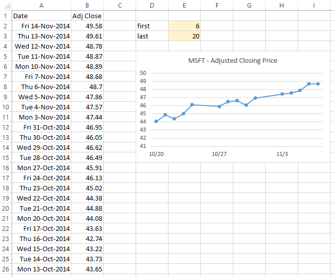
Adjust the first and last indices in E2:E3, and the chart updates to reflect the new range.

This is a bit tedious in practice, since you need to count rows and enter your findings in the index cells. It is not hard to make the process easier.
Defined Names – By Match
This exercise is in a worksheet named “MSFT By Match”. The data and the chart are the same as above. We’ll use cells F2:F3 to contain the first and last dates of the data range we want to plot. Formulas in E2:E3 will determine the index of these dates within the date range, so we can use the same formulas as above for our names. We will enter dates into cells F2:F3 and let Excel calculate the index values in E2:E3, which is a little nicer than counting rows and typing a number.
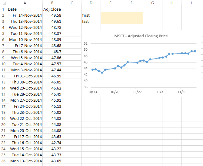
These formulas in E2:E3 determine the where the dates in F2:F3 fall in the overall list of dates:
Cell E2:  =MATCH(F2,$A$2:$A$26,-1)
Cell E3:  =MATCH(F3,$A$2:$A$26,-1)
The last argument (-1) in the functions is needed because the dates in column A are listed in descending order. Omit this argument, or use +1, for data sorted in ascending order. Use zero if the data are unsorted labels.
The name that includes the dates for our chart is:
Name: MSFT_Date_Match
Refers To:
=OFFSET('MSFT By Match'!$A$1,'MSFT By Match'!$E$2,0):
     OFFSET('MSFT By Match'!$A$1,'MSFT By Match'!$E$3,0)
This is the same, except for the sheet name, as in the previous exercise. The corresponding name for the prices should also look familiar:
Name: MSFT_Close_Match
Refers To:
=OFFSET(MSFT_Date_Match,0,1)
The series formula for the dynamic chart looks like this as edited:
=SERIES('MSFT By Match'!$B$1,'MSFT By Match'!MSFT_Date_Match,
            'MSFT By Match'!MSFT_Close_Match,1)
and like this when Excel replaces the sheet name with the workbook name for the workbook-scoped names:
=SERIES('MSFT By Match'!$B$1,'MSFT Price.xlsx'!MSFT_Date_Match,
            'MSFT Price.xlsx'!MSFT_Close_Match,1)
Here is how the chart looks for an arbitrary pair of dates:
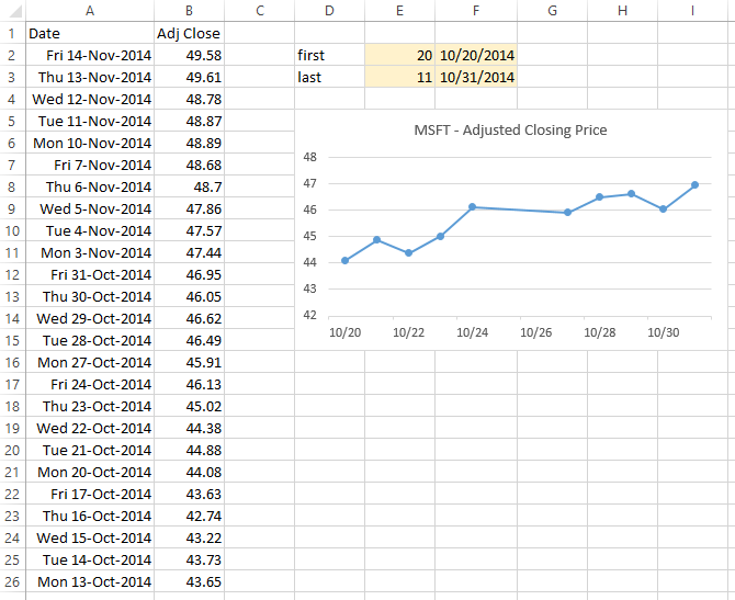
Adjust the first and last dates in F2:F3, and the chart updates to reflect the new range.

It’s much easier to enter dates than to count rows, especially if the overall data range extended beyond the number of rows visible in one screen.
Defined Names – By Combo Box
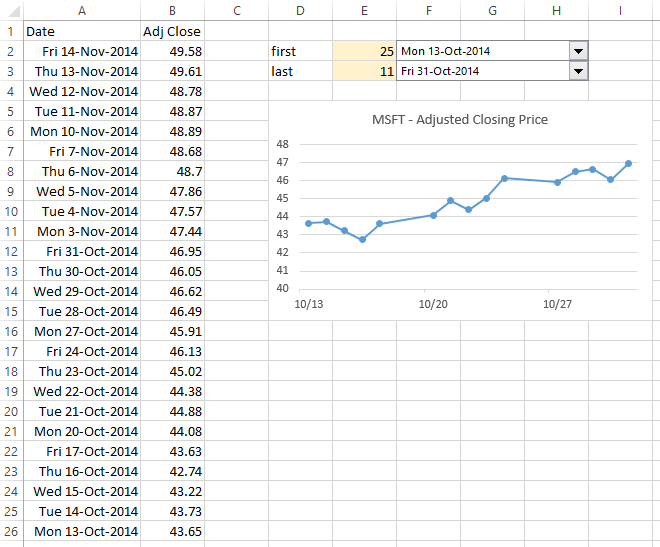
This exercise is in a worksheet named “MSFT By Combo”. The data and the chart are the same as above. We’ll use combo box controls that let us select the first and last dates of the data range we want to plot. The combo boxes link to cells E2:E3, so we can again use the same formulas as above for our names. Now we’ll use the best method in this article: we’ll select the dates we want using the combo boxes.

To add a combo box control, go to the Developer tab, click Insert, then click the Combo Box from the set of Forms Controls. The cursor turns into a shape crosshair; use this to draw the combo box.
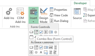
If the Developer tab is not visible, you have to change your settings. In Excel 2010 and 2013, click the green File tab, select Options, select Customize Ribbon, and in the long list of tabs on the right, check the box in front of Developer. In Excel 2007, click the big round Office button in the top left of the Excel window, click Excel Options at the bottom of the dialog, then check Show Developer Tab in the Ribbon.
Right click on the combo box, and choose Format Control from the pop-up. Select the input range (the range of dates that you want to appear in the dropdown) and the cell link (where the index of the selected date will appear).
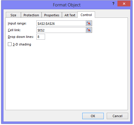
With both combo boxes formatted, defining the names proceeds as above, with essentially the same formulas. The dates:
Name: MSFT_Date_Combo
Refers To:
=OFFSET('MSFT By Combo'!$A$1,'MSFT By Combo'!$E$2,0):
     OFFSET('MSFT By Combo'!$A$1,'MSFT By Combo'!$E$3,0)
The price values:
Name: MSFT_Close_Combo
Refers To:
=OFFSET(MSFT_Date_Combo,0,1)
Here is the series formula as edited to reflect the names:
=SERIES('MSFT By Combo'!$B$1,'MSFT By Combo'!MSFT_Date_Combo,
            'MSFT By Combo'!MSFT_Close_Combo,1)
and adjusted by Excel to show the workbook name for the workbook-scoped names:
=SERIES('MSFT By Combo'!$B$1,'MSFT Price.xlsx'!MSFT_Date_Combo,
            'MSFT Price.xlsx'!MSFT_Close_Combo,1)
Adjust the first and last dates selected in the combo boxes, and the chart updates to reflect the new range.


Rossa says
Thank you very much. I always wondered if this was possible.
prashant says
some problem with file download…
Jon Peltier says
Another reader had trouble downloading the workbook. He was using IE, while I had no problem downloading with Chrome. I’ve replaced the space in the file name with an underscore; see if that helps.
Larry says
Jon, I am trying to modify some stacked area graphics with more than one data series for the Y axis. Age from 18 to 100 is the X axis. I would like the chart to automatically rescale the X-axis, but that does not seem to work with this technique. I seem to have succeeded most of the way, because the various Y axis data shift to the left, when, for example, I declare an age range of 42 to 100 instead of 18 to 100. However, the X axis shifts and compresses without rescaling. It starts properly with 42 on the left hand, but 100 is about 70% across the X axis. From that point to the far right the X axis is still there, and there is no data for any of the Y axis variables (because there should not be.) The X axis continues with periodic hash marks above 100 without any numbers. Do you have any idea about how to get the X axis to rescale automatically? Thank you. Larry