According to Do You Know What Planned Parenthood Actually Does?, “the Susan G. Komen Foundation has announced they will stop funding Planned Parenthood for breast cancer exams and other breast-health services.” MoveOn.Org attributes this action on pressure from the Republican Party, because of their stance on abortion and on the abortion practices of Planned Parenthood.
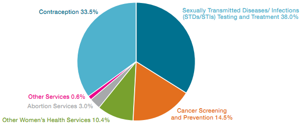
Planned Parenthood gives us this breakdown of services provided by their affiliated health care centers (download pdf):

As pie charts go, it’s not terrible. It demonstrates MoveOn’s point, that abortion accounts for only 3% of Planned Parenthood’s treatments. The remainder goes for contraception and health services, mostly for poor women.
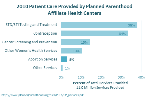
The data is also well-presented using a bar chart. This chart uses larger type and yet requires less space than the pie. The data is sorted in an easier-to-read layout, and it’s easier to highlight one value (abortion) using a darker color, because the chart uses shades of only one color.

The bars show all of the components of the whole block of services provided, as indicated by the horizontal axis label. To show that the bars add to 100%, another data series can be added and connected with a line, to make a Pareto chart. The top four items, all unrelated to abortion, account for 96% of Planned Parenthood services.


Calvin Graham says
I think the pie chart is (in this instance) the better option. The implementation is appropriate when, as with this case, 2 segments make up ¾ of the pie. Also, it’s a good format to highlight that in this case STD/Cancer services make up more than 50% of the total.
On a side note, we know that a pie chart can be misleading although that’s sometimes a useful feature. Maybe it’s just me but I think the 3% abortion services pie slice seems even smaller than it is the bar in the Peltier chart, which is possibly a good reason for them choosing to use a pie chart to make their point
Jonas says
I think one main reason for the pie chart is that it looks just like the peace symbol. I immediately though “oh, a peace symbol”, only then started to look at the actual figures. A bar chart goes straight at the data without awakening any emotions, so in this case when a group wants to prove a point, the pie chart works much better.
David Onder says
As for charting this data, I would tend to support the pie chart in this case as well.
As for the point of this post, and of the data in particular, one would have to ask what this matters. That they provide ANY abortions is warrant enough to stop funding them, both by the Komen Foundation and by the federal government. Murder is murder, no matter how many it is and no matter how much money is spent. This feels fallacious to me, though I can not put my finger on exactly how.
David
Mark says
The type of chart is irrelevant when the underlying data is purposefully misleading.
If they give 97 people a condom and do 3 abortions, then they count abortions as only being 3% of their services. A more meaningful chart would be percent of charges or payments by service rendered. A hospital might do one heart transplant and thousands of echos, but the heart transplant will be a huge chunk of the dollars and thus a major part of their business.
See: http://www.nationalrighttolifenews.org/news/2011/04/why-the-claim-that-abortion-is-%E2%80%9Conly-3-of-planned-parenthood%E2%80%99s-services%E2%80%9D-is-so-radically-misleading/
chipg says
I know this post is about the visualization, but the underlying data–what gets visualized–are always important too.
Mark makes a good point about the way the data are presented. PP asks “why complain about us, since we barely do any abortions, only 3% of our activities?”
To see why antiabortion people take aim at Planned Parenthood: 3% of 11 million services is 330,000 abortions. I think I saw that there were 2MM total in 2011, so assuming 2010 was about the same, that’s almost a 17% “share of market.” I don’t know for sure, but I’d have to think that make them the biggest provider and therefore the one to complain about.
John says
Agreed with others above: if “only” 3% of their services went to human trafficking… you see my point. The debate has nothing to do with percentages- it has to do with the personhood of fetuses. If they’re people, murder is murder. If they’re not, keep chopping them up- why would anyone care? But in 100 years, this will all be moot and we’ll kick ourselves for killing millions of babies just like we kick ourselves for treating black slaves like they weren’t human.
Martin says
Jon,
here’s another entry for your Chart Buster’s (although it lacks of charts, I believe that’s exactly what it is needing !!).
Rgds,
Martin
Martin says
Jon,
here’s another entry for your Chart Buster’s (although it lacks of charts, I believe that’s exactly what it is needing !!).
Rgds,
Martin
http://blogs.lanacion.com.ar/data/argentina/el-transporte-publico-urbano-en-numeros
Infobia says
Regardless of the political stance on abortion, it is always important to get some context on the numbers we’re visualizing (David McCandless’ TED talk did a great job displaying the importance of context when looking at raw data.)
@Mark does a good job outlining the problem, and I do believe that percentage of dollars spent rather than services rendered paints a better picture (after all, it’s donated money we’re concerned with and not donated time).
The political argument doesn’t hold weight when you talk about Abortion Services == Abortions Performed. Abortion services may be, by your same argument, completely filled by support services rather than actual abortions.