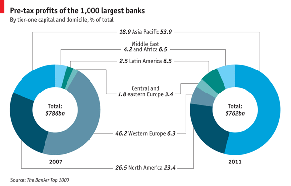
The Economist showed changing pre-tax profits among banks from 2007 to 2011 in Bank Profits Head East. They chose to use a pair of donut charts for this. Weaknesses of this approach are the separation of the pairs of values into distinct donuts. This forces the reader to jump from side to side, and ultimately skip the charts and read the values in the labels. The combined chart has leader lines to help steer the reader’s eyes from side to side, but this adds clutter, and the labels push the donuts further apart, making visual comparisons more difficult.

Who you gonna call? Chart Busters!
In Arrow Charts and Other Alternatives to Multiple Pie Charts on the Forbes magazine web site, Naomi Robbins introduced Arrow Charts as a replacement for double pie charts (and double donuts are at least as bad). I wrote a tutorial on my blog that showed How to Make Arrow Charts in Excel. The technique takes a bit of work, but once you’ve made one arrow chart, you can use it as a template for new values.
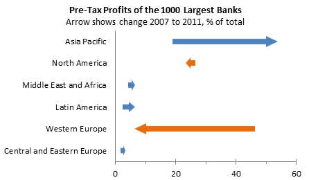
I took the example from my arrow chart tutorial and swapped in the Economist’s values:

The first thing I learned from this arrow chart, which I missed in the double donut, is that most regions showed little change, but two regions showed major changes: Asia Pacific gained a huge percentage while Western Europe lost a similar amount. This is a great example of the effectiveness of arrow charts.


XLCalibre says
This example makes it very clear how your choice of chart can make a massive difference – the arrow chart is much easier to read. However I would suggest one further change. I found myself instinctively looking for certain regions next to their neighbours, and so would make the arrows vertical and order them as much as possible from West to East.
sergeu says
wouldnt creating a simple bar chart showing just the differences between cathegories be just as effective?
Jon Peltier says
Sergeu –
I showed plain floating bars in the tutorial. They are effective, but the arrowheads emphasize the direction of the change more than color coding could.
Tim Wilson says
I think I’m with sergeu on this one. Or, maybe not. A 2-series bar chart would show the magnitude of profits and the distribution of profits in the two years in side-by-side comparison. But…maybe that’s the point here — trying to show the absolute change in percentage of the whole pie.
Didn’t you include in your original post a way to make the arrowheads the same size?
Jon Peltier says
Tim –
The bars show the magnitudes well, but the user has to decode the direction. The arrowheads are probably better than the colors for this.
Unless you meant just bars, not floating bars:
However, this shows just the changes, without indicating before and after values.
The arrowheads are the same standard size, until the bar is less than twice the standard arrowhead size, in which case the arrowhead and shaft are made equal in size.
roberto mensa says
The subtitle of the article is “Asian banks make the lion’s share of global profits” … Where can I find this information in your approach? I spent a lot of effort to understand … and the weight of each on the total is even more difficult
Best regards
r
roberto mensa says
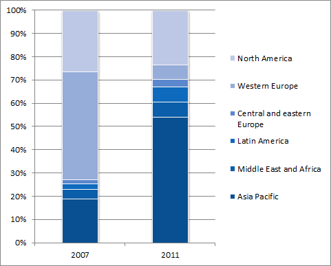
I think this approach is better:

regards
r
Jon Peltier says
Roberto –
If I had put that phrase into the subtitle of this article, you might have been keen to look for it. Without having been clued in by the Economist title, I would have missed it in the donut charts.
Didn’t you notice the two large arrows here? Those are the first clue about what has changed most.
roberto mensa says
Toggling the clockwise and counterclockwise rings of the two creates confusion in the comparison … Total values are similar … so it makes sense to compare percentages, but I want put the values in labels and not the percentages
Economist chart is really confused …
but your is confused too …
The large red arrow of Europe … I think to something big … but not to the big loss … in 2011 Europe gone, i must understand immediatly!
There are already the arrows … so i look and ask why two colors?
then, we can understand something without reading the title and watch the axis? … i’m sorry but I don’t understand after doing both things … really much effort … would be better if we were talking about values … Perhaps work … but not so.
best regards
r
Jon Peltier says
Roberto –
I’ve recreated your stacked bar, but I’ve reordered the bars by average of the values for the two years. This puts the big gainer (Asia) adjacent to the big loser (Europe), so you can see how they almost switch places.
There are now several charts at our disposal, so we should make most people happy without using too many donut charts.
Naomi B. Robbins says
They do now. :)
The Economist tweeted a link to a recent post on my Forbes blog (http://onforb.es/Nt9j3l) so, thanks to Jon, the Economist now reads Forbes.