Show Projected Data with Dashed Lines
This tutorial shows how to create a chart with historical (actual) data and future (projected) data, with the historical data formatted with a solid line and the future data with dashed lines.
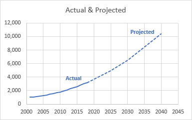
It’s not hard to do, you just need to know some data layout and chart formatting tricks.
Background
I came across this tweet, where Max wanted help with an Excel chart:
I have a population data for 2001 to 2018 and projected population data for 2025, 2030 and 2040 only. What I would like to do is a full line from 2001 to 2018 and a dotted line from 2018 to 2025 to 2030 to 2040. Is that possible ?
— Max_Habs (@Max_Habs) July 10, 2018
Basically he wants to plot all of his data, with dashed lines for the projected data.
First Attempt: Tedious Reformatting Bit by Bit
I don’t have Max’s data, so I made up my own. In my Excel worksheet, I’ve formatted the predicted values with gray italic text. I made a simple chart of this data, using a chart type of Scatter with Straight Lines.
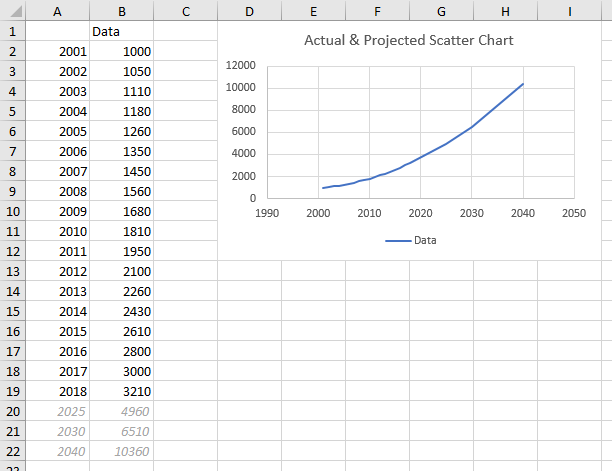
Then I selected the first line segment for the projected data (select one line segment by selecting the entire line with one click, and selecting the specific line segment with a second click), and I formatted it to have dashed lines. So far, so good, except that legend went a bit funny. When individual points re formatted differently, and there is only one series in the chart, Excel helpfully changes the legend to show each individual point, taking up half the chart.
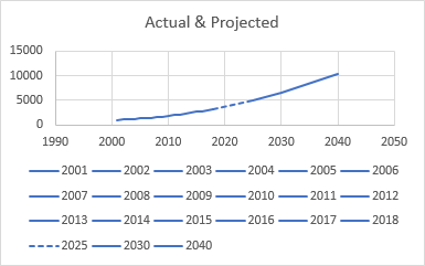
No big deal, the legend is redundant anyway, so delete it. Then reformat the rest of the projected line segments.
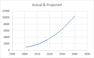
This chart wasn’t too hard to do, but imagine if you had dozens of line segments to reformat? Hard enough to select each itty bitty one, then your brain begins to turn into mush from the repetition.
The Right Way: Separate Series for Actual and Projected
The better way to make the chart is to start with better data. Put the Actual data in one column and the Projected data into the next. Repeat the last Actual value in the Projected column.
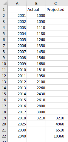
Now plot the data. Above I simply jumped ahead to a scatter chart without explanation, but anyone who knows me knows I love to explain stuff.
Here’s what happens when you try to make a line chart, which is the first thought most users have, until they’ve been burned. Excel’s line charts don’t treat the X values as numerical data, but as text labels. So the first part of the chart has data every year, and it looks okay, but then the projected data comes at irregular intervals (7, 5, and 10 years). Treating these years as labels, the widely spaced projections are still plotted one slot apart, so the orange projected line does not extend smoothly from the actual data.
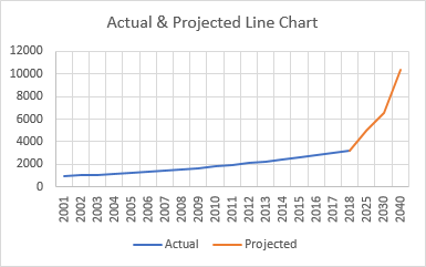
So use Scatter with Straight Lines as your chart type. I know you’d like to use Scatter with Smooth Lines, and for this example it wouldn’t make much difference. But there are reasons to avoid the smoothed lines.

At first, the fact that the projected line is formatted differently (orange) may seem like a drawback to this approach, but it’s actually a benefit. Here all you have to do is select the entire Projected series, and format it once, changing the color to blue and the line style to dashed.
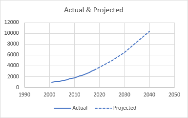
A little formatting and it’s finished. I removed the legend, adjusted the X axis scale, and added data labels on the last visible point of each series.

The Tricks
I used a few simple concepts so my chart is easy to make and easy to maintain. In case you missed them, here they are:
- Separate columns for actual and projected data
- Repeat last actual value in projected column
- Separate chart series for actual and projected lines
- Scatter chart type, not line chart


Doug Gabbard says
This chart is so simple and yet so powerful. At a glance, the user can immediately determine whether the projection is a reasonable extrapolation of history. I use this all the time. The real challenge is coming up with the projected values. When I am doing pure extrapolation of the historical data, I like to use linear regression with a logarithmic transformation.
Shobi Imran says
Great work, thanks for sharing, Keep up the good work!
Blanka says
Is there a way to do something similar with column charts?
I’m performing comparison month by month 2018 (actual numbers) to 2019. As 2019 progresses, every month one projected column would change to actual. I need a different formatting for the actual 2019 and different for the projected 2019.
Thank you.
Jon Peltier says
Blanka –
Set up the data the same way, with three columns: date (month), Actual, and Projected. No need to put a projected value where the last actual is, because you don’t need to connect up the lines.
Make a clustered column chart (top chart). Then format the Projected series as desired; I’ve used a lighter shade of the color used for Actual. Also, change the series overlap for either series to 100 (bottom chart).
Blanka says
Hi Jon,
Thank you so much for your reply.
One caveat to this was that I need to show all of 2018, month by month next to the 2019 numbers.
I found one of your blog posts – Clustered and Stacked Column and Bar Charts from 8/1/2011 and I followed your technique there. Worked like a charm
Thank you!
Blanka
Jon Peltier says
Blanka –
Needing to display 2019 actuals and projected against 2018 actuals does complicate the chart. I would have recommended exactly the approach you took, with a clustered-Stacked chart. I’m glad you got it to work. I’m glad I have such smart readers!
Jennifer Murphy says
I love this – thank you! Very easy to follow and took me 2 minutes to change my slide around to make it more impactful and allowed me to project out two different data series. Thank you for sharing this.
Thom Mitchell says
Following the four tricks, everything is as we’d want, except I have a flat Actual line at zero beyond the Actual data, and a flat Projected line at zero before the Projected data.
Jon Peltier says
Thom told me offline that he solved his flatline issues with this setting:
For some reason the Gaps option wasn’t selected at first, even though it should be the default.