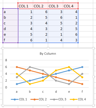
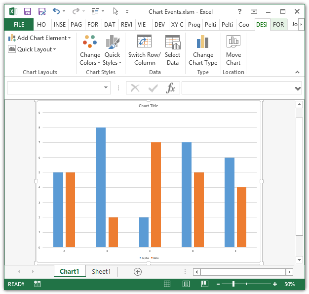
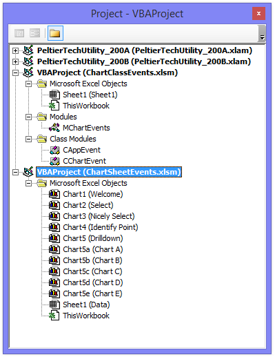
We want our chart to be interactive, so that clicking in the data range will cause the chart to plot the row we clicked in.
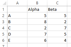
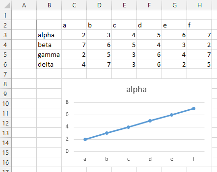
Here is the data and resulting chart. The series “alpha” is plotted, from row 3 of the data range (row 2 contains the category labels).
Excel lets us write VBA code that will respond to user actions. There isn’t a “click” event to respond to, but there is a “selection change” event.
Unlike regular VBA procedures that reside in regular code modules, these event procedures are stored in special class modules that correspond to Excel objects. Each workbook has such an object code module, and so does every sheet in the workbook.
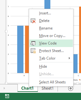
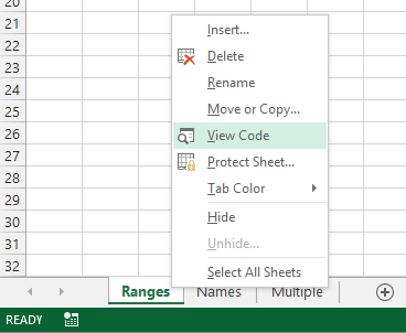
It’s easy to access the worksheet code module. Right click on the sheet tab, and choose View Code.
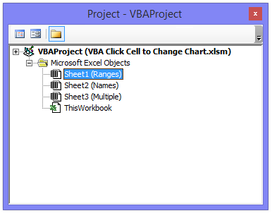
If you’re already in the Visual Basic Editor, find the workbook’s VB Project in the Project Explorer window, expand the Microsoft Excel Objects node, and double click on the item corresponding to the worksheet. In this case, the sheet name is Ranges, shown in parentheses after the sheet’s code name. We won’t talk about code names here.
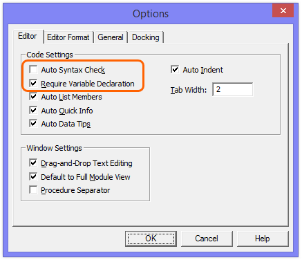
A worksheet code module opens, with the workbook name and sheet code name in the title bar. If you have “Require Variable Declaration” checked in Tools > Options (if you don’t, you should), then the line Option Explicit appears at the top of the module.

Click the left hand dropdown at the top of the module, and select Worksheet.
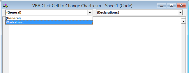
This puts an empty procedure stub in the module. The right hand dropdown now contains a list of events you can code against in the worksheet. The default event is SelectionChange, which I have selected in the dropdown, but as the default it is the one that appeared a moment ago.
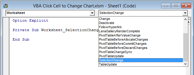
Here is the module with the new procedure stub. It’s a good idea to use the dropdowns to insert these procedures, so you don’t have to remember which parameters are needed. The SelectionChange procedure needs the Target parameter, which was automatically inserted.
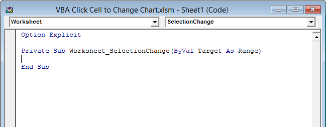
When the user selects a new range, the Worksheet_SelectionChange procedure runs, and Target is the range selected by the user.
The code that responds to the selection change to update the chart is shown below. We don’t care about the entire Target range, just the active cell. If the active cell intersects with the chart’s Y values or series names (in B3:H6), we will update the chart. For series name, we will use the cell that’s in the row that was clicked (ActiveCell.EntireRow) and in column B. For Y values, we will use the cells in columns C through H that are in the row that was clicked.
Private Sub Worksheet_SelectionChange(ByVal Target As Range)
  If Not Intersect(ActiveCell, Me.Range("$B$3:$H$6")) Is Nothing Then
    With Me.ChartObjects(1).Chart.SeriesCollection(1)
      .Name = "=" & Intersect(ActiveCell.EntireRow, Me.Range("$B:$B")).Address(, , , True)
      .Values = Intersect(ActiveCell.EntireRow, Me.Range("$C:$H"))
    End With
  End If
End Sub
Here is the chart after selecting cell B4. Series “beta” from row 4 is now plotted:
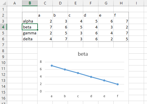
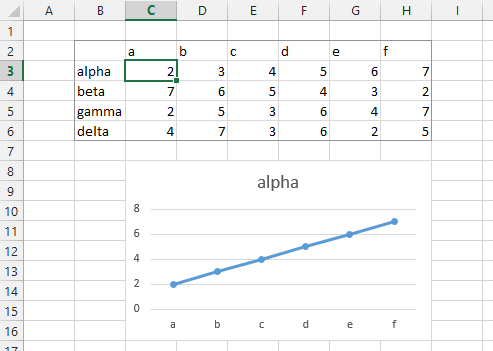
Here is the chart after selecting C3. Series “alpha” from row 3 is again plotted:
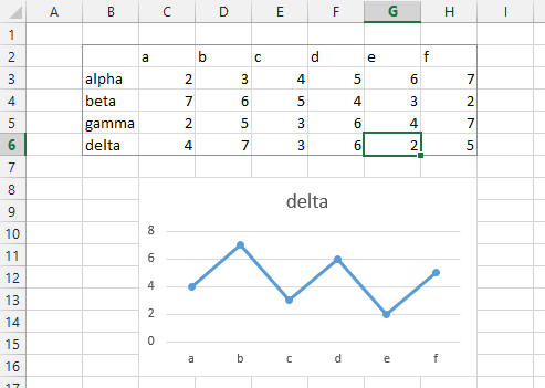
After selecting G6, series “delta” in row 6 is plotted:
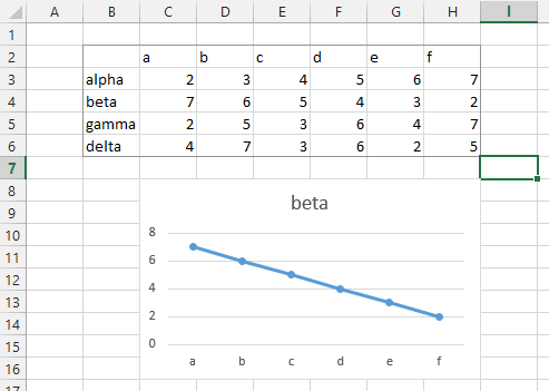
Clicking cell I7 does not change the chart, since I7 lies outside the chart data range.
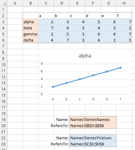
Instead of using the hard-coded ranges in the code, we can use Names that indicate the chart source data. Below two names are defined, one for the series names (column B, shaded red) and one for the Y values (C3:H6, shaded blue).
The code is substantially the same, referencing the range names instead of the hard-coded range addresses. This means that a change to the chart source data only requires an update to the name definitions, not to the code.
Private Sub Worksheet_SelectionChange(ByVal Target As Range)
  If Not Intersect(ActiveCell, Union(Me.Range("SeriesNames"), Me.Range("SeriesYValues"))) Is Nothing Then
    With Me.ChartObjects(1).Chart.SeriesCollection(1)
      .Name = "=" & Intersect(ActiveCell.EntireRow, Me.Range("SeriesNames")).Address(, , , True)
      .Values = Intersect(ActiveCell.EntireRow, Me.Range("SeriesYValues"))
    End With
  End If
End Sub
The approach using Names can readily be extended to the case where multiple data ranges and charts reside on one sheet.

The following procedure cycles through all (both) charts on the active sheet, testing whether the active cell intersects with the names associated with either chart, and updating as appropriate.
Private Sub Worksheet_SelectionChange(ByVal Target As Range)
  Dim iCht As Long

  For iCht = 1 To 2
    If Not Intersect(ActiveCell, Union(Me.Range("SeriesNames" & iCht), Me.Range("SeriesYValues" & iCht))) Is Nothing Then
      With Me.ChartObjects("Chart " & iCht).Chart.SeriesCollection(1)
        .Name = "=" & Intersect(ActiveCell.EntireRow, Me.Range("SeriesNames" & iCht)).Address(, , , True)
        .Values = Intersect(ActiveCell.EntireRow, Me.Range("SeriesYValues" & iCht))
      End With
    End If
  Next
End Sub
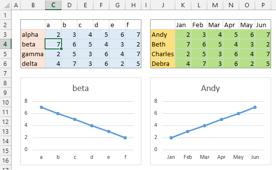
When cell C4 is selected, the first chart updates (beta is plotted in place of alpha), but the second chart is unchanged.
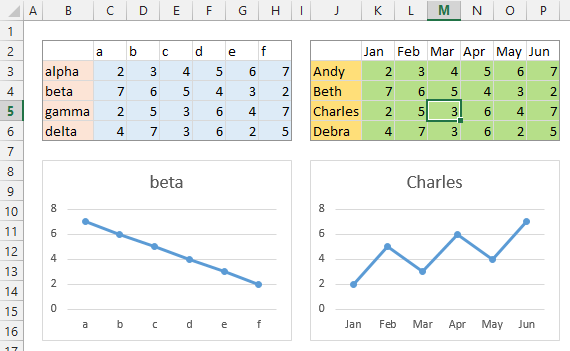
Selecting cell M5 updates the second chart (Charles is now plotted in place of Andy), but the first chart is unchanged.
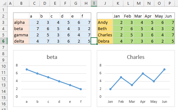
Selecting cell I6 makes no change to either chart, since I6 is not within the source data range of either.
You can extend this even further, without names or hard-coded ranges, if you assume each chart’s potential data is in a contiguous range separated from other charts’ data ranges by blank rows or columns. This code finds the region containing data for each chart, and determines whether the active cell is within that region, changing the chart if necessary.
Private Sub Worksheet_SelectionChange(ByVal Target As Range)
  Dim chtob As ChartObject
  Dim srs As Series
  Dim sFmla As String
  Dim vFmla As Variant
  Dim rngNm As Range, rngY As Range, rngData As Range

  For Each chtob In ActiveSheet.ChartObjects
    For Each srs In chtob.Chart.SeriesCollection
      sFmla = srs.Formula
        ' e.g. =SERIES(Sheet1!$B$1,Sheet1!$A$2:$A$10,Sheet1!$B$2:$B$10,1)
      sFmla = Mid$(sFmla, 9, Len(sFmla) - 9)
       ' Sheet1!$B$1,Sheet1!$A$2:$A$10,Sheet1!$B$2:$B$10,1
      vFmla = Split(sFmla, ",")

      On Error Resume Next
      Set rngNm = Range(vFmla(LBound(vFmla)))
      Set rngY = Range(vFmla(LBound(vFmla) + 2))
      Set rngData = rngY.CurrentRegion
      Set rngData = rngData.Offset(1).Resize(rngData.Rows.Count - 1)
      On Error Resume Next

      If Not rngY Is Nothing Then
        If Not Intersect(rngData, ActiveCell) Is Nothing Then
          With srs
            .Name = "=" & Intersect(ActiveCell.EntireRow, rngNm.EntireColumn).Address(, , , True)
            .Values = Intersect(ActiveCell.EntireRow, rngY.EntireColumn)
          End With
        End If
      End If

      Set rngNm = Nothing
      Set rngY = Nothing
      Set rngData = Nothing
      Erase vFmla
    Next
  Next
End Sub


