Sometimes it helps a time series chart if you can highlight certain periods with a different color background. You may want to show financial performance over time, for example, and point out the periods when the economy was in a recession. In this example, I will use a simpler example, plotting the readership of this blog over the past couple months, and highlight weekends.
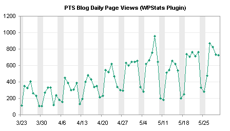
This is accommplished using a combination of a line series to show traffic with a column series to highlight weekends.
The following line chart is a time series of pageviews for the PTS Blog between mid-March and May. There is an obvious cyclical pattern, with weekends having about 40% as much traffic as weekdays.

Creation of the column chart series that highlights weekends begins with a column of data added to the worksheet. Next to the already plotted data, enter a 1 where you want the background to be shaded, and zero otherwise. In many cases, this is done manually, but I can use a formula based on the date in column A to calculate 0 or 1:
=1*(MOD(A2,7)<=1)
Copy the column of data, select the chart, and use Paste Special to add the data as a new series.
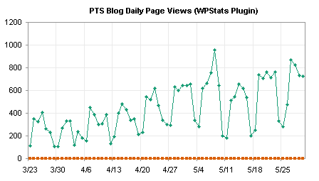
The added series is aligned with the bottom of the chart. To make the second series useful, assign it to the secondary axis.

Change the secondary Y axis scale so it has min and max of 0 and 1. In fact, if you use 1, the top edge of the chart will be obscured by the top edge of the column series (when you convert the second line series to a column), so use something slightly larger, for example, 1.005.

Format the secondary Y axis to hide it: choose no line, no major or minor tick marks, and no tick labels.

Change the second series to a column type. Right click on the series, choose Chart Type or Change Chart Type (depending on Excel version), and choose the first column type, clustered column.
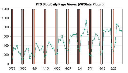
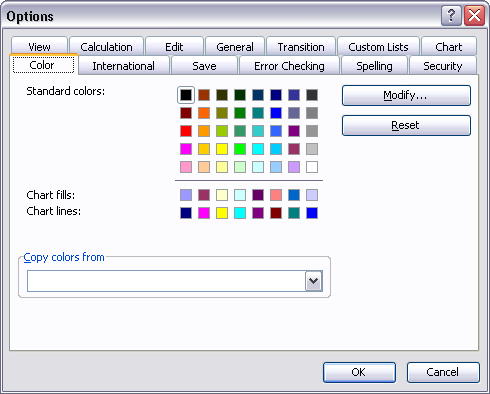
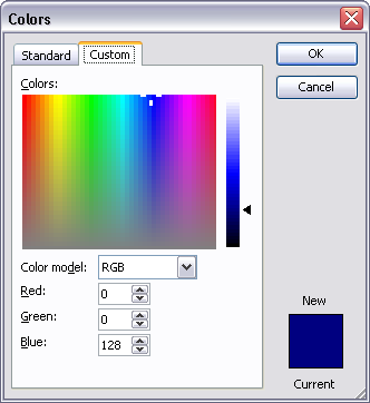
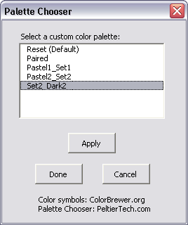
Format the column series to make a nicer background. Remove the border, change the gap width to zero, and use a light color. I’ve changed my Excel 2003 color palette so the light gray is a couple of clicks lighter than the default gray.

With the weekends highlighted, it’s easy to see that weekends have lower traffic than weekdays, and it allows us to identify a couple of low traffic weekdays. In this chart, we see that on April 3 (the day I switched hosting companies and the blog was down for several hours) and on May 26 (Memorial Day holiday in the US), the PTS Blog had lower traffic than expected for a weekday.
I noticed that Professor Tim Mayes of the Excel Blog wrote a similar post last month, showing how to indicate recession periods on a time series of an economic indicator, in Charting Economic Time Series with Shaded Recessions. This is a nice blog, with good how-to exercises, mostly geared toward Excel 2007, taking examples from the field of finance.


