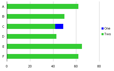
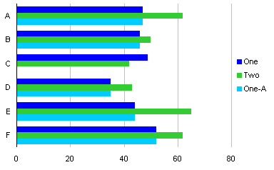
In Overlapped Bar Chart – Longer Bars in Back I showed a fairly easy way to make a chart Robert Kosara developed to examine popular vote and Electoral College vote in US presidential elections. Stag Lee commented that Robert’s chart type was not intuitive, and suggested a slight modification, as shown here:
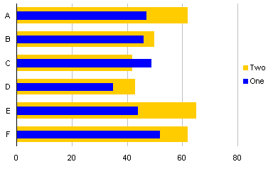
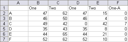
This example uses the same data from the previous post.

Start with a simple clustered column chart.
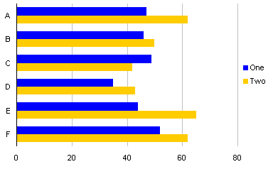
Select one of the series (in this case “One”), and move it to the secondary axis.
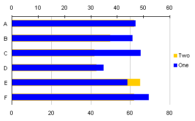
Remove the secondary Y axis, the axis along the top edge of the chart.
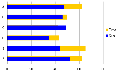
Change the gap width of the series in front to 200, and of the series behind to 50.

This is also a relatively clear way to show the two series, but it’s not as striking when the thin series represents a larger value than the wide series. Robert’s chart, reproduced below, more clearly shows the series with the smaller value, because the smaller series bar is visible all the way to the left axis of the chart.


