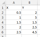
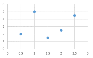
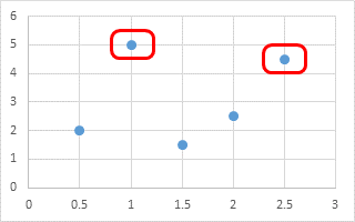
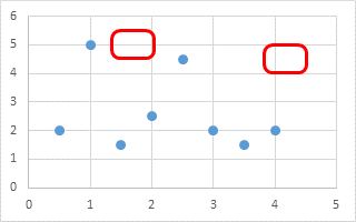
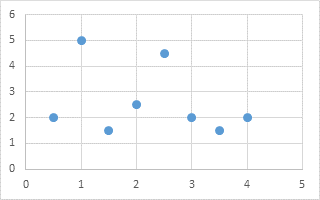
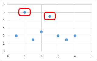
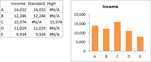
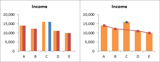
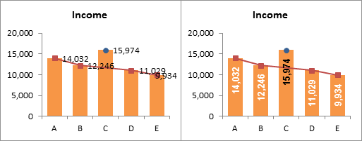
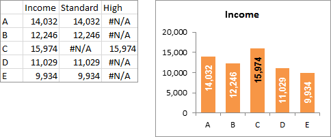
Here is a simple data set and an XY Scatter chart. We want to highlight the minimum and maximum points in the chart.
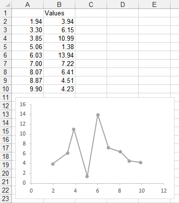
We could manually select the high data point and format it, then select the low point and format it. No big deal for a one-off chart. But if the data changes, we may have to manually change formatting again.
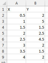
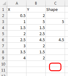
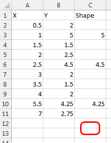
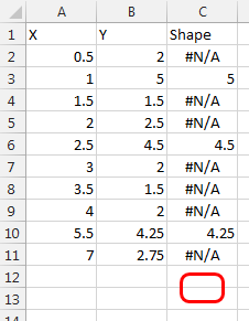
Instead we’ll add a couple columns to the data range, and use them to determine where to plot the minimum and maximum values.
The formula in cell C2 (copied and pasted in C3:C10) is
=IF(B2=MAX(B$2:B$10),B2,NA())which puts the value of column B into the same row of column C only if it’s the maximum value in column B. Otherwise column C contains the #N/A error value, which is not plotted with a marker in an Excel scatter or line chart.
Likewise, the formula in cell D2 (copied and pasted in D3:D10) is
=IF(B2=MIN(B$2:B$10),B2,NA())which puts the value of column B into the same row of column D only if it’s the minimum value in column B. Otherwise column D contains #N/A.
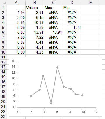
When we select the chart, we can see the chart data highlighted in the worksheet.
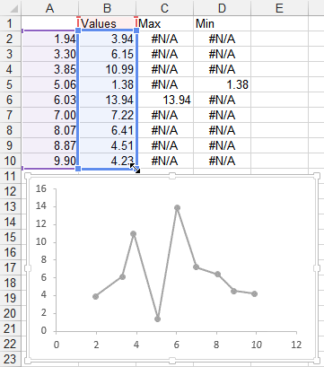
We can drag to extend the blue range to include columns C and D.

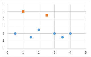
And now columns C and D are plotted in the chart. Column C (minimum) is plotted as a blue marker, and column D (maximum) as an orange marker).
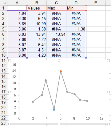
Let’s do a little formatting. Right click on the Max point, and choose Data Labels. Select the label and choose the Series Name option, so it shows “Max”, and choose the bright blue text color. Format the marker so it’s an 8-point circle with a 1.5-pt matching blue border and no fill.
Right click on the Min point, and choose Data Labels. Select the label and choose the Series Name option, so it shows “Min”, and choose the gold text color. Format the marker so it’s an 8-point circle with a 1.5-pt gold border and no fill.
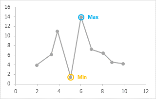
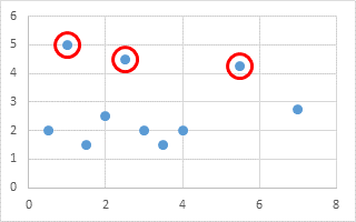
The nice thing about using this formula-based approach, instead of manually formatting everything, is that if the data changes, the new Min and Max are highlighted. In fact, if multiple points have the same min and max values, all will be highlighted.
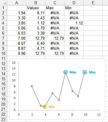
This approach, of adding a series for any data you want to highlight, is very flexible. You don’t need to only highlight minimum or maximum values, you can highlight anything that you can write a formula for.
My colleague and fellow Excel MVP Leila Gharani has recorded a video on YouTube at Highlight Max & Min Values in an Excel Line Chart, which illustrates this technique. Leila has recorded many dozens of videos, which are well made and which clearly show a wide variety of Excel features and techniques.
Peltier Tech Articles About Conditional Formatting of Excel Charts
This is one example of conditional formatting in Excel charts; below are several other approaches.
- Conditional Formatting of Excel Charts
- Conditional XY Charts Without VBA
- Invert if Negative Formatting in Excel Charts
- Conditional Donut Chart
- Split Data Range into Multiple Chart Series without VBA
- Conditional Formatting of Lines in an Excel Line Chart Using VBA
- VBA Conditional Formatting of Charts by Value and Label
- VBA Conditional Formatting of Charts by Series Name
- VBA Conditional Formatting of Charts by Value
- VBA Conditional Formatting of Charts by Category Label


