Often the positive and negative values in a chart are formatted differently to make it visually easier to distinguish these values. In Excel column and bar charts, this can be done using a feature called Invert if Negative. This is commonly done in Waterfall Charts (using a different technique).
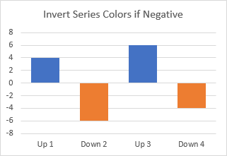
Invert if Negative is often applied incorrectly, but this article will show you the right way to use it.
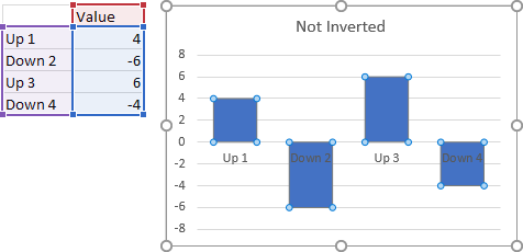
Here is a simple data set with positive and negative values. All of the bars have the same color.
Side Tip #1: Move Axis Labels
The first thing you might notice about the previous chart is that some of the category (X axis) labels are hard to read because they overlap with the bars.
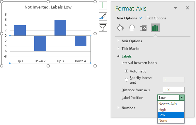
A simple axis setting moves the labels to the bottom of the chart, to eliminate this overlap. Select the axis and press Ctrl+1 to open the Format Axis task pane, click Labels, and in the Label Position dropdown, change from the default Next to Axis to Low.
Side Tip #2: Ctrl+1
People love learning new Excel shortcuts. When they ask me for my favorite shortcut, I tell them Ctrl+1. Whatever you select any object in Excel (a cell or range, a shape, or a chart element), pressing Ctrl+1 opens the Format dialog or task pane for that object. I use Ctrl+1 a lot, and when I use it in PowerPoint or Word I get mad that it doesn’t help me format what I’ve selected there.
Actually, I’m lying about my favorite Excel shortcut. My real favorite Excel shortcut, the shortcut I use more than any other, is Ctrl+Z, which undoes my last action (i.e., my last mistake). Ctrl+Z is great, because it also works in PowerPoint, Word, and many other programs.
Side Tip #3: Don’t Move the Axis
In some kinds of charts, you can actually move the horizontal axis away from its default position at Y=0 to the bottom of the chart. This is done by assigning a Y axis value to where the horizontal axis crosses.
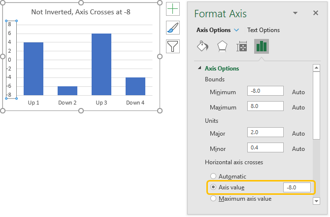
This might be fine in a line chart, to move the axis labels out of the way of the data. In a bar or column chart, this isn’t a good idea. Since Excel draws bars and columns starting from the axis, you get excessively long positive bars for positive values, and short positive bars for negative values.
Alternative Method: Invert Formats Using Different Series
You can use the approach in Conditional Formatting of Excel Charts to format the bars differently. This requires extra columns in the data range for each different format and formulas to place applicable values in each column.
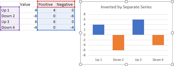
This is a fine technique, and it’s suitable for more than just positive vs. negative formatting, any condition that you’re smart enough to write a formula for. But it requires extra columns in the data range.
Invert if Negative: Not the Right Way
The Invert if Negative setting is easy to find. Select the series and press Ctrl+1 to open the Format Data Series task pane. The Invert if Negative checkbox is near the bottom of the list of fill options.
If you just check the box while the Automatic fill option is selected, you can only format the color of the positive bars with the paint can icon, while the negative bars are white with a black border.
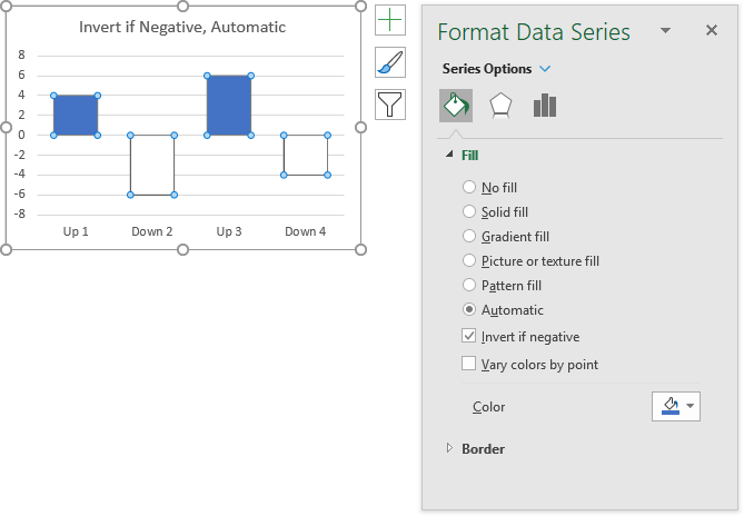
People think Invert if Negative doesn’t work right when they use it this way, but really, the right technique is easy.
Invert if Negative: The Right Way
Select the Solid Fill option when you check the Invert if Negative box, the task pane has two paint can icons, one for positive bars, and one for negative bars.
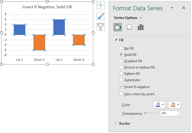
You can go back anytime and select Solid Fill later to get the double paint cans.
Invert if Negative for Old Excel Versions
Old versions of Excel had Invert if Negative, with a default negative fill color of white. In Excel 2003 and earlier, you had to apply a pattern temporarily to select a specific color for negative bars, then unapply the pattern and the color would stick. In Excel 2007, you had to apply a gradient fill with an insane gradient setting. But if you’re using Excel 2010 or later (and you should be), the Solid Fill option provides two paint cans for easy selection of positive and negative colors.
Invert if Negative for Pivot Tables
In a Pivot Chart, Invert if Negative may lose the custom negative formatting you’ve created, after you save and reopen the workbook.
The old Excel 2007 workaround that hacks the gradient fill would be good here, since it gives the appearance of Invert if Negative, though it’s a bit tedious to apply. However, that hack was based on Excel 2007’s faulty color management, and when that was fixed in 2010 or 2013, the gradient hack no longer worked. So you’ll have to rely on the even older Excel 2003 workaround that uses pattern fills.
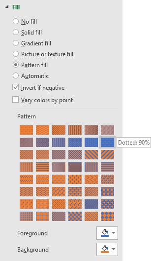
Select the series in your chart and press Ctrl+1 to open the Format Series task pane. Select Pattern Fill and Invert if Negative. Select the positive color (blue below) using the Foreground paint can, and the negative color (orange) using the Background paint can. And choose the Dotted 90% pattern
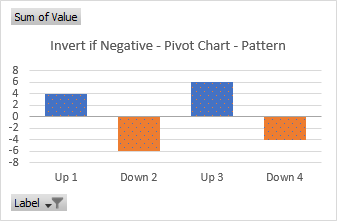
It’s not a smooth looking as the regular chart without patterns, but at least it captures about 90% of the experience, and the Pivot Chart’s pattern fill seems to keep its inverted formatting robustly.
Invert if Negative for Tables
If you create a chart from a Table, and then filter the Table (and therefore to filter bars in the chart), then Invert if Negative may also lose its negative formatting.
According to limited testing I’ve carried out, if any (but apparently not all) negative bars were filtered out of a chart, they may lose their negative formatting, and revert to the default white bar with a black outline.
Ah-HA! you say, we’ll just apply the patterned fill approach that works so well for Pivot Charts. And that will seem okay, until you filter the table, save the workbook, reopen the workbook, and refilter the table. And the formerly hidden negative bars have white fill again. Sometimes playing with the slicer may restore the inverted fill color, but not reliably.
The remedy is to unfilter the table, so all bars are visible (even if their reversed formatting isn’t totally correct), and then save the workbook. When you reopen the workbook, the negative bars are inverted correctly, and the formatting survives subsequent filtering, until the next save.
Peltier Tech Articles About Conditional Formatting of Excel Charts
Invert if Negative is one specific form of conditional formatting in Excel charts, unique in that it is built into Excel. Here are other approaches which are not built into Excel but which can be implemented with formulas and/or VBA.
- Conditional Formatting of Excel Charts
- Conditional XY Charts Without VBA
- Conditional Donut Chart
- Highlight Min and Max Data Points in an Excel Chart
- Split Data Range into Multiple Chart Series without VBA
- Conditional Formatting of Lines in an Excel Line Chart Using VBA
- VBA Conditional Formatting of Charts by Value and Label
- VBA Conditional Formatting of Charts by Series Name
- VBA Conditional Formatting of Charts by Value
- VBA Conditional Formatting of Charts by Category Label


