In Graduation Rate and Federal Spending [Chart Reviews] Tony Rose of Support Analytics and DSA Insights shows two charts from Business Week.
Federal Spending on Education and Training
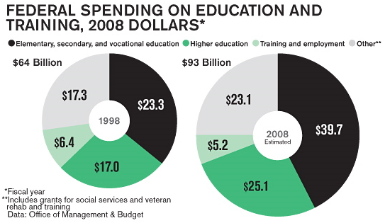
The first compares two years of Federal education spending data using side by side pie/donut charts, which commits two sins: using one pie/donut charts, and using more than one of these charts. Tony recommends using a table instead, while I’ve created a line chart instead. Tony’s table and my chart contain all of the data from the Business Week charts, with additional display of percentage changes.
The Original Business Week Donut Charts
Tony’s Tabulated Data

The Peltier Tech Line Chart
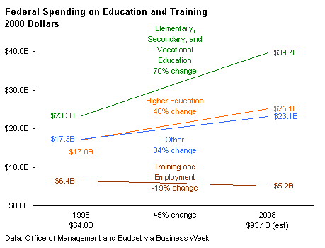
Tony’s table is certainly the most compact display of the data. The Business Week dual donuts are eye-catching, perhaps, but the line chart shows the trends best of all.
Percentage of Children Living in Poverty
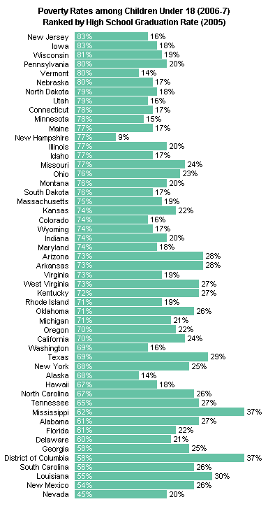
The second chart is a simple bar chart of poverty rates by state, ranked by the rate of high school graduation in each state. Tony likes this chart, and I don’t think it’s too bad either, except that it’s divided into three sections because of its aspect ratio.
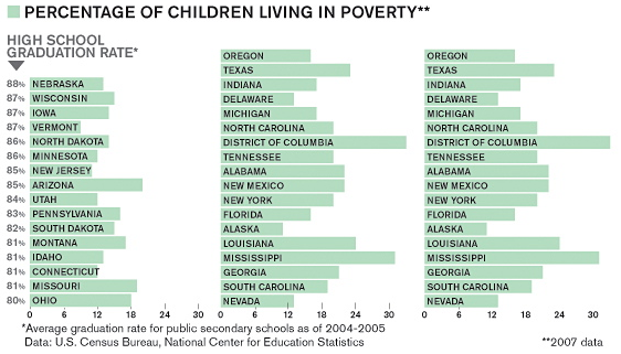
Before merely duplicating the chart above, I thought the individual graduation and poverty rates deserved some investigation. I think a heat map on a geographical state map would be interesting.
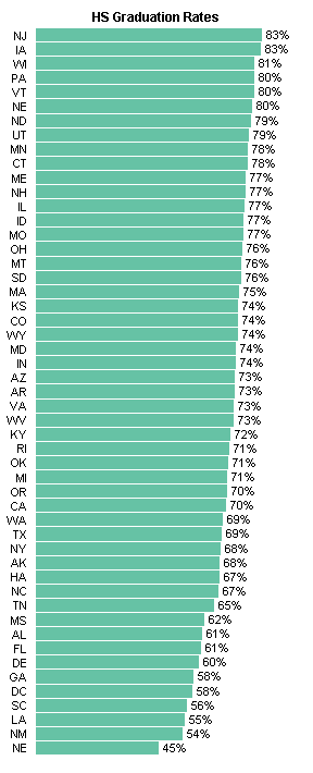
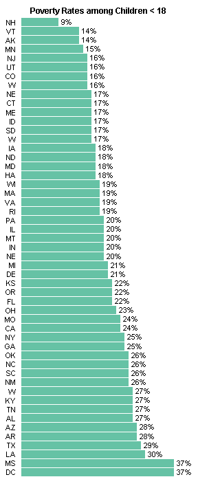
Here is my rendition of the Business Week chart, differing only by not splitting mine into three panels. It’s pretty tall, but it tabulates the data clearly. I say “tabulates” because it seems to show a trend between graduation and poverty rates, it does not allow an easy determination whether there is a correlation between these rates.
Being the geek that I am (did I say I used to be a scientist?) I decided to plot the two variables against each other. As expected, there’s a general inverse relationship. As poverty goes down, high school graduation goes up. I plotted it both ways, because there’s only a correlation, and I’m sure there are conflicting models for which variable causes the other.
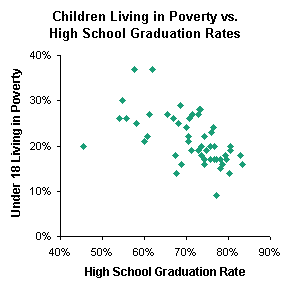
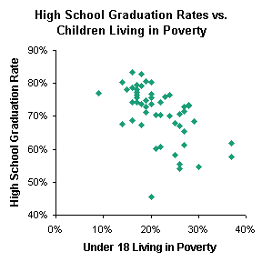
I picked the latter XY chart, because I think that economic stress leads to higher drop out rates, and replaced the markers with labels showing the state abbreviations. I enlarged the chart significantly to reduce overlap of state abbreviations.
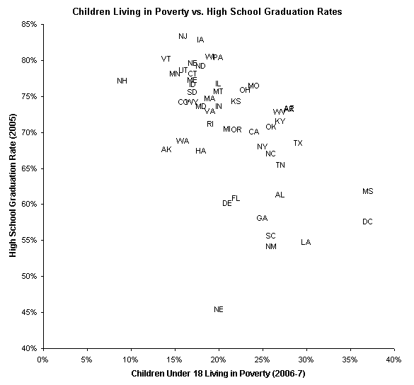
This chart is more cluttered that I would like because of the overlapping state labels, but I think it’s better to show correlations between measurable quanitites, rather than to simply list them in a table, or in a chart that is essentially like a table. What do you think?


