With a little knowledge of number formats and a healthy dose of creativity, you can work around apparent shortcomings in Excel’s charting mechanism, neaten up your charts, and produce effects that are otherwise difficult.
In the Microsoft newsgroup, someone asked how to hide the data labels in his stacked column chart if the values are zero.
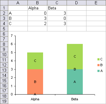
The problem is, a stacked column data point with a zero value has height of zero, and the label sits on the boundary between the two points on either side. In the example below, the labels for series C are fine, but the labels for series B in the Beta stack and for series A in the Alpha stack have no points to label.
The trick is to use the value option for the data labels, rather than the series name option. The series names have been replaced by values, and zeros appear where the unwanted series name labels are in the chart above.

Then apply custom number formats to show only the appropriate labels. In Number Formats in Excel I show how the number format provides formats for positive, negative, and zero values, and for text, with the individual formats separated by semicolons:
<positive>;<negative>;<zero>;<text>
Apply the following three number formats to the three sets of value data labels:
"A";;; "B";;; "C";;;
What these formats do is use the characters in quotes in place of any positive numbers, and use “” (from between the semicolons) for negatives, zeros, and text. The undesired labels are now gone. The labels in the number format strings can be longer than a single character, of course; A, B, and C were easy labels to use for this illustration.


