It is not difficult to build interactive charts in Excel that allow a user to selectively highlight a subset of the data for detailed examination. Excel’s semi-intuitive worksheet controls make this technique suitable for dynamic dashboard reports.
Background
Last week in Series Lines: Useful or Chart Junk?, I wrote about Excel’s “Series Lines” feature, and how it seems like a good way to clarify the data in a stacked column chart, until you implement it and realize it just adds chart junk to your chart. I proposed a panel chart to show the stacked chart data more clearly.
Gregor Aisch commented that my panel approach did not allow point-to-point comparisons as effectively as a simple line chart (despite the line chart’s clutter). So I put together the following example of an interactive chart that allows a user to compare a couple series in context of the whole data set.
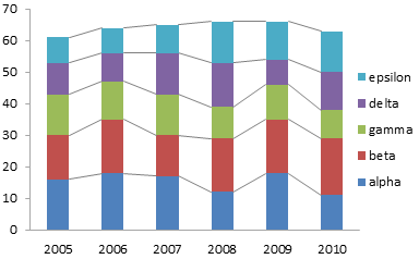
Here is the original stacked column chart, with series lines cluttering up the space between columns.
Here is the panel-style chart I constructed to show the trends more clearly. As Gregor has pointed out, comparing individual point values (for example, 2008 for alpha and for epsilon) is difficult. Also, if there are many categories (alpha through omega, for example), the data will be compressed horizontally and will be impossible to read.

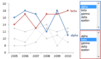
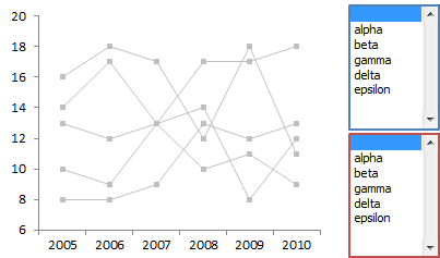
Our interactive chart will look like this. The user can selectively highlight data using the two listboxes next to the chart.
Interactive Chart: Data
We’ll use this data for our exercise. A1:G7 contains the data used in the previous discussions. A9:G11 contains repeated data for two of the series in the upper table. These are selected using Excel’s INDEX() worksheet function and the index values in H10 and H11.
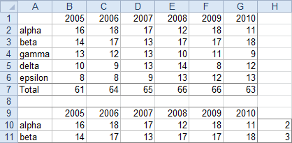
Cell A10 contains the formula
=IF($H10>1,INDEX(A$1:A$6,$H10),"")which is copied into A11. Cell B10 contains the formula
=IF($H10>1,INDEX(B$1:B$6,$H10),NA())which is copied into C10:G10 and B11:G11. The way these formulas work is as follows:
If the index in column H is 1, column A looks blank and columns B:G contain #N/A, which is not plotted in a line or XY chart. If the index is greater than 1, the label from column A and the values from columns B:G are displayed in that row. By changing the values in H10:H11, we can change the data in their rows. If this data is plotted, then changing H10:H11 will change the chart.
Worksheet Controls
It’s nice to be able to modify a chart by changing numbers in a couple cells, but this becomes tedious after a while. Fortunately, Excel has a number of helpful controls that we can drop onto the worksheet to do this in an easier and more natural way. For choosing from among a list of items (alpha through epsilon), we can use a Combo Box or a List Box.
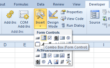
In Excel 2003 and earlier, you can access these controls by displaying the Forms toolbar. In Excel 2007 and later, you need to display the Developer tab*, then pick from among the Forms controls under the Insert button. (There are also ActiveX versions of these controls, and they have more extensive formatting capabilities, but ActiveX controls can misbehave.
* To show the Developer tab, you have to open Excel Options, and find the setting for the Developer tab.
In Excel 2007: Click on the big Office button in the top left of the window and select Excel Options; check the box in front of Show the Developer tab in the Ribbon.
In Excel 2010-2013: Click on the File tab and select Options; click the Customize Ribbon button on the left, and in the right list, check the box in front of Developer.
Here is the Combo Box button on the Developer tab.
And here is the List Box button.
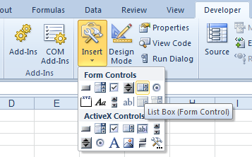
Both the Combo Box and List Box display a list of items for the user to select. I prefer the List Box, because you can several items even without clicking on the control. The Combo Box only shows one item at a time, until you click the control. Of course, if there isn’t room to display a List Box, then the Combo Box works fine.
When you click on the control button in the ribbon (or on the Forms toolbar in ancient Excel), the cursor turns into a crosshair, and you can draw your control just like drawing any other shape. In this example I’ve made two identical controls, one for each series we allow the user to highlight. You could display two list boxes side by side, two combo boxes side by side, two combo boxes one above the other, or any other arrangement that works in the available space on the worksheet.
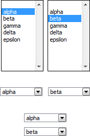
Even if I’m using multiple controls, I usually make one and format it, then make as many copies as I need, either by using Copy and Paste or by Ctrl-dragging. After copying, I change specific formats (such as the cell link, below).
When you right click on a control and choose Format Control, you are presented with this dialog. In a combo box or list box, the input range contains the list of items displayed in the control. The cell link is the cell that contains the index number of the selected list item, starting with 1 for the first item in the list. This is how the index values in H10:H11 will be changed.

With the controls formatted and the formulas already in place, play with the controls and make sure the data changes as expected. Note that multiple controls can use the same cell link. Changing one control will change the value in the linked cell, and consequently change any other controls using this cell. Likewise, changing the value in the cell will change the setting in the control.
Building the Interactive Chart
The data and the controls are all set up, so now we create our charts. Select A1:G6, and insert a line chart. Resize and format the chart as appropriate.
Now format all the series to de-emphasize them. Thin lines, small markers, light gray color.

It’s easier to keep these gray series, and add duplicate series with bolder formatting for the series we want to highlight. The lighter data is hidden behind the bolder series.
To add the highlighted series, copy A9:G11, select the chart, and use Paste Special to add the data as new series, with the First Row and First Column check boxes both checked. Format these series to stand out compared to the light gray background data, and add a series name data label to the last point of each.

Now arrange the controls next to the chart. The list boxes have ugly black borders, but I hid them behind unfilled rectangles with light gray lines, and I colored the chart area border to match.

In fact, you can relate the list boxes to the appropriate highlighted series by coloring the gray rectangles around the list boxes to match the series.

Using the Interactive Chart
The user can now highlight and compare two series, without interference from the rest of the data which is still shown in the chart. If no other series are selected in the list boxes (or combo boxes), the corresponding data values are all #N/A, so the points don’t even appear in the chart.
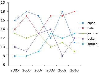
Any two series can be selected for comparison. Note how easily the opposite trends of series gamma and epsilon can be seen in this chart. In the original line chart it was very difficult to resolve these series, because the other series were not de-emphasized by shading them gray. Yet here we can still see where these two series lie compared to the overall spread of the data.


