In an organization it is often informative to plot individual salaries and grades to see how they fall within salary bands for those grades.
This is easily accomplished by constructing a combination chart using a floating bar chart and overlaying the individual points as an XY scatter plot.
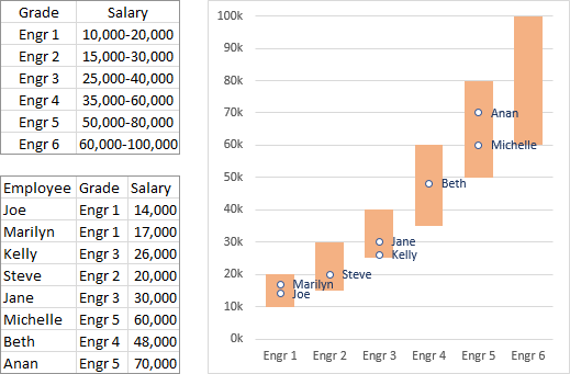
The screenshot below shows salary ranges for six grades of engineers, along with actual salaries and grades for eight engineers, with the desired chart.
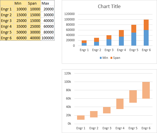
The data needed to construct the floating bar chart is shown below, with Span calculated in the column between Min and Max. The chart is constructed by selecting the orange shaded cells (Grade, Min, and Span) and inserting a stacked column chart (top chart below).
Fix up the chart (bottom chart below) by deleting the legend, formatting Min to use no fill and Span to use a light fill color, and setting a gap width of 50 or 75%. Clean up the vertical axis labels by using a custom number format of
0,"k"The lone zero means display the value without decimal digits, and the comma after the zero means show thousands, not ones. I’ve deleted the chart title, but you should use a title that describes the data being displayed.
Add the individual salary data as follows. Set up the data as shown, using a MATCH formula to find which bar the engineer’s grade falls within:
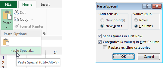
=MATCH(cell containing grade label,range containing list of grade labels,0)This column should be to the left of the salaries, since it will be used as X values for the XY series we will plot. Copy the shaded range (grade index and salary), select the chart, use Paste Special from the Home tab of the ribbon, and select the options shown in the dialog screen shot below:
- Add Cells as New Series
- Values (Y) in Columns
- Series Names in First Row
- Categories (X Labels) in First Column

The data is added as another stacked column series (below left).
Right click on the added bars, choose Change Series Chart Type from the pop-up menu, and select the XY Scatter option with markers only (below right).
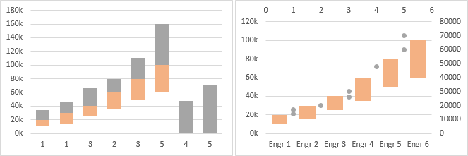
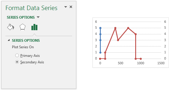
Select the XY scatter series, and press Ctrl+1 (numeral one) to open the Format Series dialog or task pane. Under Series Options, select Primary Axis, then choose a marker color and style that shows up clearly against the floating bars (below left).
Finally, you may like to stretch the chart to improve resolution (below right). Add labels to make it easier to track each engineer. In Excel 2013, add labels, then use the Values from Cells option to use the cells containing the labels. In earlier versions, you can manually change the text of each label, or you can use Rob Bovey’s Chart Labeler, a free add-in, to link the data labels to the cells.
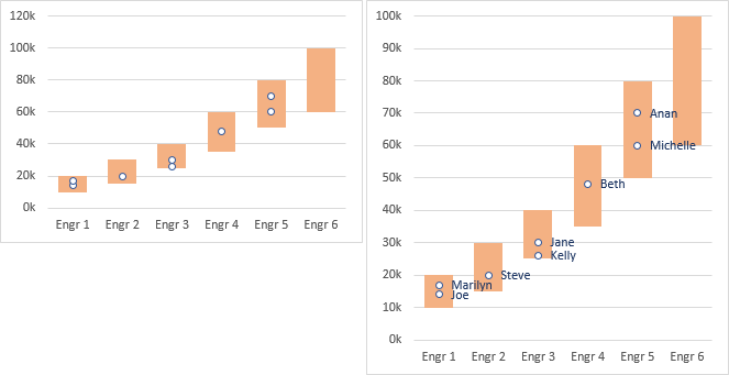
I’ve described these data labeling options in more detail in my tutorial Apply Custom Data Labels to Charted Points.
This tutorial is a rework of my answer to the October 2014 question need to create salary data with salary bands on Stack Overflow.
More Combination Chart Articles on the Peltier Tech Blog
- Pareto Charts in Excel
- Clustered Column and Line Combination Chart
- Precision Positioning of XY Data Points
- Add a Horizontal Line to an Excel Chart
- Horizontal Line Behind Columns in an Excel Chart
- Bar-Line (XY) Combination Chart in Excel
- Fill Under or Between Series in an Excel XY Chart
- Fill Under a Plotted Line: The Standard Normal Curve
- Excel Chart With Colored Quadrant Background


