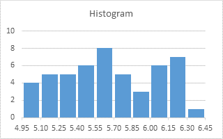
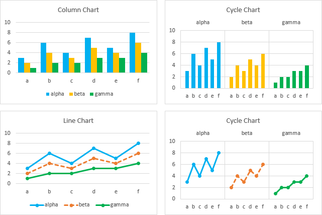
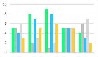
The default category labels in Excel column charts produce histograms that don’t look very good.
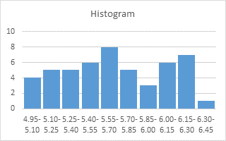
In Histogram with Actual Bin Labels Between Bars I showed a column-line combination chart that centered bin edge values between the bars of a histogram.
In Histogram on a Value X Axis Scale I showed a column-XY combination chart that simulates a horizontal value axis with markers that resemble tick marks and data labels.
In this tutorial I will go one further and show how to plot your histogram on a value-type horizontal axis.
XY Chart Histogram
The table below summarizes fifty random values between 4.95 and 6.45. The gold shaded cells contain the list of bin values, which are the values at the top of each bin. The blue shaded cells contain the results of Excel’s FREQUENCY function, which tells us the number of values below the first bin value, the number of values between each successive pair of bin values, and the number of values above the top bin.
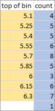
We can expand the range of bin values to show the overall upper and lower limits of the data.

We can stretch the range by inserting blank rows in the frequency table.

Finally we fill in the blank cells with the coordinates of the outlines of each histogram bar. For example, the first bar is drawn by starting at {4.95, 0}, drawing a line up to {4.95, 4}, across to {5.10, 4}, and down to {5.10, 0}. The second bar starts at {5.10, 0}, goes up to {5.10, 5}, across to {5.25, 5}, and back down to {5.25, 0}.

Select the range above and insert an XY Scatter Chart, using the lines without markers option.

Rescale the horizontal axis, and you’ve got your XY chart histogram.

This is a pretty easy chart to generate, if you don’t mind the duplicated data, and if you don’t need filled bars in your histogram.
Area Chart Histogram
The XY Chart Histogram is simple, and probably suitable for most tasks. If you want the bars to be filled, the XY chart won’t do it, but you can use an area chart.
To get vertical edges of the histogram bars, you need to use an area chart with a date axis. A date axis has a resolution of 1 day, and our scale requires decimals, so I took the XY chart data range above, and multiplied the X values by 1000. I chose 1000 instead of just 10 because I can use a number format of “0.00,” to display 4950 as 4.95.
Here is the data for our Area Chart Histogram.

Select this range and insert an area chart.

This has no border and a saturated fill. Lighten up the fill and apply a border using the original fill.
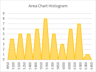
Ah, less intense on our eyeballs. (My daughter, a PhD student in the field of vision and cognition, insists that the word “eyeball” is much funnier than simply “eye”.)
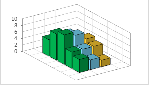
Those truncated pyramids are reminiscent of those awful 3D charts. Make them into proper bars by formatting the horizontal axis, and choosing the Date Axis option.
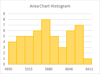
If the axis labels are converted to dates, you can change them back by changing the number format to “0”.
To get a similar axis range to that in our XY Chart Histogram, change the minimum and maximum of the horizontal axis scale. In former versions of Excel, you could enter whole number values like 4500 and 7000, but that was broken at some point along the way. You need to enter the dates that these values represent. To determine these, enter them into two cells, and format the cells as dates. So enter 4/26/1912 and 3/1/1919 as the axis minimum and maximum.

Format the horizontal axis and change the number format to “0.0,” (without the quotes). The comma divides the value by 1000, and the result is displayed with one decimal digit.
You can add light gray vertical gridlines if desired.
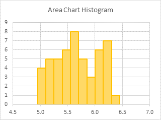
Notice how the area chart histogram originally used the smallest and largest X values as the horizontal axis limits? We can make use of this automatic scaling behavior by extending our input data by one row in each direction, and inserting the desired minimum and maximum axis scale. This avoids the need of manually scaling the axis, and of determining the corresponding dates for the scale.

As above, select this range and insert an area chart.
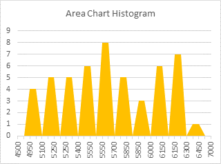
Lighten up the fill and apply a border with a darker color.
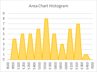
Format the horizontal axis, and choose the Date Axis option.
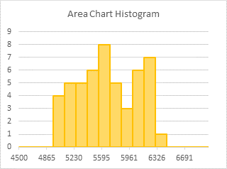
There’s no need to rescale the axis, so change the number format to “0.0,” (without the quotes) and add vertical gridlines if desired.

The only problem with extending the data sideways is that there is a thin line that extends to the ends of the axis. You can fix that by reducing the border width from the 1.5 default to 0.75.

If you need the thicker border, use the first approach. Otherwise using the data range that includes horizontal axis endpoints is easier.
Area-XY Combination Histogram
You can make a filled histogram using an XY-Area Combination Chart. The combination part makes it more complicated, but an XY chart has more descriptive chart tooltips.
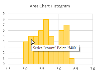
The area chart above displays the series name and point label when the cursor passes over a point. The XY chart below also displays the actual X and Y values.

Start with the XY Chart Histogram from the first section of this article.

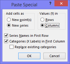
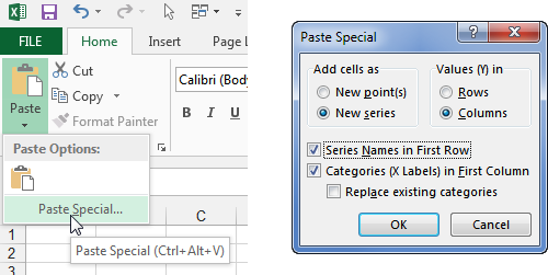
Copy the expanded data range for an area chart; you can use either range, but the range with added first and last points that match the intended axis scale limits will be easier. Select the chart, go to the Home tab of the Ribbon, click the down arrow on the Paste button (the Copy button in older Excel ribbons), and choose Paste Special. Add the data as a new series with rows in columns and with category (X) labels in the first column.
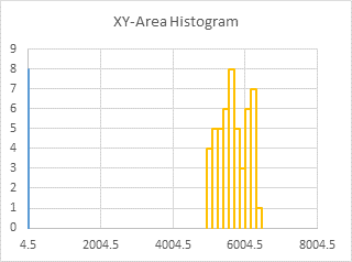
Format this added series, and assign it to the secondary axis.

Use the plus icon in Excel 2013 or the Chart Tools > Layout tab > Axes dropdown to add the secondary horizontal axis.
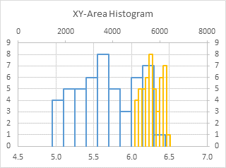
Right click on the new series, choose Change Series Chart Type from the pop-up menu, and select an area chart. Lighten up the fill color.
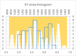
Format the secondary (upper) horizontal axis, and change the axis type to Date Axis. Depending on which data range you used, you may have to enter appropriate axis scale limits.

Select the secondary (upper) horizontal axis. Format it so it has no line, no markers, and no labels.
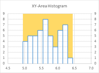
Select the secondary (right) vertical axis, and press Delete.

This chart has the filled appearance of an area chart with the informative chart tooltips of the XY chart.
