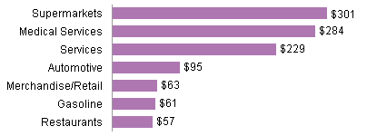
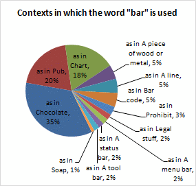
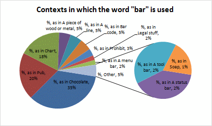
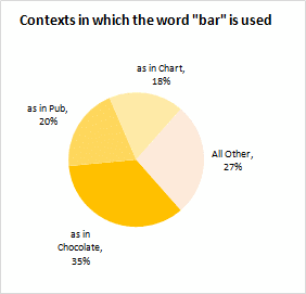
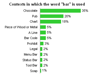
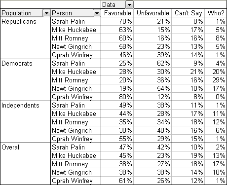
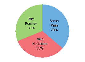
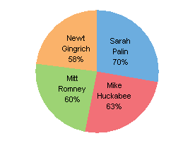
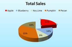
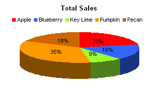
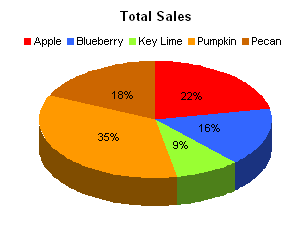
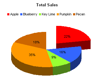
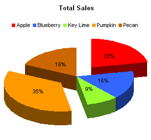
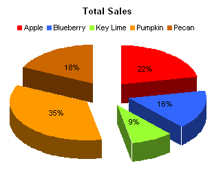
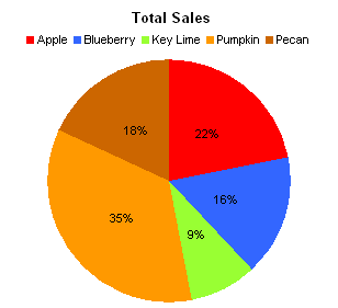
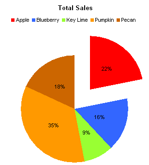
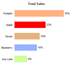
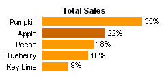
In Pareto lines on bar charts – an Excel fudge, Alex Kerin of Data Driven Consulting took data from a very badly distorted pie chart, and generated a Pareto chart. I busted the pie in Extra Distortion in a Pie Chart, but thought I’d chime in on the subject of Pareto Charts.
A Pareto Chart is a horizontal or vertical bar chart with its data sorted in descending order. The largest items (categories) in the chart are listed first for emphasis. Often a line is overlaid on the bar chart, showing cumulative sums or percentages of the total.
The Pareto Principle, named for Italian economist Vilfredo Pareto, is based on the observation that most of the effects of an action come from a small amount of the causes. This is often called the 80-20 rule, implying that 80% of the failures come from 20% of the types of defect, or that 80% of one’s sales come from 20% of one’s customers, or pretty much any 80-20 metaphor you can come up with.
The simplest Pareto chart is a plain column chart.
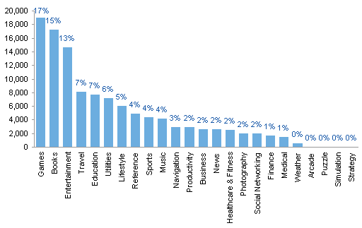
The percentages of each value are used as data labels. In this case, obviously the first three bars are substantially taller than any of the rest.The last four bars aren’t even as tall as the axis line is thick, so the bottom five categories can be combined into a category called “Other”.
To show the cumulative proportion of items (in this case, apps you can buy for your iPhone), a line can be added to show the percentage on a secondary axis. In Excel this is a simple column-line combination chart on two axes.
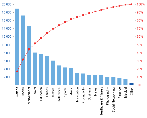
This shows that we didn’t reach 80% of the effect until about 50% of the categories were accounted for. It’s still disproportionate, but not as severely as the “80-20” nickname would indicate.
An alternative approach plots the accumulated value line on the same scale as the individual bars, with data labels showing the cumulative percentages. In Excel it’s even simpler: a column-line combination chart on one axis.
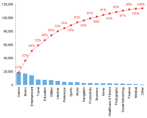
The heights of all bars is reduced substantially, but lowering the resolution also stresses that none of the bars is a huge amount of the total.
Vertical bars seem to be more common in Pareto charts, but there are problems with this orientation. The category labels have to be listed vertically, making them hard to read. Data labels may overlap; the labels were placed in a distracting staggered layout to make them legible.
To remedy these legibility problems, the chart can be rotated. Categories and percentage labels in the following chart are perfectly legible.
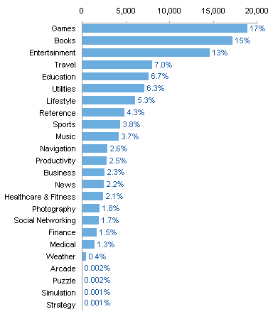
There is no difference in our ability to interpret the data in this chart, compared to the first vertically oriented chart above.
As before, a line can be added to show the percentage on a secondary axis. In Excel this requires a bit of a trick, using a bar-XY combination chart on two axes. For the XY series, X is the percentage and Y indicates the order of the categories.
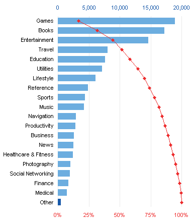
Again, the readability is the same for horizontally and vertically aligned charts.
Anything done vertically can also be done horizontally.
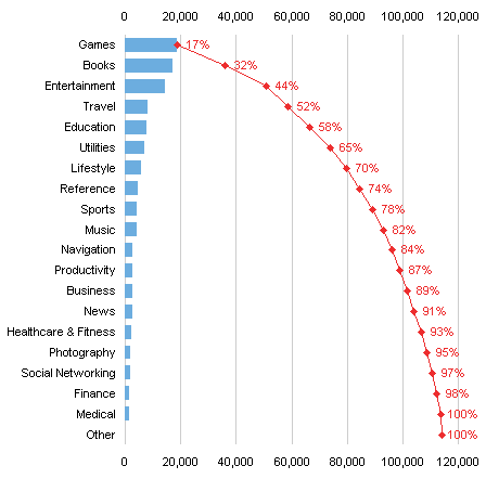
I prefer the horizontal bar charts for improved readability of the labels. In most cases I also prefer the one-axis version, where the line shows the accumulated totals on the same scale as the individual values.
Pareto Charts in Peltier Tech Charts for Excel
This tutorial shows how to create Pareto Charts, including the specialized data layout needed, and the detailed combination of chart series and chart types required. This manual process takes time, is prone to error, and becomes tedious.
I have created Peltier Tech Charts for Excel to create Pareto Charts (and many other custom charts) automatically from raw data. This utility, a standard Excel add-in, lays out data in the required layout, then constructs a chart with the right combination of chart types.
Pareto charts can be created in vertical or horizontal orientation.
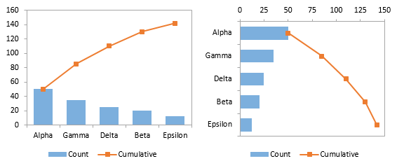
Values can be plotted (above), or percentages (below left), or bars as values and the line as cumulative percentages (below right).
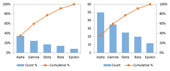
An “Other” category with different shading can be plotted at the end of the data (below left). The data can also be plotted as a floating cumulative bar shart, like a waterfall (below right).
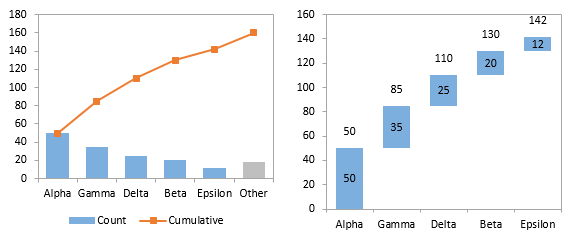
All of these options are available in vertically or horizontally oriented charts.
This is a commercial product, tested on thousands of machines in a wide variety of configurations, Windows and Mac, which saves time and aggravation.
Please visit the Peltier Tech Charts for Excel page for more information.


