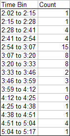
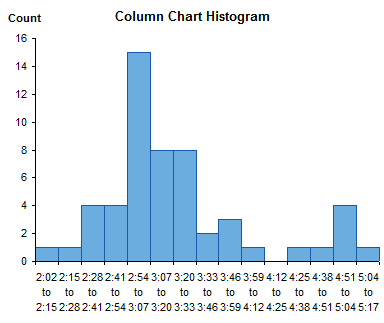
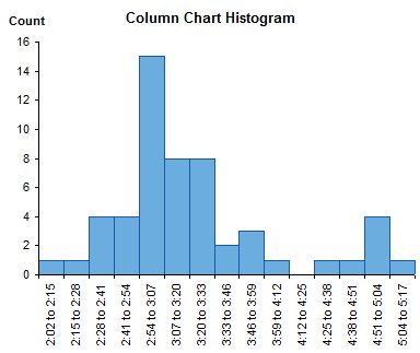
I recently showed how to create Histograms Using Excel XY Charts. This technique produces a human-friendly numerical X axis scale, which is easier to read and harder to be deceived by than the bin labels used by column chart histograms.
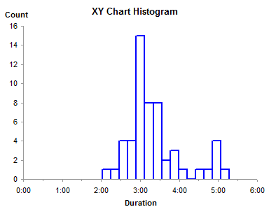
The drawback of that technique is that it produces histogram bars in outline only, without a fill color. In this post I will show how to extend that technique to fill the bars, using the protocol from Fill Below an XY Chart Series with an XY-Area Combination Chart.
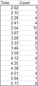
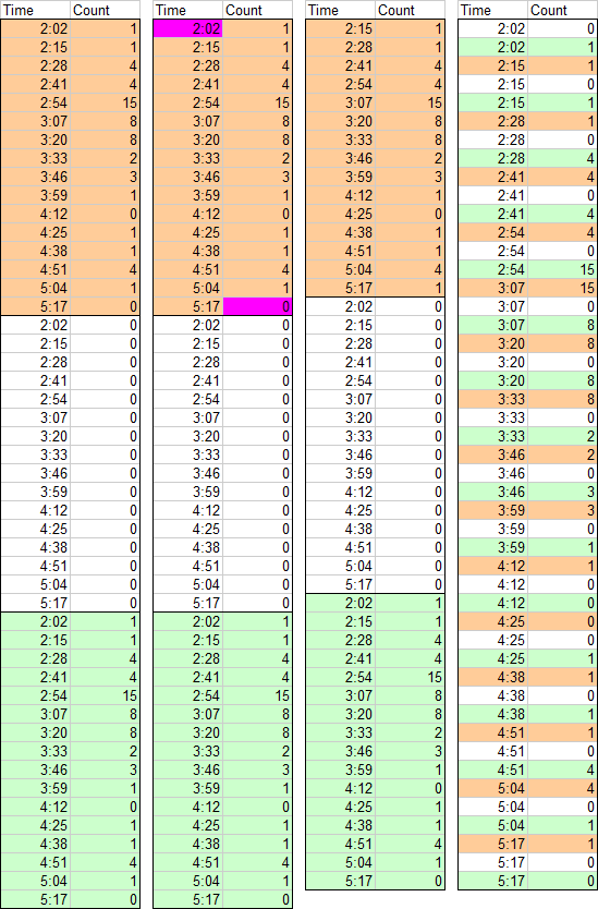
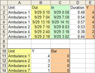
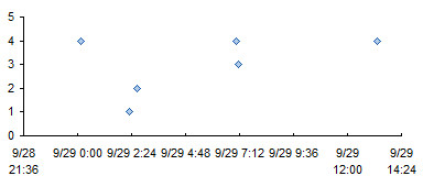
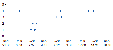
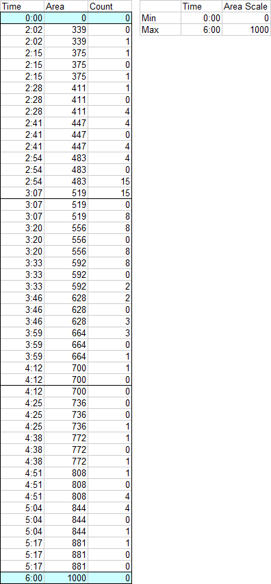
I started with the data from Histograms Using Excel XY Charts. I added a row at the top of the data for the left edge of the chart, and another row at the bottom for the right edge of the chart. I inserted a column between the Time and Count columns, containing calculated X values for the area chart that will provide the fill color.
The calculated values in the middle column are based on the small table to the right. It contains the minimum and maximum X values (minimum and maximum times) from the XY chart, and the minimum and maximum values I will use in the area chart series. Using 1000 for a chart that’s a few hundred pixels wide is a reasonable resolution, though you could use something larger, like 10,000. The conversion uses this formula (fill in the appropriate cell addresses for your worksheet):
Area Value = Area Scale Min + (Time - Time Min) / (Time Max - Time Min) * (Area Scale Max - Area Scale Min)
or something like this, depending on where the tables are in the worksheet:
=(A2-$F$2)/($F$3-$F$2)*($G$3-$G$2)+$G$2
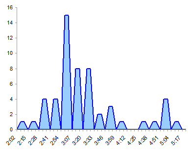
We need to use both XY and Area chart types. The XY chart series provides the X axis formatting and border, and the Area chart series provides the fill.
If we just used an area chart, the time points would be equally spaced, so the points at the same time would not occur at the same X position, but at consecutive positions. There would be no vertical lines between bars; instead the bars would be shaped like trapezoids.
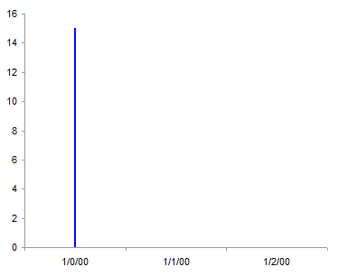
When we convert this axis to a date type, all the times are less than one (dates are whole numbers, remember, and times are fractions). The date axis treats days as whole number values, spaced according to their values, and ignores any times. Since the times occur within the same day (day zero), they occur along the vertical line at day zero, or January 0, 1900. To get the area series to look like bars with vertical sides, we need the times to be some integer multiple, hence our calculated values in the middle column.
Note: In cases where your bin boundaries are all integers, you can get away with using an area chart series without the XY chart series needed for the borders of the bars and for the axis. Simply use the protocol in Histograms Using Excel XY Charts with an area chart, and format both the fill and border of the area chart series as desired.
So let’s make the chart. Select the Time values and Counts in the first and third columns, not including the added first and last row, and create an XY chart. (Use Ctrl+Click to select multiple regions.) With one exception, these are the Excel 2003 version charts, but the Excel 2007 charts look the same, and with one exception, the steps are the same.
Copy the Area and Counts in the second and third columns, including the first and last row. Select the chart, and use Paste Special to add the data as a new series, categories in first column. Since the new X values are so much larger than the old, the first series is squashed against the left hand axis.
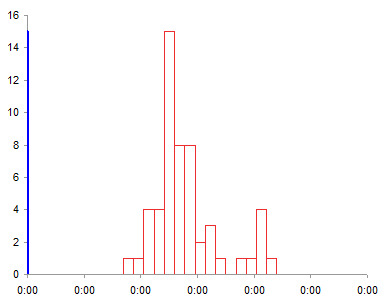
Format the new series so it appears on the secondary axis.
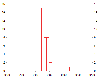
Excel adds only the secondary vertical axis, so we need to add the secondary horizontal axis. In Excel 2007, go to Chart Tools > Layout tab > Axes; in Excle 2003, go to Chart menu > Chart Options > Axes tab. The first axis makes its reappearance.
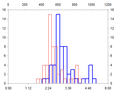
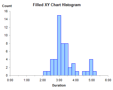
Convert the second series (red lines above) to an area type (colored in light blue with no border below).
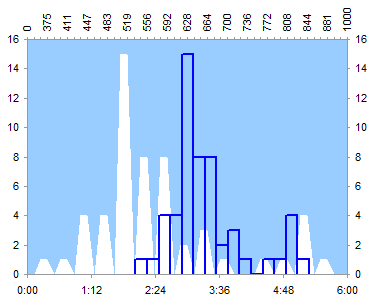
Convert the secondary horizontal axis to a date scale axis. Excel 2007: right click on the axis and select Format Axis; Excel 2003: go to Chart menu > Chart Options > Axes tab. It’s filled above the lines, not below, but we’ll take care of that shortly.
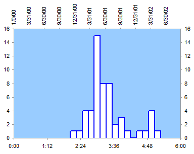
Format the secondary horizontal axis so it is hidden. No line, tick marks, or tick labels.
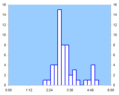
In Excel 2003 you need to format the secondary vertical axis to make the secondary horizontal axis cross at the bottom. Uncheck the Axis Crosses At Maximum Value box.
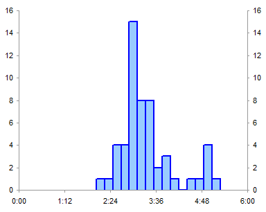
Ignore this step in Excel 2007. If you make the date axis cross at the bottom, even if it’s hidden, it will carve out a little space for itself, and push the other horizontal axis away from the data. No matter how you juggle primary and secondary axes, no matter what order you do the steps, no matter which incantations you may use. Speaking of incantations, I have uttered many an epithet over this behavior. It’s only a few pixels, but it looks like crap. They must have been celebrating Geek Liberation Day or something the day they programmed this part of the Excel 2007 charting module. (I don’t know whether Excel 2010 has addressed this issue.)
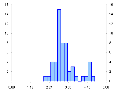
The Excel 2007 chart is still filled light blue above the line. Select the secondary vertical axis, and press Delete. The Excel 2003 chart is filled below the line, so all we need to do is hide the secondary vertical axis (no line, no tick marks, no tick labels) or delete it.
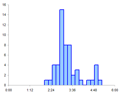
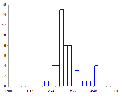
Format your X axis with human-friendly scale parameters, add a few titles, et voilà! Oh yeah, I used a thicker line when the histogram was unfilled, but with it filled, you can use a thin line for the borders of the bars.

There is a slight misalignment of area and XY series in the exported Excel 2003 chart, evidenced by the sliver of white in a couple of the bars. This does not appear in the actual chart, only in the exported image. Excel 2007 does not exhibit this problem. If I worried about it, I could probably fudge the formula used to compute the area chart’s X values. Perhaps adding 1 to all the calculated values except in the first and last (highlighted) rows would do the trick, or using a larger scaling factor (10,000 rather than 1000), and nobody’d be any the wiser.
To me this is much less aggravating than the gap at the bottom of the Excel 2007 chart I had a mini-rant about earlier, because there is no teeny fudge factor that makes that misalignment go away, other than the scorched-earth approach of deleting the vertical axis.


