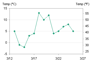
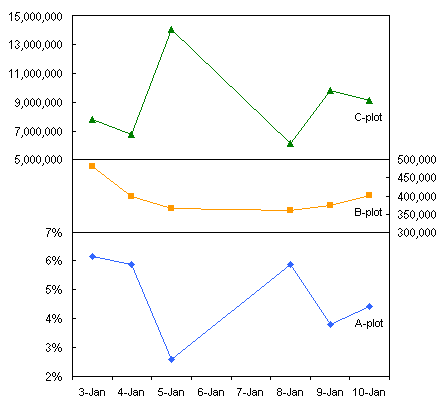
In my last post, Secondary Axes in Charts, I described an essay by Stephen Few in which he concluded that secondary axes provide no benefit to good infographics. I have come to the same conclusion myself: secondary axes are more likely to confuse and obscure the data, than to clarify relationships in the data.
In the first comment, Lee countered with a description of charts he frequently uses, which have dual axes. His axes are not independent of each other, however, but instead are tied together, showing different measures of cost of fuel per energy content. The units of measure are different for oil (gallons) than for coal (pounds), for example, and industry has developed standard measures of each. With a few constants, however, Lee is able to relate primary and secondary scales on a chart.
Lee’s charts do not have truly different scales. He uses a single scale, with two sets of numbers to describe them. That’s like reporting your weight in lb and kg, or your car’s speed in mph or km/hr. The numbers are different, but the scales are proportional, not independent. I thought, what a good opportunity to show how to construct a chart with this kind of proportional scales, which are the only kind of intentionally visible secondary axes you should employ in your charts.
Standard Secondary Axis Construction
In this example, I’ll plot fictional daily temperatures in Fahrenheit and Celsius. The data is shown in this simple table. The Fahrenheit values were derived from the made-up Celsius values using the well known F = 9/5 C + 32 relationship.
| A | B | C | |
| 1 | Date | Temp (°C) | Temp (°F) |
| 2 | 3/13/2008 | 5 | 41 |
| 3 | 3/14/2008 | -1 | 30.2 |
| 4 | 3/15/2008 | -2 | 28.4 |
| 5 | 3/16/2008 | 3 | 37.4 |
| 6 | 3/17/2008 | 4 | 39.2 |
| 7 | 3/18/2008 | 13 | 55.4 |
| 8 | 3/19/2008 | 10 | 50 |
| 9 | 3/20/2008 | 12 | 53.6 |
| 10 | 3/21/2008 | 4 | 39.2 |
| 11 | 3/22/2008 | 5 | 41 |
| 12 | 3/23/2008 | 7 | 44.6 |
| 13 | 3/24/2008 | 8 | 46.4 |
| 14 | 3/25/2008 | 5 | 41 |
The first step in creating a chart with primary and secondary value axes is to plot the data. In Excel you need to have at least two series in a chart if you want secondary axes, because each axis group requires at least one series. The data will be plotted with the Dates as the X variable and the Temperatures as the Y variable(s). At first the chart has only a primary Y axis.
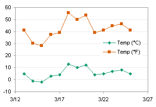
So far so good. The curves actually relate to the same temperatures, but they are measured on different scales. Let’s move the Fahrenheit data to the secondary axis. Classic Excel (97 and probably earlier to 2003): double click the series, click on the Axis tab, choose the Secondary Axis option. New Excel (2007, and 2010 if they don’t change it again): select the series, press Ctrl+1 (numeral one) to open the formatting dialog, and on the main screen, choose the Secondary Axis option.
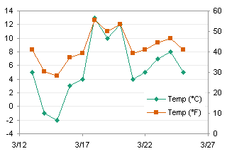
The scales still do not coincide. Excel’s built-in axis scaling algorithm has assigned a Y axis minimum of zero to the secondary axis, even though the actual minimum is almost 30 on a scale of 60. No matter: like everything else, if you want something done right, you have to do it yourself. I decided to clean up the Celsius axis by locking in the minimum and maximum at -5 and 15, with a step (major unit) of 5. With the 5/9 relationship between the two scales, the works out to a minimum and maximum of 23 and 59 on the Fahrenheit scale, with a step of 9.

The scales coincide, as evidenced by the alignment of the Celsius and Fahrenheit data. I’ve hidden the Fahrenheit lines os you can see that the Celsius lines connect the Fahrenheit points perfectly. The only problem is that the Fahrenheit scale is a bit unfamiliar; people would probably prefer a scale that started and incremented in multiples of five. in addition, having to plot two sets of data is a bit redundant, because the points coincide exactly.
Custom Axis Scale
Let’s rebuild the chart using just the Celsius data points, and we’ll fake the Fahrenheit scale.
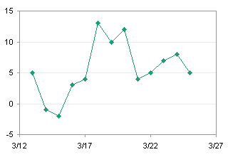
We need a range of values for our fake Fahrenheit axis. From our first experiment we know that -5 to 15 Celsius encompasses 25 to 55 Fahrenheit, os this is the table we will use. The Celsuis values this time were calculated from the Fahrenheit labels. We will add an XY series to the cahrt, using the dates in column E as the X values, the Celsius values in column F as the Y values, and the Fahrenheit values in column G as the “axis” labels.
| E | F | G | |
| 1 | Temp (°C) | Temp (°F) | |
| 2 | 3/27/2008 | -3.88889 | 25 |
| 3 | 3/27/2008 | -1.11111 | 30 |
| 4 | 3/27/2008 | 1.666667 | 35 |
| 5 | 3/27/2008 | 4.444444 | 40 |
| 6 | 3/27/2008 | 7.222222 | 45 |
| 7 | 3/27/2008 | 10 | 50 |
| 8 | 3/27/2008 | 12.77778 | 55 |
To add the points, copy the range E1:F8, select the chart, and use Paste Special (Classic Excel: Edit menu, New Excel: Home tab of the ribbon, far left) to add the data as a new series, X values in the first column, series name in the first row. As desired, the points line up along the right edge of the chart.
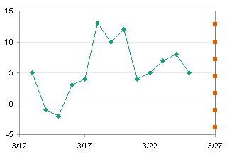
Next we need labels on the data points. There are two very good chart labeling utilities, both free, that integrate nicely with Classic Excel. I haven’t tested either in New Excel: I suspect they work but may not interface as nicely with the ribbon. The utilities are Rob Bovey’s Chart Labeler from AppsPro.com, and John Walkenbach’s Chart Tools from J-Walk.com. Download, install, and use one of these utilities to add chart labels from the range G2:G8 to the data points, in the position to the right of the points.

The last step is to make the XY series look like an axis. First, format the series so it has no markers and no lines. Add positive X error bars to this series, with a nominal value (in this case, 0.15 seems good). Format the error bars so there sre no end caps on the bars, and the line color matches the gray of the chart frame.
Note: I have just tried this in Excel 2007, and it doesn’t work. In Classic Excel, there is a small border around the visible plot area of a line or XY chart that has markers in any of its series, which allows a marker to be located on the edge of the chart and not be truncated by the plot area’s border. This allows the error bars to extend away from the chart. New Excel does not have this little border region around the plot area, or maybe the error bars do not appear within the border. I’ve had other issues with Excel 2007 error bars, and maybe one day I’ll rant post about them.
Here is the finished chart in Classic Excel. In New Excel you could change all your ticks in the chart’s axes to Cross instead of Outside, then use the plus-sign markers for the dummy scale axis. Or you could use the small dash marker, but that produces a tick which is too thick.
