In Data Sets, Dick described his affection for data to his Daily Dose of Excel readers. One of his bar charts showed the life expectancy differential between men and women in various countries. In Bangladesh, men actually outlive women, so the bar extends into negative chart space, and the category label “Bangladesh” overlies this data.
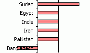
Dick wondered how to avoid this problem. There are two ways, one very simple and the other slightly simple but more attractive.
I’ll illustrate with the following data. The “opposite” data in column C is dummy data for a hidden series which will provide data labels that replace the default axis labels. The values are defined by a simple formula: =-B2/ABS(B2). I could have used =-SIGN(B2), but I thought of this variation after I built the data range.

I created a bar chart using the first two columns of data.
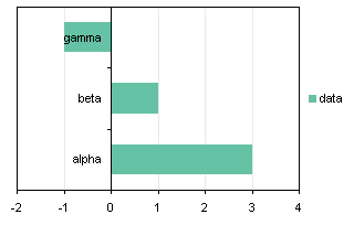
Since Excel plots data starting from the axis and moving away, the first category (alpha) is plotted next to the axis, below the next category. It’s actually very logical, but people don’t understand this. Anyway, fix this by formatting the category axis so it is plotted in reverse order, and the value axis crosses at the maximum category, which is at the bottom of the chart when categories are plotted in reverse order.
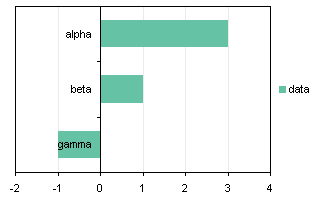
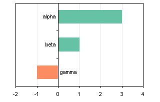
Okay, looks fine, except for the label “gamma” which overlap its data point.
I promised an easy way, so here goes. Format the category axis so the axis tick labels are in the “Low” position. They are plotted at the low side of the chart. This is a good quick way to move the labels out of the way, but in some cases, the labels may be moved pretty far from the axis. Because the labels need a margin, the entire chart is compressed laterally, reducing the resolution of the value axis scale.
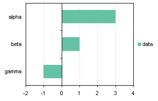
So here is the almost as simple method, which eliminates the issues raised above. Extend the chart source data to include the “opposite” column of data.
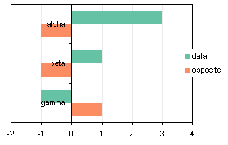
Format either of the bar chart series so the overlap is 100%. Now the bars line up perfectly.
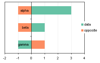
Format the category axis to remove the tick labels (select the “None”) position.

Add data labels to the “opposite” series, using the Category Labels option.
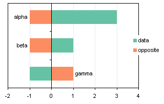
Format the data labels so they are in the “Inside Base” position.

Now hide the “opposite” series by formatting it to show no border and no area fill. Also remove the “opposite” legend entry by single clicking twice on its text label, and pressing Delete. (You could remove the legend altogether, since there’s but a single series.
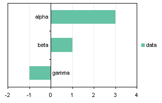
The technique works just as well with column charts.

You could also use the Invert Excel Chart Format if Negative technique to further highlight the negative value.


chip says
I like it. I agree that “Low” often puts the labels pretty far away.
Generally, Excel makes it really hard to make attractive charts unless they are very simple charts with short labels. The forced reorientation and skipping of labels and ignoring of settings to angle (or not) the text really annoys me. If I have a complex chart I often forego the x axis labels altogether, and format the columns underneath the chart to match the width of the bars and gaps. The I put the labels underneath and format them how I want–wrapped, vertically, etc.
Should I have to do that? I think not. The version of Harvard Graphics I used on a PC-XT running DOS 2 provide more control over the appearance and positioning of the axis labels. Or maybe I am only waxing nostalgic, but I remember the switch to the PPT graphing lo those many years ago, and looking for the ability to fix the labels.
Primo says
I loved Harvard Graphics – I used a DOS version for years after I switched to Windows, I couldn’t understand why anyone would use Excel for drawing graphs. The Microsoft Graph program that Excel used was very basic and produced the ugliest graphs I’ve ever seen. And there was an add-on that extended the graph types to (as I remember) way beyond what Excel does now.
Jeff Weir says
I love your ‘opposite’ approach, Jon. Somehow I missed this post when you posted it last year, and since then I’ve needlessly been using textboxes to display chart labels purely so I could have the flexibility to drag them out of the way. But this is way cooler.
Do you by any chance have a tutorial on here somewhere that deals with overlapping series labels? I’ve got a couple of charts that I’ve used your ‘label last point’ macro (excel 2007) in, but sometimes the two labels overlap.
Jon Peltier says
Hi Jeff –
For specific projects I’ve often had algorithms for locating labels, using a hidden XY series to position the labels. Something like, if Y2>Y1 but Y2<Y1+Delta, then plot point (label) at Y1+Delta (and the other at Y2-Delta), where Delta was the minimum legible label spacing, dependent on axis scale.
Jeff Weir says
That’s a great back-door approach! And kinda obvious given the ‘opposite’ approach you mention in your post. I feel like I should have put 2 plus 2 together myself on this one :-)
Thanks Jon
Jon Peltier says
Jeff –
Y1+Delta and Y2-Delta aren’t exactly right, but I got it right in the code I posted under the other article:
Y1+(Delta-Abs(Y1-Y2))/2
Y2-(Delta-Abs(Y1-Y2))/2