You may have sets of data for several categories, and you want to show the values for each category, and highlight some kind of range for each category (a permissible range, a target range, or some statistically computed range).
The following chart shows three categories (A, B, and C) with highlighted ranges and several data points for each.

This combination chart is simple to make.
The Individual Values
We can plot the points as an XY Scatter chart series. This chart uses 1, 2, and 3 for categories A, B, and C.

There is substantial overlap between points, so it would be helpful to jitter the points, that is, spread them out laterally so they no longer overlap.
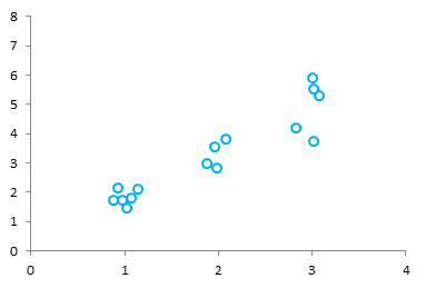
And of course, we want to show A, B, and C instead of 1, 2, and 3. Plus add the highlighted ranges for each category.
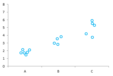
The Data
We’ll use the following data. The floating columns are defined in B2:D5, and the actual points are described in F2:I17. Column F has the point identification, category and index, which will not be shown in the chart. Column G has X values 1, 2, and 3 corresponding to the categories A, B, and C. Column H has the jittered X values. Column I has the actual Y values.
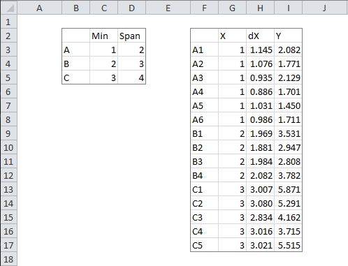
I’ve never encountered a useful jittering algorithm, so I fudged my own, which works well enough. The formula in H3 is
=G3+0.2*(RAND()-RAND())
This gives a random number within ±0.2 of G3, biased closer to the middle of the ±0.2 range.
Building the Chart
Make a stacked column chart with the data in B2:D5.
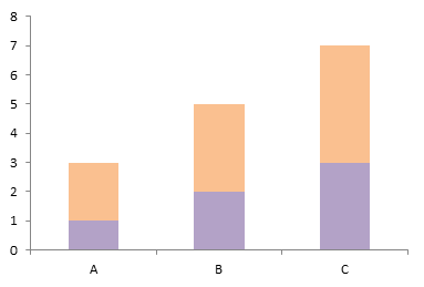
Format the bottom series (“Min”) so its fill is No Color. The result is the floating column chart that serves as a backdrop for the actual points.
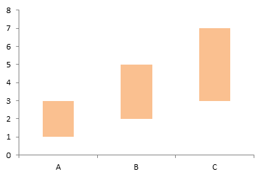
When an XY series is plotted on the axes of a column chart, an X value of 1 corresponds to the first category, 2 corresponds to the second category, etc. A value between 1 and 2 will be plotted proportionally between the first and second categories: 1.5 is midway between the columns at A and B. The jittered X values between 0.8 and 1.2 will fit within the width of the column at A.
Copy the range H2:I17, select the chart, and use Paste Special to add the data as a new series, with series in columns, series name in first row, category labels in first column.
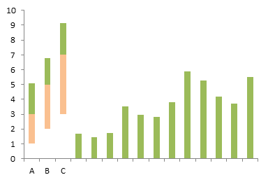
The new series was added as a new set of columns stacked on the floating columns and on extra categories further to the right.
Right click one of the added points, choose Change Chart Type, and select the XY variant with markers and no lines.

The XY points were initially plotted onto secondary axes, which are misaligned from the primary axes of the floating columns. Format the XY series so it is plotted on the primary axis to finish the chart.


Joe Mako says
What if instead of adding random jitter, the individual points were sorted by value, either ascending or descending? Here is an example made in Tableau: http://public.tableausoftware.com/views/HighlightedCategoricalRanges/Dashboard1
An added benefit is you can see that B and C have less points, something not immediately visible with random jitter.
AusSteelMan says
Hi Jon,
Thanks for sharing another great tip.
I like the jitter calc. I ended up using 0.15 to try and keep the points with in the “box”
Additionally, I added 2 more “Y” value columns. The first returned the “Y” value if it was inside the span range for that category, and the second returned the value if outside the span. This allowed me to show the points in different colours, which was especially useful when the point was just ouside the range, but some of the marker was inside the box.
Thankd again.
Kind regards,
Darren
Jon Peltier says
Joe –
That’s a good idea. I’ll add it to the technique above.
Darren –
I was going to include alternate coloring of points which are out of bounds, and decided it was more than I needed for the post. Glad to see that my readers can figure these things out. Still, I may include it.
Bill Coon says
Hello,
Please see the spreadsheet at the following address:
https://www.yousendit.com/download/WUJiTkFsUnJkMnZWUThUQw
In Chart 1 I used VBA code from the Microsoft site to add data labels to points on an XY plot. The macro is called AttachLabelsToPoints. But I wanted to make the markers vary, based on another variable. So I used your suggestion from an earlier post to change the markers to dfferent values (Chart 2). Now the macro won’t work, and I lack the VBA coding skills to correct it. Can you please suggest how to make it work? Thanks so much!
Jon Peltier says
Without examining the workbook, I have a few thoughts.
Did you add points to the chart? The simplistic Microsoft macro (it has to be simplistic) probably only adds labels to SeriesCollection(1). The easiest way to fix this is to keep your multiple series with different formatting, add a series that has all the data points (which worked before), move this series to first in the list, and format it so it has no markers or lines. When you rerun the code, the macro will add labels to this hidden series, and it will appear that each individually formatted marker has a corresponding label.