A candlestick chart is used to show stock price performance, typically daily; a bar shows the daily change from the opening to closing price, with different colors for gaining and losing changes, and lines extend from the bar to the daily high and low.
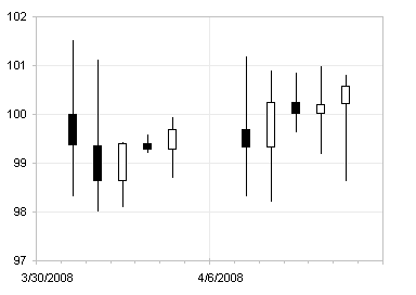
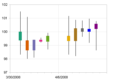
I was recently asked how to apply different arbitrary colors to individual up-down bars in a candlestick chart.
As I showed in Stock Charts and Other Line Chart Tricks, a candlestick chart can easily be fashioned from a run-of-the-mill line chart in Excel. (The web page just cited and this blog post were written about Excel 2003. Excel 2007 faithfully follows most of this discussion, but not all, as the charting capabilities in Excel 2003 are more advanced and more consistent.) Below is a line chart of the same stock data as in the candlestick chart above.
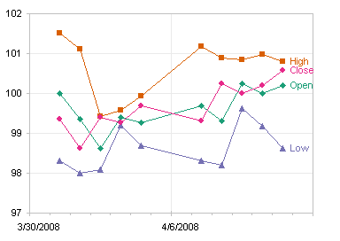
The data is shown below, or you can click here for a CSV file. I’ve added columns F:J for use later in this discussion.

You can select any of the line chart series and open the Format Series dialog. On the Options tab, select the High-Low Lines and Up-Down Bars options. The High-Low Lines option draws a line from the highest to the lowest of all line chart series plotted in the axis group (primary or secondary) of the selected series, no matter what order the series are in, as long as there are two or more line chart series.
The Up-Down Bars option draws a bar from the first line series to the last line series in the axis group (primary or secondary) of the selected series. The bars representing an increase from first to last are in a different formatting group (Up Bars) than those representing a decrease (Down Bars). Therefore, although it doesn’t matter how many line chart series you have (as long as it is a minimum of two), the order of series is very important: Open should always be first and Close should always be last. By default, Up Bars are filled white and Down Bars are filled black. The chart below is a line chart with High-Low Lines and up-Down Bars. To produce the candlestick chart at the top of this post, the line series themselves are formatted to show no markers and no lines.
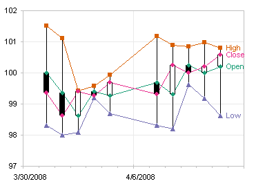
You can right click on a set of bars, choose the Format item in the pop-up menu, and format the bars. I sometimes forget whether the up or down bars are black and white in the default color scheme, so I color gains green and losses red. You can pick any color scheme you want, but all up bars get one scheme and all down bars get another. You cannot selectively color any individual bars with distinctive colors.
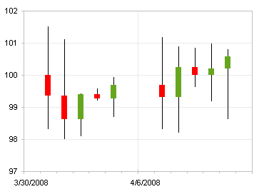
I’ll describe the alternate approach you need to follow to enable formatting individual up-down bars, but first I’ll show a stock chart appearance which is very common in financial sources. Instead of the up-down bars, this chart shows a left tick for an opening price and a right tick for a closing price. Excel offers a variation that has a right tick for closing prices, but no left tick option. I rely on smoke, mirrors, and error bars to get this effect, as described in Stock Charts and Other Line Chart Tricks.

We know from changing the up-down bar colors to red and green (above) that we can format a group of up or down bars, but we cannot individually format one up or down bar. We do know that we can format an individual point in a column chart series, so let’s reconstruct the up-down bars using a stacked column chart to generate floating columns. In the table above, I have used simple formulas to calculate the heights of the Float, Down, and Up columns:
Float (cell F3)
=MIN(B3,E3)
Down (cell G3)
=IF(B3>E3,B3-E3,0)
Up (cell H3)
=IF(B3<E3,E3-B3,0)
Create a stacked column chart using this data:
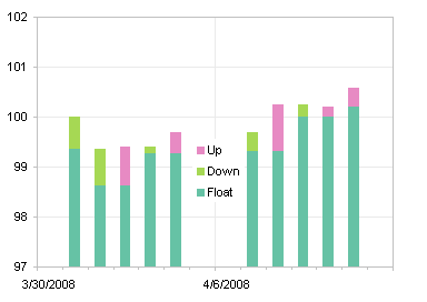
Then format the Float series to be invisible (no border and no fill) and the Up and Down series to be the colors you want (I used the same green and red color scheme I’d used for the Up-Down Bars in the earlier chart).
Although individual bars can be formatted separately, I kept separate series of Up and Down Bars, so that I could format each series in one step, rather than formatting several individual bars the same way.

As stated above, you can get High-Low lines with a pair of line chart series. The steps are: add series for High and Low, change the chart type of these series to line chart, add High-Low Lines, and hide markers and connecting lines. I didn’t go through the protocol in detail, because the results are not what we want: The High-Low Lines lie in front of the Up-Down Bars. This is simply the way Excel draws these chart elements, and we cannot change that.
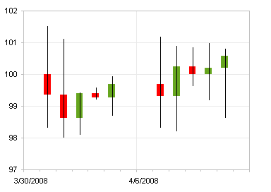
All is not lost, however. There is more than one way to skin a cat, or in this case, to draw vertical lines on a chart. We’ll use error bars. I used formulas in the Max and Min columns in the data to calculate error bar values:
Max (cell I3)
=C3-MAX(B3,E3)
Min (cell J3)
=MIN(B3,E3)-D3
Select the Float series (use the chart element selector dropdown on the Chart toolbar, since the series is invisible), press Ctrl+1 (numeral one) to bring up the Format Series dialog, and on the Y Error Bars tab, click in the Custom (-) box, and select the range containing the Min values (J3:J12 in my table). Select the High series, press Ctrl+1, and on the Y Error Bars tab, click in the Custom (+) box, and select the range containing the Max values (I3:I12 in my table).

Double click on one set of error bars, and choose the style that has no end cap. Repeat for the other set of error bars.
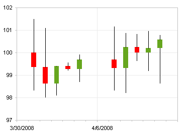
Now you can individually format any of the pseudo Up-Down Bars. Click on the bar to select the series of bars, then click on it again to select it by itself, then press Ctrl+1 to open the Format Point dialog, and select any colors you like.


Mike Alexander says
Ha! I don’t know how I missed this post, but I need it now. Another post from Peltier that makes me look like a genius.
Jon Peltier says
Mike – Just leave a nickel in the jar.
BxCapricorn says
Candlestick Pattern Recognition, written as Excel Statements (Nested IF, Nested AND)
The formulas assume Column A has the Date, B has Open, C has High, D has Low, E has Close. The formulas begin on line 3 (Today) and use line 4 (Yesterday) and line 5 (day before Yesterday). I believe these are correct, but I don’t trade Candlesticks. I simply used the creation of these statements to better improve my Excel skills.
Doji
=IF(B3=E3,”Doji”,” “)
Near Doji
=IF(ABS(B3-E3)=E3),((B3-E3)>(E4-B4))),”Bear Engulfing”, ” “)
Bullish Engulfing
=IF(AND(B4>E4,(E3>B3),(E3>= B4),(E4>=B3),((E3-B3)>(B4-E4))),”Bull Engulfing”, ” “)
Hammer
=IF(AND((C3-D3)>(3*(B3-E3)),((E3-D3)/(0.001+C3-D3)>0.6),((B3-D3)/(0.001+C3-D3)>0.6)),”Hammer”,” “)
Hanging Man
=IF(AND((C3-D3)>(4*(B3-E3)),((E3-D3)/(0.001+C3-D3)>=0.75),((B3-D3)/(0.001+C3-D3)>= 0.075)),”Hanging Man”,” “)
Piercing Line
=IF(AND(E4<B4,E4+B4/2<E3,(B3<E3),(B3<E4),(E30.6)),”Piercing Line”,” “)
Bullish Harami
=IF(AND((B4>E4),(E3>B3),(E3<=B4),(E4<=B3),(E3-B3)B4),(B3>E3),(B3<=E4),(B4<=E3),(B3-E3)<(E4-B4)),"Bear Harami"," ")
Bear Kicker
=IF(AND(B4<E3,B3<=B4,E3E4,B3>=B4,E3>B3),”Bull Kicker”,” “)
Dark Cloud
=IF(AND(E4>B4,E4+B4/2>E3,(B3>E3),(B3>E4),(E3>B4),((B3-E3)/(0.001+(C3-D3))>0.6)),”Dark Cloud”,” “)
Morning Star
=IF(AND(B5>E5,((B5-E5)/(0.001+C5-D5)>0.6),(E5>B4),(B4>E4),((C4-D4)>(3*(E4-B4))),(E3>B3),(B3>B4)),”Morning Star”,” “)
Evening Star
=IF(AND(E5>B5,((E5-B5)/(0.001+C5-D5)>0.6),(E5B4),((C4-D4)>(3*(E4-B4))),(B3>E3),(B34*(B3-E3),((C3-E3)/(0.001+(C3-D3))>=0.75),(C3-B3)/(0.001+(C3-D3))>=0.75),”Shooting Star”,” “)
Inverted Hammer
=IF(AND((C3-D3)>3*(B3-E3),((C3-E3)/(0.001+(C3-D3))>0.6),(C3-B3)/(0.001+(C3-D3))>0.6),”Inverted Hammer”,” “)
Three White Soldiers
=IF(AND((E3>(B3*1.01)),(E4>(B4*1.01)),(E5>(B5*1.01)),(E3>E4),(E4>E5),(((C3-E3)/(C3-D3))<2),(((C4-E4)/(C4-D4))<2),(((C5-E5)/(C5-D5))(E3*1.01)),(B4>(E4*1.01)),(B5>(E5*1.01)),(E3<E4),(E4E4),(B3E5),(B4<B5),(((E3-D3)/(C3-D3))<2),(((E4-D4)/(C4-D4))<2),(((E5-D5)/(C5-D5))<2)),"*"," ")
BxCapricorn says
In checking my comment, somehow the Harami formulas posted incorrectly. They should be:
Bullish Harami
=IF(AND((B4>E4),(E3>B3),(E3<=B4),(E4<=B3),(E3-B3)B4),(B3>E3),(B3<=E4),(B4<=E3),(B3-E3)<(E4-B4)),"Bear Harami"," ")
GLTA.
BxCapricorn says
Same problem. The formula must have something in it that gets the HTML script messed up. I’ve posted a public Google document here:
http://docs.google.com/Doc?docid=0AWIwmWo21U8sZGZmejk2NnFfMjQ5Y3F0a2tmZ3E&hl=en
For those interested.
Amarnath says
Thanks for the info provided in this link (https://peltiertech.com/candlestick-alternative-individually-colored-up-down-bars/)… Its very useful.
I would like to know if its possible to display the value based on the Mouse Pointer location on the chart….
Jon Peltier says
If you want to see the open, close, high, low, and change values, plot the four line series (OHLC) and format them to be invisible. This will provide OHLC values on mouse over, and the floating bars that replaces the up-down bars shows the changed value on mouse over.
RichG says
Just when I am ready to yank my hair out because I can’t figure out something in Excel (and of course there is no useful help file) I get some great online advice! This was very helpful, thanks.
Eyal Christopher Yunkatz says
Hello, Jon
I have created a nice program that retrieves automatically stock prices and charts
them on a candlestick chart for every range I want.
There is 1 problem.
I use:
‘=================================
ActiveChart.ChartGroups(1).DownBars.Select
With Selection.Interior
.ColorIndex = 3
.PatternColorIndex = 2
.Pattern = xlSolid
End With
‘=================================
However, If I have a range that has only UpBars, I get an error.
Is there any way to check, using a VBA code if a candlestick chart has any upBars or
DownBars in advance?
In addition, Is there any way to refer to individual bars, for example, color all bars of
a stock that made a 5 point gap in a unique color?
I know you showed the trick of individual bars, but I am asking about a candlestick
bar.
Warm Regards, Chris
Jon Peltier says
Chris –
All up bars must be formatted the same, and all down bars must be formatted the same (but up and down bars may be different, of course).
Try this to avoid the error:
You can get the effect of individual up/down bar formatting using the technique in Candlestick Alternative: Individually Colored Up-Down Bars.
stan says
May you please send me your candlestick formulas either as a word doc or in excel. Send to [email protected]
Thank you so much
Jon Peltier says
Stan – The formulas are given in the text above.
Stan says
Its only that some of them when I tried them were showing errors. I would aslo want to find out if these are all or you have the formulas for other candlesticks as well? Thank you
Jon Peltier says
Stan –
All the formulas used in the analysis are displayed in the text. What kind of errors do you see?
rabbit says
Again – astonished about the charting details you offer. However – I do not get the same results as described. You write “Select the High series, press Ctrl+1, and on the Y Error Bars tab, click in the Custom (+) box, and select the range containing the Max values (I3:I12 in my table)…”
The following chart in your discription shows positive errorbars ending at the end of the up-down-Bars which are already in the chart – which seems to be correct for me. But if I use your formula for (cell I3)
=C3-MAX(B3,E3)
….the errorbars end above the top of the up-down-bars.
Shouldn’t the formula in be:
=MAX(B3,E3)-F3 and then…
“Select the Float (!) series, press Ctrl+1, and on the Y Error Bars tab, click in the Custom (+) box, and select the range containing the Max values (I3:I12 in my table).
?
At least this does work in my worksheet…
Whatever – I really learned a lot by scrolling through your pages over the years – thank you so much!
Best regards
Martin says
Hi,
all this advice on how to create/ combine the stock chart is extremally useful.
However, I use Excel 2010 and it seems that in this version none of the tricks wors/ is allowed.
Simply, I cannot see any “Options” tab on the data series property …
Have these tricks been tested with Excel 2010?
Thank you.
Martin
Jon Peltier says
Martin –
All of this is allowed in Excel 97 through 2013. In Excel 2007 Microsoft changed where certain features were hidden. Hi-Lo Lines and Up-Down Bars are now located on the Chart Tools > Layout tab of the ribbon.