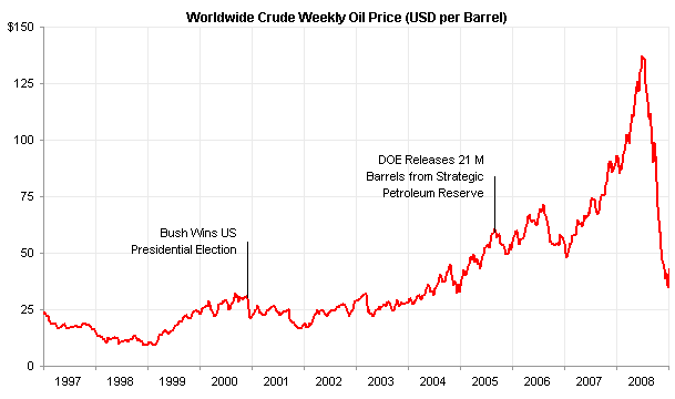
In Replacement for and Oil Price Radial Chart I used error bars as callouts, to connect labels to points on a line chart.

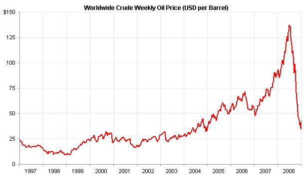
The technique is actually pretty simple. Here is the line chart, unadorned by any labels.

The data you need to label two points is shown below. The dates are the same as the corresponding line chart data points. The Y values (under “Labels”) are spaced above the line chart data points by the lengths of the error bars (under “Error Bar”).

Copy the first two columns of the data range shown above, select the chart, and use Paste Special to add the data as a new series.

Add custom negative Y error bars using the values in the table (see Error Bars in Excel Charts or Error Bars in Excel 2007 for assistance). Also, apply the labels in the last column of the range to this new series using Rob Bovey’s Chart Labeler.

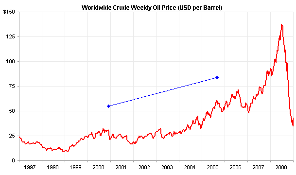
Hide the added series (no markers and no lines), and format the error bars to remove the end caps.

With a lot of labels, I positioned the labels to the side of the hidden data points, as above. If it isn’t so crowded, you can center the labels above the points, below.

In an upcoming post, I’ll show how to add callouts using XY series to add line segments oriented at any angle, not just the horizontal or vertical line segments afforded by error bars.


wayne says
What is your opinion on using the drawing toolbar to add text boxes and the vertical lines and then grouping the chart with these drawings in order to form the final chart for reports in word purposes?
Jon Peltier says
Wayne –
These drawing objects are not tied to any particular values in the chart, but for a static report, they are fine.
However, I would not follow exactly the procedure you describe. Instead, I would select the chart prior to clicking on the drawing tool. In this way, the drawing object is created in the chart, not in front of the chart. You will not have to do any grouping, and only copy the chart and paste it.
Danièle says
Thanks again Jon for your “elegant” callout labels as well as the extra tip about the drawing objects created in the chart rather than grouped with the chart.
Danièle
Stijn says
Hi Jon,
This is indeed a nice solution; thanks for sharing it with us.
However, I tried to apply the steps listed above, but when I paste special the ‘events’ as a new series, the dates of those events are not interpreted correctly because the X values of the original (fuel price) data series are used. It seems like this is because a line chart is used.
Can you clarify what I’m doing wrong?
Thanks,
Stijn
Jon Peltier says
1. Make sure the date axis of the original line chart uses Days as the Base Unit.
2. Add the data (X = dates) as a new series.
3. Convert the added series to XY type, then assign error bars.
Andy says
I’m using Excel 2010, and there is no option to “Paste Special” into the line graph that I have made. In an effort to get around that, I added a new series using the call-out points, but excel placed my new series on the far left side of the graph, when it should have been placed in the middle of the graph according to the dates. Any help?
Jon Peltier says
If a range is selected, then clicking the downward pointing triangle on the Paste button of the ribbon’s Home tab will show the Paste Special command.