In Calculating Wind Direction, Dick Kusleika helped solve the problem of calculating a wind direction using a best fit trendline, given wind directions that may vary on either side of 360°. Dick’s original data has wind directions in degrees at various altitudes in feet. The requirement is to estimate the wind direction at the intermediate altitude of 3000 ft. Interpolation between the wind directions at 2000 and 5000 feet may be adequate, but let’s play along and use Dick’s best fit solution.

One of the answers to the generic question “Why do we need charts?” is to gain insight into a problem before we try to solve it.
Dick showed a couple of charts, lame little pie charts actually, which hand-waved a clever little trick he used to account for directions on either side of 360°. I’ll show how using more carefully crafted charts could have helped lead to the same result more quickly, by showing exactly what the relationships are. I will also show how such charts can easily show when a simplified approach is too simple, and leads to a very wrong answer.
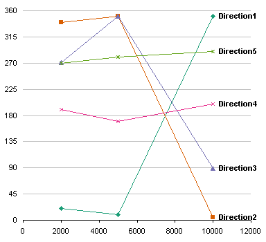
When charted, the original data looks like the following.

By inspection, we can see that Directions 4 and 5 are pretty nearly straight lines as drawn, while the other three have points on either side of 360°. To turn these into linear fits, we need to add or subtract 360° so that the lines can cross 360° (or 0°).
Here is the data, corrected by adding 360° as appropriate. The calculated wind directions at 3000 ft are shown in blue.

Which leads to this chart. All five cases now follow nearly straight lines.

Dick’s Approach
The trick is knowing which data needs to be “enhanced”.Obviously you need to correct the ones which have values concentrated at the ends of the 0 to 360° range.
Dick’s approach was to examine the three directions in each case, and if the difference between the min and the max exceeded 180°, he added 180° and moduloed by 360°. This took data which was arranged around 360° and rearranged it around 180°. To these cases he then added 180° to the calculated result, and again moduloed by 360°.
Dick’s magic formula is
=IF(MAX(C4:C6)-MIN(C4:C6)>180,
    MOD(FORECAST($B7,MOD(C4:C6+180,360),$B4:$B6)+180,360),
    FORECAST($B7,C4:C6,$B4:$B6))
which is array-entered (by holding Ctrl+Shift while clicking Enter), so in the formula bar it is surrounded by curly brackets. B4:B6 are the altitudes 2000, 5000, and 10000 in the first column, B7 is the target altitude 3000, C4:C6 are the wind directions under the label Direction1, and this formula is entered in C7. As written, this formula can be copied and pasted into D7:G7 to provide all five calculations.
Instead of a difference of 180°, Dick could have used another cutoff value to decide which data needs correction. Alternatively, a check of the correlation or residuals of the three points could indicate whether the points are nearly aligned or far from linear. These latter approaches are more computationally intensive.
Dick’s calculated results for 3000 ft are shown by the squares in the chart above. They are all pretty close to the line segments connecting the 2000 ft and 5000 ft data.
Alternative Approach, Simple but Wrong
A comment by “T” suggested using some trig to convert all angles to fit into the ragne -180 to 180°, and computing the resulting fit. This seems like an easier approach, and if you only check the answers to the first three cases, they agree.
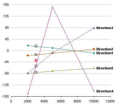
However, converting all angles to the arbitrary range -180 to 180° doesn’t check to see which angles should be changed. Dick’s fourth case has wind directiosn {190, 170, 200}, which become {-170, 170, -160}. Oops, now the three directions, which differed by at most 30°, now differ by 340°.
The incorrected directions are shown in the table and chart below.


Four of the five cases work out fine, but the fourth is obviously way off. Of course, without a simple chart, it’s not so obvious. The calculated values are shown as squares at 3000 ft. The black squares match perfectly with Dick’s solution, but the red square for the fourth data set is way off. If this solution had incorporated a check to see which sets of dta should be converted and which should be left alone, it may have made correct calculations for all cases.


Matt Healy says
Actually, wind direction is an excellent example of the kind of data for which the methods of “Directional Statistics” or “Circular Statistics” are appropriate. Another classic example would be many cyclical data sets (for instance access to a web site versus hour of the day over many days). Here is a Wikipedia article on the subject:
http://en.wikipedia.org/wiki/Directional_statistics
Most of what I know about circular statistics I learned 20-some years ago
from the Batschelet book cited in the references of that article.
Jon Peltier says
Matt –
I’ve seen wind direction charts, and they are somewhat intuitive, unlike 99% of the circular or cyclical charts I’ve seen.
Re web site statistics by hour of day: been there, done that. Last week I reasserted that Radar Charts are Ineffective