In Plotting Values Against Limits, I showed a few ways to compare some values (in this case, hourly wages) against recommended limits. In this post I’ll show a Box Plot approach to displaying this same data. The box plot will include the familiar boxes for the inner quartiles and whiskers for the outer quartiles calculated from the actual data, and it will be embellished with the actual values and with recommended limits on the values.
The Data
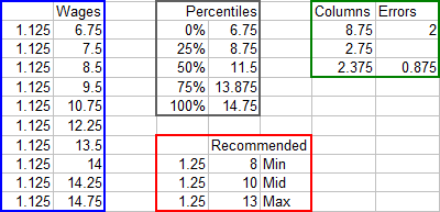
The data is rearranged as shown below. The blue rectangle at the left contains the wages data; the column of 1.125 are the X values that set the position of all of the points. The gray box contains percentile data calculated from the wage values using the formula =PERCENTILE(range,percentile) or =PERCENTILE($B$2:$B$11,D2) with the percentile as a percentage or decimal fraction.The red highlighted range contains the recommended limits on the hourly wage; the column of 1.25 values are used to position these data points.
The green area contains data for the boxes and whiskers. The first cell under Columns has the height of the bottom of the lower box, which is the value of the 25th percentile. The second cell has the height of the lower box, which is the value of the 50th percentile minus the value of the 25th. The third cell has the height of the upper box, which is the value of the 75th percentile minus the value of the 50th. The first cell under Errors has the length of the lower whisker (error bar), which is the value of the 25th percentile minus the value of the 0th. The third cell under Errors has the length of the upper whisker (error bar), which is the value of the 100th percentile minus the value of the 75th.
Create the Box Plot
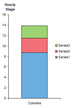
Select the cell containing “Columns” and the three cells below that, and create a stacked column chart with series in rows. This produces the two inner quartile boxes, and a box (which will later be hidden) that floats these at the appropriate height.
Add a negative error bar to the bottom series using the first error bar value (2) to form the lower whisker. Add a positive error bar to the top series using the second error bar value (0.875) to form the upper whisker.
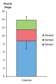
We’ll complete the formatting later.
Add the Values
Copy the two columns in the blue-outlined Wage values rectangle, select the chart, and use Paste Special to add the data as a new series, by columns, with series and category labels in the first row and column. These values are added as another set of stacked columns, and many novice chartsters would lose faith at this point. But you won’t, because you’re with me.
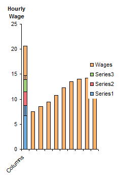
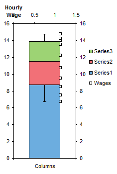
Change the chart type of the Wages series to XY (Scatter). The points become a series of vertically aligned markers, and Excel has added secondary axes to the top and right edges of the chart. We’ll fix that later.
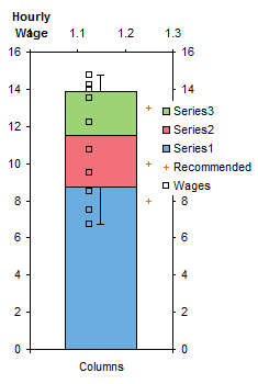
Copy the first two columns in the red-outlined Recommended values rectangle, select the chart, and use Paste Special to add the data as a new series, by columns, with series and category labels in the first row and column.
Clean Up and Format
Assign both the Wages and Recommended series to the primary axes. The X values should make sense now. The stacked columns are formatted with a 100% gap width. This means half of the one-category wide chart is columns and half is gap between columns. Categories in Excel charts have assumed X values of 1, 2, 3, etc., so the only category here has an X value of 1 and a width of 1. This means the left edge of the chart is at X=0.5, the right edge of the chart is at X=1.5, and the right edge of the boxes is at 1.25, where the Recommended data points lie. The Wage points are at X=1.125, between the whiskers and the right edge of the boxes.
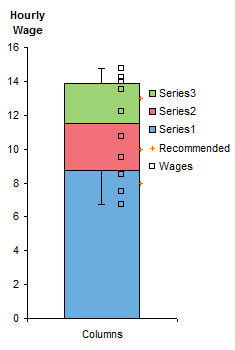
Hide the bottom box by formatting it with no fill and no border. Format the other two boxes with no fill or white fill, and black borders. Hide the category (X) axis. Rescale and lighten up the Y axis. Label the Recommended points with the values in the third column of the red-outlined range. I used Rob Bovey’s Chart Labeler for this. Add negative X error bars to the Recommended series using a constant value of 0.25. Use a medium gray for the Recommended labels and error bars, and hide the markers.
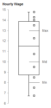
I used arbitrary X values for the Wages and Recommended XY series. To adjust the chart’s appearance, you can change these values. In the alternative below, I used a two-column wide range when creating the Columns series, with zeros in the second column; the zeros in the second category allow extra room to the right of the box and whisker chart for the other features. I used X=1.6 for Wages and X=1.9 for Recommended, and the Recommended X error bars are 0.7 long.
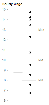
Showing the actual values, the (box and whisker) statistics based on the values, and the Recommended limits can be informative. In this case, it shows that the actual wages have been based only loosely on the recommendations.


Anonymous says
Hi Jon,
Nice looking chart.
How would you extend this for 100’s of salaries over multiple departments?
Panel charts setup or would you use something like the daily temperature chart
Glad to see you are blogging again.
Cheers,
Bob
Jon Peltier says
Hi Bob –
I would do this using a regular multiple box plot. I’d set it up so there was one box and whiskers unit per department and another for the total. I’d ignore the individual points, except for outliers.
I may also break it down by pay grade, gender, etc., just to make sure we’re not exposed to legal action.