A blog reader emailed me with a question:
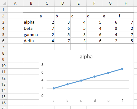
I want to visualize a series of prices on single axis:

I want to portray these in correct proportion, horizontally along a single line – much like points on a thermometer.
These prices are going to be the X values. You need some kind of dummy Y values, so Excel knows where to put the points.
In the data range shown below, I’ve put a set of dummy values in the row below the prices, using 0.5 as a dummy value. I picked 0.5 to float the points in a line above the horizontal axis; if you do in fact want the points right on the axis, you could use 0.0 for the dummy Y values.
I also changed the product numbers to alphabetic labels for this illustration. Short names will work best as data labels in the chart.
I made a chart using the prices and the dummy Y values (the shaded cells in the sheet). That’s the big chart below the data.

First I shrunk the chart and the chart title, and changed the title to something more descriptive.
I removed the gridlines, and set the Y axes to a min of 0.0 and a max of 0.7, which made the labels fit better.
The Y axis scale is something that can be easily adjusted as needed. In fact, I didn’t really set it here, I set it later, after I saw how my chart looked with the labels. If you plot the points along (not above) the X axis, you may want to pick a Y axis minimum which is the negative of the maximum.

Next I hid the vertical axis by using no line color and no labels.
I also set the X axis scale to a min of 1.5, to spread out the points a bit.

Next I set the plotted points so the format varied by point; this setting is found where you set the fill color of the markers.
I also added data labels; by default Excel uses the values in the labels, and placed them above the points.

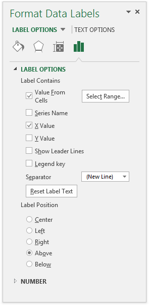
Finally I set up the custom labels I wanted. I used the X values instead of the default Y values and also used the Value from Cells option to get the product names into the labels, with a new line separating the cell values and the X values. These settings are shown in the Format Labels task pane shown below. Unfortunately if you do not have Excel 2013, you don’t have the Values from Cells option, but you have other ways to Apply Custom Data Labels in Excel Charts.
I also changed the font color of each label to match the corresponding point, and staggered labels where they were too close by placing a couple below the points.


